Badge Font Size Rules for Badges: What’s Readable at 6 Feet?
Why badge font size matters at 6 feet (and what “readable” really means)
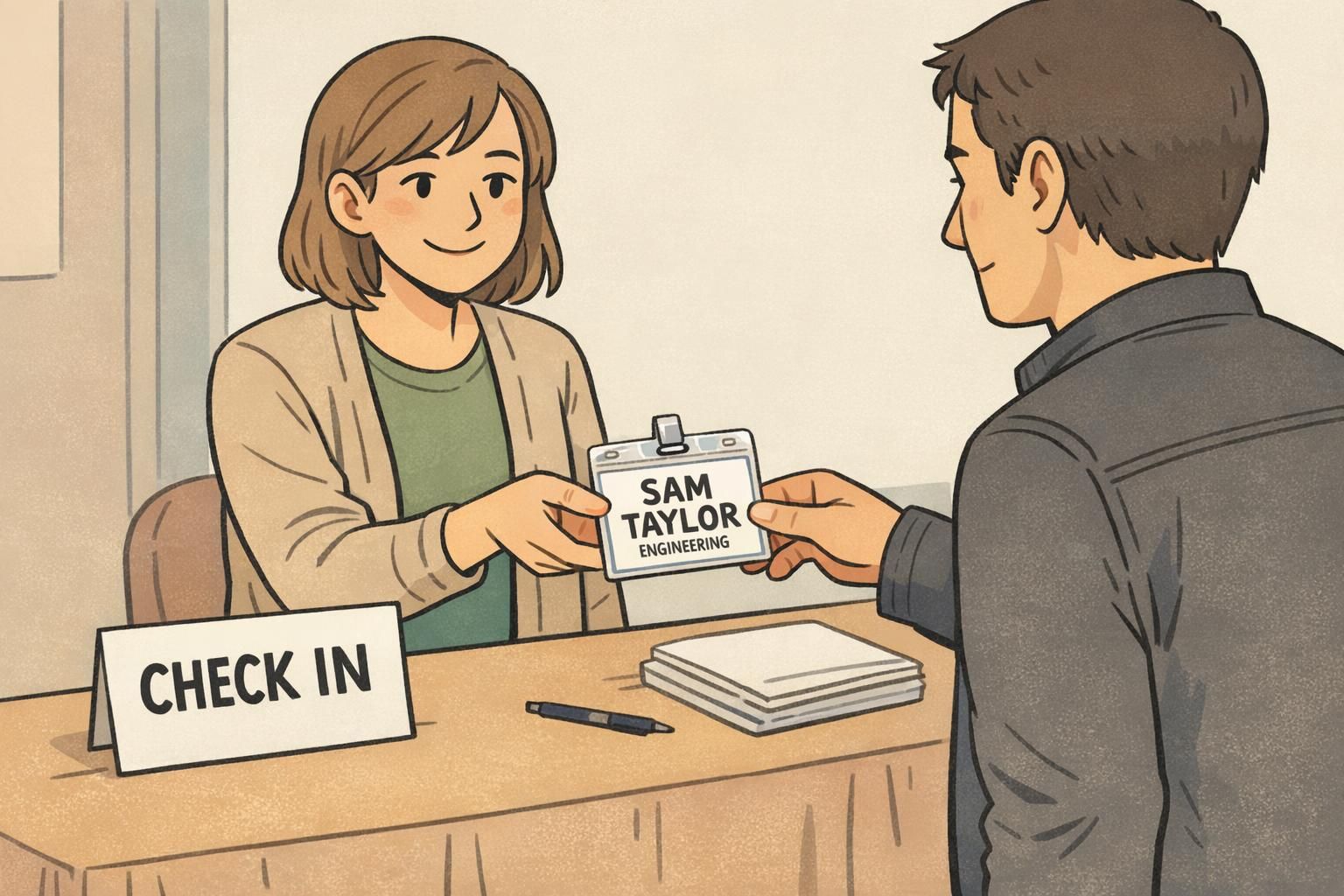
Badge font size is one of those details that feels “small” until you’re in a lobby, hallway, or event check-in line watching people lean forward to decipher a name. At a normal conversation distance—about 6 feet—a name badge either works instantly, or it creates friction: squinting, awkward stepping closer, or skipping introductions altogether.
The tricky part is that “readable” isn’t one standard. In real life it can mean either: (1) barely recognizable for someone with strong vision in good lighting, or (2) comfortably readable for a wider range of people, including older attendees, tired eyes at the end of a conference day, and anyone dealing with glare from a clear holder. Those are very different targets, and they lead to very different typography choices.
If you design for “barely readable,” small shifts in lighting, motion, or contrast can make a badge fail. If you design for “comfortably readable,” your badge works in more rooms, for more people, with less effort.
This guide translates practical legibility concepts into decisions you can apply before you print—especially around how big the name line should be, how to set a clean hierarchy for titles and departments, and how to test your proof so you’re not guessing.
The 6-foot baseline: minimum vs preferred letter heights for name badges
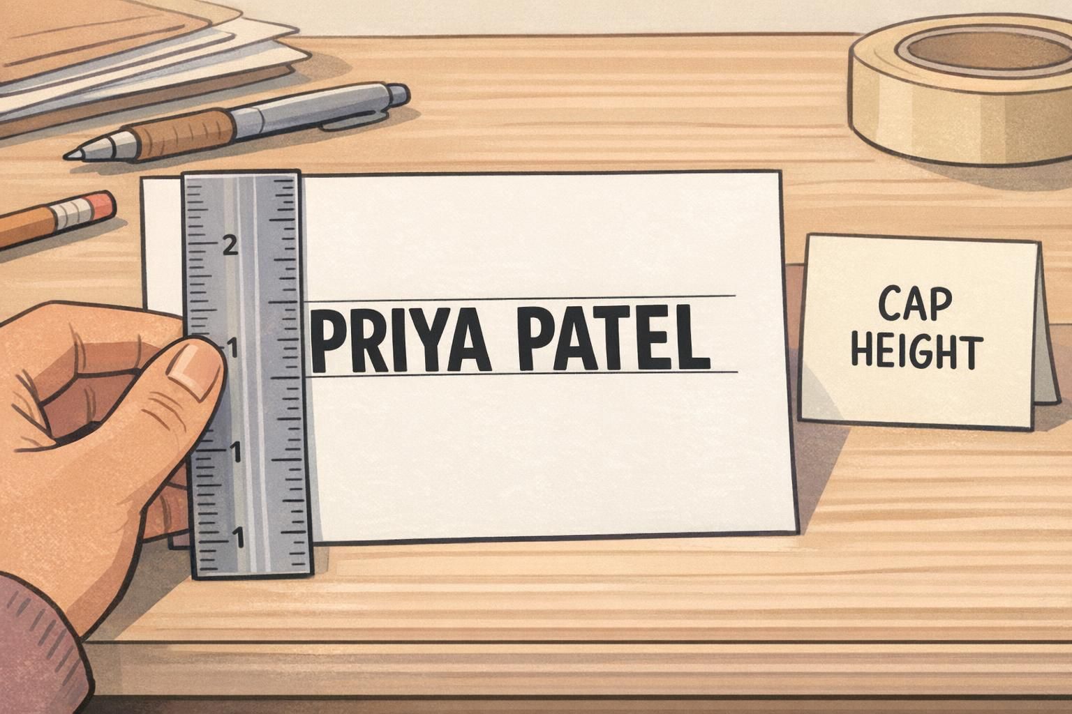
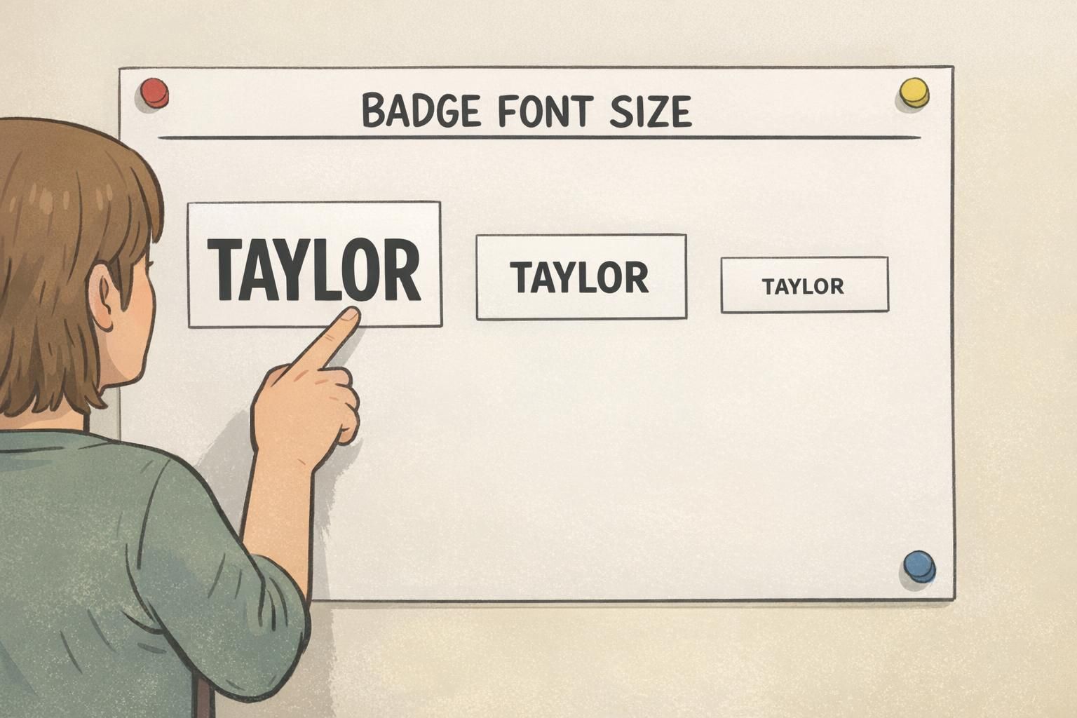
For a main name line intended to be read at roughly 6 feet, the most useful measurement isn’t the point size—it’s the printed capital letter height (often called “cap height”). Point size varies by font, and two fonts set at the same pt can produce noticeably different letter heights.
As a practical baseline, aim for a preferred capital letter height of about 0.5–0.7 inches (12–18 mm) for the name line. That range tends to feel comfortably readable in real settings, not just on a designer’s screen.
You can sometimes get by with an absolute minimum cap height closer to 0.3–0.35 inches (7.5–9 mm), but that target is less inclusive and more sensitive to real-world variables like dim hallways, glare on plastic holders, and people turning as they talk.
- Preferred cap height for the name at ~6 feet: ~0.5–0.7 inches (12–18 mm)
- Absolute minimum cap height for the name at ~6 feet: ~0.3–0.35 inches (7.5–9 mm)
- Typical point-size ballpark for many fonts to hit these targets: often ~40–60 pt for the name line (confirm with a printed proof)
The “40–60 pt” range is only a rough translation; the reliable method is always the same: print a proof at 100% scale, then measure the cap height with a ruler. If the printed letters don’t meet your target height, the point number doesn’t matter—your badge will read smaller than you intended.
Practical size recommendations: names, titles, company, and secondary info
A readable name badge works because it has a clear hierarchy. The name is optimized for 6 feet. Everything else is optimized for closer distances—typically 2–3 feet—so the badge stays clean instead of turning into a tiny-text business card.
A helpful way to think about it is: What must be recognized quickly from across a small room? That’s your name. What helps once you’re already chatting? That’s role, team, or company.
- Name (largest): target ~0.5–0.7 inch (12–18 mm) cap height for comfortable 6-foot reading; avoid dropping below ~0.3–0.35 inch (7.5–9 mm) unless you accept “barely readable” performance
- Title/Role (medium): sized for 2–3 feet; often lands in a ~16–24 pt neighborhood depending on badge dimensions and font
- Company/Department (medium or small): similar to title, or slightly smaller if the badge is getting crowded
- Secondary info (small, optional): use sparingly; keep it readable up close and consider moving it to the back if it steals space from the name
When space is tight, protect the name first. It’s the one line that needs to succeed at 6 feet; other details can be designed for closer reading.
If you’re working with badge buddies (for example, to show role, access, or group), treat them as support—not competition. A role label or color cue can be helpful, but it shouldn’t force the name line to shrink below your 6-foot target.
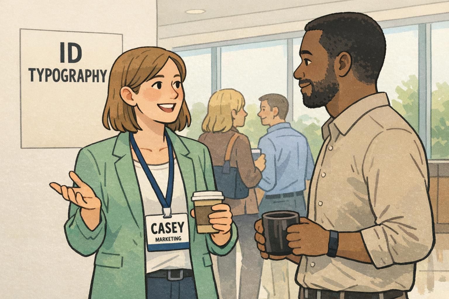
Readable name badge typography: font choice, weight, spacing, and case
Once you’ve set a size target, the next big win is choosing type that holds up in motion. People don’t read badges while standing perfectly still, under perfect light, with unlimited time. They read while walking, turning, and scanning faces.
For ID typography that works in real environments, prioritize simple sans-serif fonts with open shapes and clear character differentiation. That means avoiding condensed styles, overly stylized letterforms, and ultra-light weights that disappear when printed or seen through a holder.
- Font family: choose a clean sans-serif with open counters (clear “A,” “O,” “e”)
- Weight: regular to semi-bold is usually safer than light; avoid hairline strokes
- Width: avoid condensed fonts that squeeze letters together
- Spacing: don’t track letters too tight; slightly open spacing often reads faster at distance
- Case: Mixed case (Title Case) typically reads faster than ALL CAPS for names because word shapes are easier to recognize
Often, no. ALL CAPS can look bold, but mixed case is typically faster to recognize because the word shape is more distinctive. If you use caps, protect spacing and size so the letters don’t blur together at a distance.
Not always. A slightly heavier weight can help at distance, but overly heavy bold can fill in letter shapes (especially at smaller sizes). Regular or semi-bold is a dependable starting point for most badges.
Contrast and backgrounds: the fastest way to lose legibility
If you’ve ever seen a badge with a “big” name that still feels hard to read, the culprit is usually contrast, background noise, or lighting—more than the font size itself. In other words: letter size helps, but it doesn’t guarantee real-world legibility.
High contrast (dark text on a light background) is one of the most reliable ways to improve quick recognition. The opposite—light text on a light color, dark text on a dark photo, or text placed over patterns—forces the eye to work harder, especially at distance and while moving.
Research on reading and legibility consistently points to the importance of contrast and viewing conditions alongside size. If you want a neutral, research-informed reminder that readability is more than “make it bigger,” see this source.
- Use a quiet name area: solid light background behind the name is the safest choice
- Avoid text over photos, gradients, patterns, or textures (especially for the name line)
- Watch for glare: clear holders can reflect overhead lights; stronger contrast helps compensate
- Keep brand color accents away from the main name line if they reduce contrast
If the name has to be readable at 6 feet, treat the background behind the name like a “no-drama zone”: clean, light, and high-contrast.
Quick tests teams can run before printing (no special tools needed)
The fastest way to avoid disappointment is to test one printed badge before you commit to a batch. Screens lie: zoom levels, backlighting, and crisp vectors can make borderline sizes look fine—until the badge is printed, put in a holder, and worn under overhead lights.
- Print at 100% scale: print one badge proof at actual size (not “fit to page”)
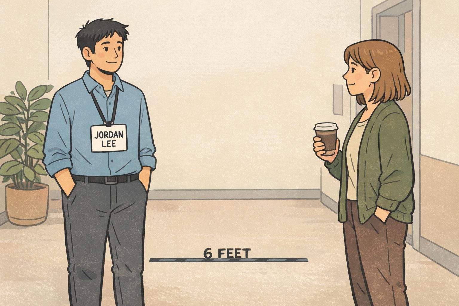
- Tape-at-chest-height test: place the badge on a wall at chest height and stand 6 feet away; read the name without stepping closer
- Team test: try multiple readers, including anyone who wears glasses or has mild low vision; confirm it’s comfortably readable, not just decipherable
- Lighting check: repeat the test under the same lighting you’ll have on-site (conference room lights, lobby daylight, gymnasium lighting, etc.)
- 2–3 foot test for secondary lines: confirm title/department is clear at typical conversation distance
- Walk-by test: have someone walk past at a normal pace while another person tries to read the name to simulate real networking/check-in flow
“If someone can read the name at six feet without concentrating, the badge is doing its job. If they have to ‘work’ to read it, the design needs another pass.” – Event Operations Lead
Common layout mistakes that shrink your name line (and how to fix them)
Most badge readability problems aren’t caused by a bad font. They’re caused by a layout that tries to do too much in too little space—until the name line gets squeezed below the distance-readability target.
If your goal is a readable name badge, treat the name line as protected space. Build everything else around it, and be willing to simplify.
- Mistake: too many fields on the front (pronouns, full company address, multiple hashtags, etc.). Fix: remove or shorten secondary fields; keep only what supports quick introductions.
- Mistake: logo dominates the top third of the badge. Fix: limit the logo to a corner or smaller header area so the name can stay large.
- Mistake: long titles force wrapping and shrink the name. Fix: shorten roles (e.g., “Engineering” vs. “Senior Infrastructure Platform Engineering”) or move the full title to the back.
- Mistake: using multiple lines for the name to fit (especially for first+last+credentials). Fix: prioritize the most useful element for 6 feet (often first name or preferred name) and keep the main line single-line if possible.
- Mistake: condensed fonts to ‘make it fit.’ Fix: use a normal-width font and adjust layout; condensed type often reads worse at distance.
A clean badge isn’t missing information—it’s focused. The fastest badges to read usually contain fewer, larger elements with clear hierarchy.
How ID typography changes with badge type: events, workplaces, and visitor IDs
Good ID typography starts with the job the badge needs to do. A badge used for networking across a room is different from an ID used for workplace verification or a visitor pass used to signal access level.
Event badges usually benefit from fast first-name recognition at distance. That often means dedicating the biggest, highest-contrast space to the name—sometimes even prioritizing the first name if space is limited.
Workplace IDs may need to balance name readability with a photo, department, and potentially additional identifiers. In these designs, the name still benefits from strong size and contrast, but you may accept a slightly smaller name line if close-range verification is the main use case.
Visitor badges tend to emphasize what someone needs to do in the space: where they can go, who they’re visiting, or how long the badge is valid. If you add role labels, color bars, or access cues, keep them from competing with the name. The most important line should still be the easiest to read.
The name line. Make it the clearest element at 6 feet, then size title/company for 2–3 feet so the badge stays uncluttered.
The photo helps verification, but the name still supports quick, polite interaction. Strong name readability reduces awkwardness and improves day-to-day usability.
Choosing a badge format that supports larger type (without redesign headaches)
Sometimes your typography is fine—the format is the constraint. If your target name size won’t fit cleanly, the most reliable solution is often a larger badge format or a simpler layout, rather than squeezing the type until it becomes hard to read.
This is especially common when teams try to include a large logo, a long full name, a title, a department, and extra details all on the front. If the name line has to shrink below your 6-foot goal, consider stepping up the badge size, reducing the number of front-side fields, or moving non-essential info to the back.
If you’re exploring formats for events, BadgeZoo’s custom event badges can be configured to give the name line enough space for 6-foot readability while keeping titles and secondary info organized.
When readability is the goal, format is part of typography: give the name enough physical space to hit your cap-height target without crowding.