Conference Badge Layout for Photos: Readable, Professional Designs for Social Moments
Why a conference badge layout matters in photos (and from across the room)
A good conference badge layout does two jobs at once: it helps people recognize each other quickly in real time, and it stays legible when captured in photos. That second part matters more than many organizers expect—phones often shoot at an angle, in mixed lighting, and while people are moving. In those conditions, small type, thin fonts, and low-contrast color choices can disappear fast.
When badges are readable, hallway conversations start smoother (“Hi, Alex” instead of “Sorry—what was your name again?”), group photos feel more inclusive, and social posts have clearer context. Clear identification also supports safety and event flow by making it easier to spot staff, speakers, and other roles at a glance.
Goal for a photo-friendly badge: instant recognition of the person first (name), then the context (organization and role), without crowding the design.
Build the hierarchy: what must be readable first in a crowd shot
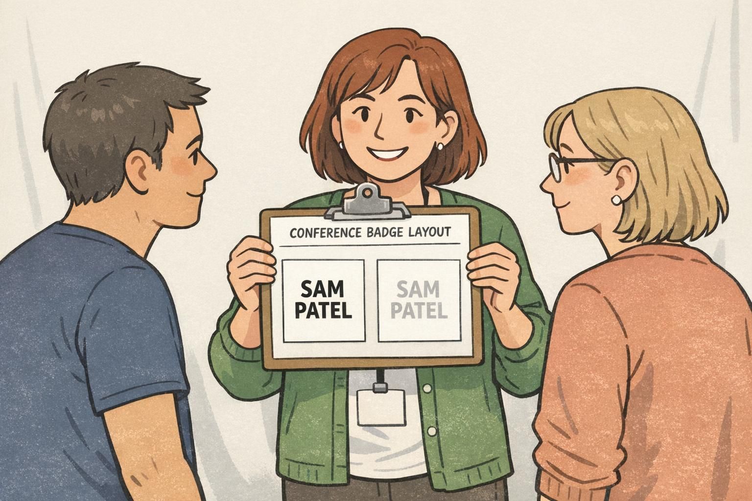
A readable event badge starts with hierarchy—an intentional reading order that matches how people actually scan badges in a crowded room and how cameras capture them in step-and-repeat photos, booth selfies, and quick group shots.
A simple hierarchy that works in most conferences:
- Attendee name (largest, highest contrast, easiest to find at a glance)
- Company/organization (supporting line, still clear from a few feet away)
- Title, role, or track (helpful context in networking, but shouldn’t overpower the name)
- Optional details (pronouns, hometown, session code, QR code—only if they fit without shrinking the essentials)
For the fastest scanning in photos, place the attendee name centered in the upper half of the badge. That area tends to remain visible even when the badge swings, a jacket covers the lower edge, or the lanyard twists slightly.
If you’re adding speaker or sponsor identifiers, treat them as supporting information. The person’s name should remain the dominant element. A “Speaker” label that is clear but contained (like a single bar) is more photo-friendly than a second headline competing with the name.
Font sizes that survive phone cameras: practical starting points
Badge typography doesn’t need to be trendy to photograph well—it needs to be stable under blur, distance, and compression. A common mistake is choosing a beautiful thin font that looks great on-screen, then turns fuzzy in motion or disappears in a busy photo.
Instead of aiming for perfect numbers, use a simple, testable approach: print one sample at actual size and check it from typical “camera distance.” If you can read it comfortably from about 6–10 feet away, it’s much more likely to hold up in crowd shots.
- Make the name the largest line on the badge, in a bold weight.
- Set company/organization slightly smaller than the name, but still clearly readable from several feet.
- Use title/track in a smaller supporting style—helpful up close, not critical from far away.
- Choose a clean sans-serif font and avoid thin strokes that blur when photographed.
- Use comfortable line spacing so letters don’t visually run together in photos.
- Avoid all-caps for long names (ALL CAPS can look dense and become harder to parse quickly).
If the name only looks “barely readable” on a printed test, it will usually look unreadable once it’s angled, partially covered, or captured in a quick phone photo.
Contrast and color choices that reduce blur and glare
Contrast is one of the biggest factors in whether a badge stays readable in photos. Cameras often boost contrast and smooth details automatically, which can wash out low-contrast type (like light gray text on white) or lose detail in dark-on-dark combinations.
A dependable choice is dark text on a light, solid background for the name and primary details. If you want to incorporate brand color, use it as a strong accent area (like a role bar) rather than placing the name over a patterned or multicolor background.
- Use high-contrast text for the name (dark on light is the safest).
- Avoid busy patterns behind critical text—patterns look “louder” in photos than they do on a screen proof.
- Use solid color blocks behind key labels (like role) so the text edge stays sharp.
- Watch for glare: glossy surfaces and big dark glossy areas can create hotspots under overhead lighting.
- If glare is a concern, consider finishes that reduce reflections (matte options can help).
These general best practices are widely reflected in event badge design guidance that emphasizes clarity, templates, and legibility considerations; see source.
Placement rules: where to put logos, QR codes, and schedules without crowding
A clean layout grid prevents the “everything is important” problem. When too many elements compete, the name—your most important networking tool—shrinks first, and the badge becomes harder to read in photos.
A practical grid for most events:
- Top zone: event branding (small logo or event name, not oversized)
- Center zone: attendee name (largest text, clear background)
- Lower zone: company/organization and title/track (supporting details)
- Lower corner or bottom area: QR code (if used) with enough quiet space to scan
QR code placement matters more than people think. Avoid placing it where the lanyard clip or slot will cover it, and avoid edges where hands naturally land when someone holds the badge up for a photo. Keeping it slightly inset (with margin around it) helps both scanning and camera clarity.
For sponsor logos, keep them smaller and away from the name block. Sponsors can still be visible without competing with attendee identification.
- Don’t stack multiple icons beside the name (they add clutter and shrink the text).
- Don’t use several accent colors that all fight for attention.
- Don’t place critical info right at the top hole/clip area where it will be covered.
Readable event badge details: roles, access levels, and color-coding that photographs well
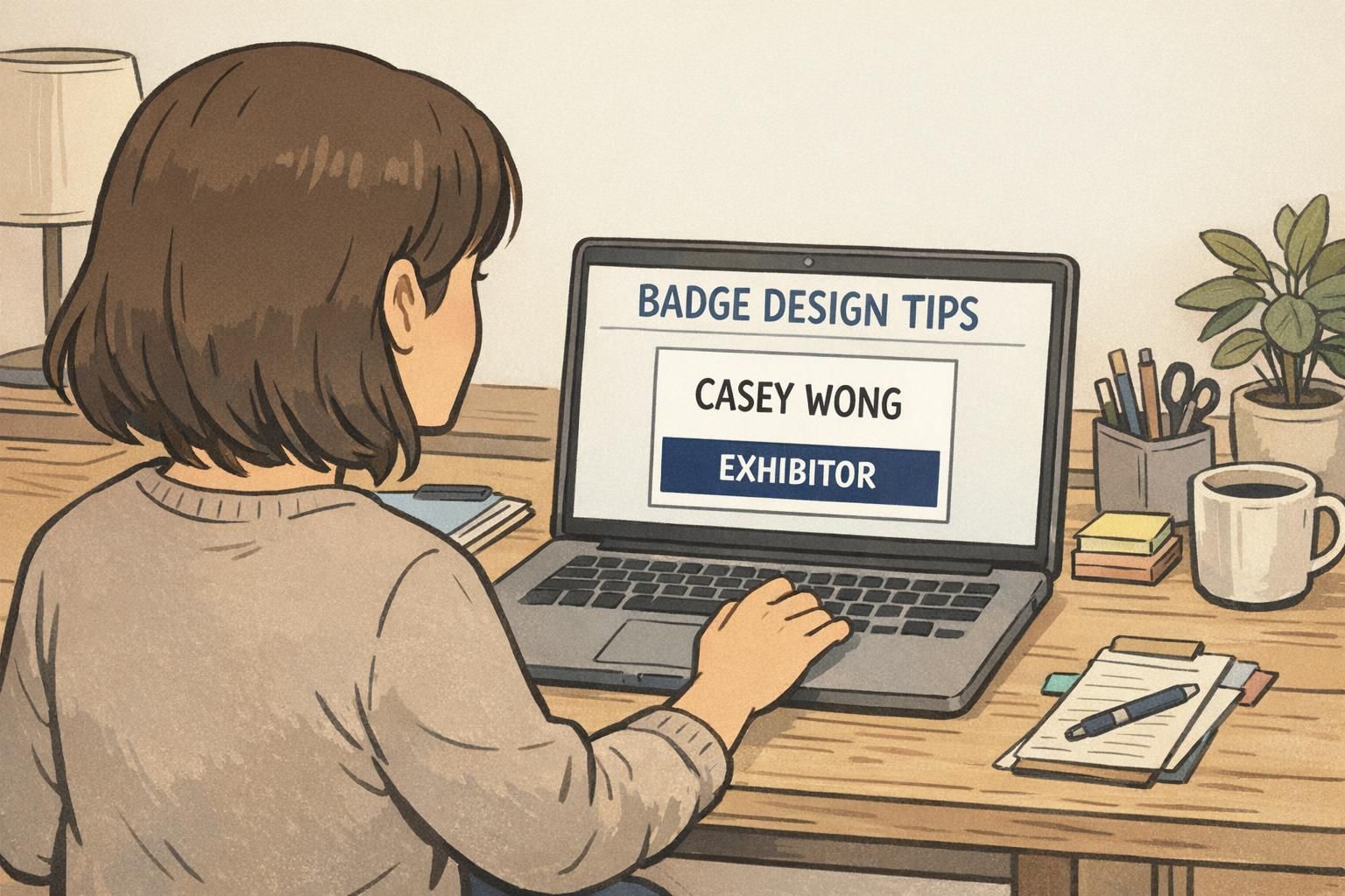
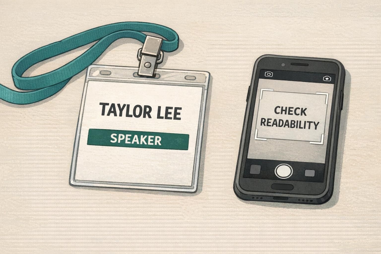
Role and access markers are most effective when they’re unmistakable at a glance, but they shouldn’t overwhelm the badge. The cleanest approach is usually a single label or bar (for example: SPEAKER, STAFF, VIP, EXHIBITOR) that’s high contrast and easy to spot in photos.
Color-coding can support fast recognition, but it should be a secondary cue—not the only cue. Photos may be taken in poor lighting, posted with filters, or viewed in ways that reduce color accuracy. A readable event badge keeps the role text clear even if the image ends up desaturated or low-quality.
- Use a single high-contrast bar or label for role (simple, bold, and readable).
- Pair color with text (color helps, text confirms).
- Keep access markers obvious enough for staff to recognize, but not so dominant that they crowd the attendee name.
- Avoid subtle tone-on-tone role labels that look stylish up close but vanish in photos.
Clear role labeling helps with wayfinding and event operations, while still keeping the badge’s primary job—identifying the person—front and center.
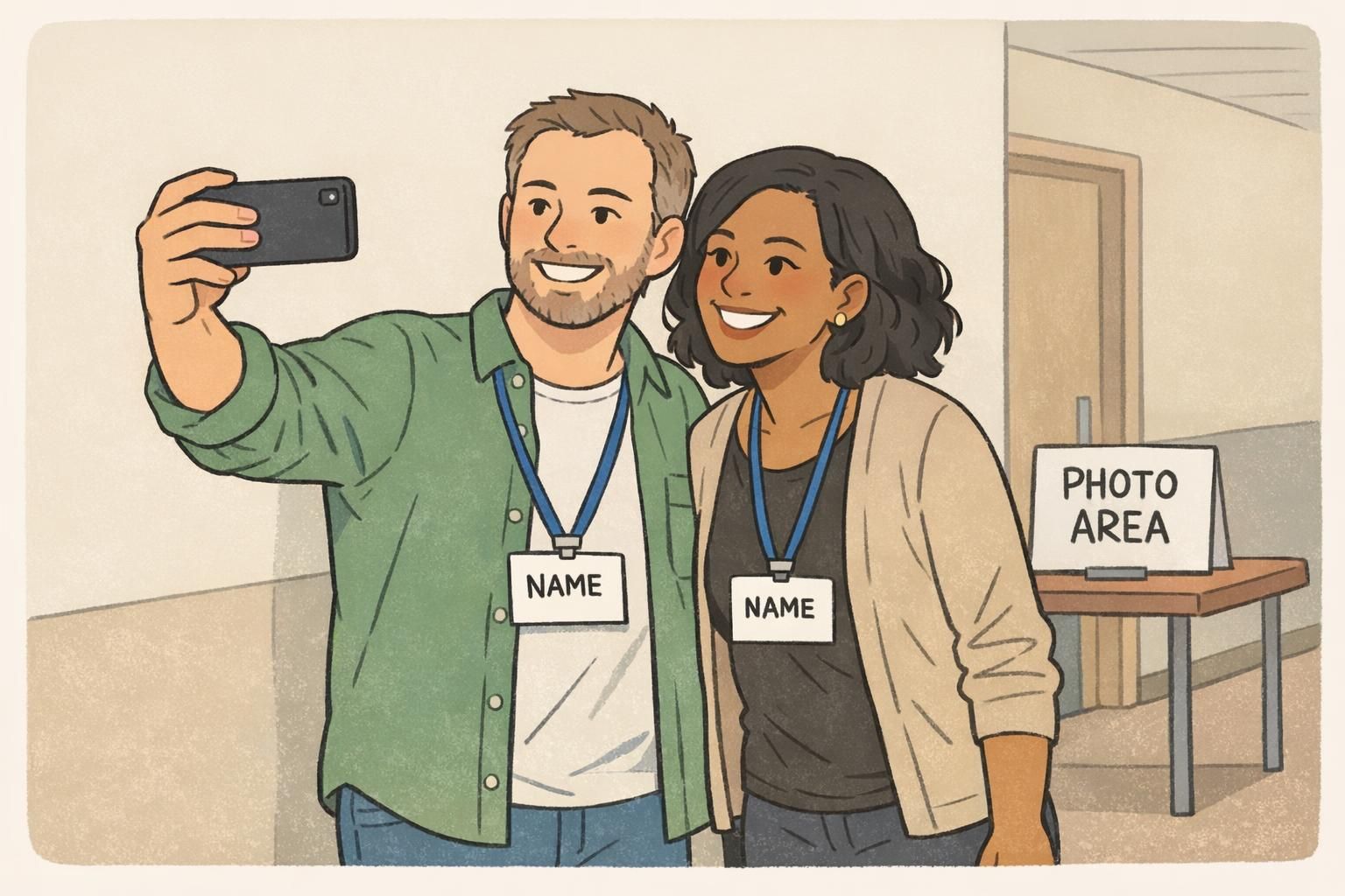
Badge design tips for social media moments (selfies, stage shots, and group photos)
Most badge photos aren’t planned. They happen while walking, laughing, leaning in for a selfie, or turning toward a stage. Designing for those moments means assuming the badge will be angled, partially blocked, and sometimes twisted on the lanyard.
A few badge design tips that consistently improve photo readability:
- Create a “photo zone” for the name: keep the name high enough and large enough that it stays visible even if the bottom portion is covered by a jacket, hair, or hands.
- Use a strong, simple name block: avoid putting the name on top of gradients or textures that break up letter edges.
- Plan for lanyard twist: keep the most important information centered so it’s still readable when the badge rotates slightly.
- Be respectful and clear with preferred names and pronouns: place them close to the name (or directly beneath it) at a readable size, instead of pushing them into tiny corner text.
- Do a quick phone test: take a selfie and a 6–10 foot photo of a printed sample. If the name isn’t instantly readable, adjust before you print hundreds.
A common approach is placing pronouns on the same line as the name (if space allows) or as a short line directly beneath the name in a slightly smaller size. The key is to keep them in the main scanning area rather than hiding them in tiny text.
Only if it doesn’t reduce the readability of the name and organization. For photo-focused layouts, it’s usually better to keep the front clean and place extra details elsewhere (like a QR code) if you need them.
Materials and print choices that keep badges crisp on camera
Even with a strong layout, materials can affect how crisp a badge looks in pictures. Badges that curl, swing too freely, or reflect overhead lighting are more likely to look blurry or washed out in photos.
Common options and how they tend to behave on camera:
- Paper inserts in badge holders: budget-friendly and flexible, but clarity depends on print quality and how flat the insert sits inside the holder.
- Direct-printed plastic badges: can look very crisp with consistent alignment and clean edges; often hang flatter depending on thickness and hardware.
- Rigid holders or thicker stock: helps the badge hang flat, which improves readability in photos (less curl, less warp).
Regardless of material, consistency matters. Clean trimming and careful alignment prevent the “crooked text” look that stands out in group photos. If you’re choosing a finish, glare is the main consideration for photo clarity—finishes that reduce reflection can make names easier to read under bright indoor lights.
Make it easy to order: templates, proofing, and event badge printing options
The easiest way to get consistent results is to lock a template early and treat proofing as part of the design process (not just a final approval step). A repeatable workflow also reduces last-minute edits that shrink fonts or add clutter.
- Choose a template that already supports strong hierarchy (name-first).
- Lock typography rules (font family, weights, and a clear size relationship between name and supporting lines).
- Collect attendee data in a consistent format (so long names don’t break the layout).
- Proof at actual size and print at least one sample.
- Print and assemble with the intended lanyards/clips so you can confirm coverage points and twist behavior.
Proof checklist for photo-friendly badges:
- Name legibility from 6–10 feet away
- High contrast for the name and key details
- QR scan test (if included), with margin around the code
- Lanyard/clip coverage check (nothing critical hidden by hardware)
- Quick phone photo test (selfie distance and group distance)
If you want a consistent, professional run without managing multiple vendors, you can use custom event badge printing to keep layouts standardized across attendees and roles.
“We stopped trying to fit everything onto the front of the badge. Once we made the name the hero and tested it on a phone camera, networking got noticeably easier—and the photos looked more professional.” – Event Organizer