Team event name tags: Making Introductions Easier at Company Gatherings
Why team event name tags reduce awkward introductions
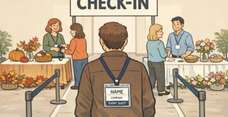
Team event name tags solve a problem everyone recognizes: you want to be friendly and confident, but you can’t always remember names (especially across departments, after travel, or when you’ve only met on video calls). When names are visible and easy to read, you don’t have to wait for a formal introduction—or avoid saying someone’s name altogether.
In practice, readable name tags speed up small moments that shape the whole event: greeting someone you’ve seen in Slack, introducing a new hire to a table, or forming quick breakout groups without the “sorry, what was your name again?” loop. They also help quieter participants join conversations sooner because they can use names naturally rather than finding a pause to ask.
There’s also a simple communication benefit: when people can clearly see and use one another’s names, it supports more direct, fluid interaction—something that’s been discussed in research contexts around group communication and identification cues (source). You don’t need a formal study to feel the difference in a busy room, but it’s reassuring that the common-sense design goal—make names easy to see—maps to how humans interact in groups.
- Fewer “I forgot your name” moments, especially in cross-team settings
- Faster conversation starts during icebreakers, workshops, and mixers
- Smoother inclusion for new hires, remote teammates, and guests
- Less reliance on memory (and less social pressure) in crowded rooms
“The biggest change isn’t that people suddenly have perfect memory—it’s that the room gets friendlier because everyone can address each other directly.” – People Ops coordinator
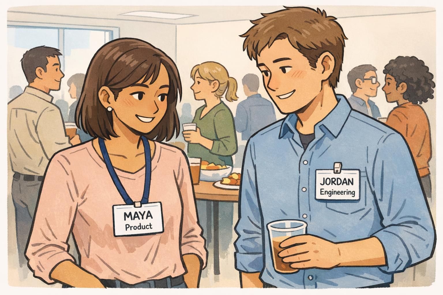
Layout basics: Big names first, then one helpful context line
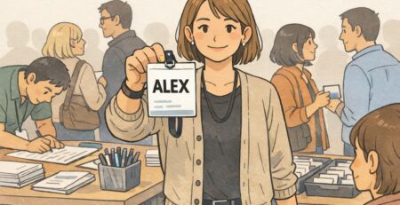
If you only change one thing about your badges, make the first name large, high-contrast, and easy to spot from a few feet away. That’s the information people need in the first half-second of an introduction. Everything else should support the name—not compete with it.
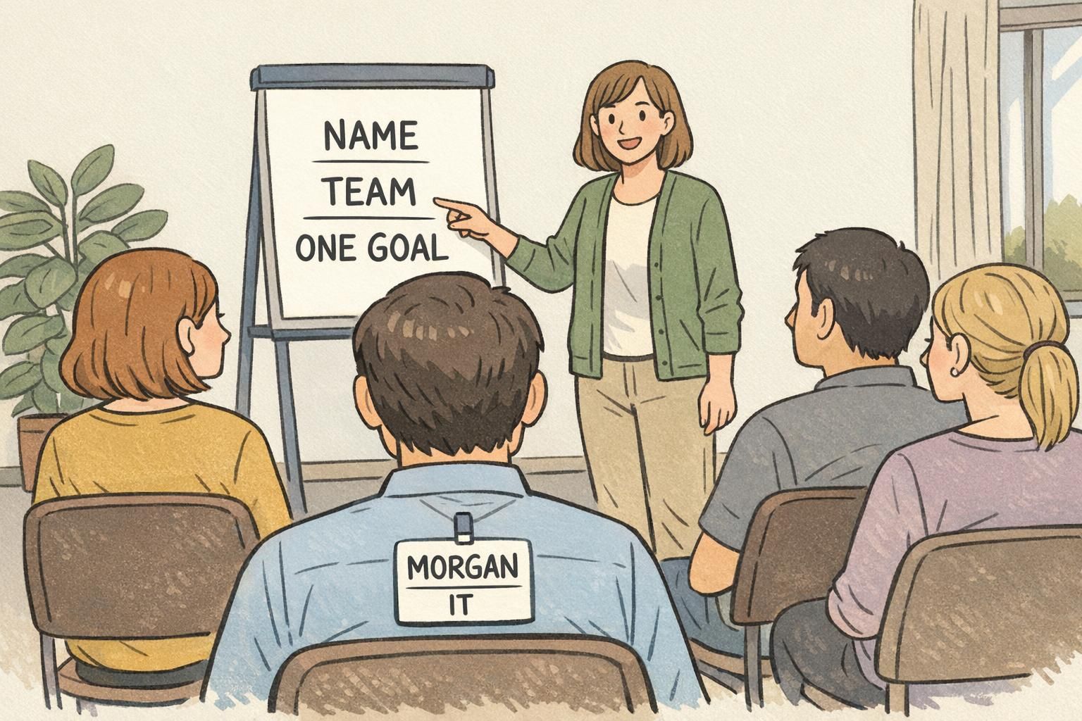
A clean hierarchy works best in real rooms: first name (largest), last name (optional, smaller), then a single context line that helps someone connect quickly. That context line can be a team, role, or a light conversation starter. The key is restraint: one line, short words, and a format that scans instantly.
A reliable structure: First Name (largest) → Last Name (optional) → One context line (team/role or a short prompt). If you have to squint up close, it’s not going to work across a room.
- Use high-contrast text (dark text on a light background is a safe default)
- Keep the font simple and readable (clean sans-serif styles typically hold up best at distance)
- Avoid crowding the badge with multiple lines of small text
- Treat logos, pronouns, or extra details as optional—only include them if they don’t shrink the name
Include them when it helps (large organizations, many similar first names, external guests). Keep them smaller than the first name so the badge still works from a few feet away.
Team often works better for routing conversation (“Product,” “IT,” “Finance”), while titles can be useful in formal events. If you use titles, keep them short and consistent.
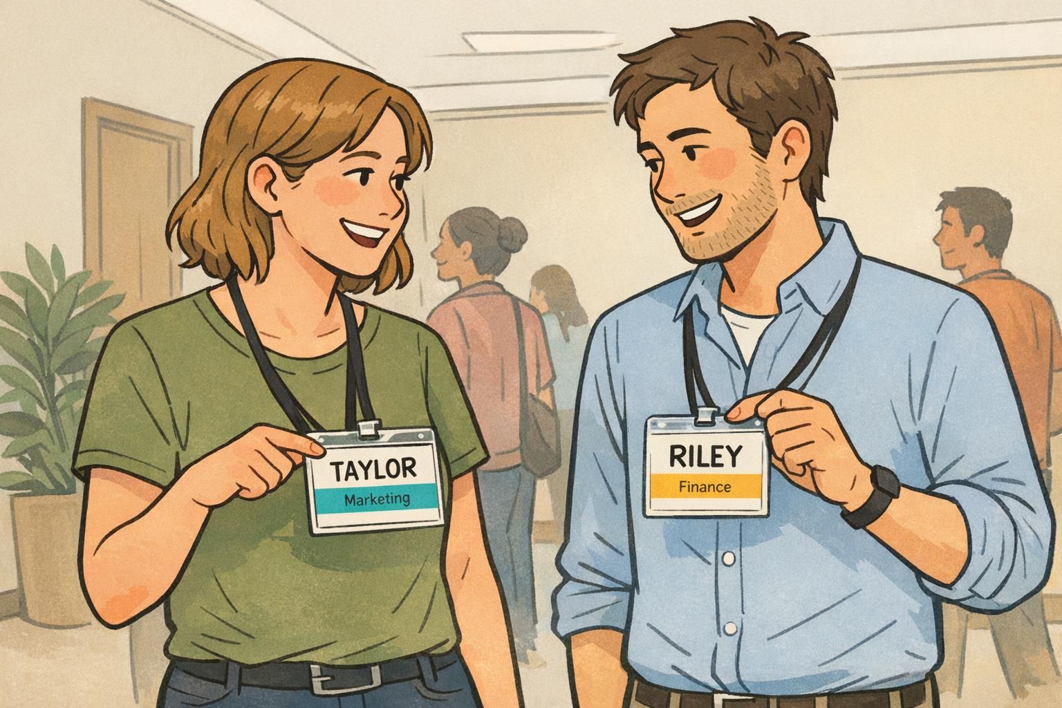
Conversation prompts that actually get used (without oversharing)
The best “prompt line” is one that people actually read and respond to while standing with a drink or moving between sessions. That means it has to be short, specific, and useful—something that gives others an easy opening without turning the badge into a mini bio.
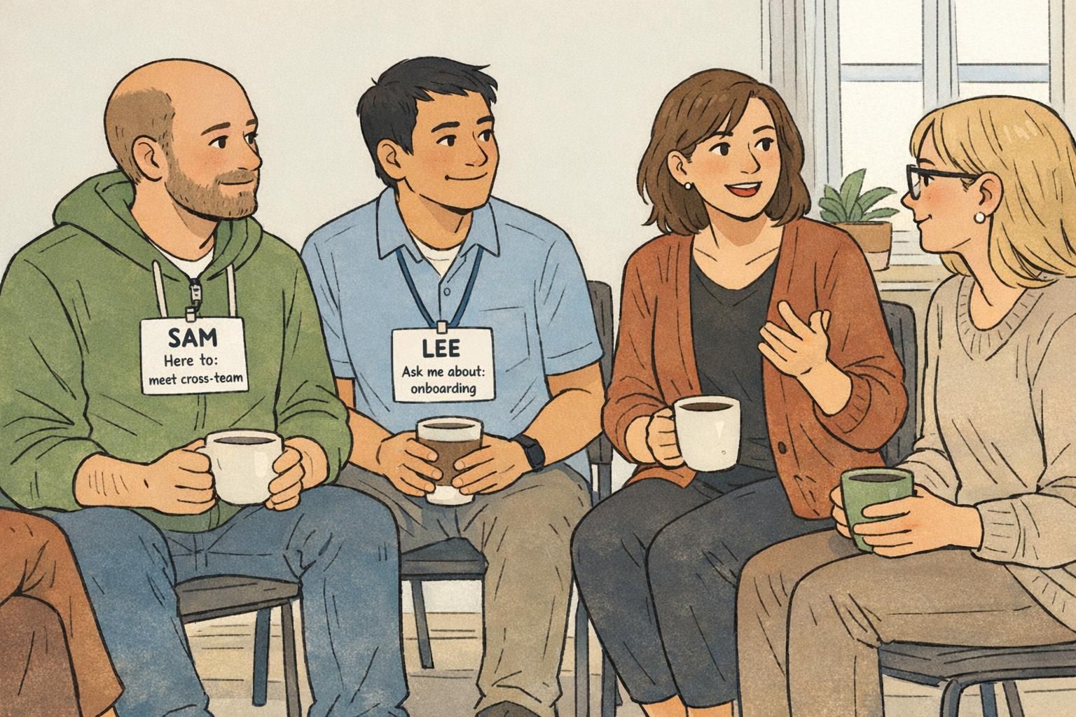
A practical rule: keep prompts to a single line and make them action-oriented. Think “Ask me about…,” “Working on…,” or “I can help with….” These cues make it easier to start a conversation with someone new, and they reduce repetitive questions like “So, what do you do?” by giving an immediate, relevant hook.
- Ask me about: onboarding
- Working on: Q3 launch
- I can help with: analytics
- Here to: meet cross-team collaborators
- Design • Accessibility focus
- IT • Device setup
One prompt line is plenty. If you add more than one, people stop reading—and your main goal (a readable name) gets weaker.
Avoid anything too long, too vague (“Love networking!”), or too personal for a workplace context. If it wouldn’t belong in a quick introduction, it probably doesn’t belong on the badge.
Choose one prompt format for everyone (for example, “Ask me about:” or “Working on:”) so badges scan the same way and people learn to look for that line.
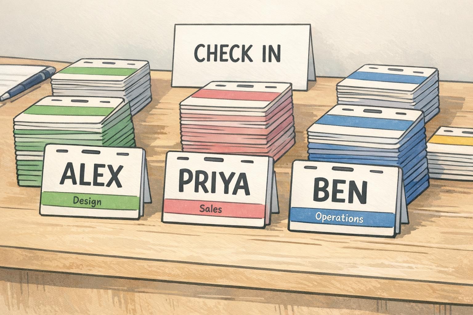
Color-coding for clarity: Teams, projects, and first-timers
Color-coding is a quiet way to make the room more navigable—without forcing extra text onto the main badge area. A simple color band (header or side stripe) can signal department, project group, or attendee type such as New Hire, Facilitator, or Guest.
This helps in two directions: it reduces the friction of repeatedly asking “What do you do?” and it helps people find relevant connections faster (the person you need for device setup, the teammate from your project track, the facilitator for your workshop). It can also make it easier for organizers to spot who needs support—especially first-timers who may not know many faces yet.
- Department band (e.g., Product, Engineering, Sales, Operations)
- Project/track band for multi-session events (e.g., Track A / Track B)
- Attendee type band (New Hire, Facilitator, Guest)
- Cabin/group band for retreats (useful without adding clutter to the name area)
“The color band let people self-sort quickly—then the big name did the rest. It made the whole mixer feel less like a guessing game.” – Event organizer
Print-ready sizing and placement: Make names readable in real rooms
A name tag design that looks fine on a laptop can fail in a real event space. People are moving, lighting varies, and conversations happen at different distances. Design for the moment when someone glances at a badge while smiling and listening—not when they’re standing still in perfect light.
Start with distance: the first name should be large with generous spacing around it. A clean sans-serif font tends to hold up well, and high contrast is your friend. Then consider placement. Badges work best where people naturally look during conversation: on the upper chest, often on the right side from the wearer’s perspective (so it’s closer to the other person’s line of sight during a handshake or greeting).
If you expect photos, keep the name high on the badge. Names placed too low are more likely to be covered by a jacket, a lanyard twist, crossed arms, or a tote strap.
- Make first names the largest element—readable from a few feet away
- Use generous padding so text doesn’t feel cramped
- Prefer clean, simple fonts over decorative styles
- Place the name near the top for better visibility in photos and in motion
- Choose clip or lanyard placement that keeps the badge facing forward
If you can’t read the badge while standing at conversational distance, the layout is doing too much—or the name is too small.
Company retreat badges vs. simple name stickers: choosing the right format
Not every gathering needs the same level of badge. For a short, casual event, a well-designed sticker name tag can be enough—especially if you keep the name large and include one helpful context line. But if your agenda spans multiple sessions or locations, you’ll usually benefit from a sturdier format.
Company retreat badges are a strong fit when you need structure and durability: multi-day schedules, meal tickets, access needs, activity tracks, or clear role visibility (facilitators, first-timers, speakers, guests). A retreat badge can carry those details without sacrificing the core requirement: a readable name.
- Choose stickers when: the event is short, indoors, and low-complexity
- Choose sturdier badges when: the event is multi-session, outdoors, includes movement, or needs check-in control
- If you must include logistics (meals, tracks, cabins): keep them away from the main name area—use small sections or a color band
Yes—keep a standard template (big name + one context line) and swap only what changes (color band, track label, attendee type). Consistency makes the room easier to read.
Not always. Lanyards are durable and easy for all-day wear, but they can flip or twist. Clips keep the badge stable for face-to-face conversation. Many events mix both successfully.
Facilitator-friendly intro formats that pair with the badge design
Badges work best when the event flow teaches people to use them. A simple way to do that is to align your introductions with what’s printed: name + team/role + one sentence. When everyone hears that format and sees it on the badge, people naturally start relying on it during mingling.
For a meet the team vibe, the goal is to create quick, low-pressure connections that repeat throughout the day. Badge cues can make activities smoother without feeling forced—especially when you use color bands or prompt lines as the “instruction.”
- Session opener: “Name + team/role + one sentence” (match the badge exactly)
- Mixer cue: “Find someone with the same color band and swap one tip from your workday”
- Mixer cue: “Find someone whose prompt line mentions a topic you care about”
- Fast round: group by first-name initial for a 3-minute chat, then re-mix by color band or role
“When the intro format matches the badge, people stop asking the same basic questions and start talking about real work faster.” – Workshop facilitator
Ordering and setup tips (and a BadgeZoo option that fits team events)
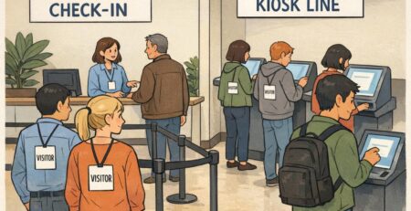
The best badge design still needs a practical check-in plan. Set yourself up for last-minute changes (they always happen) by keeping a small stack of blank write-on backups and a clear table layout. Alphabetical stacks work well, and so do team-color stacks if you’re using bands—just label the system clearly so lines move fast.
Standardizing the template is what makes a room feel “readable.” If every badge follows the same visual rules—big first name, one context line, optional color band—attendees learn where to look without thinking. That’s the difference between a badge that looks nice and a badge that actively helps people connect.
If you’re printing badges for an event and want consistent formatting with large, legible names and clean role lines, BadgeZoo offers event badge printing for team events. For planning flexibility, it can also help to know there’s no minimum order quantity—useful when headcount is changing or when you want a small run for a pilot meetup.
- Prepare for changes: print a few blanks for walk-ins, name corrections, and replacements
- Organize check-in: alphabetical stacks or color-band stacks (pick one and keep it obvious)
- Keep the template consistent: large first name, one context line, minimal extras
- Do a quick “distance test”: hold a badge at arm’s length and confirm the first name pops immediately
Decide what the badge is for. If it’s for introductions, protect the big name. Put only one additional line of context and move everything else (logistics, rules, extra details) off the main area or onto a separate handout.
Use a color band or a small header label for group info, and keep the name area untouched. That way the badge stays readable while still helping people self-sort.