Large Workplace IDs in Big Facilities: Helping People Navigate Who’s Who
Why big facilities struggle with “who’s who”
In a small office, people quickly learn each other’s names and job functions. In a hospital tower, a multi-building campus, or a sprawling corporate site, that “who’s who” knowledge breaks down fast—especially when shifts rotate, contractors come and go, and visitors arrive with urgent questions. That’s where large workplace IDs make a difference. When someone can immediately tell who you are and what you do, they can ask the right question the first time, get pointed to the right location, and avoid interrupting the wrong person. Clear IDs also reduce the awkward back-and-forth that happens when people feel they have to “guess” whether someone is clinical staff, facilities, security, IT, admin, or a visitor. In big facilities, role clarity matters because most quick interactions aren’t about credentials. They’re about direction and triage: “Can you help me check in?” “Who can reset a badge reader?” “Where do I go for student services?” An ID that clearly signals role and approachability saves minutes across hundreds of daily interactions—and that adds up.
In large teams, the biggest win isn’t adding more information—it’s making the most important information (name + role) easier to see and interpret.
- High foot traffic: visitors and staff constantly crossing paths in hallways and lobbies
- Rotating teams: shifts, floats, trainees, and cross-coverage make faces unfamiliar
- Similar uniforms: different roles may dress alike, especially in healthcare and facilities
- Time pressure: people ask quick questions while walking, carrying equipment, or managing lines
- Multiple buildings: departments repeat across sites, so visual consistency becomes critical
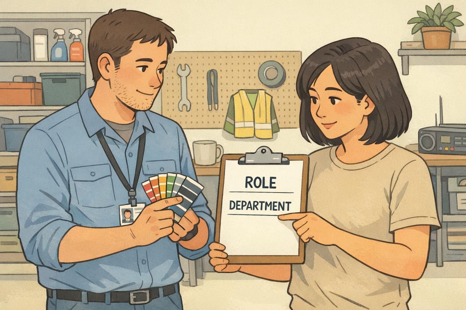
Large workplace IDs: what they should communicate at a glance
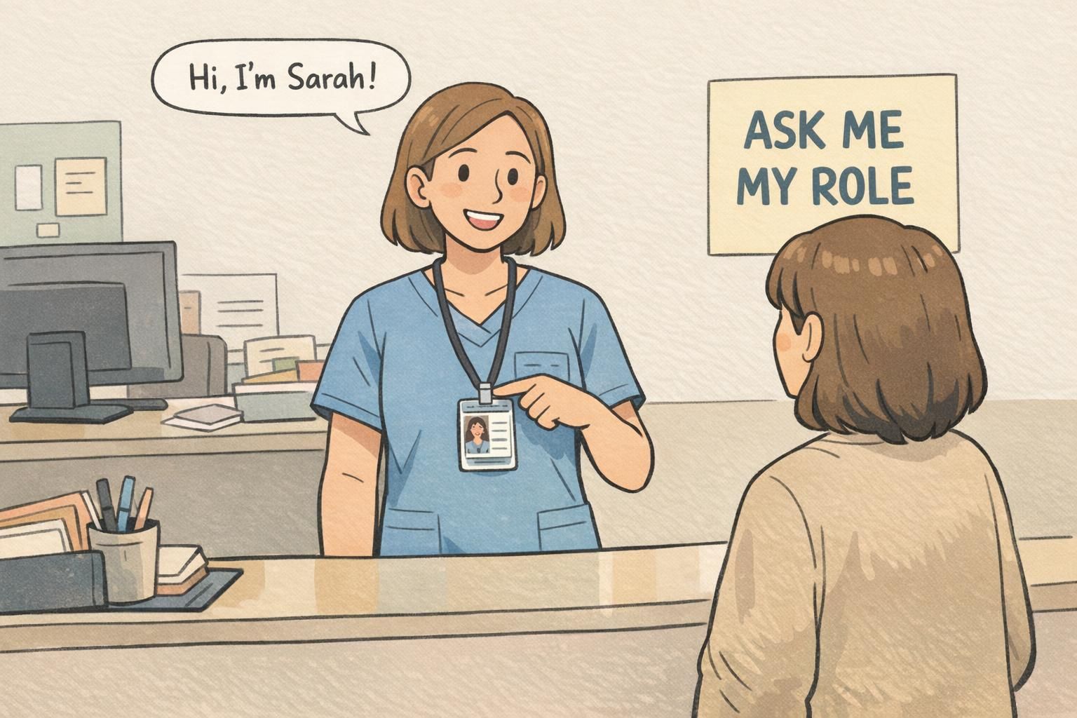
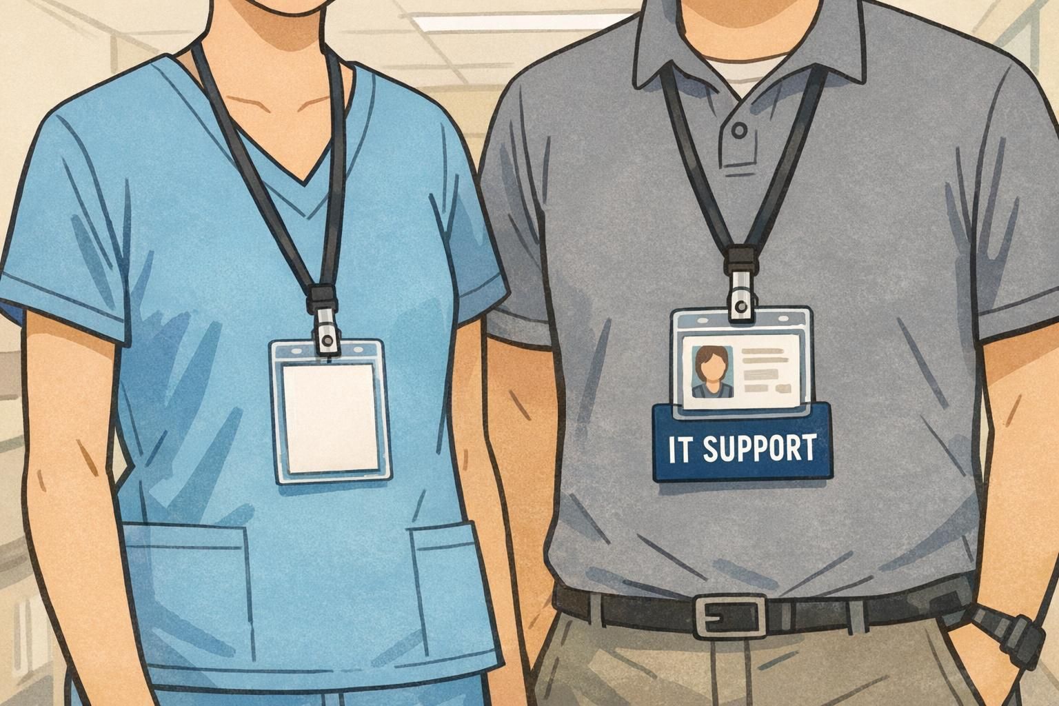
A workplace ID can do a lot—access control, printing, timekeeping—but in day-to-day navigation, it has one main job: make the right information readable at the moment someone needs it. In busy environments, the most helpful large workplace IDs communicate three things quickly: 1) A recognizable photo: so people can confidently match badge to wearer. 2) A preferred name: so interactions start politely and efficiently. 3) A plain-language role: so someone can route questions correctly from a few feet away. That last point is easy to underestimate. A badge that says “RN” may be meaningful inside a department, but someone new to the building may not know what it stands for. Likewise, long department names or strings of credentials can crowd the layout and reduce readability. When someone is simply trying to find help, role tends to matter more than formal titles. Clarity comes from design choices that favor speed: strong contrast, an uncluttered layout, and consistent placement of the photo, name, and role. When the pattern stays the same across the organization, people stop “reading” and start recognizing.
- Make role text large and plain-language (for example: “NURSE”, “SECURITY”, “IT SUPPORT”, “VOLUNTEER”)
- Keep the layout consistent so eyes know where to look
- Use strong contrast (dark text on light background or vice versa)
- Avoid crowding: fewer fields, bigger type, faster comprehension
- Prioritize the viewing distance you actually need (often a few feet in halls and lobbies)
If credentials are required by policy, include them—but don’t let them replace a plain-language role. In many quick interactions, “role” answers the real question: who can help with this issue right now.
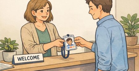
Many facilities use photos because they reduce misidentification, especially in high-traffic areas. Whether it’s required depends on your policy and environment, but photos typically improve confidence in fast interactions.
Role identification systems that scale (colors, titles, and consistent categories)
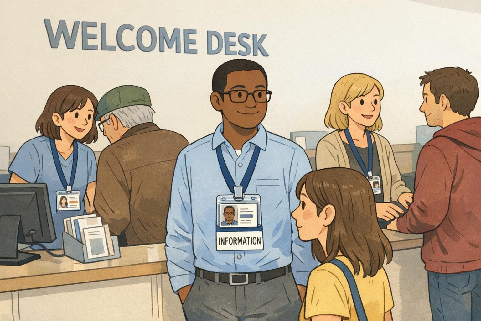
If you manage identification for a large facility, the challenge isn’t creating one good badge—it’s creating a system that stays understandable across buildings, departments, and years of staffing changes. A scalable role identification system starts with limited, standardized categories. Too many categories feel precise on paper, but they fail in the hallway because people can’t remember what each one means. A practical approach is to pick a small set of roles that cover most interactions and keep the definitions consistent across the entire organization. Color-coding can be helpful, but it should reinforce—never replace—large, readable role text. Colors can be hard to distinguish in poor lighting, for people with color vision differences, or when lanyards and scrubs introduce competing colors. The safest design is: role text first, color second. Consistency is the hidden key. Confusion spikes when different buildings use the same color to mean different things, or when one department abbreviates roles while another uses full names. Standardize the category names, the placement of role text, and the overall visual hierarchy so the system becomes automatic.
- Keep categories limited and memorable (for example: clinical, facilities, security, IT, administration, volunteer, visitor)
- Use the same role names everywhere (avoid “same role, different label”)
- Use color as a supporting cue, not the only cue
- Define where role text appears on every badge so it’s instantly findable
- Document the system so new departments don’t improvise their own versions
How badge buddies add instant role clarity without redesigning the whole ID
Even when an organization wants clearer IDs, reprinting cards for every person can be slow—especially if roles change often, staffing surges seasonally, or multiple departments share the same ID program. Badge buddies solve a practical problem: they add a rigid, highly readable role layer to an existing badge. Because they attach behind (or alongside) the current ID, you can make the role visible during quick hallway interactions without changing the underlying card design. They’re especially useful for staff-to-staff coordination in complex settings like hospitals and research campuses, where people may need to identify function, team, or training level quickly. When the format is consistent and the wording is plain-language (“NURSE”, “SECURITY”, “IT SUPPORT”), the meaning becomes automatic. Evidence from a large hospital setting suggests that role-labeled badge add-ons can improve staff awareness of colleagues’ roles, while visitor understanding still benefits from introductions and supporting signage (source). In other words: badge buddies can reduce internal friction, but they work best as part of a broader communication system.
- Use large, high-contrast role text that can be read quickly
- Choose plain-language titles (avoid inside abbreviations when possible)
- Standardize the format so the same role looks the same across departments
- Keep categories aligned with your broader role identification system
- Treat the badge as a prompt for conversation, not a replacement for it
“When roles are readable at a glance, people stop guessing. That one change reduces handoffs, interruptions, and the ‘wrong person’ problem in hallways.” – Facilities Operations Coordinator
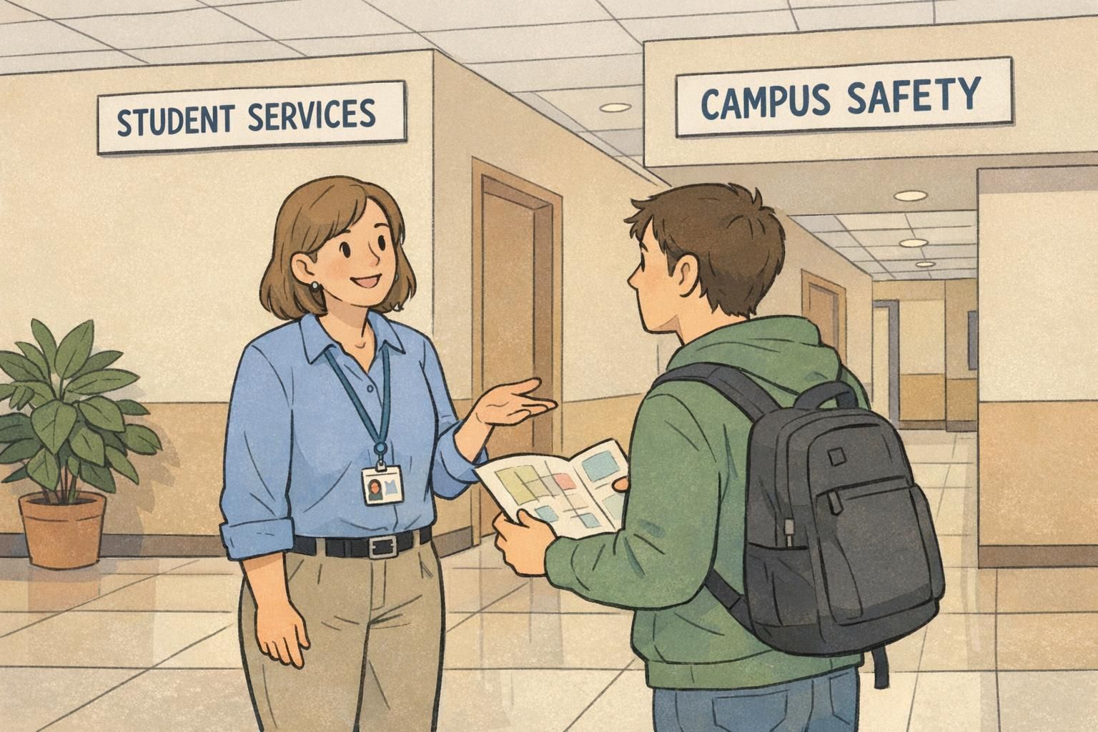
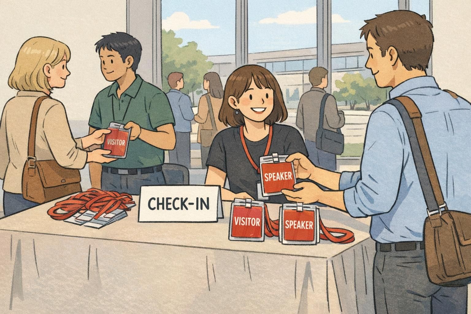
Use cases in healthcare and campuses (and what visitors notice most)
Different environments have different “who’s who” pain points, but the pattern is consistent: people want to find help quickly and feel confident they’re talking to the right person. In healthcare, role cues reduce internal confusion—especially when multiple teams overlap. A visitor may not understand the difference between a nurse, tech, resident, or attending team, but staff members need to coordinate fast. Clear role identification reduces misdirected questions and helps keep work flowing. Visitors and patients’ families, however, often notice something even more basic: who seems approachable, who is clearly labeled, and whether the environment supports them with signs and friendly explanations. For them, the best outcome is a combination of readable IDs, staff introductions, and simple wayfinding. On campuses, large facilities often feel like small cities. Students and guests look for the quickest path to a person who can solve their immediate problem: admissions questions, event access, lost-and-found, safety concerns, or building maintenance. IDs work best when they show a role that maps to common requests. The goal in both settings is not to cram every detail onto the badge. It’s to build a system that supports daily operations and first-time visitors without overwhelming anyone with codes, acronyms, or clutter.
- Healthcare: reduce staff-to-staff confusion during handoffs, rounding, and cross-coverage
- Healthcare: support visitors with clear roles plus supportive signage and introductions
- Campuses: help students identify staff who can assist (event staff, security, admissions, facilities)
- Any large site: improve confidence that questions are going to the right person the first time
Implementation checklist: policies, comfort, and privacy in public-facing environments
A clear ID system only works when people actually wear it—and wear it in a way that keeps the important information visible. Implementation is where good designs succeed or fail. Start by defining what must be visible based on your risk level and policy. Many organizations require a photo and a role; some minimize full legal names for privacy, especially in public-facing settings. The right choice depends on your environment, local policy, and the types of interactions your staff handle. Next, confirm wear rules. If the badge sits under a jacket, behind a clipboard, or flips backward on a lanyard, even the best layout won’t help. Standardizing holders and placement reduces variation and makes the system more reliable. Finally, train teams on a simple script: preferred name + role. The badge supports the message, but it shouldn’t be forced to carry the entire introduction. This is especially important when visitors are stressed or unfamiliar with the facility’s terminology.
- Policy: decide what must be visible (often photo + role) and what can be minimized (for example, full legal name)
- Wear rules: standardize lanyard/clip/holder choices so badges don’t flip or get covered
- Placement: set a consistent location on the body where badges are easy to spot
- Privacy: ensure role text helps wayfinding without exposing unnecessary personal details
- Training: practice a quick introduction script (name + role) for visitor-facing areas
- Maintenance: assign ownership for updating roles and replacing worn or unreadable items
Involve representatives from key roles early, explain the goal (reducing misdirected questions and improving coordination), and focus on plain-language categories that help staff as much as visitors.
Not usually. Many facilities pilot role identification in one building or one high-traffic area first, then expand once the categories and formats prove easy to recognize.
Products that support clear identification at scale
Most large organizations do best with a layered approach: a standard photo ID for identity and access, plus add-ons that make role and department easier to interpret in day-to-day movement. Badge buddies are a practical way to add a highly readable role layer without reprinting every card—especially when assignments change or when you want to improve clarity in specific areas like entrances, units, labs, or campus services. Name tags can also be helpful in fixed locations like front desks, tours, and customer-facing counters where the goal is quick, friendly introductions. If you’re evaluating options for role callouts, you can explore BadgeZoo’s custom badge buddies for role identification to see how a consistent format can be added to existing IDs. The key is to keep the system simple enough that people learn it quickly and consistent enough that it works across buildings.
At scale, clarity improves when roles can be updated faster than the core ID card. Add-on role layers help facilities stay consistent without constant reprints.
Measuring success: simple ways to test whether your system reduces confusion
A role system is only successful if it reduces real-world confusion. The good news is you can test that without complex analytics. Start with quick “glance tests.” Ask staff—and a small group of visitors—to stand several feet away and identify the person’s role. If they hesitate, misread, or need to step closer, you’ve found a design or wording problem. Next, track common misdirected questions in high-traffic areas: entrances, information desks, nurses’ stations, and campus service counters. Are people still asking security for IT help? Are visitors still interrupting clinical staff for wayfinding? Even a simple tally before and after changes can show whether readability is improving. Finally, iterate with small adjustments. Often the biggest gains come from making role text bigger, reducing the number of categories, improving contrast, and keeping placement consistent. Because the goal is fast comprehension, small refinements can create noticeable improvements without disrupting your existing ID workflows.
- Run a glance test: can people identify roles correctly from a few feet away?
- Check comprehension across groups: staff, new hires, and visitors may interpret labels differently
- Track misdirected questions at key points (lobbies, stations, service desks)
- Adjust one variable at a time (bigger role text, fewer categories, clearer contrast)
- Re-test after changes and document what worked so consistency holds over time