Matte ID Card vs Glossy: Choosing the Right Finish for Your Lighting
Why matte ID card finish matters under real-world lighting
Most workplaces and events don’t have “perfect” lighting. You might have bright overhead LEDs, daylight pouring through a window at certain hours, or spotlights aimed at a reception counter. In those situations, a matte ID card finish can be the difference between quick identification and a badge that’s hard to read at the exact moment it matters.
The key issue is glare: light reflecting off the card in a way that creates a bright hotspot. If that hotspot lands over a name, photo, barcode, QR code, or role label, it slows down check-ins and can cause avoidable mix-ups. Even a well-designed layout can look “washed out” when reflections hit it from the wrong angle.
This guide breaks down what matte and glossy finishes actually do under lighting, how handling affects the surface over time, and how to choose based on your environment rather than guesswork. You’ll also see when glossy can still be a smart choice—especially when you want extra visual pop and you can control the lighting and viewing angle.
A finish choice is really a lighting choice. If your badge will be seen from multiple angles, under mixed light, or near windows, matte is often the more consistent option for badge readability.
Glossy vs matte: what’s actually happening with reflections
Glossy and matte finishes handle light differently. A glossy surface reflects light in a more mirror-like way (specular reflection), which can create sharp, bright highlights. A matte surface scatters light more broadly (diffuse reflection), which tends to reduce harsh hotspots and make the card look more even as you tilt it.
In practical terms, glossy often looks higher contrast and more vivid at first glance—especially when you’re viewing it straight-on in softer indoor lighting. But the same shininess that makes it look crisp can also make it unpredictable under overhead lighting, sunlight, or camera flash. Matte usually looks more consistent across a range of angles and lighting directions, which is why it’s so often chosen for everyday workplace identification.
The direction of the light matters as much as the finish. Overhead downlighting can put glare directly where people look first (the name and photo area), while side lighting from a window can create a moving reflection that changes throughout the day. That basic difference between specular (gloss) and diffuse (matte) reflection is widely discussed in vision and imaging contexts, including how lighting direction affects perceived glare and visibility (source).
- Glossy finish: sharper reflections, richer “pop,” but more glare risk when lighting shifts or you view the card at an angle.
- Matte finish: softer reflections, more stable appearance across angles, typically better when lighting is mixed or unpredictable.
- Lighting direction: overhead and window light are the most common glare triggers because they create bright hotspots on smooth surfaces.
When glossy looks best (and when glossy badge glare becomes a problem)
Glossy cards can look great when the lighting is controlled and relatively soft. In shaded indoor spaces—like a quiet office area away from windows, a back-of-house staff corridor, or a controlled entry point—gloss can make colors appear deeper and more saturated. If your design relies on bold brand colors or high-contrast photography, glossy may help those elements feel more vibrant.
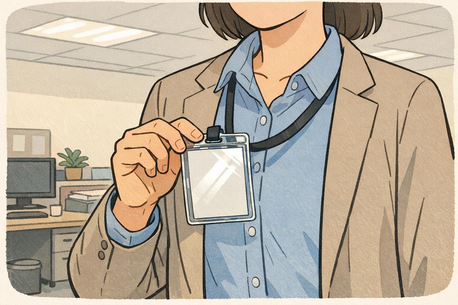
The tradeoff is glossy badge glare. Because glossy reflects light in a more mirror-like way, a bright ceiling light or sunbeam can create a hotspot that lands directly over the most important information. And because people don’t hold badges perfectly flat, glare tends to appear at the worst times: while someone is walking up, turning their torso, or leaning in at a counter.
Glossy can also be more likely to show reflections in photos and videos. That matters for conferences, visitor check-in photos, security snapshots at access points, or any environment where badges may be photographed under mixed lighting. A badge can look “fine” in one angle and unreadable in the next.
- Glossy often shines in: controlled indoor lighting, designs where color vibrancy is a top priority, and situations where badges are mostly viewed straight-on.
- Glossy glare is more likely in: overhead LEDs, strong window light, spotlights, and settings where badges are constantly moving (networking, queues, busy lobbies).
- High-risk areas for glare: name line, photo box, barcode/QR area, and any small role text near the top of the card.
When matte wins for daily use: readability, smudges, and wear
If your goal is fast, reliable identification under everyday conditions, matte is usually the safer bet. Matte finishes tend to reduce harsh reflections from overhead lighting and help keep details visible when the badge is viewed from an angle—exactly how badges are read in real life.
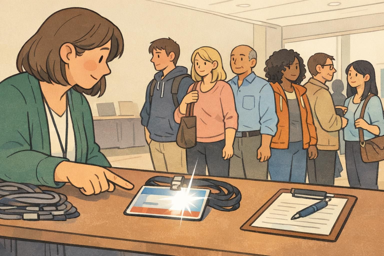
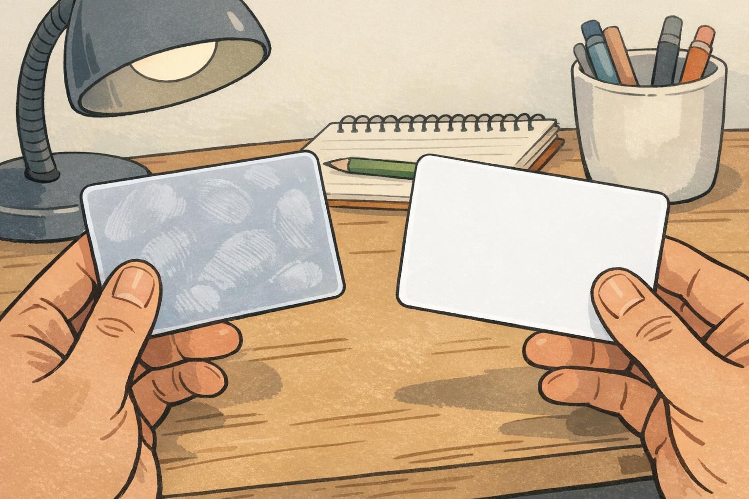
Matte also tends to be more forgiving with fingerprints and light scuffs. In many workplaces, people touch their badge constantly: they flip it at a turnstile, tap it against a reader, show it to a receptionist, or adjust a lanyard. Oils from hands and minor abrasion can show up more obviously on glossy surfaces, while matte often hides that day-to-day handling better.
That doesn’t mean matte is “no maintenance” or that glossy is always a smudge magnet—it depends on how badges are handled and stored. But for front desks, schools, healthcare, and rotating classroom or staff environments, matte typically stays looking clean and readable longer without requiring people to think about lighting or fingerprints.
If badges are handled frequently or used in bright, mixed lighting, a matte ID card finish usually improves consistency: fewer glare hotspots, fewer visible smudges, and better day-to-day badge readability.
Not necessarily. Matte often looks more consistent in bright workplaces and can read as clean and modern. If your environment has glare-prone lighting, matte can look more professional simply because people can read it quickly.
Matte can reduce the “shine,” but you can keep designs crisp by using strong contrast, clear photo exposure, and slightly larger type for names and roles. For many teams, the tradeoff is worth it for readability.
It can. Glare can interfere with quick scanning if a bright hotspot crosses the code area. Matte often reduces that risk in mixed lighting, especially at check-in desks or under overhead lights.
Decision guide by environment: office, healthcare, schools, events, and outdoors
A simple way to decide is to focus on the lighting you can’t control. If the environment includes windows, overhead LEDs, spot lighting, or outdoor transitions (entryways, courtyards, parking-lot check-in), matte tends to stay readable from more angles. If the environment is consistently shaded and you want extra color impact, glossy can be a great fit—as long as you’ve tested it under your actual lights.
- Office settings: If you have lots of overhead LEDs or glass-walled conference rooms, matte is often more stable. Glossy can work well in evenly lit interiors where the badge is viewed mostly straight-on.
- Healthcare and clinics: Mixed lighting is common (hallway LEDs, task lighting, daylight near entrances). Matte usually helps staff names and photos stay clear during quick interactions.
- Schools and campuses: Movement between classrooms, hallways, and outdoor areas makes reflections unpredictable. Matte is commonly the low-drama choice for daily identification.
- Conferences and trade shows: Badges are constantly tilted during networking, and lighting changes from hall to hall. If you’ve experienced glossy badge glare in photos or at check-in, matte is often the safer default.
- Outdoor and sunlit entryways: Sunlight creates strong, shifting reflections. Matte typically reduces hotspots and keeps details visible as people move.

“We didn’t realize our lobby lighting was the problem until badges started reflecting the ceiling fixtures. Switching to a matte finish made names easier to read without changing our whole layout.” – Facilities Coordinator
Fast checklist: choosing a finish for badge readability
If you’re deciding quickly, this checklist helps you match the finish to real use—how the badge is viewed, handled, and lit. The goal isn’t to pick a “better” finish; it’s to avoid surprises like glare covering names or smudges making cards look worn too soon.
- Will the badge be viewed under overhead LEDs, track lighting, or spotlights? If yes, matte usually reduces glare hotspots.
- Will it be worn near windows or in sunlit entryways? If yes, matte is typically more consistent across changing light.
- Do people need to read names quickly from multiple angles (walking by, across a counter, in a hallway)? If yes, matte often improves badge readability.
- Will badges be photographed frequently (events, security snapshots, group photos)? If yes, consider matte to reduce shiny reflections in images.
- Is bold brand color “pop” a top priority in controlled lighting? If yes, glossy may be worth it—test it under your actual lights.
- Will badges be handled constantly (check-in, swapping holders, classroom rotations)? If yes, matte often hides fingerprints and light scuffs better.
If you’re unsure, choose based on the worst lighting conditions the badge will face. When glare is likely, matte is usually the safer default.
Product options to match your lighting conditions (and how to order)
If you’re ordering for a team, a practical approach is to test where badges will actually be used: the lobby, the main hallway, the shop floor, the event hall, or the outdoor entry point. Tilt a sample under those lights and see whether names and photos stay clear. The best finish is the one that stays legible when people are moving, not just when the badge is held perfectly flat.
BadgeZoo offers multiple finishes (including gloss and matte/silk), which makes it easier to match your ID cards to your lighting and handling conditions. If you’re starting from scratch or replacing an older program, you can use custom PVC ID cards to choose a finish that fits the way your badges are actually worn.
Small hardware choices can also help reduce reflection issues. Clear holders protect the surface from scuffs, and clips or lanyards that keep the card facing forward can make the badge easier to read without people constantly touching or re-tilting it.
- If glare is your biggest concern: choose matte/silk and keep key info (name, photo, code) large and high-contrast.
- If visual pop is the priority and lighting is controlled: test glossy under the actual fixtures and angles where it will be viewed.
- If badges swing and twist all day: consider holders and attachments that keep the face oriented forward to reduce reflection surprises.
Common mistakes and quick fixes (without changing your whole design)
Finish helps, but it’s not the only factor. A few small design and usage adjustments can solve common glare and smudging complaints without forcing you to rebuild your entire badge layout.
- Mistake: Using thin, light fonts for names. Quick fix: increase font weight and size so names stay readable even when lighting isn’t ideal.
- Mistake: Putting critical details in a low-contrast area (light text on light background). Quick fix: increase contrast and simplify the background behind names and photos.
- Mistake: Making barcodes/QR codes too small. Quick fix: enlarge codes and keep them away from the shiniest “hotspot zones” (often near the center under overhead lights).
- Mistake: Expecting glossy to behave the same in every room. Quick fix: test under your brightest overhead lights and near windows to see whether glossy badge glare covers key info.
- Mistake: Letting badges twist sideways in a loose clip. Quick fix: use a holder or attachment style that keeps the badge more front-facing, improving consistent badge readability.
- Mistake: Assuming matte will automatically look vivid. Quick fix: strengthen color contrast, use clean iconography, and avoid overly complex backgrounds so the design still feels crisp.

The most reliable outcome comes from pairing finish and layout: choose a finish that matches your lighting, then support it with high-contrast design and comfortably readable name text.