Pop Up Event Badges: Fast Badge Solutions That Still Look Professional
Why pop up event badges matter (even when everything is last-minute)
When an event comes together fast, introductions are usually the first thing to get messy: people forget names, staff get interrupted with the same questions, and attendees aren’t sure who’s “running things.” Pop up event badges solve those problems in a simple, highly visible way—without requiring a perfect timeline.
A badge that’s readable and consistent does three practical jobs at once: it speeds up check-in (because people know what to expect), it supports smoother conversations (because names and roles are easy to see), and it reduces confusion (because attendees can quickly find staff, speakers, or vendors). The goal in a pop-up is “fast but professional”: not flashy, not complicated—just clear, uniform, and durable enough to last the day.
In real-world pop-ups, professionalism often looks like consistency: one template, one placement for the name, and an easy way to tell who’s staff versus guests.
In the rest of this guide, you’ll see three of the quickest formats to produce on short notice: quick-print inserts in holders, neat adhesive tags on a base card, and direct printing on badge stock. Each can look intentional if you build around legibility, alignment, and repeatable steps.
Choose your fastest format: inserts, adhesive tags, or direct print
The “best” badge format for a pop-up is usually the one you can reliably produce on-site with the least friction. That depends on your attendance size, whether power and Wi‑Fi are dependable, and how formal you want the event to feel. Below is a practical comparison of three common approaches.
- Quick-print paper inserts in clear holders: Often the cleanest look with the simplest reprint process—print a new insert, swap it in, done.
- Adhesive labels on a branded base card: Great when you want a polished, consistent background but need fast personalization with labels.
- Direct print on badge stock: Most “finished” look when it works smoothly, but it can be less forgiving if hardware, drivers, or power become an issue.
Think of your gear needs as a spectrum. Inserts can be produced with a basic printer; adhesive labels can be produced with a label printer or even pre-printed sheets; direct print typically benefits from a setup that’s already been tested end-to-end.
- If you expect 25–75 people: Adhesive labels or inserts both work well, depending on how “uniform” you want the badges to look.
- If you expect 75–300+ people: Inserts in holders tend to scale smoothly because reprints and corrections are fast and the finished badge stays neat.
- If power/Wi‑Fi is uncertain: Bring a plan that works offline (preloaded templates, offline name list, or handwriting-ready backups).
- If the event is more formal (sponsors, VIPs, press): Inserts in holders or label-on-base-card usually reads more “intentional” than flimsy sticker-only solutions.
For pop-ups, the fastest option is the one with the fewest failure points. A slightly simpler badge that prints reliably usually beats a more complex badge that stalls check-in.
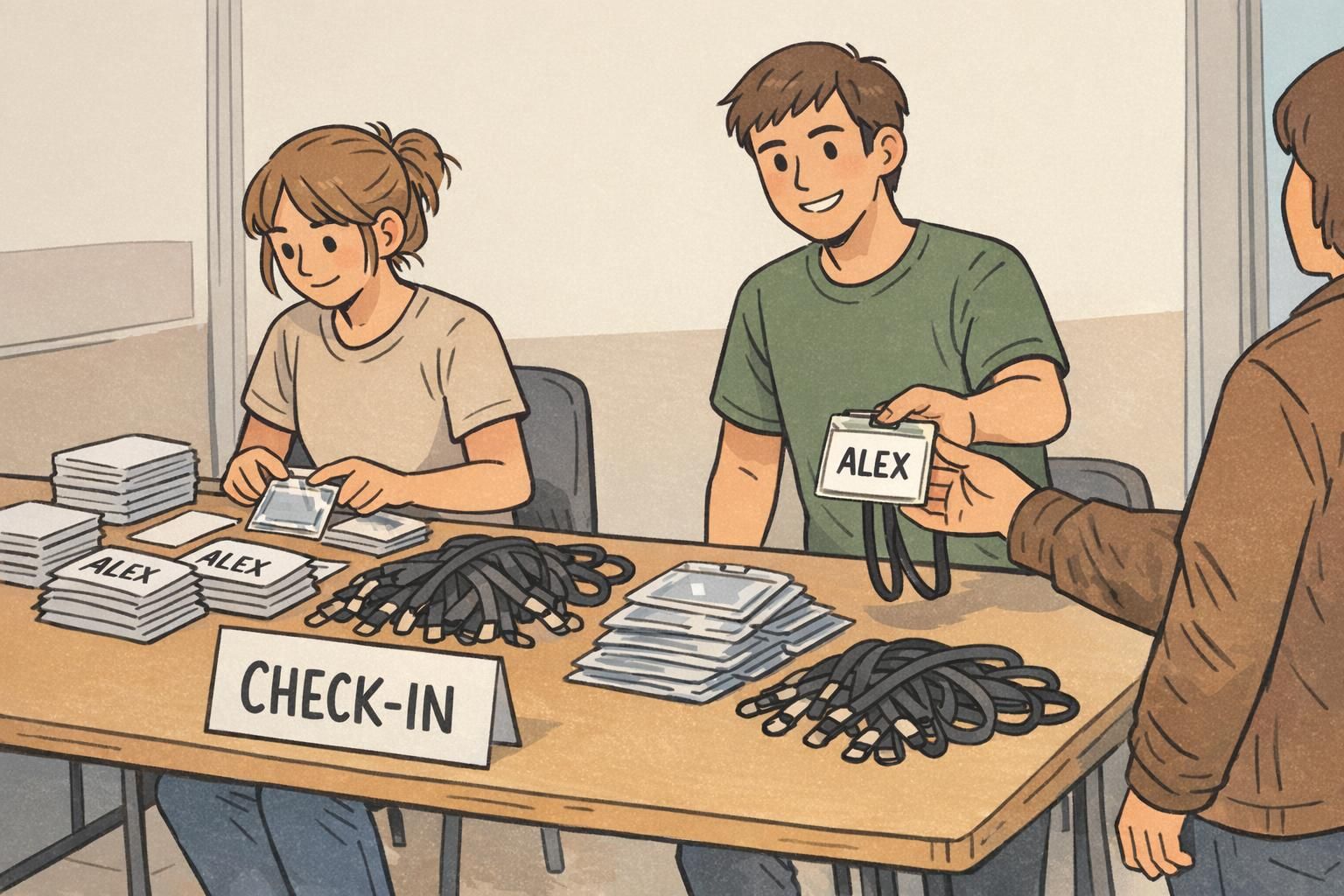
Quick-print inserts + simple holders: the cleanest “pop-up” workflow
If you want pop-up speed without the “rushed” look, quick-print inserts paired with clear holders are hard to beat. The workflow stays simple: keep one template, print only what changes (the name/role), and slide it into the same style holder every time.
To make inserts look professional, standardize the template so it’s instantly recognizable across the room. A dependable layout is: logo area at the top, a large name zone in the center, and a role line beneath (or a small role bar that still includes text). When every badge uses the same spacing and alignment, it looks planned—even if you printed it five minutes before doors opened.
- Pick one insert size and stick to it (3″×4″ is common for event badges).
- Reserve at least half the insert height for the name zone so it can be large.
- Use one role line (e.g., STAFF, SPEAKER, VENDOR) to reduce confusion.
- Keep margins consistent so nothing looks “shifted” from badge to badge.
Simple holders help in two important ways: they prevent edges from bending or peeling, and they keep the badge readable throughout the day. Clip-style holders work well for seated or low-movement events, while lanyards are often better for busy, standing-room pop-ups where people turn, walk, and network.
Temporary name tags that don’t look flimsy
Temporary name tags are sometimes the only realistic option—especially if you don’t have a printer on-site or you’re filling last-minute walk-ins. The difference between “flimsy” and “surprisingly nice” usually comes down to three controllable choices: legibility, alignment, and consistent materials.
If you’re handwriting, use thicker label stock (or a good-quality marker-friendly label) and commit to a clear name zone so the text never feels cramped. If you’re printing labels, use a branded label template or a base card that adds a consistent frame—so every label placement looks intentional, not random.
- Use one clean sans-serif font (or one marker style) for the name—avoid mixing styles.
- Keep contrast high: dark text on a white/light background reads fastest.
- Align the label to a consistent corner or guideline on the base card.
- Add a simple role indicator: text plus a color bar (not color-only).
- Leave generous whitespace; crowded name tags look improvised.
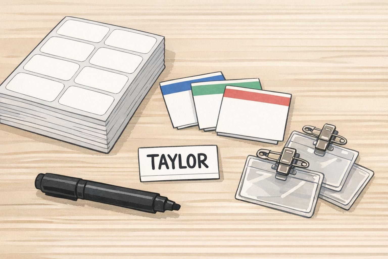
A neat temporary name tag is less about fancy materials and more about discipline: one template, one placement, one style of text.
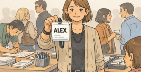
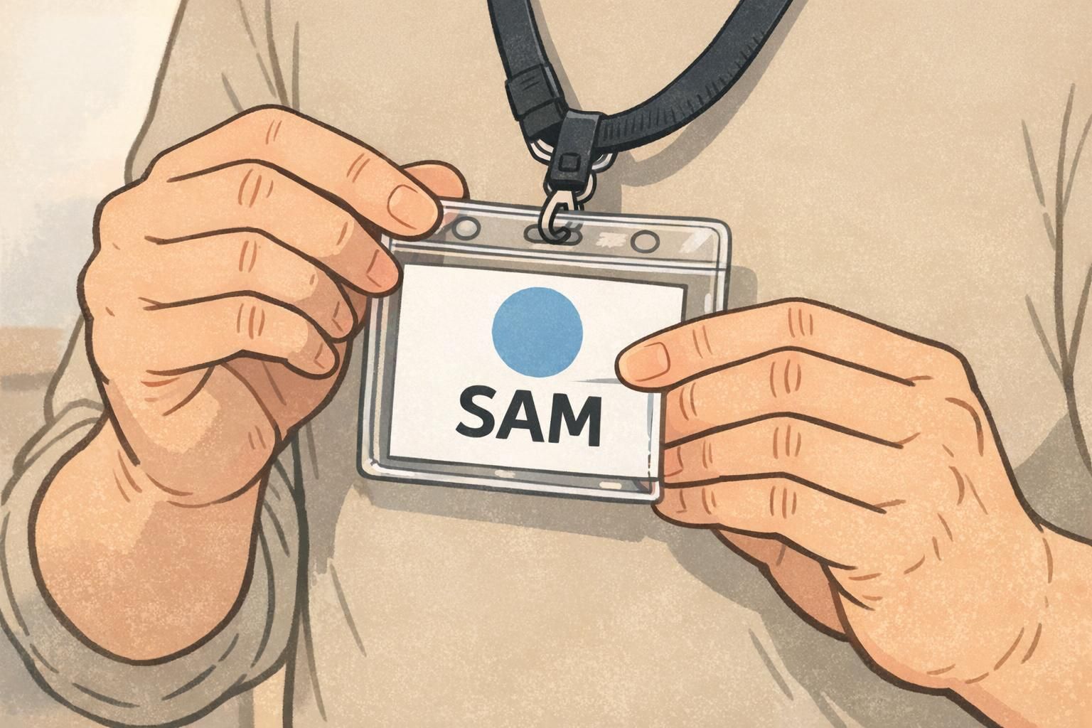
A quick ID solution for staff, vendors, and VIPs (without slowing check-in)
A quick ID solution matters most for the people attendees need to find instantly: staff, security, speakers, vendors, volunteers, and VIPs. When roles aren’t obvious, check-in lines get interrupted and questions spread to the wrong people (“Are you staff?” “Where’s the restroom?” “Who can help with AV?”). Clear role identification keeps service smooth without adding complexity.
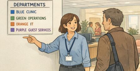
The simplest system is also one of the most effective: a bold ROLE line (like STAFF) paired with a small color bar. The key is to avoid color-only identification. People may be colorblind, lighting may be uneven, and badges can flip or tuck under jackets—so role text should always do the heavy lifting.
- Use role text in all caps (STAFF, SPEAKER, VENDOR) for fast scanning.
- Add a color bar as a secondary cue, not the only cue.
- Keep guest badges distinct but simple to avoid “status clutter.”
- For VIPs, consider a subtle marker (like a gold bar) plus VIP text—still readable, still respectful.
For privacy-friendly events, you can keep badges orderly without oversharing. Many pop-ups do well with first name only, optional pronouns, and a clear role. That keeps introductions easy while reducing the amount of personal information on display.
Only if it helps the event. For networking events, organization can be useful as a smaller third line. For community pop-ups, first name + role is often enough and keeps the badge cleaner.
Use a system that’s easy to update: swap a new insert, apply a new label, or add a small role overlay that doesn’t cover the name.
Design rules for badges that read well from 6–10 feet away
Fast production doesn’t excuse hard-to-read badges. In busy pop-up spaces, people glance—not stare—so your layout needs a strong hierarchy. A simple rule: first name largest, last name smaller, organization/role as a third line. If you only include one thing, make it the first name in a size that’s readable across a small crowd.
- Hierarchy: First name (largest) → Last name (smaller) → Role/organization (third line).
- Type: Clean sans-serif fonts read quickly and hold up at large sizes.
- Contrast: Dark text on a light background is the safest choice for pop-ups.
- Spacing: Consistent margins and line spacing make even basic badges look professionally produced.
- Simplicity: Don’t shrink text to fit extras; remove extras to protect readability.
Operationally, design consistency also supports a more professional experience: staff are easier to spot, wayfinding questions decrease, and the event feels more organized. Sustainability can fit into this, too—reusing holders and lanyards reduces waste without changing the attendee experience. These kinds of consistent visual identity and operational choices are commonly associated with stronger event execution in temporary or conference-like settings (source).
“When badges share the same layout and role system, guests stop second-guessing who to ask. It’s one of the quickest ways to make a pop-up feel ‘put together.’” – Event Operations Lead
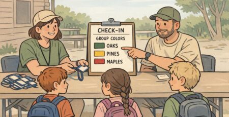
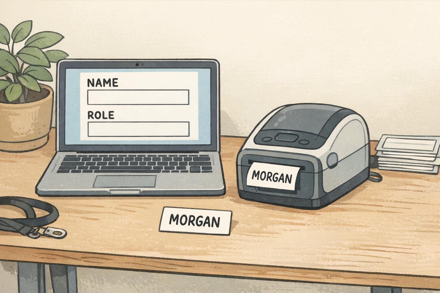
Micro badge station setup: people, gear, and a 3-step workflow
A compact badge station is less about having the fanciest equipment and more about preventing bottlenecks. If you can, staff it so one person isn’t juggling spelling confirmations, printing, and distribution while a line builds.
- Person 1: Confirms spelling and checks the attendee list (keeps errors from reaching the printer).
- Person 2: Prints or writes the badge (stays focused on production speed).
- Person 3 (optional): Inserts into holder / applies label and hands it out (keeps the line moving).
Pack like you’re expecting one small thing to go wrong—because at pop-ups, it often does. A few backups prevent you from switching to messy handwriting mid-stream.
- Holders and lanyards or clips (plus extras for reprints and walk-ins)
- Pre-cut paper inserts or label sheets/rolls (and spares)
- Thick black markers (even if you plan to print—useful for quick fixes)
- Laptop/phone with your template preloaded and accessible offline
- Backup power/extension cord and a small power strip
- Spare media and a simple bin or tray for finished badges
A simple three-step workflow keeps quality high even when you’re moving fast:
- Collect name → confirm spelling and role (if applicable).
- Produce badge → print/label/write using the standardized template.
- Quick visual check → ensure name is centered, readable, and the role cue is correct before handing it over.
Recommended BadgeZoo products for pop-up speed and a polished finish
For pop-ups, the products that help most are the ones that make fast output look uniform: clear holders that keep inserts crisp, and attachments that keep badges visible (and less likely to end up in pockets). If you’re using printed inserts, choosing the right holder size is the key decision—because it determines how cleanly your insert fits and how readable it stays.
For example, you can use clear badge holders for quick-print inserts to keep a consistent look across guests, staff, and vendors—even if names are printed at different times. Top-load holders are especially practical in pop-up environments because inserts can be swapped quickly when you need a reprint or a last-minute role change.
- Choose holder size based on your insert size (avoid “floating” inserts that shift).
- Pick lanyards for high-movement or crowded events; choose clips when the dress code or setup calls for something more minimal.
- Match attachments to the environment: lanyards tend to stay visible when people are standing and networking; clips can work well for seated sessions or short check-ins.
A holder doesn’t just protect the badge—it standardizes the presentation, which is what makes a fast badge feel professionally produced.
Pop-up scenarios: what to use for community, campus, and corporate activations
Different pop-ups have different pressures. Here are a few common scenarios and setups that balance speed with a polished, readable result—without overcomplicating your station.
- Community pop-up (small venue, casual): Pre-printed blank card + neat handwriting (thick marker) + clear holder. Keep it simple: first name large, optional role for volunteers/staff.
- Startup demo night (networking-focused): Branded base card + on-site printed adhesive label. Include first name large, last name smaller, and a short role (Founder, Demo, Investor, Staff).
- Campus event (fast check-in, lots of walk-ins): Reusable holders with paper inserts. Print on demand; keep templates generic so leftover inserts can be reused at the next event.
- Sponsor-heavy corporate activation (more formal): Printed inserts with strong role coding (STAFF/SPEAKER/VIP/VENDOR). Use text + a small color bar so roles are clear in photos and in motion.
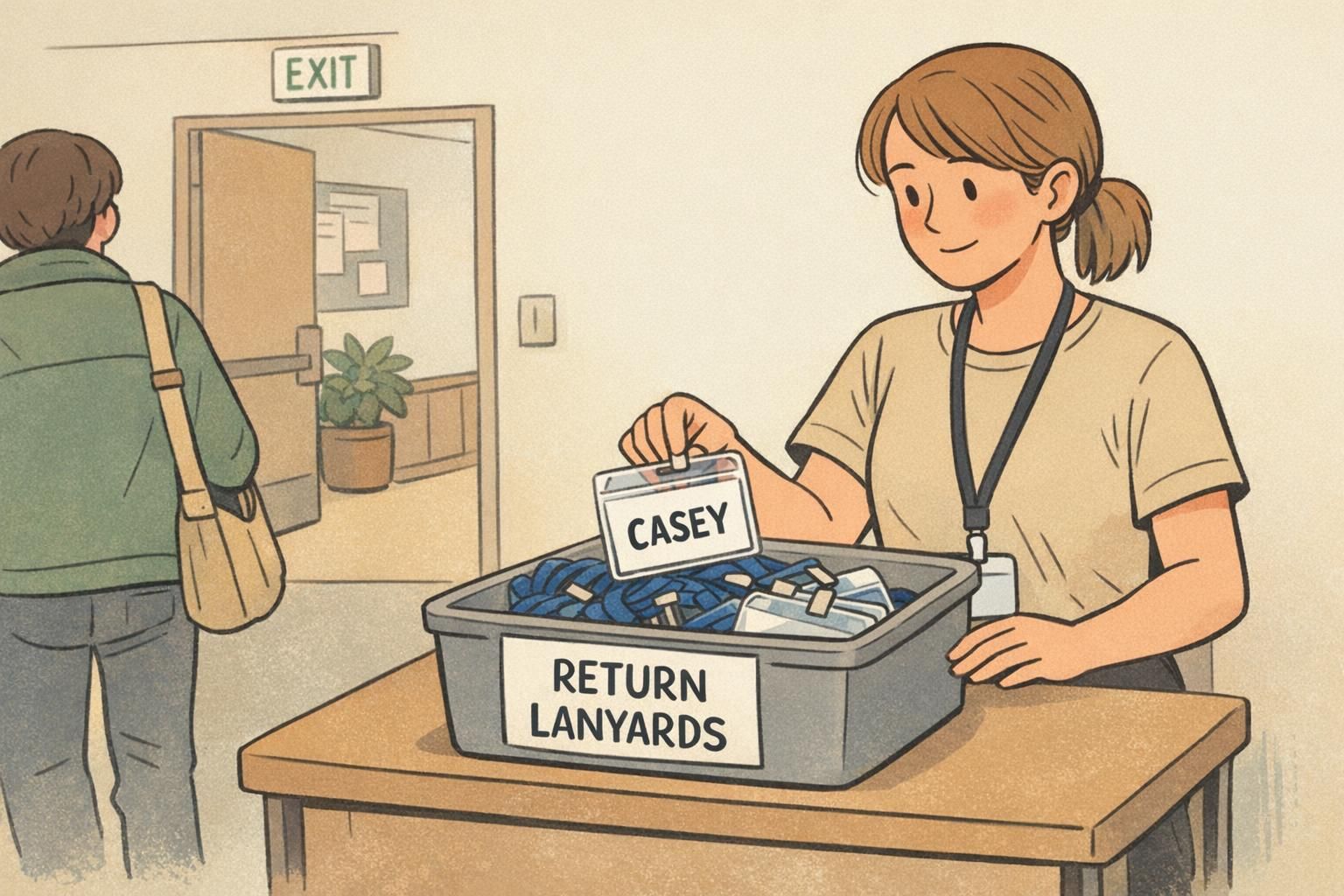
If you want to reduce waste and costs over time, plan for reuse: collect holders and lanyards at the exit, and keep your template generic (logo area + name zone + role line) so you aren’t stuck with single-purpose leftovers. Even a simple “return” bin and reminder sign can make re-collection feel normal.
When time is tight, the winning formula is repeatability: one layout, one role system, and a badge format that’s easy to correct without restarting the whole process.