Job Title on Badge: Clear Abbreviations for Long Titles That Stay Readable
Why long titles get tricky on small credentials
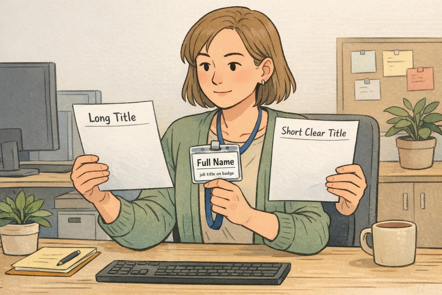
A job title on badge has to do a surprisingly hard job: communicate someone’s role instantly, on a tiny print area, in real-world conditions. Most people glance at a badge for a second or two—often from a few feet away—while also processing a face, a name, and the context of where they are (a busy lobby, a clinic hallway, a loading dock, a conference check-in table).
That’s why long, formal titles that look fine in an HR system can turn into a readability problem on name tags, ID cards, badge buddies, and event badges. The credential has limited space, fonts can’t shrink indefinitely, and the badge still needs to look professional and consistent across teams, sites, and shifts.
Goal: shorten titles without creating confusing acronyms—so anyone (coworkers, visitors, patients, clients) can understand the role at a glance.
Start with a role-first hierarchy (what must be understood in 2 seconds)
When you’re shortening titles, clarity improves if you decide what must be understood first. A practical hierarchy for most workplaces is: role, then department/service line, then seniority or specialty. In other words, the first words should answer: “What does this person do?”
This role-first approach helps you reduce length without losing meaning. It also supports consistent identification across locations—especially when visitors don’t know internal department names or organizational structure.
- 1) Core role (must be clear immediately): Nurse, Security, Teacher, Technician, Engineer, Coordinator, Volunteer
- 2) Department or service line (adds routing clarity): Patient Services, IT, Facilities, Admissions, Warehouse, HR
- 3) Seniority/specialty (helpful, but not always required on the front): II/III, Lead, Supervisor, ICU, Lab, Events
If your current title starts with a long department name, consider moving that department to a second line or placing it after the role. If your title includes multiple qualifiers (regional, enterprise, strategic, cross-functional), decide which of those actually helps someone interact with the badge wearer.
- Quick decision tree:
- • If a stranger can’t route a question without it → keep it (usually the role).
- • If it helps narrow where they work → move it later or onto a second line (department/unit).
- • If it’s mainly HR/organizational detail → omit from the front and keep it in your system of record (program names, internal initiatives, lengthy scopes).
Badge abbreviations: a practical strategy that stays clear
Good badge abbreviations shorten without turning the title into a puzzle. The best strategy is to shorten with familiar, readable words—then use initials only when they’re truly universal in your environment.
- Step-by-step strategy for badge abbreviations:
- 1) Write the role in full first (even if it’s long). Then shorten everything else.
- 2) Prefer common words over initials: “Patient Services” beats “PS” for many audiences.
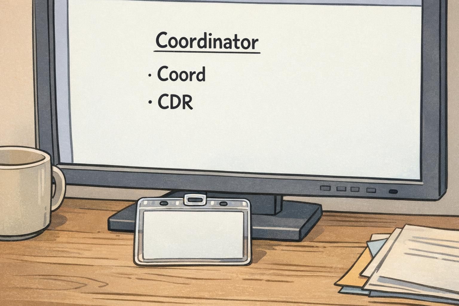
- 3) Use familiar truncations: Coordinator → Coord; Administrator → Admin; Specialist → Spec (only if your environment recognizes it).
- 4) Remove filler words that don’t change meaning: “and,” “for,” “of,” “Services,” “Management” (sometimes), “Department” (often).
- 5) Use separators to help scanning: commas, hyphens, or parentheses (e.g., “Nurse – ICU” or “Engineer (II)”).
- 6) Keep mixed case when possible; avoid long ALL-CAPS strings that blur letter shapes on small print.
A good abbreviation still looks like language. If it reads like a code, it probably won’t work on a badge.
Short enough that it stays legible at a glance without shrinking the font excessively. Many teams set an internal character limit and route longer titles to a second line or an approved shortened form.
Not necessarily. If a title is already readable at the chosen font size and layout, keep it in full. Abbreviations are most useful when space forces the text to become hard to read.

Avoid confusing acronyms (and redundancy) on name badges and ID cards
Acronyms can be tempting because they save space—but unclear acronyms create friction. They can lead to misdirected questions (“Are you IT or Intake?”), slower check-ins, and role confusion during high-traffic moments. On small-format printed credentials, the cost of ambiguity is paid repeatedly throughout the day.
A plain-language rule works well: if it needs explaining, it doesn’t belong on the front line of a badge. When space allows, writing the full role name is often the simplest solution. When space doesn’t allow, prefer a clear truncation (“Coord”) over an insider initialism (“CDR”) unless the acronym is truly universal for your audience.
Readability also drops when text becomes a dense block of capital letters. That matters because badges are read quickly, often in motion or under mixed lighting. In general readability research, all-caps and ambiguous abbreviations can make scanning and comprehension harder, which parallels why unclear acronyms are risky on credentials (source).
- Common acronym pitfalls to avoid:
- • Insider shorthand that a visitor/new hire won’t know
- • Overlapping abbreviations used by different departments (same letters, different meaning)
- • Redundant acronym phrases (repeating the last word, such as adding a word that the acronym already stands for)
- • Titles that become a string of initials with no clear role word (hard to interpret at a glance)
“If someone can’t tell what I do without asking a follow-up question, the badge isn’t doing its job.” – Facilities supervisor
Consistency guide: build a shared title standard across departments
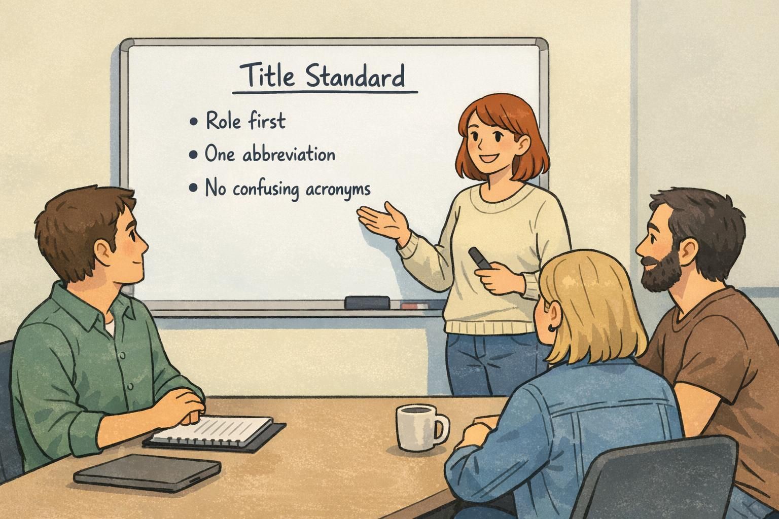
Once you have a sensible abbreviation strategy, the next step is consistency. A shared standard prevents the same role from appearing three different ways across buildings or teams (which undermines clarity and looks uncoordinated). Consistency also makes printing, reprints, and data imports much smoother.
- Consistency checklist for a shared standard:
- • One approved abbreviation per role (and per department/unit when used)
- • Same ordering everywhere (Role first, then Unit/Dept, then Level)
- • Same capitalization and punctuation rules (e.g., “Coord” not “COORD” unless required)
- • Defined character limits and a fallback plan (second line or approved short form)
- • A simple “Title Style Sheet” that lists approved titles and abbreviations
Assign an owner for the style sheet (commonly HR, Security, or Operations) and set a review cadence—especially if departments reorganize often. The goal isn’t bureaucracy; it’s to keep badges readable and predictable for everyone who depends on them.
Keep the role readable first (e.g., “Contractor – IT” or “Volunteer – Events”). If your environment needs it, you can distinguish status on a separate line or via a badge buddy so the core role remains clear.
Prioritize the role word(s) that your audience will recognize fastest. Many teams use a two-line approach (role in one language per line) or a short dual-language format—while still keeping role-first ordering.
ID card layout tips that protect readability (without shrinking the font too far)
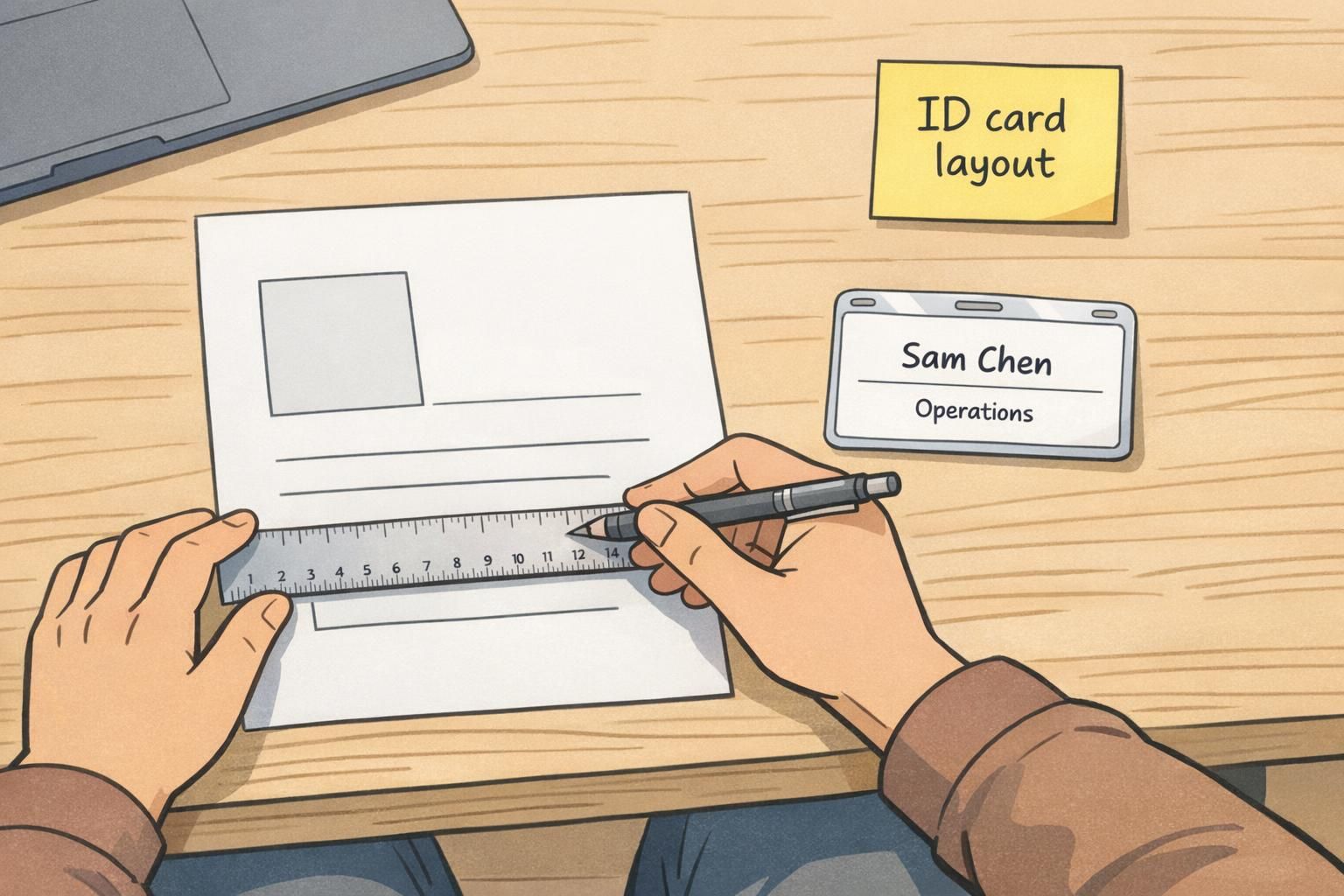
Even the best wording can fail if the ID card layout forces text to be tiny or cramped. Thoughtful layout choices often let you keep titles clearer with fewer compromises—especially when you can use two lines intelligently.
- Practical ID card layout moves for long titles:
- • Use line breaks on purpose: put Role on line 1, Department/Unit on line 2
- • Keep safe margins so text doesn’t feel squeezed against edges or design elements
- • Use font weight (regular vs. semibold) to improve quick scanning without enlarging everything
- • Avoid condensing letter spacing too much; it can reduce legibility at a distance
- • Balance priorities: name prominence and photo size typically outrank extra title details
- • Reserve icons/indicators for what must be recognized instantly (access, visitor status), then fit title around them
If your organization uses badge buddies (for example, to show access levels or high-visibility role labels), the badge itself can stay clean while the buddy carries the extra, high-contrast information. The key is that the overall credential system stays readable and consistent in daily use.
Examples: clear vs unclear title shortening (with ready-to-use patterns)
The fastest way to create a workable standard is to use a few repeatable patterns, then apply them consistently. Below are cross-industry examples showing a full title, a clear badge version, and an unclear version to avoid.
- Pattern: “Role, Specialty”
- • Full: Laboratory Support Technician
- Clear: Technician, Lab
- Avoid: LST (unclear to most audiences)
- • Full: Information Technology Support Specialist
- Clear: IT Support, Helpdesk
- Avoid: ITSS (looks like an internal code)
- Pattern: “Role – Unit”
- • Full: Registered Nurse, Intensive Care Unit
- Clear: Nurse – ICU
- Avoid: RNICU (hard to scan; unclear outside healthcare)
- • Full: Manufacturing Quality Assurance Technician
- Clear: QA Tech – Manufacturing
- Avoid: MQAT (not self-explanatory)
- Pattern: “Role (Level)”
- • Full: Software Engineer, Level II
- Clear: Engineer (II)
- Avoid: SWE2 (may be understood in some teams, unclear in mixed audiences)
- • Full: Custodial Services Supervisor, Level 3
- Clear: Supervisor (3) – Custodial
- Avoid: CSS3 (reads like a system label)
- Pattern: “Role first, then program/area”
- • Full: Student Success and Retention Program Coordinator
- Clear: Coordinator – Student Success
- Avoid: SSRPC (too many initials)
- • Full: Corporate Events and Experiences Lead Coordinator
- Clear: Coordinator – Events
- Avoid: CEELC (unreadable at a glance)
In each “clear” example, a reader can identify the role word immediately (Coordinator, Nurse, Technician, Engineer, Supervisor). The rest of the title adds routing context without becoming a code.
Implementing your abbreviation rules in printing workflows
A title standard only helps if it shows up reliably in the actual print process. Implementation is mostly about preventing exceptions from becoming last-minute layout problems or reprint requests.
- Workflow steps that reduce rework:
- • Build templates with dedicated fields (Name, Role, Department/Unit, Level) so long titles don’t spill into the wrong area
- • Set a character limit per field and route over-limit titles to a review step
- • Add a pre-print check for new or changed titles (especially during hiring waves or reorganizations)
- • Pilot test with a small group: review badges at typical viewing distances and lighting conditions
- • Keep a simple change-log in your Title Style Sheet so updates don’t create mismatched reorders later
Consistent data formatting matters as much as design. If the HR system exports “Sr.” in one place and “Senior” in another, your print results will drift. Standardized fields and approved values keep orders and reorders smoother, especially when multiple people can initiate badge requests.
Products that support clear titles and scannable credentials
Clear titles depend on the full credential system working together: the wording standard, the template, and the physical format (ID cards, name tags, badge buddies, or event badges). If your organization issues multiple credential types, using the same role-first title convention across them helps people learn the pattern quickly.
When you’re updating a template or rolling out a title standard, it can help to choose a card design that reliably holds two lines for role and department while keeping the name and photo prominent. If you’re building or refreshing your credential format, you can explore options like custom ID cards that support standardized templates and straightforward reorders.
If you anticipate frequent title changes (seasonal staff, rotating units, events), a consistent standard also makes it easier to keep credentials readable without redesigning every time—because your layout and abbreviations already have rules that handle long titles gracefully.