Back to Blog
Back to Blog
Related Posts
Long Names on Badges: Designing for Readability Without Tiny Fonts
Why Long Names Break Badge Readability (and How to Prevent It) Long names on badges create a common design trap: to... read more

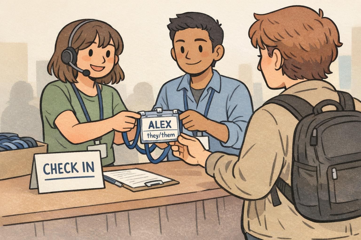
Volunteer Badges for Role Clarity That Makes Events Run Better
Why volunteer badges reduce confusion at busy events When an event gets busy, most problems aren’t complicated—they’re time-sensitive. Someone needs directions,... read more
Badge Font Size Rules for Badges: What’s Readable at 6 Feet?
Why badge font size matters at 6 feet (and what “readable” really means) Badge font size is one of those details... read more
Badge Icons on Badge Buddies: Small Symbols That Save Time
Why badge icons speed up recognition in busy workplaces In a busy workplace, the first few seconds of an interaction matter.... read more

Matte ID Card vs Glossy Finishes: When Finish Hurts Readability
Why a Matte ID Card Finish Can Improve Everyday Readability A matte ID card finish is often chosen for one simple... read more
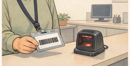
Barcode ID Card Barcodes on Badges: Avoiding Smears, Scratches, and Curves
Why Barcode Durability Matters for Daily Badge Use A barcode ID card is only as dependable as the condition of the... read more

First Impressions Name Tag: How Names Shape Everyday Interactions at Work and Events
Why a First Impressions Name Tag Changes the Conversation A first impressions name tag does something surprisingly powerful: it removes the... read more
Badge Readability Test: A Simple ‘Hallway Check’ Method for ID Designs
Why a quick hallway check beats guessing before you print A badge readability test doesn’t require special equipment or weeks of... read more

Networking Name Tag Ideas That Actually Help People Meet at Events
Why a Networking Name Tag Should Do More Than Show a Name A networking name tag is often the first “introduction”... read more
Personalized Lanyards: Balancing Uniformity and Individuality in Badge Programs
Why Personalized Lanyards Matter in a Clear, Consistent Badge Program Personalized lanyards can be a small change that delivers a big... read more