Badge Icons on Badge Buddies: Small Symbols That Save Time
Why badge icons speed up recognition in busy workplaces
In a busy workplace, the first few seconds of an interaction matter. A quick glance often has to answer questions like: “Is this person staff?”, “Are they in training?”, or “Do they belong in this area?” Badge icons help answer those questions without stopping the workflow.
Think of icons as visual shortcuts. Instead of leaning in to read small print or asking someone to repeat their role during a handoff, people can scan a single symbol and move forward with confidence. That saves time in settings where identification is checked frequently—hospitals, schools, conferences, and secure facilities—and it also reduces the awkwardness of repeated introductions when teams rotate or move between departments.
Icons work best when they’re easy to see, easy to remember, and applied consistently. A simple symbol can be more “readable” than text from a few feet away.
- Faster role recognition during quick conversations and handoffs
- Less confusion when multiple departments share the same space
- Fewer interruptions for basic “who are you/what’s your role?” questions
- More consistent identification when people are wearing masks, moving, or working in noisy areas
What a single icon can communicate: role, training, and access
A single icon can carry a surprising amount of meaning—if you keep that meaning focused. In most workplaces, the highest-value information falls into three categories: role, training/qualification, and access. The goal is not to label everything. The goal is to highlight what someone needs to know immediately to interact appropriately and safely.
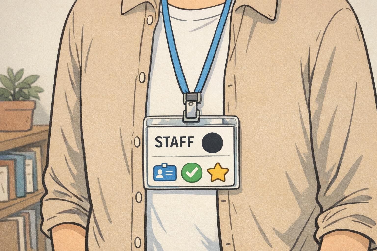
Role indicators are the most straightforward: an icon can represent a nurse, security, volunteer, teacher, or contractor. Training or qualification indicators help people understand supervision needs or task boundaries—such as student, resident, trainee, certified, or specialized team membership. Access indicators can signal “restricted,” “visitor,” or “cleared” in a way that’s visible even when someone is walking by.
In healthcare settings, visual identifiers that clarify training level can reduce uncertainty during real-world workflows—especially when teams are moving quickly or working across units. Research and quality-improvement efforts have explored how role- and training-level identifiers can improve awareness and reduce confusion (source).
A strong icon system avoids “guessing games.” One icon should map to one meaning—so people don’t have to interpret it differently depending on the situation.
- Role: nurse, pharmacist, security, volunteer, teacher, IT
- Training/qualification: student, resident, certified, supervisor on duty
- Access: visitor, restricted areas, after-hours access
Usually no. Icons are fastest when each one stands for a single concept. If you need to communicate both role and access, consider using one icon for role and a separate, clearly different marker (like a color band plus shape) for access.
Start small—often 3 to 6 icons for the most common, high-impact distinctions. You can expand later once the initial set is recognized reliably.
Role badge symbols vs. text: when visual cues work best
Text will always matter on workplace identification. People need names, photos, and often departments or pronouns. But when the main challenge is speed, role badge symbols often outperform text because they can be recognized quickly—even when the badge is moving, partially covered, or viewed from a few feet away.
Visual cues are especially helpful when staff interact across departments (where names are unfamiliar), when conversations happen in loud spaces, or when quick decisions are required. They also reduce dependence on small font sizes that may be hard to read in motion.
The most readable approach is usually pairing: keep text for precision (name, department) and add a single symbol for immediate scanability. When you do that, make sure your icons look like a family—consistent line weight, consistent style, and consistent placement—so your eyes know where to look every time.
- Use icons for what must be recognized instantly (role, trainee status, visitor)
- Use text for details that must be exact (name, department, credentials)
- Keep icon placement consistent so badges can be scanned the same way each time
- Avoid “decorative” icons that compete with the role indicator
“When we added one simple role symbol, people stopped leaning in to read tiny text. It made quick hallway interactions feel smoother.” – Operations coordinator
Keep meanings consistent (and when to add a simple legend)
Icons only save time when everyone interprets them the same way. If one building uses a shield to mean “visitor” and another uses the same shield to mean “security,” the system creates the exact friction it was meant to remove.
Start by defining what each icon means in plain language. Then standardize it across departments, floors, and sites. This is where many programs succeed or fail: the art matters, but governance matters more.
A simple legend is worth adding when you have visitors, rotating staff, multi-site teams, or seasonal volunteers. The legend doesn’t need to be a poster. It can be a one-page onboarding sheet, a check-in desk card, or a quick reference in an orientation packet. The key is keeping it short enough that people actually use it.
If you need a legend, that’s not a sign the icon system failed. It’s a sign you’re supporting consistent interpretation across people who weren’t there when the system was introduced.
- Write a one-line definition for each icon (no jargon)
- Avoid reusing one icon for multiple purposes
- Decide who “owns” the icon meanings (HR, security, operations, or a joint team)
- Add a small legend at check-in or in onboarding when audiences change often

Design rules for icons that are readable from a distance
An icon that looks great on a computer screen can turn into a blob on a printed badge if it’s too detailed. Readability from a distance depends on simple shapes, strong contrast, and consistent sizing.
Start with silhouettes that are recognizable in a split second. Favor bold outlines and minimal interior detail. Choose icon artwork that stays legible when reduced and that still makes sense in grayscale—because printing needs and lighting conditions vary.
Color can be helpful, but it shouldn’t be the only cue. Pair color with a distinct shape so the meaning remains clear for people with color-vision differences and in environments where lighting shifts throughout the day.
- Use high-contrast icon/background combinations
- Prefer simple silhouettes over detailed illustrations
- Limit the palette and test icons in grayscale
- Size the icon to be seen quickly without crowding name/photo
- Pair color cues with distinct shapes for accessibility
Overly intricate icons (thin lines, small details) that blur when printed at badge size or viewed while someone is walking.
In most systems, yes. Consistent size and placement make scanning faster because people learn where to look.
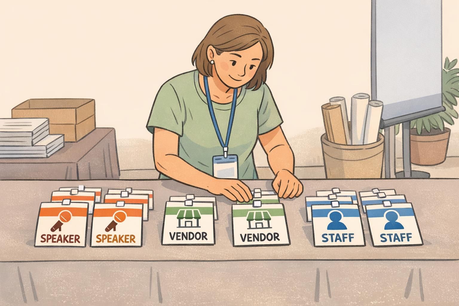
Where icons belong: badge buddies, ID cards, and event badges
Where you place icons matters as much as what the icon means. The right placement depends on how people will be scanning credentials—at arm’s length, across a counter, or while walking past in a hallway.
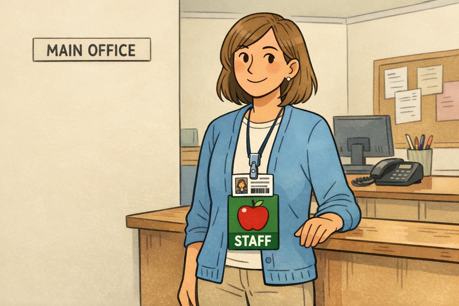
Badge buddies are a popular choice when you want role information to be visible below the main ID. Because they extend the visible area, they can make an icon and role label easier to catch at a glance without squeezing the main card’s photo and name.
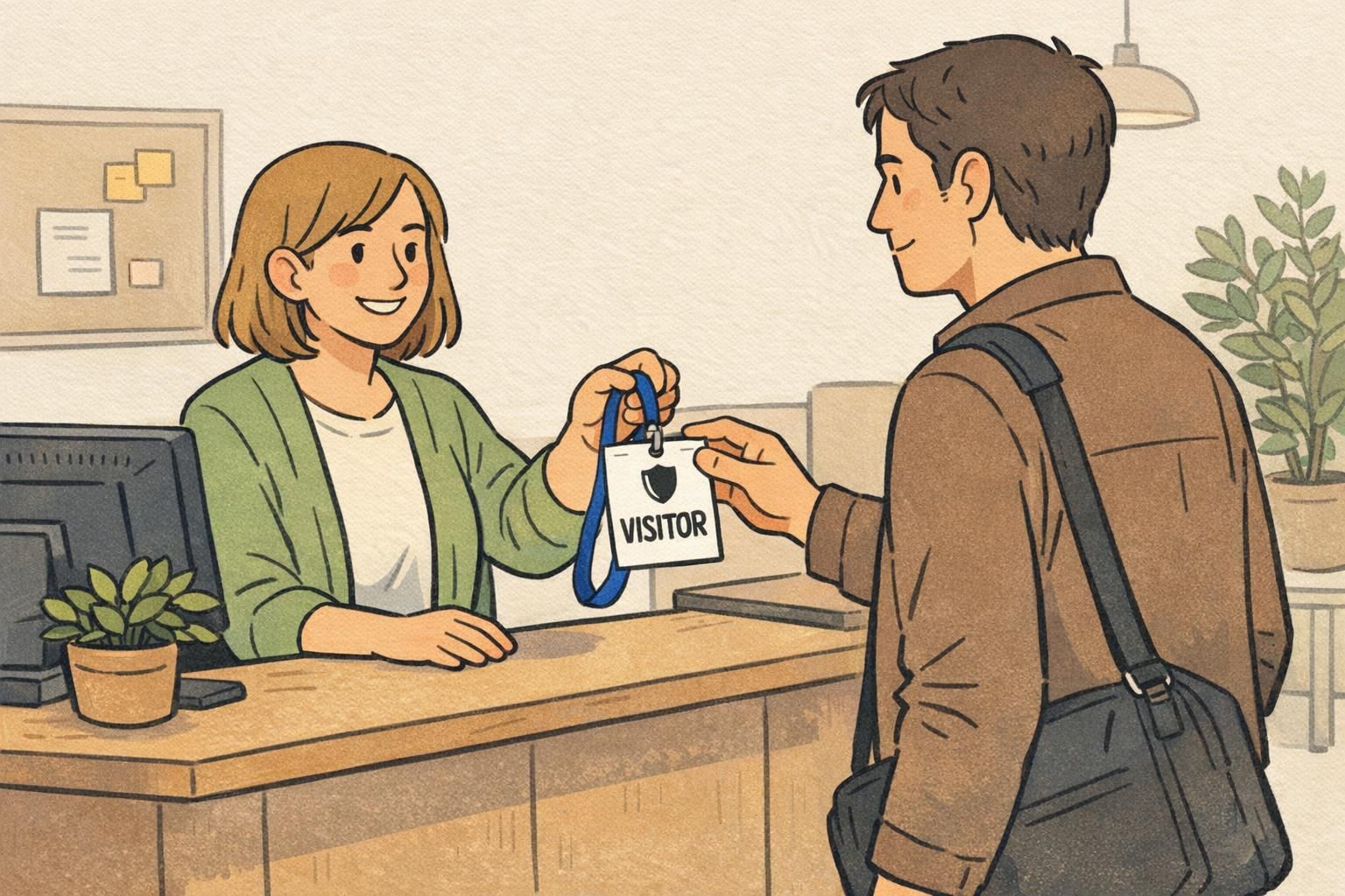
ID cards can also integrate icons directly into the card layout, often at the bottom or a corner where the eye naturally lands. For event badges, icons are especially useful for quickly distinguishing staff, speakers, vendors, press, or VIP access—without forcing attendees to read fine print during a busy check-in or networking moment.
Choose the format that matches the real scanning moment. If your team needs to recognize someone while they’re moving, icons should be large, bold, and placed where they won’t be covered by clips or lanyards.
Operational rollout: choosing icons, training staff, and keeping it updated
A good rollout starts with operations, not artwork. Before choosing icons, list the real decisions people need to make quickly. Those decisions should determine your icon set—not the other way around.
Once you’ve identified the key signals, map each signal to a single icon and define it in a sentence. Then pilot the system with a small group: one unit, one department, one event type, or one building. Ask simple questions during the pilot: Were the icons seen quickly? Were any confused with each other? Did anyone interpret an icon differently than intended?
Finally, plan for change. Rotations, seasonal staffing, new volunteer categories, and shifting access policies can all make icon systems drift over time. Assign an owner, document the current icon meanings, and build in a lightweight update process so badges stay accurate.
- Step 1: Identify the top “two-second” decisions (role, trainee status, access)
- Step 2: Assign one icon per decision and write a one-line definition
- Step 3: Pilot with a small group and collect feedback
- Step 4: Standardize placement, colors, and usage rules
- Step 5: Include icons in onboarding and refreshers
- Step 6: Maintain an update process as roles and policies change
“The best test is the hallway test: if someone can’t tell what the icon means while walking past, it needs to be simpler.” – Training lead
BadgeZoo options for icon-based identification
If you want icon-based identification to stand out without redesigning every credential, badge buddies can add a bold visual layer beneath an existing ID card. That can be useful when an organization already has a standardized ID layout, but needs quicker role recognition in day-to-day interactions.
BadgeZoo offers custom badge buddies that can be designed to display a clear icon and short role label in a consistent style. BadgeZoo also produces ID cards and event badges where icons can be incorporated into the printed layout for a unified look.
The most effective approach is the one that fits your workflow: keep the main ID for identity (photo and name) and use a dedicated area—on-card or on a buddy—for the “two-second” role or access signal.
Common mistakes to avoid with icon systems
Icon systems fail for predictable reasons—and most are fixable with a simpler, more consistent approach. A common trap is adding too many symbols. When people must choose from a large set, recognition slows down and the icon becomes just another piece of visual clutter.
Another frequent problem is inconsistency across departments or locations. If the same icon changes meaning from one area to another, staff and visitors have to re-learn the system each time they move. That increases questions, slows check-ins, and can create security or workflow confusion.
Finally, don’t rely on color alone, and avoid symbols that are culturally specific or easily misread. The safest icons are simple, neutral, and tested for quick interpretation.
- Too many icons (recognition slows down instead of speeding up)
- Using color alone without a distinct shape
- Changing meanings across departments or buildings
- Overly detailed artwork that blurs when printed
- Icons that are ambiguous, culturally specific, or easily confused
- Poor contrast or production that reduces crisp edges over time