Event Staff Badge Designs That Make Help Easy to Find
Why an Event Staff Badge Makes Help Easy to Find
In a busy venue, people don’t “search,” they scan. A clear event staff badge turns that split-second scan into a fast, confident choice—especially for attendees who are stressed, lost, separated from their group, or rushing to a session. When staff identification is visually distinct and consistently worn, the whole event runs more smoothly. Attendees get routed to the right person sooner, lines move with fewer interruptions, and specialized teams (security, medical, technical) aren’t constantly pulled into questions they don’t handle. The goal is simple: make roles obvious at a glance, without clutter, gradients, or graphics that compete with the message. Public safety guidance on crowd management emphasizes planning and clear communication so people can quickly identify help and reduce confusion in dense environments (source). A badge that’s readable and predictable is a small design choice that supports that bigger goal.
A badge works best when it answers one question instantly: “Is this the right person to help me?”
Start With the “Big Role Text” Rule (Legibility From a Distance)
If attendees can’t read the role from several feet away, the design is doing the opposite of its job. The biggest text on the badge should be the role: STAFF, SECURITY, INFO, MEDIC, CREW—whatever your event uses. Everything else supports that main label. Keep the role text in a simple sans-serif font, bold weight, and high contrast (dark-on-light or light-on-dark). Avoid thin strokes, condensed fonts, or decorative type that looks stylish up close but disappears at a distance. If you’re choosing between “pretty” and “readable,” choose readable every time. A practical rule: if the role can’t be identified in about one second while walking, it’s too small or too busy. Your event doesn’t need a badge that says everything—it needs a badge that says the right thing first.
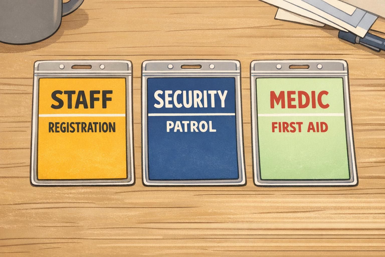
- Make the role the largest element on the badge
- Use high contrast: light background with dark text or the reverse
- Choose a clean sans-serif font with bold weight
- Limit decoration that competes with the role text
- Keep supporting details clearly secondary
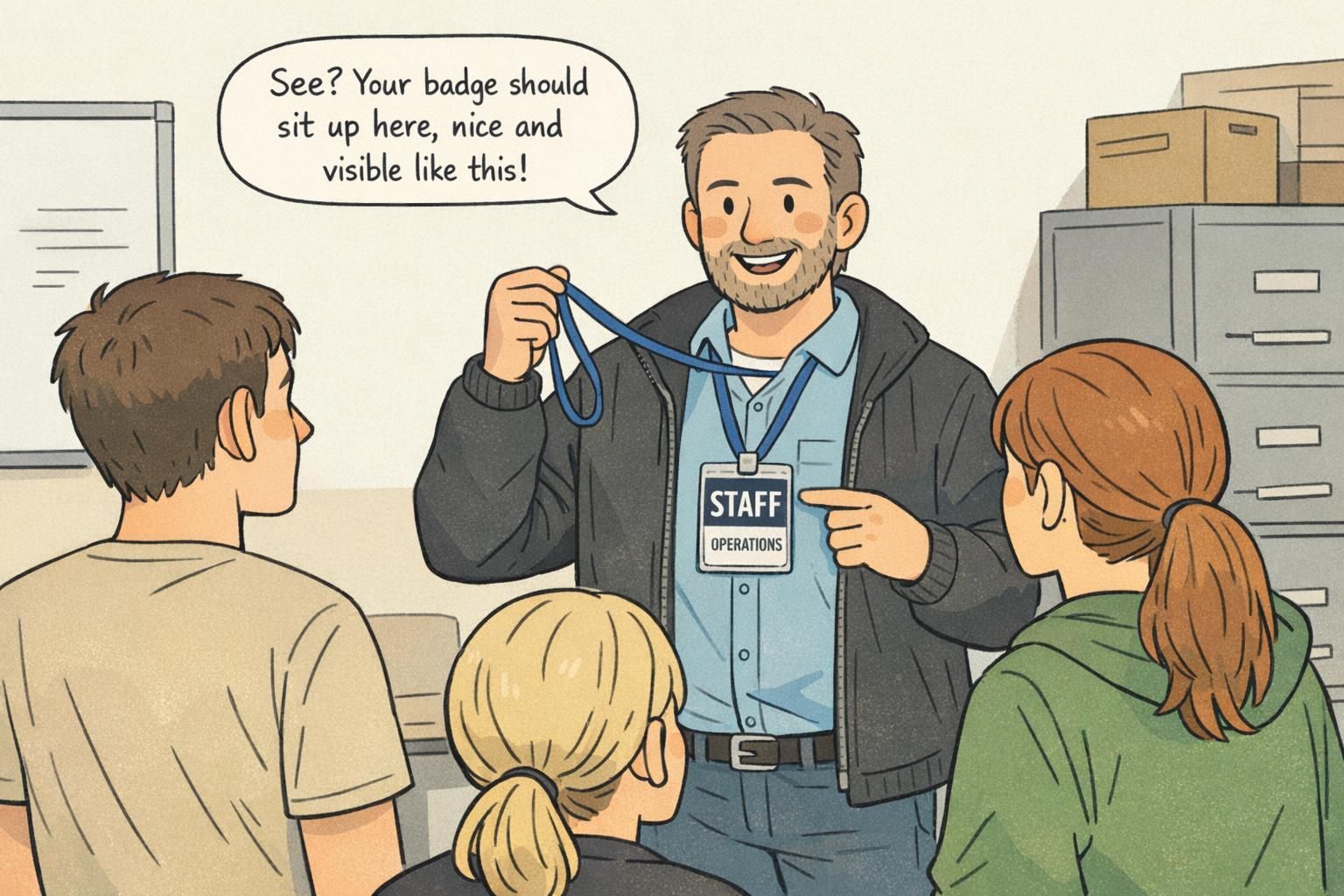
Consistent Placement: A Simple Layout Template That Scales
Once you decide what needs to be readable first, the next step is making it predictable. Consistent placement beats clever design because people learn patterns quickly. If every badge follows the same structure, attendees stop “reading” and start recognizing. A simple layout template that scales across teams looks like this: Role (largest) → Department/Zone (medium) → First name or alias (smaller) → Optional unique ID (small) Keep the role in the same position on every badge—top or center are the most common choices. Don’t move it around between teams. When the brain sees the same format repeatedly, it builds confidence: “I know what I’m looking at.” Also consider real-world badge movement. In crowds, badges flip, twist, and slide behind jackets. Two-sided printing can help keep the core role visible if the card turns. Alternatively, an anti-flip setup (like a secure holder and a stable clip position) helps the front stay front-facing.
- Role: largest text, fixed position across every badge
- Department/Zone: medium text (e.g., Registration, Hall B, VIP, Parking)
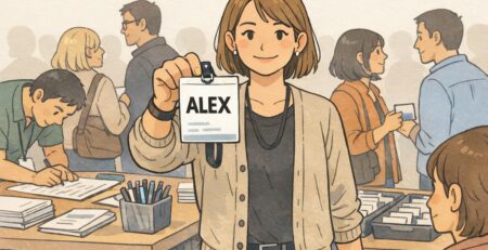
- First name or alias: smaller and friendly (e.g., “Sam” or “Alex”)
- Optional staff ID: small, for check-in or access workflows
“When every badge is laid out the same way, attendees don’t hesitate—they walk straight to the right team.” – Event Operations Lead
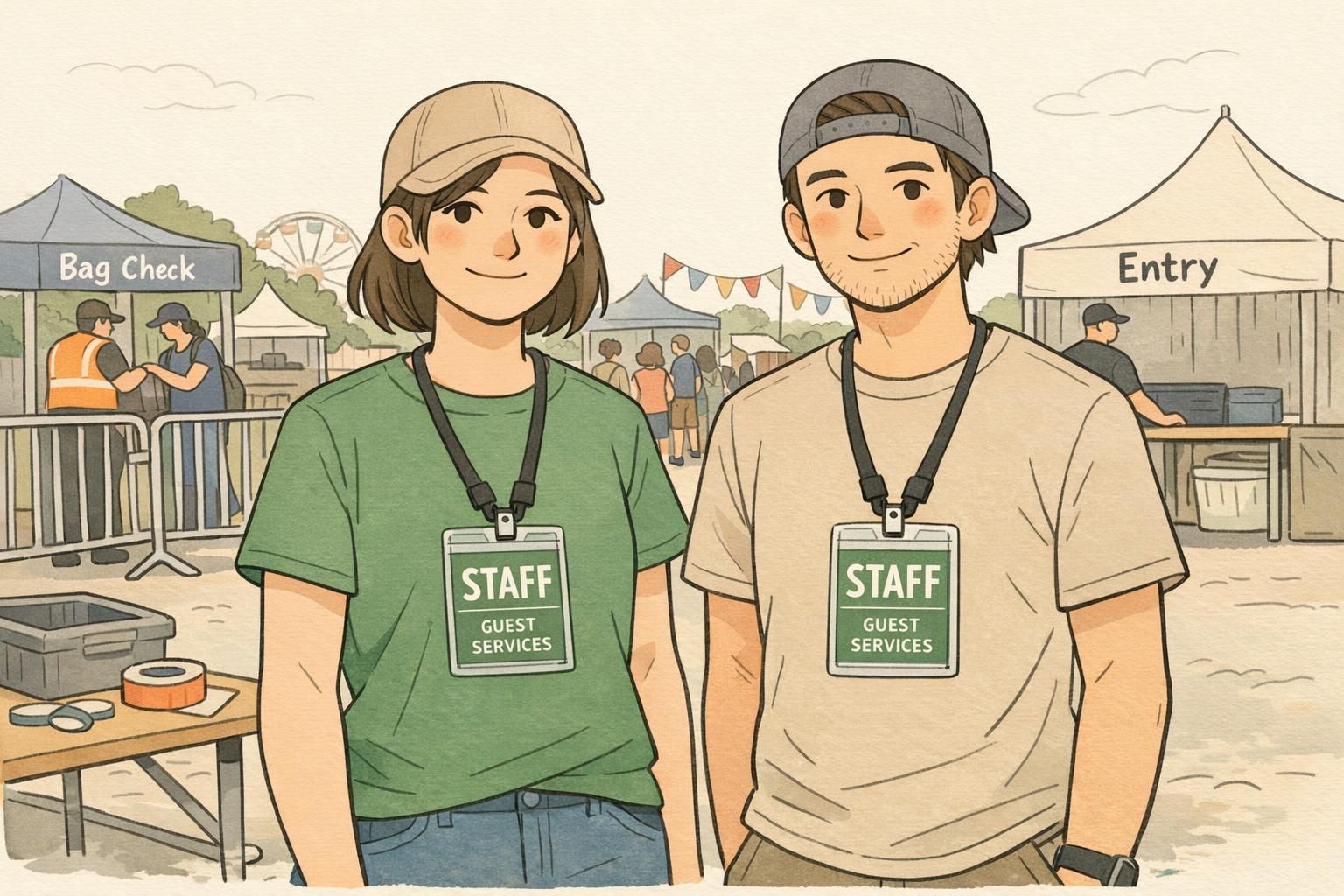
Color-Coding Roles Without Visual Mess
Color-coding is one of the fastest ways to make staff identification easier—if it’s controlled. The common mistake is using too many colors or turning the entire badge into a bright gradient that reduces legibility. Use a limited palette and assign one clear color per function. Keep backgrounds mostly clean and reserve your strongest colors for simple elements like a role bar, border, or header block. This keeps the badge readable while still allowing quick visual sorting. Color should never be the only cue. Pair color with text, and optionally a simple icon. That way, people who can’t rely on color alone (or who are viewing it under odd lighting) still get the message instantly.
Use color to support the role label, not to compete with it.
What to Include (and What to Skip) for Clear, Safer Badges
A helpful badge is selective. It includes what an attendee needs in public—and keeps the rest for back-end systems. For most events, prioritize: Role: the primary decision point Zone/department: the fast “where/what” qualifier First name or alias: human and approachable, while still respecting privacy Then add only what strengthens clarity or reduces confusion across days. An event name/logo and dates can help prevent reuse and mix-ups, especially for multi-day events or venues hosting multiple groups. Operational elements like a barcode, QR code, or short staff ID can be extremely useful for check-in, shift tracking, or access control—but keep them from crowding the design. They should live in a corner or bottom band, not in the same visual lane as the role. What to skip, most of the time: dense fine print, long titles, personal details, and anything an attendee doesn’t need to decide “yes, this is the right person.” Public-facing environments reward speed and simplicity.
Often, a first name or alias is enough for public-facing roles. It keeps interactions friendly while reducing unnecessary personal exposure in crowded settings.
They can if they compete with the role text. Keep the QR small and placed away from the main role label so it supports operations without hurting quick recognition.
Wear Rules That Make Staff Identification Work in Real Life
Even the best design fails if it’s worn inconsistently. For staff identification to actually work, the badge has to be visible, stable, and predictable. Set simple wear rules that everyone can follow: Wear it above the waist Keep it unobstructed (not under a jacket, bag strap, or hoodie) Aim for front-facing whenever possible Standardize lanyard length or clip position so the role text lands in roughly the same place on every person. If one badge sits at chest level and another hangs near the stomach, attendees can’t scan consistently. For loud, high-density venues, coordinated apparel (like a vest or staff shirt) can reinforce who to approach. But the badge should remain the primary role label—the part that answers “Which kind of help is this?”
Integrate Badges Into Event Operations and Wayfinding
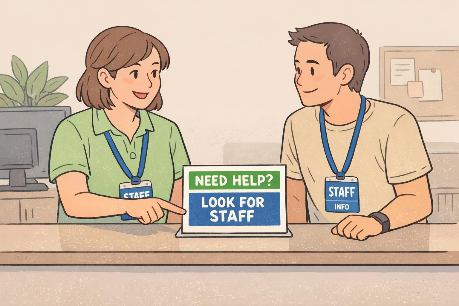
Badges are most powerful when they’re part of the whole navigation system, not a standalone item. If you color-code roles, reinforce what those colors mean in the places attendees already look: maps, programs, entrances, and info desks. A simple legend does a lot of work. For example: “Look for BLUE STAFF for help,” or “Red = Security, Green = Medical.” When help points and information desks match the same cues, attendees gain confidence and stop bouncing between teams. This is where event operations benefits show up quickly. When questions get routed correctly the first time, you reduce bottlenecks, speed up escalations, and keep specialized staff focused on their real responsibilities. Clear badges don’t just look organized—they help the venue behave in an organized way.
- Add a simple badge legend at entrances and info desks
- Match help-point signage to the same role colors used on badges
- Train staff to point attendees to roles by label (“Find SECURITY”) not by vague descriptions (“Ask someone over there”)
- Use consistent role terms across badges, maps, and radio calls
“Once we aligned badge colors with our wayfinding signs, we saw fewer misdirected questions and faster handoffs between teams.” – Site Manager
Product Options That Support Clean, Consistent Badges
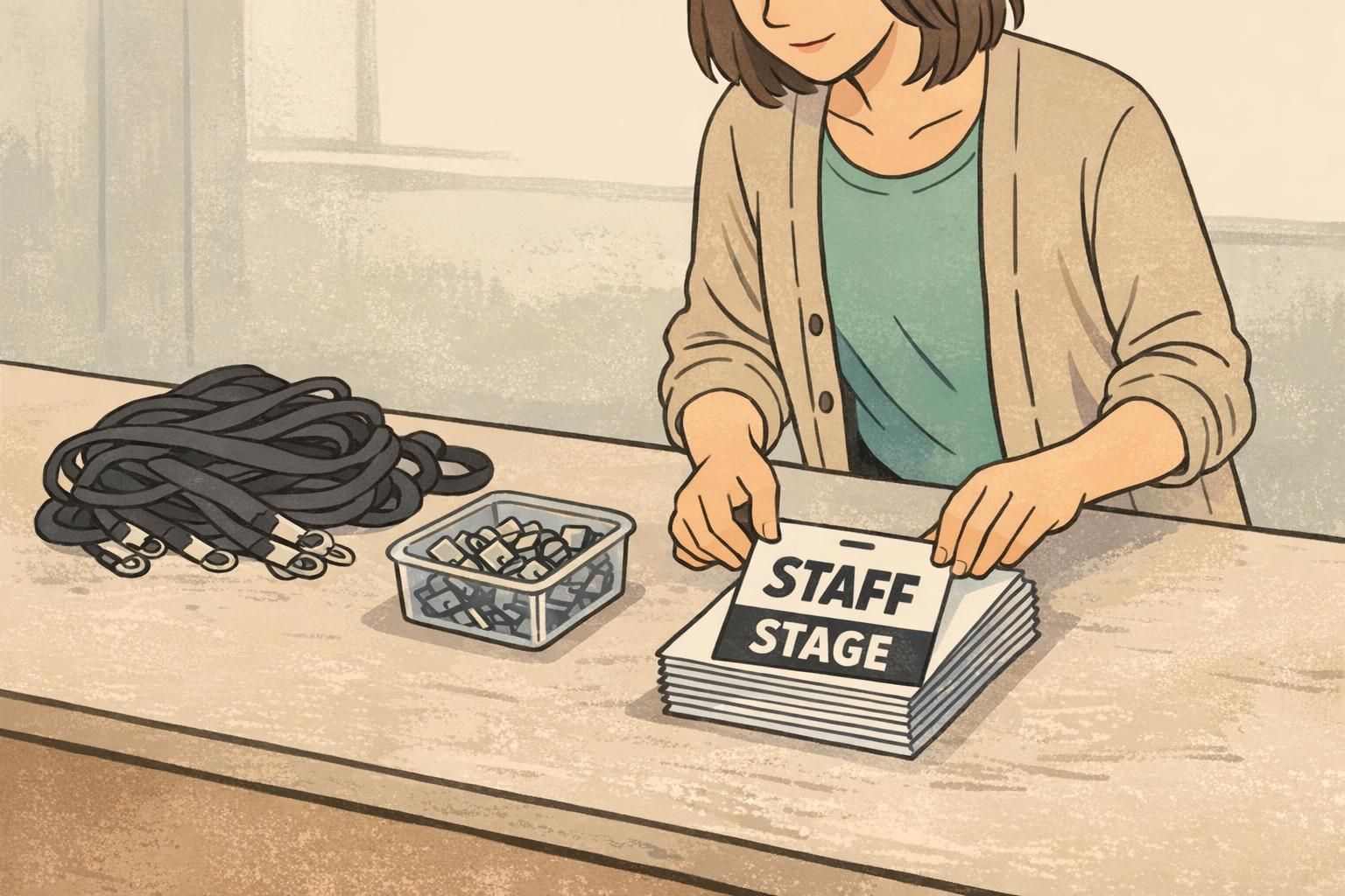
For events with rotating shifts, last-minute role changes, or multiple venue zones, it helps to choose formats that keep the design consistent even when staffing changes. Event-specific inserts or dedicated event badges can make it easier to maintain the same bold role layout across the full team. Durable holders and the right attachment (lanyard or clip) also matter more than people expect. A stable setup keeps the badge front-facing, reduces flipping, and protects legibility across long shifts. If you’re building a role-forward system and want a format designed for clear, repeatable layouts, you can explore custom event badges with bold role text as one option for event use.
Quick Checks: Test Visibility Before Doors Open
A quick visibility test can prevent a full day of avoidable confusion. Before doors open, do a simple “spot test” from common attendee distances—about 10 to 20 feet. Can you read the role in one second? If not, adjust size, contrast, or layout. Then run a short walkthrough in real conditions: entrances, food lines, restrooms, dark hallways, bright outdoor checkpoints. Watch how badges behave when people move, turn, bend, and talk. If the badge keeps flipping or hiding under clothing, your wear rules or attachments may need refinement. Finally, collect lightweight feedback during the event: one or two questions to frontline staff (“Are you getting stopped for the wrong questions?”) can reveal where labels or zones aren’t specific enough. Small changes—like increasing role text, simplifying colors, or tightening layout consistency—often make the biggest difference by day two.
- Distance check: read the role in one second from 10–20 feet
- Lighting check: test in the brightest and dimmest areas of the venue
- Movement check: confirm badges stay front-facing while walking and bending
- Confusion check: ask staff which role labels attendees misunderstand
- Update check: refine for the next day or next venue using what you observed