Event Check In Design for Seasonal Check-In Stations That Make Badge Pickup Feel Premium
Why premium check-in starts with event check in design
Premium events rarely feel premium by accident. The arrival experience is where people decide whether the day will feel smooth or stressful—and strong event check in design is the difference between “Where do I go?” and “I’ve got this.” Before attendees hear a keynote or walk the expo floor, they’re already judging clarity, pace, and how they’re treated.
The most “high-end” check-in areas don’t rely on elaborate decor. They rely on three practical things that attendees can feel immediately: speed (lines move), clarity (choices are obvious), and warmth (people are greeted and guided). When roles, lines, and identifiers are clear, you reduce mis-picks, reprints, and awkward moments—while making badge pickup feel like hospitality instead of paperwork.
Seasonal branding can enhance the first impression, but it should never slow throughput. Aim for subtle, readable, consistent cues that support flow—then let staff service do the rest.
Layout planning: organized tables, lanes, and a “hotel lobby” flow
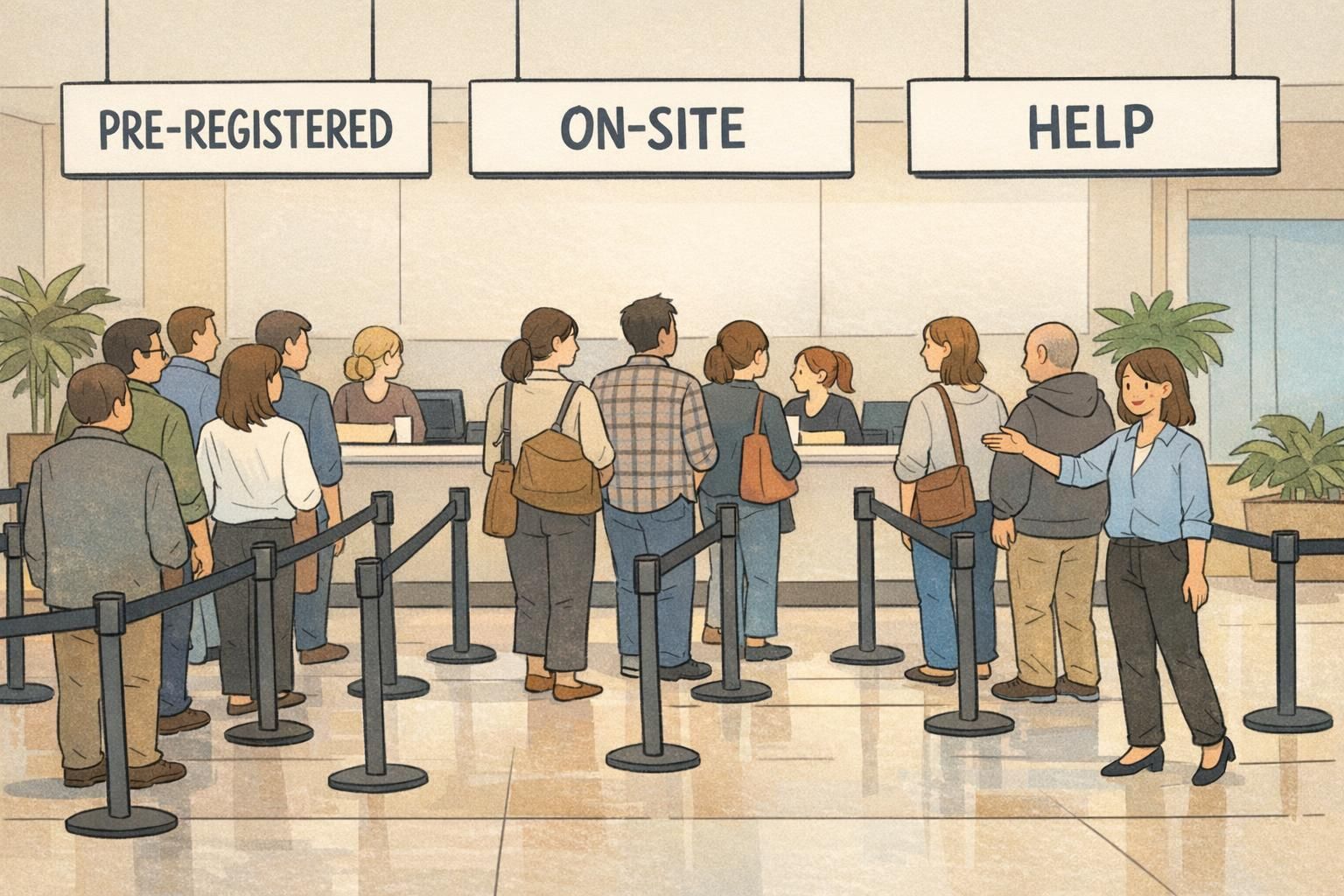
If attendees have to stop and scan the room to figure out what to do, you’ve already added friction. A lobby-style layout works because it mirrors a familiar experience: you enter, you see the options, you choose the right lane, and you’re served at a small station. That “concierge” feel is mostly layout, not luxury.
Start by separating lines by need. The more mixed the line, the more exceptions you’ll process at the main station—and exceptions are what stall queues. A simple lane plan also helps staff feel confident and reduces the number of interruptions for directions.
- Entry sightline: Make the first thing people see a large “CHECK-IN” header and lane choices underneath it.
- Separate lanes: Pre-registered, on-site registration, VIP/speakers, and help desk (problem-solving) lanes keep “fast” and “complex” tasks from competing.
- Multiple smaller stations: Use two to six small tables or podiums rather than one long table to reduce bottlenecks and create a premium, one-on-one interaction.
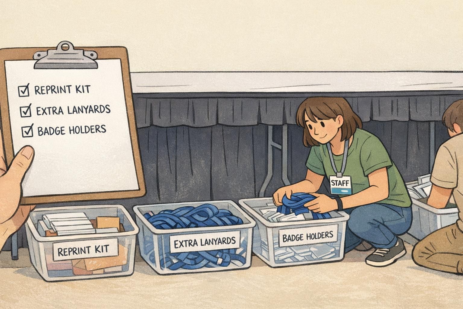
- Behind-the-table staging: Keep backup supplies within arm’s reach so staff never leaves the station (extra lanyards, badge holders, blank stock, reprint materials).
- Issue isolation: Put the help desk slightly off the main flow so detailed conversations don’t block fast pickups.
- Quick ADA-friendly spacing checklist:
- Keep walkways wide and free of obstacles so wheelchairs and strollers can pass without “lane hopping.”
- Avoid tight turns at lane entries; give people room to merge and exit smoothly.
- Ensure at least one station has a comfortable height and clear knee space, if you’re using counters or tall podiums.
- Place signage at decision points (entry and lane start) so attendees don’t need to move forward to read.
Badge pickup station setup: tools, supplies, and a clean tabletop system
A premium badge pickup station looks simple because everything has a place. The goal is a tabletop that stays clean, a handoff that stays consistent, and a process that doesn’t change when you hit a rush. When staff can operate on muscle memory, you move faster and make fewer mistakes.
Think in zones: a “retrieve zone” for sorted badges, a “prep zone” for holders/lanyards, and a “handoff zone” where the attendee receives the finished badge. Avoid letting loose stacks spread across the table—clutter creates slowdowns because staff start searching instead of serving.
- Badge pickup station essentials (reusable packing list):
- Sorted badges (alphabetized or batched) with dividers
- Badge holders or rigid cards (plus extras for damage and swaps)
- Lanyards and/or clips (pre-counted bundles so staff isn’t untangling)
- Pens and a small notepad for quick corrections or notes
- A “reprint kit” (blank stock, approved name formatting guide, printer supplies if applicable)
- Labelled bins for overflow supplies (kept under the table, not on top)
- Table skirt or modesty panel to hide storage and keep the area tidy
- Cable management (tape or covers) if you’re using devices at the station
Contingencies are where most check-in stations lose time. Plan a standardized process for the common issues—lost registration, name changes, duplicate names, and reprints—so staff doesn’t improvise. The simplest approach is a quick triage: if it can be solved in under a minute, handle it at the station; if not, route to the help desk so the primary line keeps moving.
Keep the “work” behind the table and the “welcome” in front of it. Attendees should see calm, uncluttered surfaces and a clear handoff point—never a scramble for supplies.
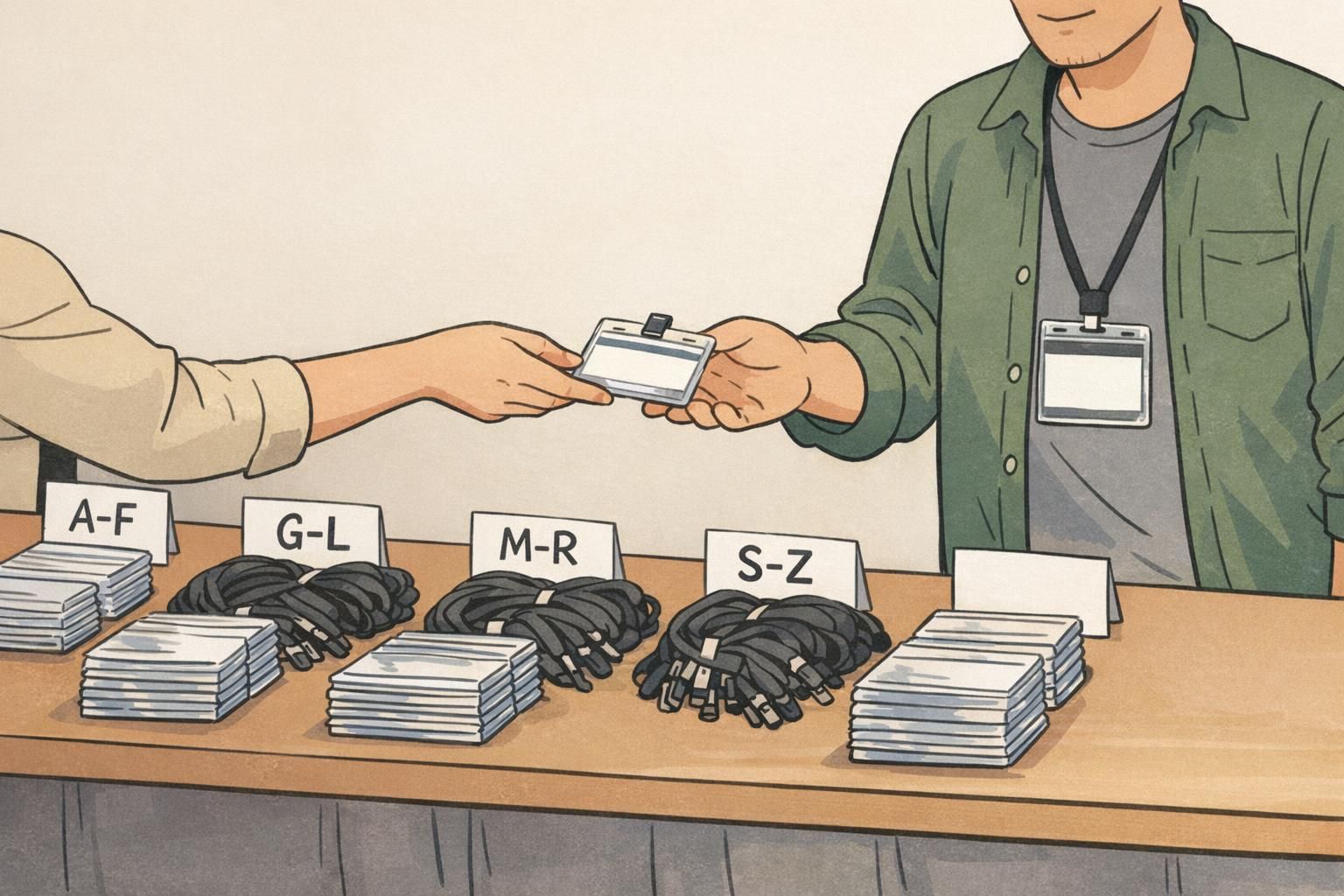
Name sorting that prevents errors: alphabet, groups, and smart batching
Fast check-in depends on retrieval speed and accuracy. The more predictable your sorting, the fewer “almost” moments you’ll have—handing someone the wrong badge, searching through a messy stack, or printing an avoidable reprint. Good sorting also makes onboarding new staff easier because the system teaches them what to do.
Choose one primary sorting method and stick to it across all stations. If one staff member is sorting by last name and another is sorting by company, you’ll create confusion the moment someone floats between stations.
- Practical sorting methods that scale:
- A–Z by last name: Best for general audiences and predictable retrieval.
- Segmented ranges (A–F, G–L, M–R, S–Z): Best for high attendance and multiple stations—each staff member owns a range.
- Company/team groupings: Best for internal meetings or multi-team workplaces where attendees arrive together.
- Arrival-time batching (waves): Best when you have scheduled arrivals (e.g., workshops) and want to stage packets ahead of time.
- Two-step verification handoff (fast and friendly):
- Step 1: Confirm name spelling (especially last name) before you pull the badge fully out of the stack.
- Step 2: Confirm a second detail (organization, role, or attendee type) before you hand it over.
Color-coding can reduce confusion without adding complexity. For example, distinct accent colors (or a small stripe) can quickly differentiate general attendees from vendors, staff, and VIPs. When paired with consistent placement—badge always in the same corner of the holder, lanyard always attached the same way—staff can work faster and attendees can recognize who to ask for help.
Event signage that guides people instantly (and feels on-brand)
People don’t experience check-in as a process map—they experience it as a series of quick decisions. Effective event signage reduces questions, keeps lines calmer, and protects staff focus. When signage is clear, the space feels intentional and premium because attendees don’t need to interrupt, hesitate, or backtrack.
Use a simple hierarchy so people can orient themselves in seconds: one big label for the overall area, smaller signs for lane choice, and tiny prompts for “what do I do at the table?” If everything is the same size and style, nothing stands out—and you’ll hear the same questions repeatedly.
- A simple sign hierarchy that works:
- 1) Big header: “CHECK-IN” (visible from the entry).
- 2) Lane signs: “PRE-REGISTERED,” “ON-SITE,” “HELP,” plus “VIP/SPEAKERS” if needed.
- 3) Tabletop cards: One to two steps max (e.g., “Have ID ready” or “Tell us your last name”).
Seasonal styling should support readability, not compete with it. A subtle palette (winter neutrals, spring pastels, autumn warm tones) can feel elevated if the type remains high-contrast and consistent. Keep motifs simple—think a small icon or border rather than busy backgrounds. The goal is for attendees to read the sign instantly while walking.
- Accessible signage placement tips:
- Place the first directional sign at the entry, before lines begin.
- Repeat lane signs where people commit to a lane (at the start of stanchions).
- Use high contrast (dark text on light background, or the reverse) and avoid thin fonts.
- Mount signs at a height that’s visible over crowds, and avoid glare from overhead lighting.
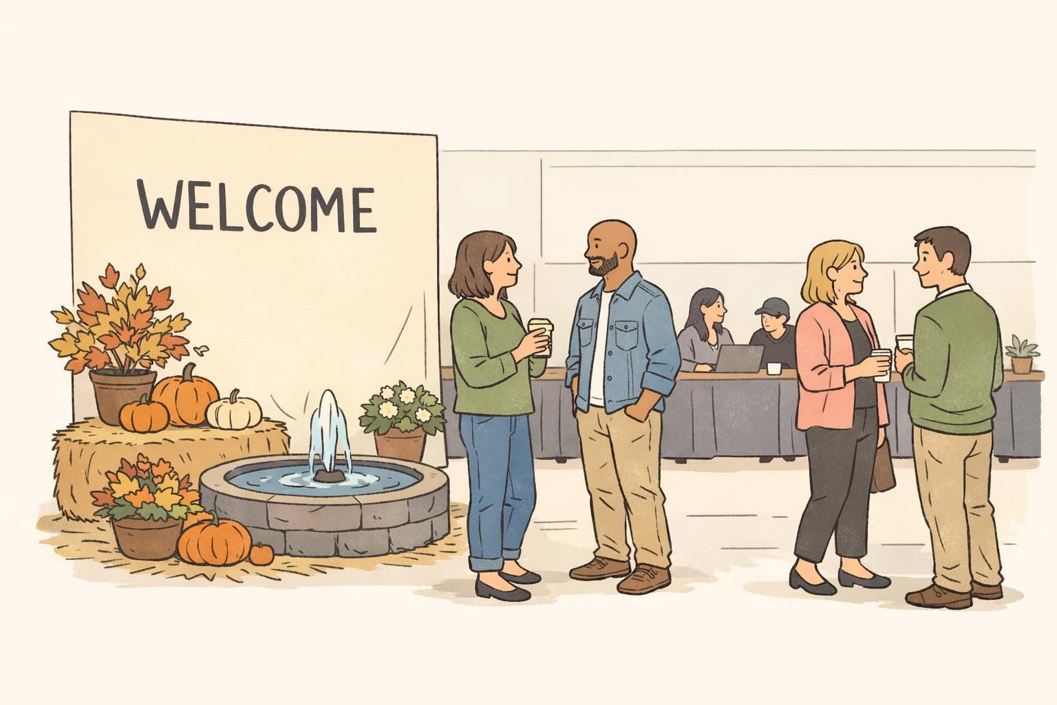
Add premium touches without slowing down: hospitality + micro-moments
Premium doesn’t have to mean fancy—it can mean considered. The best “upgrades” are the ones that reduce perceived wait time and prevent confusion, without adding steps to the check-in transaction. A calm welcome can make a five-minute wait feel shorter than a chaotic two-minute wait.
Treat the check-in area like a hospitality moment: attendees arrive with questions, bags, and a little uncertainty. Small comforts—done deliberately—can make people feel taken care of while protecting throughput.
- Premium touches that don’t slow the line:
- A greeter at the entry who confirms which lane to use before attendees join the wrong queue
- A small water station set off to the side (not on the check-in tables)
- A simple branded photo spot or backdrop adjacent to check-in (keeps people occupied while they wait)
- A calm “welcome script” so staff can greet and direct consistently
- Soft LED accents or a single seasonal centerpiece placed away from the work surface
If a “premium” element creates tabletop clutter, blocks signage, or makes staff turn away from the attendee, it’s working against you. Premium is smooth, not busy.
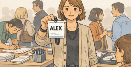
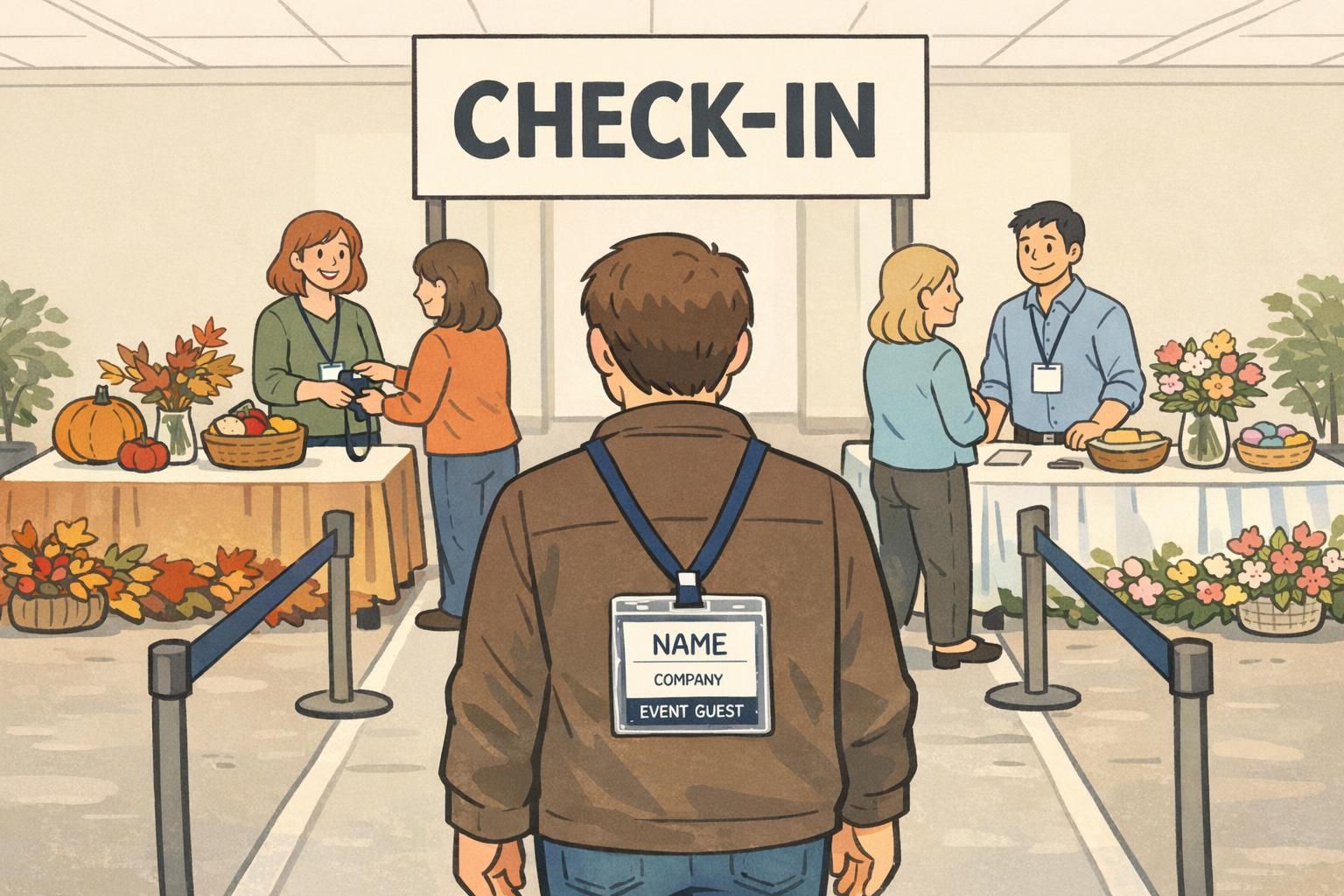
Badge and name tag choices that look premium and scan fast
Badges are more than an accessory—they’re a functional tool for quick recognition, access control, and smoother conversations. The “premium” look comes from clean layout, durable presentation, and easy readability at a distance. The “premium” experience comes from fewer slowdowns: fewer squints, fewer flips, and fewer rescans.
- A badge layout that supports fast verification:
- Name large and high-contrast (the primary thing people need)
- Company/organization and role smaller but readable
- Clear attendee type indicator (text and/or color cue) to reduce confusion
- Scannable QR code where relevant, placed consistently so scanners know where to aim
Material and format matter most in multi-day events or high-traffic environments. A rigid card or a sturdy holder helps keep badges flat and readable (especially for scanners). Lanyards are ideal when you want badges visible at chest height all day; clips can feel cleaner and more formal for short sessions or dressier attire. Whatever you choose, consistency is what prevents check-in and on-floor confusion.
If you’re ordering for a seasonal event, it can help to align color accents with the season while keeping the core text high-contrast and easy to read from a few feet away. For teams planning event badge layouts, you can review options for custom event badges that support clear hierarchy and reliable day-of handling.
Staffing & scripts: warm, fast service with fewer mistakes
Even the best layout and supplies won’t fully protect your lines if staffing is vague. When everyone is “helping,” the most important jobs—greeting, verifying, handing off—get interrupted. Defining roles makes service warmer and faster because each person knows what success looks like in their lane.
Hospitality-focused registration and attendee experience practices are widely discussed in professional event management guidance and case studies. If you want a broader view of how service design influences attendee satisfaction, the professional event community (including resources like source) often frames registration as part of the overall experience—not a separate operational task.
- Core check-in roles (simple and effective):
- Line greeter: Stands at the entry, confirms the correct lane, answers one-question directions, and sets a calm tone.
- Check-in attendant: Stays at the station, pulls badges, verifies details, and completes the handoff.
- Badge runner: Restocks holders/lanyards, retrieves overflow batches, and handles quick supply issues so attendants don’t leave their spot.
- Issue resolver (help desk): Handles exceptions (typos, missing registrations, upgrades, duplicates) without stalling the main line.
- Floater: Watches where lines are building and shifts people or signage as needed.
- A short welcome script that’s warm and fast:
- “Hi—welcome! What’s your last name?”
- “Thanks. And what organization are you with?”
- “Perfect—here you go. Your badge is ready, and the main entrance is straight ahead.”
Build a simple escalation path so staff can stay confident under pressure. For example: name mismatch or missing badge goes to the issue resolver; a simple spelling correction gets noted and routed for reprint; VIP changes go to one designated person. The premium feel comes from calm certainty—attendees sense when staff has a plan.
- Post-rush reset routine (2–3 minutes per station):
- Straighten stacks and dividers; confirm ranges are intact
- Refill holders and lanyards to a set “par level”
- Clear the handoff zone (no loose badges left on the table)
- Confirm the reprint kit is complete and easy to reach
Measuring success: throughput, reprints, and attendee feedback
If you want check-in to feel premium every season, measure a few simple indicators and improve one thing at a time. The goal isn’t perfection—it’s predictable flow, fewer mistakes, and fewer moments where attendees feel unsure.
- Practical metrics to track:
- Average check-in time per attendee (especially during peak arrival)
- Peak line length or wait time estimate (even a simple manual count helps)
- Number of reprints and the reason (misspelling, mis-pick, lost badge, duplicate name)
- How often staff are interrupted for directions (a signage and layout signal)
- Number of help desk escalations per hour (a process and data quality signal)
Add one focused attendee survey question about the arrival experience. Keep it specific so you get actionable feedback, such as “Check-in was easy and clearly marked” with a short comment box. Those comments will often point to fixable issues like lane labeling, unclear role identifiers, or a missing “what to have ready” prompt.
- Easy A/B tests to run across seasonal events:
- Adjust sorting ranges (e.g., A–D, E–H…) based on attendee distribution
- Add one extra small station instead of extending a single long table
- Move or elevate the main “CHECK-IN” header to improve sightlines
- Revise tabletop instruction cards to one step instead of two
A premium first impression is measurable: faster throughput, fewer reprints, calmer lines, and staff who can stay focused on people—not problems.