ID photo background: Consistent ID Photo Styles Without a Studio
Why ID photo background consistency matters for everyday ID programs
A consistent ID photo background is one of the simplest ways to make an ID program look organized, even when hiring happens over months (or years). When every badge photo shares the same background color and overall look, it’s easier to scan a group and recognize who belongs—especially in workplaces with visitors, rotating staff, or multiple departments.
Consistency also protects your badge photo style from “drift.” Without basic standards, older IDs might have yellow indoor lighting, newer photos might be taken outdoors, and a handful might have cluttered backgrounds. Even if each photo is technically “fine,” the set looks mismatched—and that can make the whole credential system feel less professional.
- Visual uniformity: IDs look like one system, not a patchwork of one-off photos
- Faster recognition: similar framing and backgrounds make faces stand out
- Less rework: repeatable rules reduce retakes and editing time
- Smoother onboarding: new hires can match the established standard without special equipment
The goal isn’t studio perfection. It’s a repeatable setup that produces the same “look” every time, so ongoing hires blend seamlessly into your existing IDs.
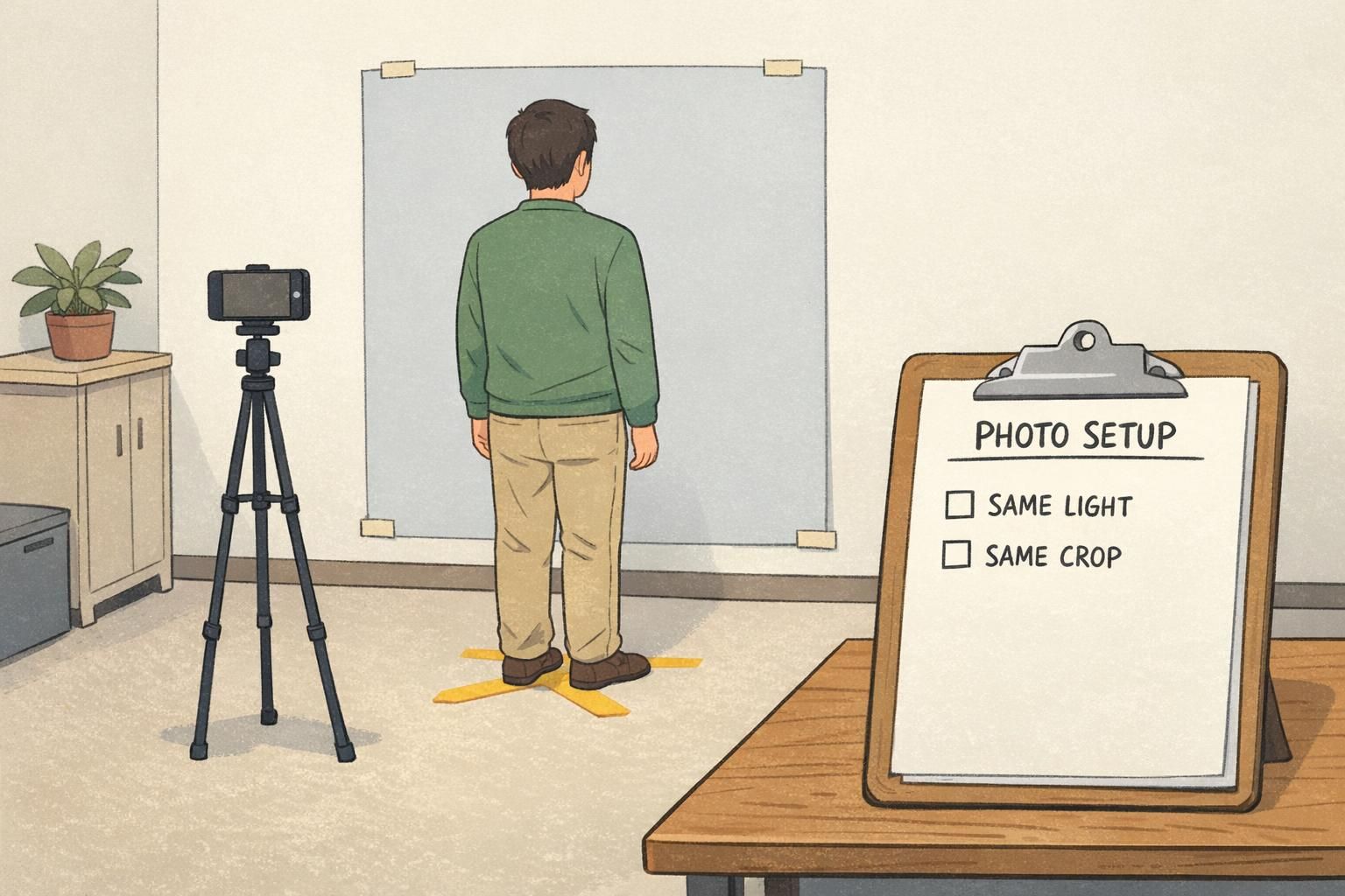
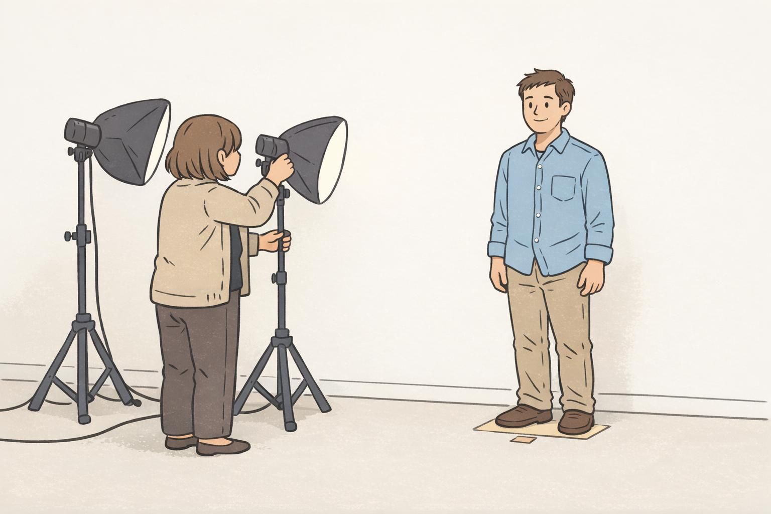
Pick one repeatable setup: wall, light, and camera position (the “same every time” checklist)
If you only standardize three things, make them these: (1) the background surface, (2) the direction and softness of the light, and (3) the camera position. Most inconsistency comes from changing one of those variables from person to person.
A workable “no-studio” photo station can be as simple as a plain wall, a marked standing spot on the floor, and a phone set at eye level on a tripod (or stable shelf). The big win is repeatability—so the next time you take photos (next week or next year), you can reproduce the same results quickly.
- Background: choose one plain wall (or one portable backdrop) and stick with it
- Standing spot: mark where the subject stands so distance stays constant
- Camera height: eye level reduces unflattering angles and keeps proportions consistent
- Camera distance: keep the same distance so head size in the frame doesn’t vary
- Framing: use the same crop guidance for every person (more on this below)
“The biggest improvement wasn’t buying anything new—it was taking every photo from the same spot, at the same height, with the same crop. The whole set immediately looked more official.” – Operations Coordinator
Lighting you can repeat: window light, two-lamp method, and glare control
Lighting is where most “mismatched” ID photos start. One person gets bright light from a window, another gets overhead office lighting, and a third gets shadows from a lamp that’s off to one side. Even with the same ID photo background, the photos won’t feel unified if the light changes.
For a simple setup, aim for soft, even light that comes from the front (or slightly off-center). You’re trying to avoid harsh shadows under the eyes and nose, and you want consistent skin tones from person to person.
- Window light (simple): place the subject facing a window for soft, natural light; if you use this method, take photos in the same spot and roughly the same time of day
- Two-lamp method (repeatable): use two matching lamps placed symmetrically to the left and right of the camera, aimed softly toward the subject to reduce shadows
- Avoid overhead-only lighting: it often creates dark eye sockets and uneven shine on foreheads
- Glasses glare control: raise the lights slightly and angle them down gently; if glare persists, ask the subject to tilt their chin slightly down while keeping eyes level
The most repeatable lighting is the lighting you can set up the same way every time. If your space changes or you have multiple locations, the two-lamp method is often easier to standardize than relying on daylight.
Background options that look uniform: paint, paper rolls, and portable backdrops
A consistent ID photo background should be matte (not shiny), non-textured (so it doesn’t “compete” with the face), and the same color every time. Neutral tones—like light gray, off-white, or soft blue—tend to print well and keep attention on the subject.
If you have a dedicated area, a painted wall can work well as long as it’s clean, evenly colored, and not covered in scuffs or visible texture. If your organization has multiple offices with different wall colors, a portable fabric backdrop or a paper roll can help you standardize quickly without remodeling.
- Painted wall: best for dedicated spaces; choose a flat/matte finish and keep it uncluttered
- Paper roll: creates a smooth, uniform look; replace when it gets wrinkled or marked
- Portable fabric backdrop: convenient for multi-location programs; pick a matte fabric that doesn’t reflect light
- Subject distance: have the subject stand a few feet in front of the background to reduce shadows and wrinkles
Light gray, off-white, and soft blue are common choices because they look neutral on camera and print predictably. The most important factor is choosing one color and using it consistently.
Not necessarily. Bright white can increase glare and make exposure harder to keep consistent. A soft neutral background is often easier to repeat across different people and lighting conditions.
Employee photo tips: wardrobe, hair, and pose rules that don’t feel rigid
Good employee photo tips should make life easier for everyone: the person being photographed, the person taking the photo, and the team that uses the badges every day. The aim is recognizability and consistency—not making people feel overly controlled.
Keep your guidance short, friendly, and focused on outcomes: clear eyes, neutral expression, and a consistent crop. The more complicated the rules get, the less likely they’ll be followed during busy onboarding.
- Face the camera directly with a neutral, natural expression
- Keep eyes visible; avoid hair covering the eyes when possible
- Remove hats and anything that hides key facial features (unless required for safety or religious reasons)
- Avoid busy patterns (tight stripes or small checks) that can look distorted when printed
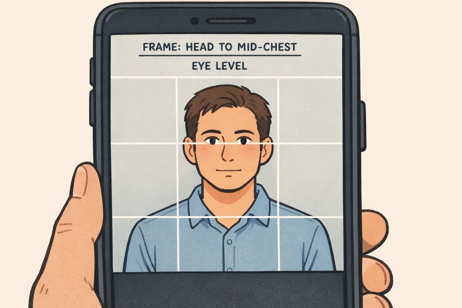
- Use a consistent crop: top of head to mid-chest keeps proportions similar across the badge set
- Stand tall with shoulders relaxed; small posture changes can noticeably affect consistency
“We tell people: ‘Look like you do at work on a normal day—just with your face clearly visible.’ That one sentence covers most of what we need.” – HR Generalist
Use 3–4 quick shots for better consistency (and fewer retakes later)
Even with a solid setup, tiny variables can throw off an ID photo: a blink, a micro-expression, a quick head tilt, or glare on glasses. Taking 3–4 quick shots (without changing the setup) gives you options so you can select the image that best matches your standard framing, expression, and exposure.
This isn’t just a convenience. Research on face recognition has shown that using multiple images (image arrays) can improve matching compared with relying on a single photo, reinforcing the practical value of capturing several options during enrollment for more reliable identification outcomes (source).
- Take 2 front-facing shots (same pose) to avoid blinks
- Take 1 slight-left and 1 slight-right variation (tiny angles, not profile) in case one angle reduces glare
- Review quickly for: sharp eyes, even lighting, neutral background, consistent crop
- Select the shot that best matches your existing badge photo style, not necessarily the most “artistic” image
Multiple quick shots are a low-effort insurance policy. They reduce retakes, speed up onboarding, and help keep your ID photos consistent even when people (and conditions) vary.
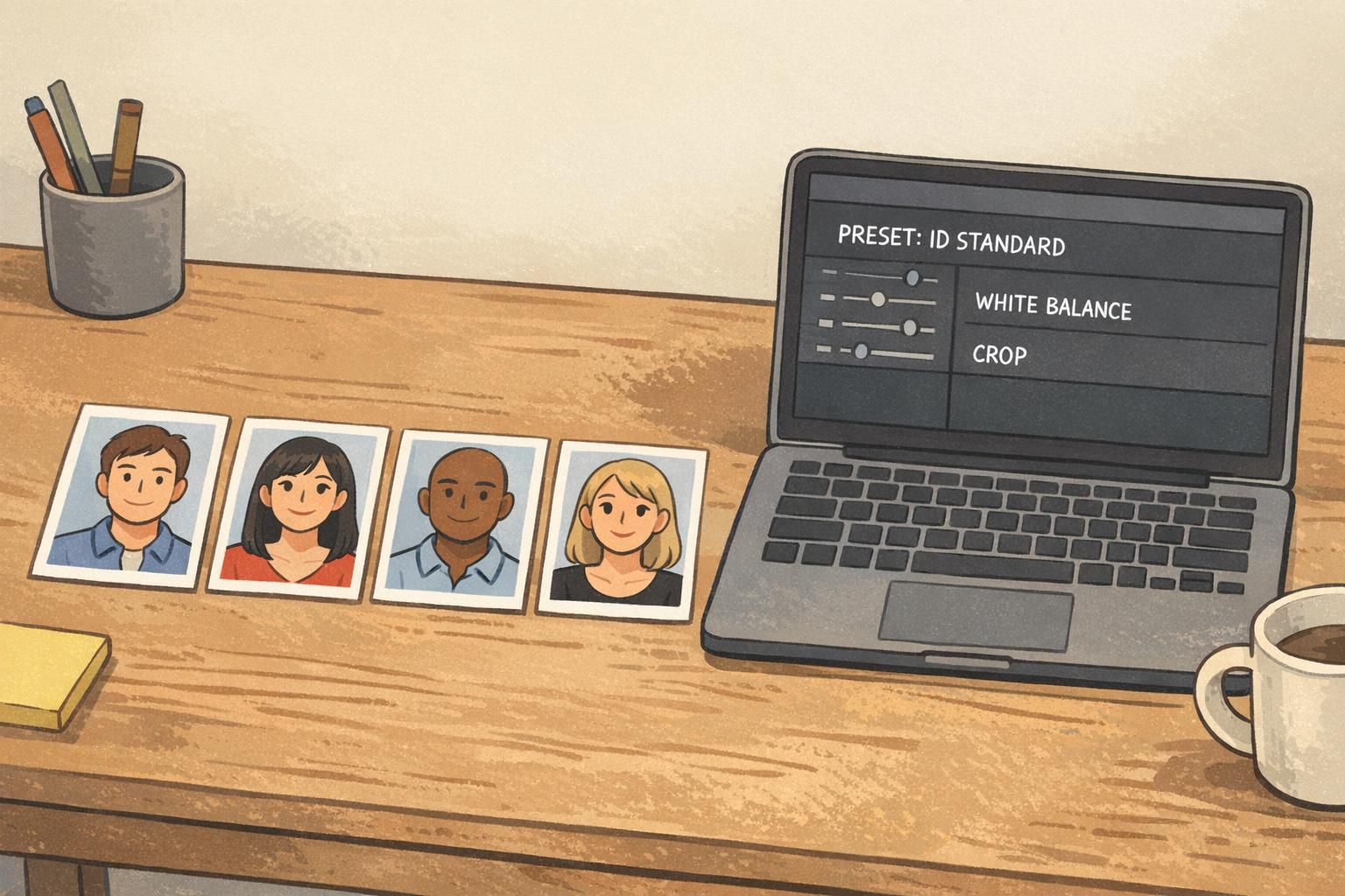
Editing for uniformity: simple color, exposure, and crop rules (avoid over-processing)
Editing is where you “lock in” consistency—especially if multiple people take photos across time. The trick is to make small, repeatable corrections (color, exposure, and crop) and then stop. Heavy filters or strong retouching can make one batch look noticeably different from the next.
If your organization has a defined badge photo style, treat it like a template: the same framing, the same background tone, and the same general brightness. A saved preset (even a simple one) helps you avoid guessing each time.
- White balance: keep skin tones consistent; avoid swinging between warm/yellow and cool/blue
- Exposure: adjust lightly so faces are evenly visible without washing out highlights
- Crop template: use the same head size and placement each time (top of head to mid-chest is a common standard)
- Avoid over-processing: skip heavy skin smoothing, dramatic sharpening, or stylized filters
- Export settings: keep the same file type and size so printing and layout remain consistent
It’s better to prevent shadows with lighting and subject distance from the background. Small, light corrections are fine, but relying on heavy background edits can make different hires look inconsistent across sessions.
Not necessarily. What matters most is applying the same basic adjustments and the same crop every time, using whatever tools your team can consistently repeat.
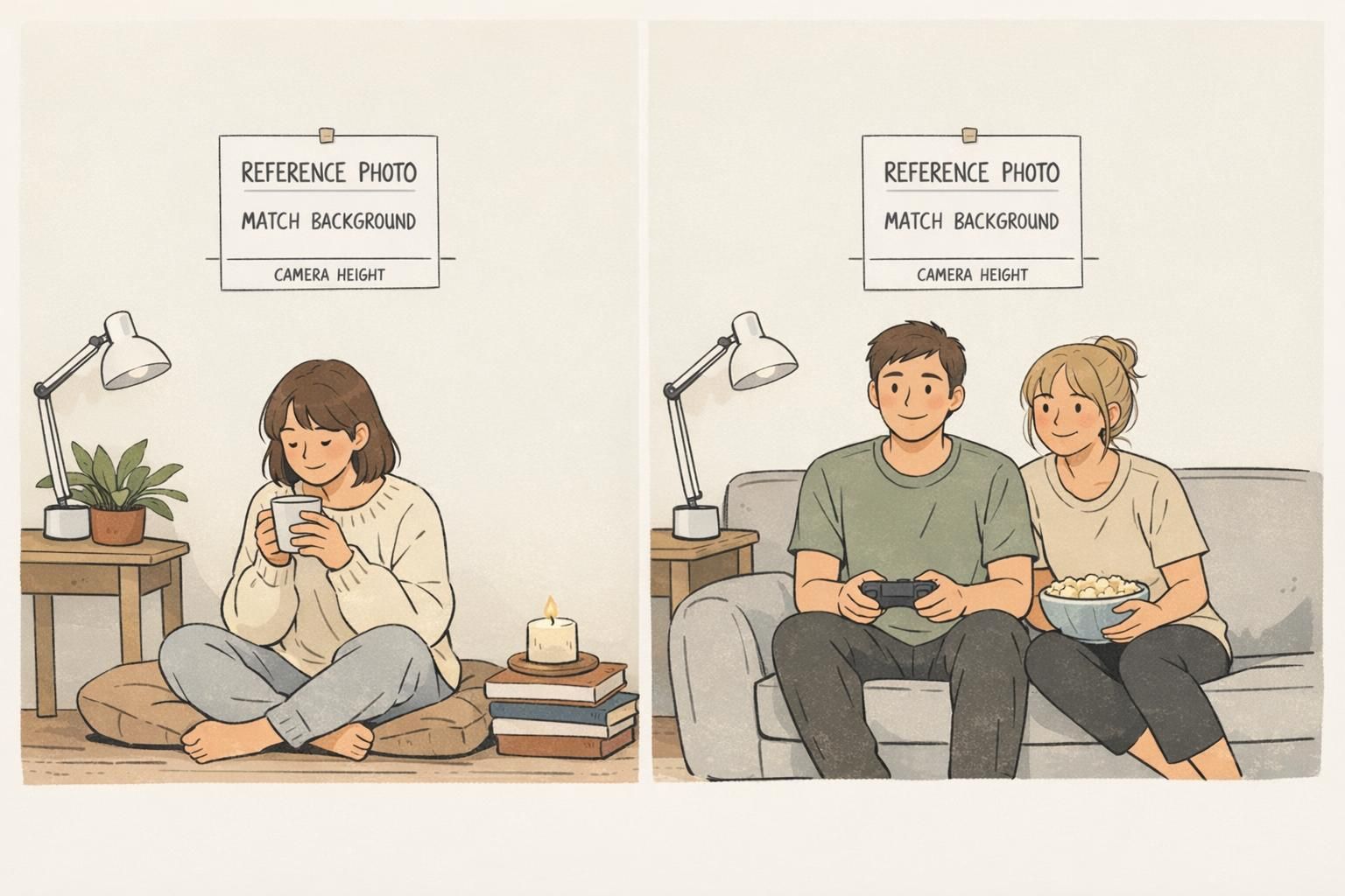
Operational playbook: how to keep the same look for ongoing hires across locations
If you want lasting consistency, document your setup. A one-page “photo station SOP” keeps your ID photo background, lighting, and crop from changing when the responsible person goes on vacation—or when another office starts taking photos.
Think of it like a recipe: if someone follows it, the results should look the same. Include a reference image (a “gold standard” example) so anyone can compare a new session’s photos and quickly see if they match.
- Background: exact color/material and how it’s mounted
- Subject placement: standing distance and floor mark position
- Lighting: lamp type, position, and height (or window location and time-of-day guidance)
- Camera: device type, eye-level height, and distance from the subject
- Framing: example screenshot showing head size and crop
- Editing: preset name or settings notes (white balance, exposure, crop)
- File handling: naming convention and export format
Repeatability is what makes the system work. When your process is easy to follow, your IDs stay consistent as your team grows.
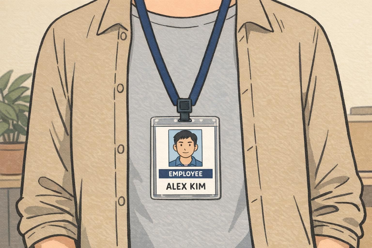
Putting photos onto cards: print-ready specs and BadgeZoo products that support consistent IDs
Once your photos are consistent, the next step is making sure the final credential looks just as uniform. A clean ID card layout—standard photo size, consistent name placement, and a predictable role/department line—helps the photo work as intended: quick recognition at a glance.
It also helps to standardize how the photo is prepared for printing. When your crop and color are consistent, you spend less time fixing “one-off” problems and more time producing credentials that look like they belong to the same system—whether they’re for employees, contractors, visitors, or event staff.
If you’re ordering printed credentials, BadgeZoo offers custom photo ID badges that can be designed to match your established photo style and layout standards. For growing teams, it can also be helpful that there’s no minimum order quantity—so you can keep the same look even when you’re only adding a few new hires at a time.
- Keep photo placement consistent (same size and position on every card)
- Use readable typography for names and roles
- Avoid clutter: the photo should be the visual anchor
- Keep versions controlled: one approved template prevents design drift over time