Badge Color Psychology for Badges: What Your Palette Communicates
Why Badge Color Psychology Matters in Everyday Identification
Badge color psychology isn’t about making a badge look “nice.” It’s about making identification work in the real world—where people are walking, talking, multitasking, and making quick judgments. In seconds, a color choice can help someone feel oriented (“I know who to ask”), reassured (“this person belongs here”), or warned (“restricted role—pay attention”).
In workplaces, schools, healthcare environments, and events, color is one of the fastest cues the brain can process. Done well, it reduces friction: fewer awkward “Are you staff?” questions, fewer wrong-room detours, and fewer delays at check-in. Done poorly, it creates small but constant confusion—especially when roles blend together or badges aren’t readable.
The best badge palettes do two things at once: they communicate role and they protect readability. If either breaks, the system becomes unreliable.
- First impressions: Color sets an emotional tone (official, friendly, urgent) before anyone reads a name.
- Wayfinding: Distinct role colors help people navigate spaces and ask the right person for help.
- Consistency: Matching badge colors to signage or check-in materials reduces mental effort.
- Professionalism: A controlled palette looks intentional, even in busy environments.
How Color Cues Signal Trust, Authority, and Approachability
People interpret color as a shortcut for meaning—especially when they’re moving quickly or meeting someone new. On a badge, color is often the first thing noticed, even before a name or title. That makes it a powerful tool for establishing trust cues and helping others decide how to interact.
Blues and greens commonly read as steady and safe, which is why they’re popular for everyday staff IDs and service roles. Reds and oranges can signal urgency, heightened attention, or caution—useful for security, restricted access, or “ask me first” roles, but easy to overuse. Dark neutrals like navy, charcoal, and black tend to feel official and structured. Lighter tones and pastels can feel welcoming and approachable, which can work well for volunteers, guest services, or community-facing teams.
“When roles are color-consistent, people stop hesitating. They know who to approach, and staff spend less time clarifying who’s who.” – Facilities Coordinator
- Trust and calm: Navy, medium blue, teal, forest green
- Authority and formality: Black, charcoal, deep navy, dark maroon
- Approachability and warmth: Teal, light blue, soft green, warm neutrals
- High attention / caution (use sparingly): Red, orange, bright yellow accents
Consistency matters more than “perfect” meanings. If the same role always maps to the same color family across badges, signage, and check-in materials, people learn it quickly—and rely on it.

ID Card Colors: Building a Role System People Learn Fast
Using ID card colors as a deliberate role system helps people identify who’s who without interrupting work—or putting anyone on the spot. The key is to build a scheme that’s easy to learn, hard to misread, and stable over time.
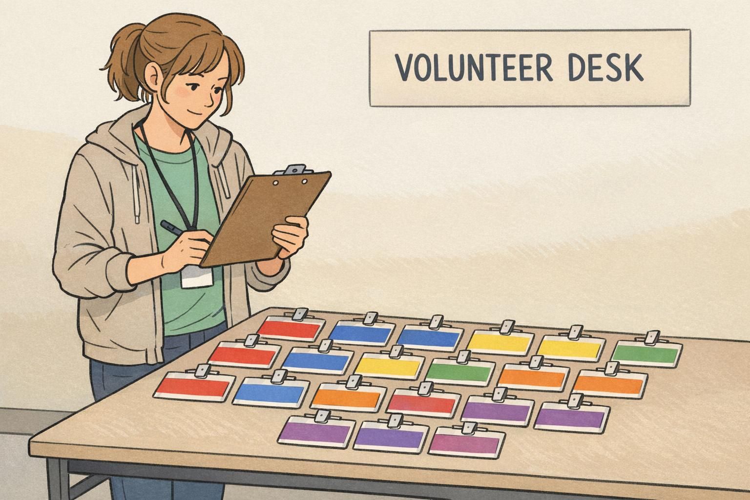
Start with a small set of categories that genuinely benefit from quick recognition. In many environments, that looks like: Staff, Visitor, Vendor/Contractor, Student, Volunteer. If you add too many categories too early, colors start to blur together, and the system loses its advantage.
When you do need higher-privilege roles (for example, Security, Admin, Lab Access), avoid relying on subtle shade differences like “medium blue” vs. “slightly darker medium blue.” Instead, make high-privilege roles visually distinct with a bold border, a strong header bar, or a clearly separated top panel that stands out in peripheral vision.
- Choose 4–6 role categories people actually encounter day to day.
- Assign one clear color family per role (not multiple similar hues).
- Make high-privilege roles distinct with a strong border or header, not tiny differences.
- Write down the mapping so new hires and reorders stay consistent.
A header bar or role band is usually enough. Keeping most of the card neutral improves name readability and avoids overly saturated backgrounds that can make text harder to see.
Use a two-level system: a main role color (large, easy to spot) plus a smaller department accent (like a thin stripe or corner block). That keeps the badge learnable at a glance.
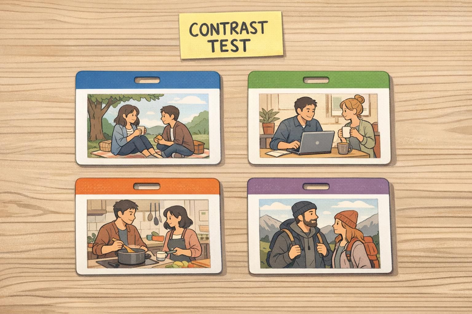
Color Coded Badges for Quick Role Recognition (Without Confusing People)
Color coded badges work best when you treat color as a fast “first signal,” then back it up with a second cue. That second cue matters because lighting changes, badges flip, and not everyone perceives color the same way.
A reliable system uses a simple, high-contrast palette and pairs each color with one additional identifier—like an icon, a stripe pattern, or a clearly printed role label. If you’re choosing multiple blues for different roles, assume someone will misread them under warm lobby lighting or a dim event venue.
Design for the way badges are actually worn. Lanyards, badge reels, and holders can cover corners and edges. Keep the key color zone large and near the top so it remains visible even if the badge is partially obscured or turned slightly.
- Keep the palette simple: fewer colors, more recognition.
- Use a large top role bar so the color is visible when the badge flips.
- Add a second cue (role text, icon, stripe) for accessibility and reliability.
- Avoid “close cousins” (e.g., three similar blues) that collapse under different lighting.
- If needed, use a two-level system: main role color + small department accent.
“We thought people would notice subtle color differences—until we saw the badges under different lighting. Strong top bars and clear labels fixed it.” – Event Operations Lead
Readability First: Contrast, Distance, and Lighting Checks
A badge fails if someone can’t read the name from a normal conversational distance. Color is part of that—because contrast, glare, and “busy” backgrounds can make even large type hard to decipher. The most effective designs treat color as a usability tool: it should reinforce legibility, differentiation, and consistent meaning—not act as decoration (source).
Start with the basics: strong contrast between text and background (dark text on light, or light text on dark). Be careful with saturated color blocks behind text; some combinations can visually “vibrate,” which feels tiring to read quickly. If you want bright colors, consider using them as headers, borders, or role bars while keeping the main name area neutral.
Then test in realistic conditions. Badges that look perfect on a screen can become unreadable under fluorescent lighting, near a glass entryway with strong daylight, or in a dim event space. Print a sample, put it in the actual holder, hang it on the actual lanyard, and check it from a few feet away.
- Check readability at 3–6 feet (normal greeting distance).
- Test under fluorescent office lighting, daylight near entrances, and dim venues.
- Keep names as the largest text element; reduce decorative clutter.
- Avoid placing key text over heavily saturated or patterned areas.
- Use bright color for role bars/borders instead of the entire badge background.
If two roles can’t be distinguished quickly in the lighting where they’re worn, the color system needs simplification or stronger contrast.
Practical Palette Recipes (with What They Communicate)
A good palette does two jobs: it matches your environment’s tone (calm, formal, welcoming) and it keeps information readable. These recipes are starting points—you can adapt them to your brand colors by shifting the header bar while keeping the body neutral and high-contrast.
- Calm, trustworthy (staff-facing roles): navy + white + cool gray. Feels steady and professional; easy to read at a glance.
- Welcoming, service-oriented (volunteers / guest services): teal + off-white + warm gray. Friendly without feeling casual; good in community spaces.
- High-attention roles (use sparingly to avoid alarm fatigue): red header bar + white body + black text. Best for security, restricted access, or “check with me” roles.
- Event-friendly brand system: one brand color as a bold header + neutral body colors. Keeps names readable and photos clear while still feeling on-brand.
You can, but it often hurts readability—especially with saturated colors. A safer approach is to use the brand color in the header bar and keep the name area neutral for maximum contrast.
Picking colors that look distinct on a monitor but become similar when printed or seen under different lighting. Proofing and real-world testing prevents that.
Applying Color Across Formats: Name Tags, Event Badges, and Badge Buddies
The same colors behave differently depending on the format. A palette that looks balanced on a horizontal name tag can feel top-heavy on a vertical event badge. And a color bar that seems “big enough” in a design file may be too small once it’s inside a holder or partially covered by a clip.
Standardizing a few templates helps your color system stay recognizable across use cases. For event badges, a bold top role bar is especially useful because badges tend to flip or swing as people walk. When the badge rotates, the top bar is often the last stable visual cue—so make it count.
Badge buddies are a practical option when you want fast role recognition without redesigning the core ID layout. A buddy sits behind the ID badge and adds a strong, consistent role color beneath it. That way, staff can keep the same ID card format while visitors, vendors, or specific access levels remain immediately obvious.
- Use the same role colors on name tags, event badges, and temporary passes so people don’t have to relearn the system.
- For event badges, prioritize a high-visibility top bar that still reads when the badge flips.
- Keep the name area neutral and consistent across formats for quick scanning.
- Consider badge buddies when you need role visibility without changing the ID card design.

Production and Consistency Tips: Printing, Materials, and Reorders
Color systems only work when they stay consistent over time. In practice, that means planning for printing variables, material finishes, and reorders. A teal that looks perfect on one batch can drift slightly in the next if specs aren’t documented or if materials change.
Finish also affects how colors read. Matte materials can reduce glare in bright lobbies and make text easier to see from an angle. Glossier finishes can make colors feel more vibrant, but they may reflect overhead lighting—especially on vertical badges worn on clips. The goal isn’t “matte vs. glossy,” it’s choosing what protects readability in your actual environment.
A simple spec sheet keeps your ID card colors stable: note your color approximations (HEX/RGB/CMYK), role mapping, and template rules (like header bar height and where role labels go). Before a large run, print a small proof, place it in real holders, and evaluate under the lighting where it will be used.
If you’re ordering durable cards, options like custom full color PVC ID cards can help keep the printed palette consistent and professional-looking, especially when you’re standardizing templates across teams and locations.
- Document color and role mapping so reorders match the original system.
- Choose finishes based on lighting: matte reduces glare; glossy increases pop but can reflect.
- Proof in the real world: actual holders, actual lanyards, actual lighting.
- Avoid subtle shade differences; printing variation can collapse them into the same-looking color.

Quick Checklist: Choosing a Badge Palette That Works
When you’re choosing colors, it helps to treat your palette like a system—not a one-off design. The goal is fast recognition, high readability, and consistent meaning across every format people encounter.
- Pick 4–6 core colors maximum and map them to your highest-traffic roles.
- Confirm high contrast for names and role labels (light on dark or dark on light).
- Verify colors stay distinct under common lighting (office, entryway daylight, event venue).
- Add a second identifier (role text label, icon, or stripe) so the system still works for color-vision differences.
- Keep the key role color area large and near the top so holders/lanyards don’t hide it.
- Standardize templates and keep the mapping consistent across ID cards, event credentials, and temporary passes.
If people can identify role + read the name in one glance, your palette is doing its job.
In general, as rarely as possible. Frequent changes force people to relearn the visual language. If you must update it, roll changes out with clear communication and updated templates.
Use fewer colors, make the role color area larger, and pair color with a second cue like a clear role label or icon.