ID Card Printing: What Prints Differently Than Screens (DPI, Color Shifts, Photo Quality)
Why Screens and Printers Don’t Match (and Why It Matters for In-House IDs)
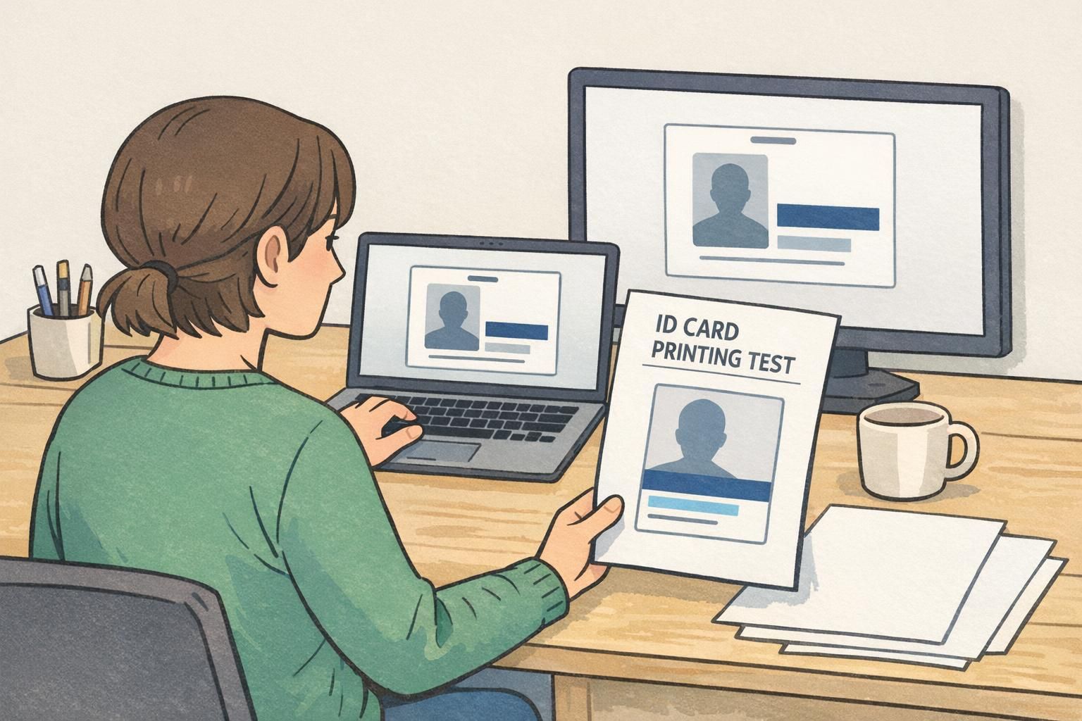
ID card printing can be surprising the first time you compare a clean on-screen preview to the physical badge in your hand. A monitor is bright, backlit, and tuned to display glowing color. A printer, on the other hand, has to translate your file into tiny marks of ink or toner laid onto a real surface—paper, PVC, or a label—then rely on the room’s lighting for what you actually perceive.
That difference matters because workplace identification is judged in real-world conditions: a badge clipped to a shirt, a visitor label viewed across a reception desk, or an event credential swinging on a lanyard under mixed lighting. If colors shift, dark areas turn muddy, or small text softens, the badge can become harder to read at a glance—exactly when speed and clarity matter most.
What you see on-screen is a best-case preview. What you print is a physical object affected by resolution, color conversion, materials, and lighting.
- Resolution mismatch: artwork that looks sharp on-screen can print soft if the source image is too small.
- Color shifts: bright RGB colors often lose vibrancy when printed, changing how badge colors look in person.
- Photo changes: faces can print darker or flatter, especially in shadows and hair detail.
- Material effects: the same file can look different on paper vs PVC, or matte vs glossy finishes.
DPI vs PPI: Print Resolution Basics for Crisp Text and Logos
One of the most common reasons an ID design prints “worse than it looks on the screen” is resolution confusion. Screens display pixels (PPI—pixels per inch). Printers place dots (DPI—dots per inch). They’re related, but they aren’t interchangeable, and the practical takeaway is simple: your source artwork has to contain enough real detail at the size you’re printing.
For small-format designs like name tags, employee IDs, and event credentials, resolution problems show up fast because the design often includes tiny text, thin rules, and small logos. A logo copied from a website might look fine on a monitor, but when it’s reduced to a small area on a badge and then printed, edges can turn jagged and fine elements can blur together.
- Practical target for raster images (photos, non-vector logos): aim for about 150–300 PPI at the final printed size.
- Avoid “fixing” a too-small image by upscaling: it usually makes blur look smoother, not sharper.
- Use vector files (SVG, AI, EPS, or PDF vector art) for logos and icons when possible: vectors scale cleanly.
- Watch minimum line weights: very thin lines (hairlines) may break up or disappear on some printers.
- Proof tiny text: small font sizes that look crisp on-screen may print soft, especially on matte or uncoated stocks.
Not automatically. A printer may support a high DPI setting, but if your file doesn’t contain enough detail (low PPI at the printed size), the result will still look soft. Start with a high-quality source file, then use a sensible print setting for your device and stock.
Using a small web image for a logo or QR code. It may look sharp in a preview, but it often prints fuzzy because there isn’t enough true detail at badge size.
Color Shifts Explained: RGB vs CMYK and What Happens to Brand Colors
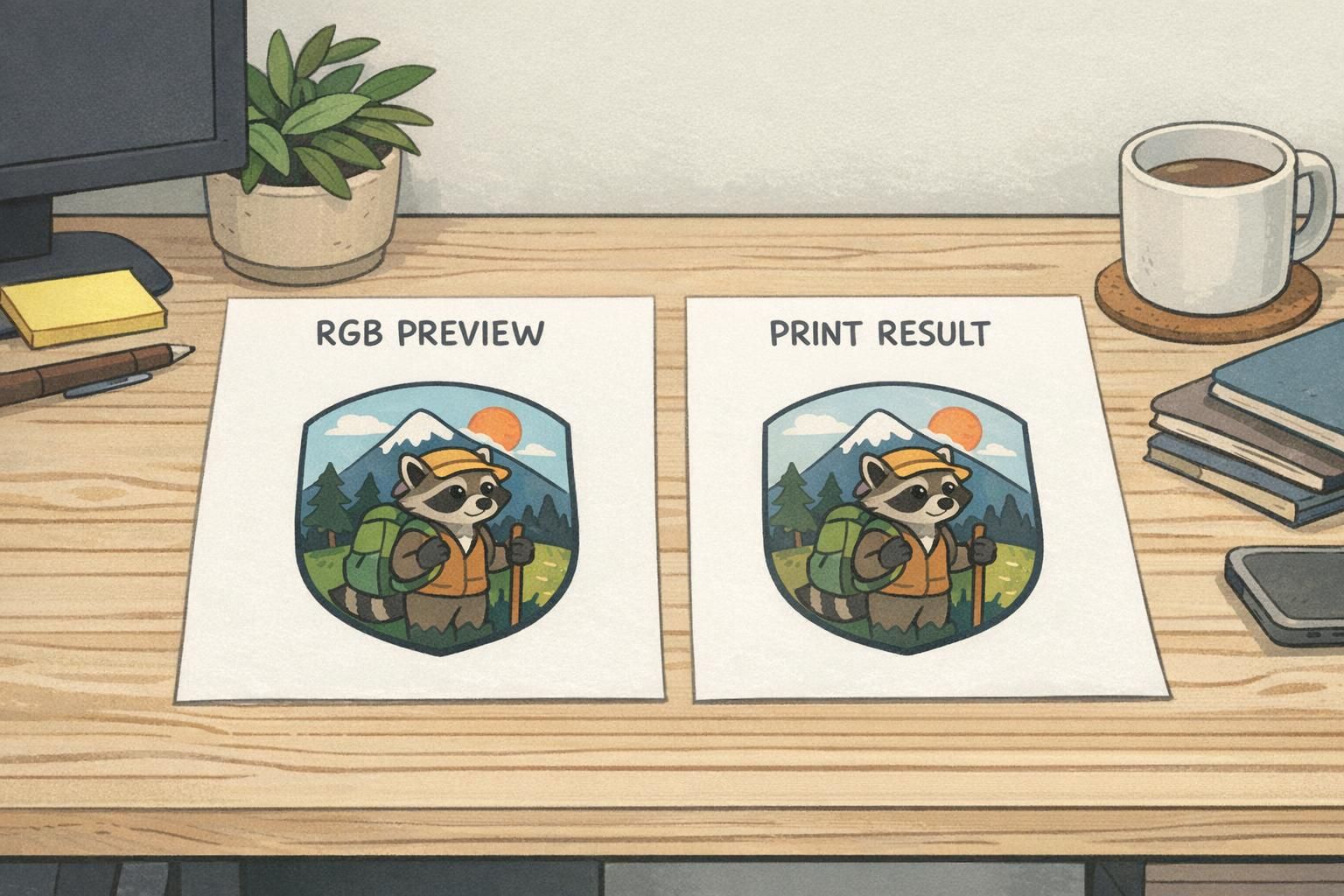
Screens typically display color using RGB light (red, green, blue). Printing relies on ink/toner on a physical surface—often closer to a CMYK-style process in how colors are built and perceived. That’s why certain colors that “pop” on-screen can look more muted, darker, or simply different once printed.
Bright blues, vivid greens, and neon-like colors are common trouble spots. The monitor can emit intense light; a printed badge can only reflect the light in the room. On top of that, different print processes and substrates can produce measurable differences in color transfer, tone reproduction, and effective resolution across methods and materials (source).
Badge colors also behave differently depending on your stock. A whiter, brighter surface typically makes colors appear cleaner. A warmer or slightly gray substrate can make the same file look duller. Surface finish matters too: glossy or smoother finishes often preserve perceived saturation and edge clarity, while matte finishes can reduce glare but may slightly soften the look.
- Start with print-safe palettes: choose colors that remain distinct when slightly dulled.
- Prioritize legibility first: high contrast between text and background beats perfect brand matching.
- Test print early: don’t wait until you have 200 badges to discover a shift.
- Adjust for your exact setup: the same file can look different on different printers and stocks.
- Re-check dark colors: deep backgrounds can swallow fine white text or thin lines when printed.
If brand colors are critical, build a quick “approved print” reference using your actual printer and stock—then keep those settings consistent for reprints.
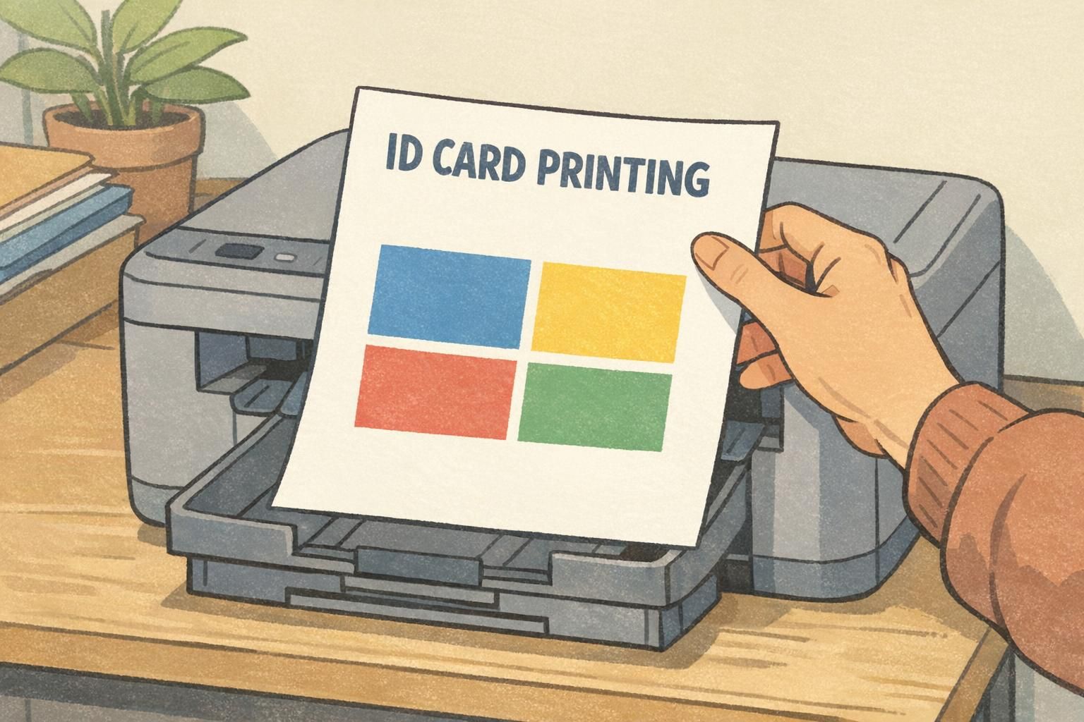
Photo Quality on ID Cards: Faces, Contrast, and Compression Pitfalls
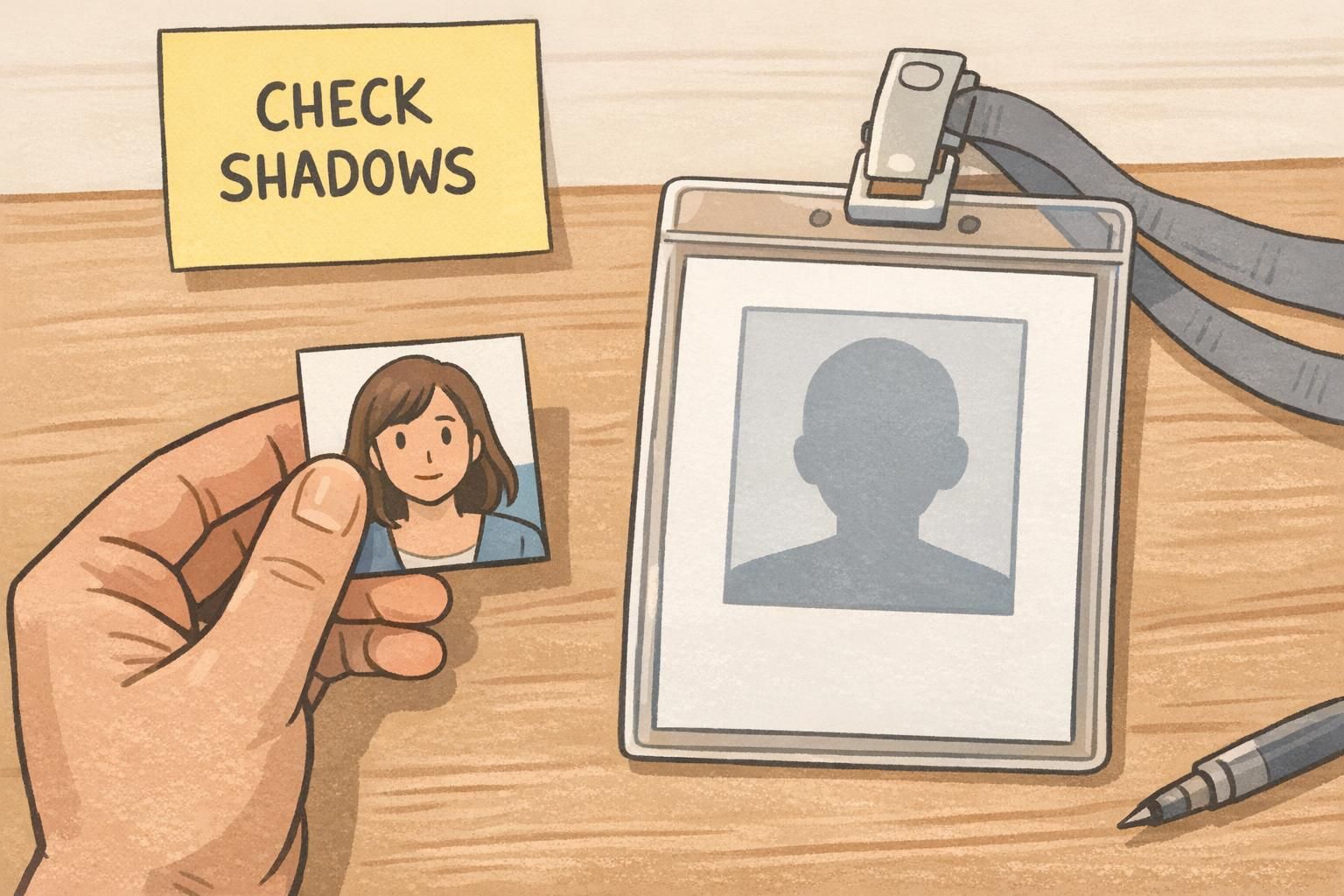
ID photos are where “looks fine on my screen” often fails the fastest. On a bright display, you can still recognize a face even when shadows are heavy or the photo is slightly compressed. In print, especially under typical office lighting, those same shadows can plug up (turn into near-black), and subtle facial detail can flatten out.
To keep faces identifiable at a glance, aim for clear separation between hair, skin, and background. Portraits often benefit from slightly brighter midtones and balanced contrast so the eyes, nose, and mouth remain readable without harsh shadows. Avoid heavy filters that change skin tone or reduce natural detail—those effects can become more obvious and less flattering when printed small.
- Use a high-resolution source photo: small, heavily compressed images can show blocky artifacts in print.
- Keep lighting even: avoid strong overhead shadows or bright windows behind the subject.
- Choose a simple background: it helps the face stand out and improves fast recognition.
- Crop consistently: keep the head size similar across badges for a uniform, professional look.
- Avoid over-sharpening: it can create halos and emphasize compression artifacts.
“If the hairline disappears into the background or the eyes sit in deep shadow, the photo may look ‘fine’ on a monitor but print less identifiable. A small brightness lift and a simpler background usually fixes it.” – Operations Coordinator
Designing for Real Materials: Paper, PVC, Lamination, and Surface Finish
Printing isn’t just about the file—it’s about what the file lands on. Paper, adhesive name tag stock, PVC cards, and laminated pieces each interact differently with ink or toner. Even within “paper,” coated vs uncoated surfaces can change sharpness and saturation noticeably.
As a general expectation: uncoated stocks can soften edges and reduce color density, while smoother or coated finishes tend to keep details cleaner. Laminated finishes can also change perceived contrast and color, sometimes making darks look deeper and highlights slightly more reflective. None of this is “good” or “bad”—it just means you should design with the final material in mind, especially for small text, thin borders, and subtle gradients.
- Standardize your stock when possible: consistent materials lead to consistent outcomes.
- Document printer settings: keep notes on the mode, color settings, and driver options used for approved prints.
- Maintain an “approved test set”: one or two reference prints you can compare against during reorders or staff changes.
- Be cautious with delicate gradients: some devices show banding (visible steps) instead of smooth transitions.
- Plan for wear and lighting: glare, scuffs, and reflections can affect readability in day-to-day use.
Operational consistency is the real win: the more you standardize stock and settings, the more predictable your reprints become.
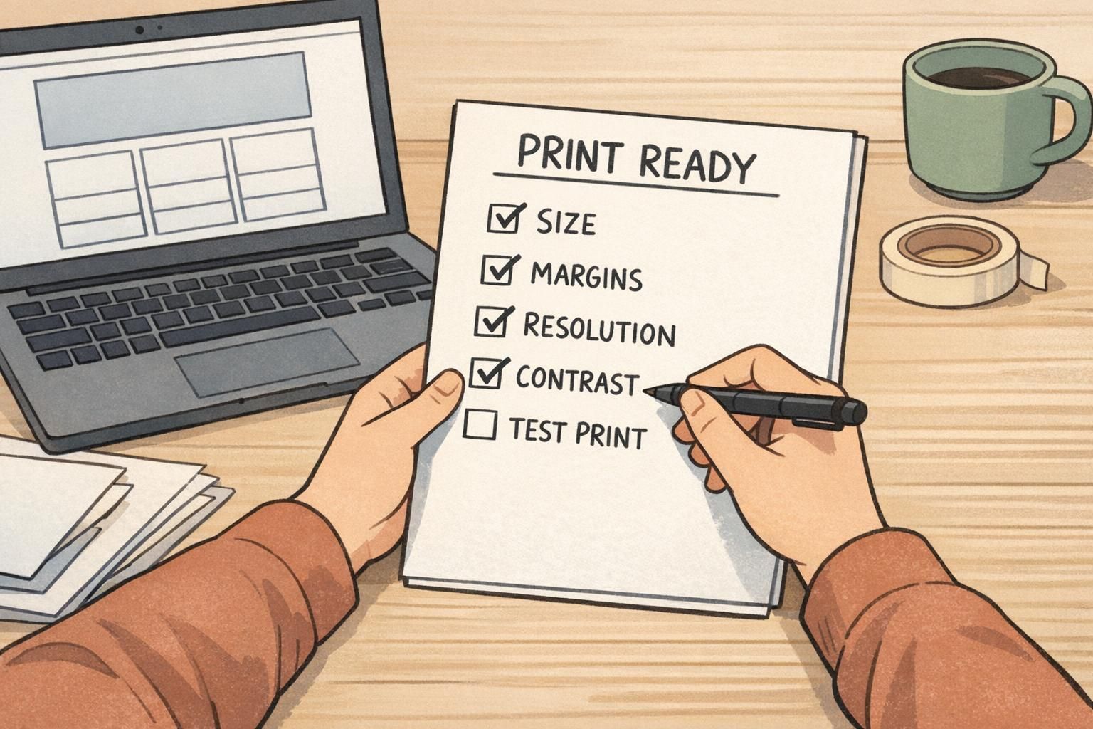
Print-Ready File Checklist for In-House Badge and Name Tag Production
A print-ready file is less about perfection and more about repeatability. If you’re producing badges in-house—whether for employees, visitors, or events—a short preflight checklist can prevent the most common reprint triggers: blurry logos, unreadable small text, and unexpected color changes.
- Confirm final size: set your document to the exact badge/name tag dimensions before designing.
- Add safe margins: keep critical text and logos away from edges to avoid trimming and alignment surprises.
- Verify image resolution at size: ensure photos and raster logos are about 150–300 PPI at their placed dimensions.
- Use vectors for logos and icons when possible: they stay crisp at small sizes.
- Strengthen contrast intentionally: especially for names, roles, and “VISITOR/STAFF” labels.
- Proof small text: print at 100% size and read it at arm’s length (or the real viewing distance).
- Avoid tiny reversed type: small white text on a dark fill can fill in or blur on some devices.
- Limit delicate gradients: simplify backgrounds if you see banding or uneven tone in tests.
- Check QR codes and barcodes: keep them high-contrast and large enough to scan reliably.
Print one sample at final size, check it under normal office lighting, make a quick adjustment if needed (contrast, brightness, font size), then print the full batch. This small step is one of the easiest ways to reduce waste.
Darks can lose separation in print, especially on certain stocks or with certain printer settings. Try slightly lightening the dark fill, increasing text weight, or switching to a lighter background with dark text for critical fields.
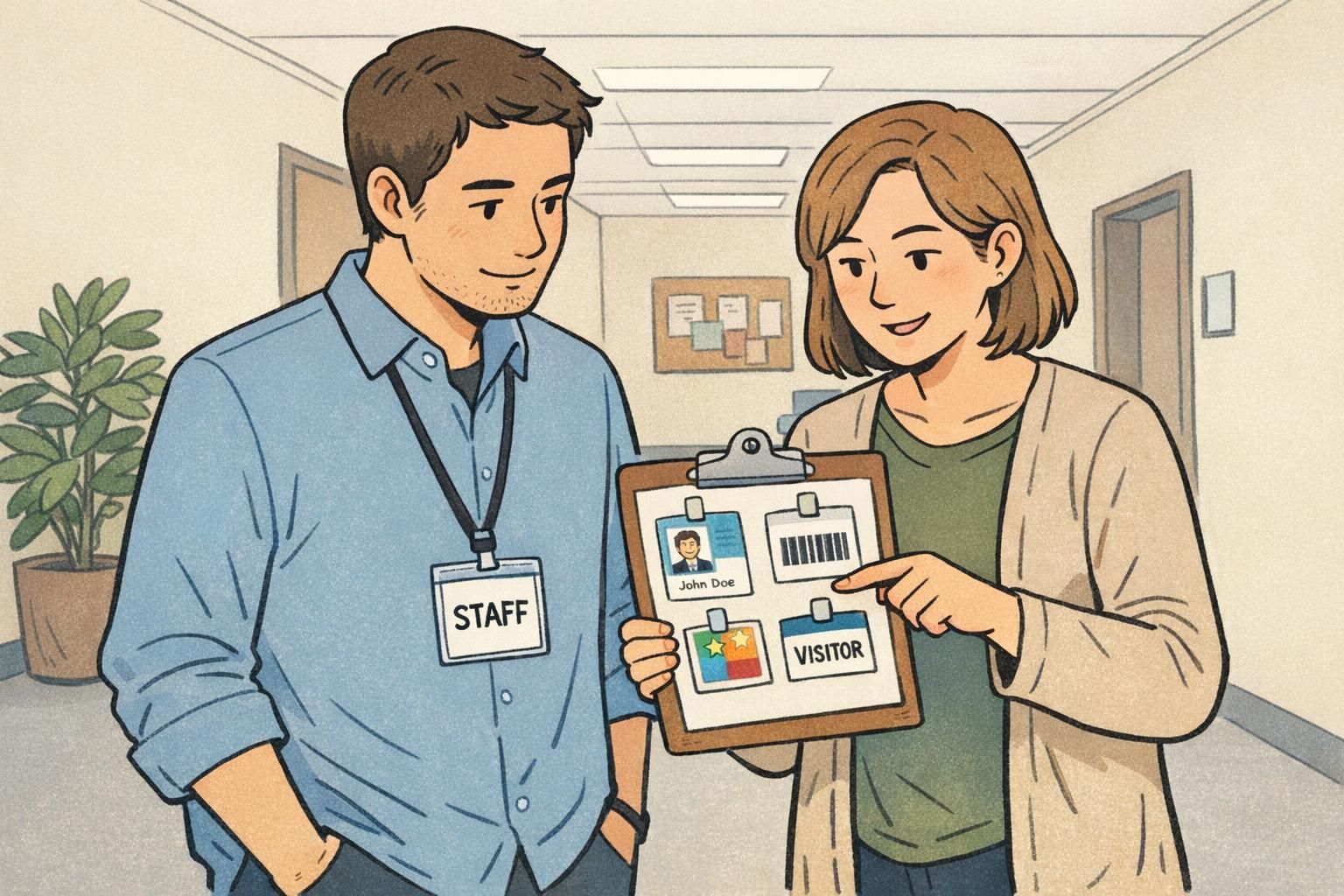
Matching the Design to the Use Case: Employee IDs, Visitor Badges, and Event Credentials
Different credentials succeed for different reasons. An employee badge typically needs a recognizable photo and a clear name. A visitor badge often needs an unmistakable, high-contrast label so staff can identify access level quickly. Event credentials usually prioritize readability at distance—large names, roles, or company—because people glance while walking and talking.
When you design for real use, you naturally make better decisions about print resolution and contrast. Small text might be acceptable for internal reference fields, but the primary identification elements should remain readable when the badge is worn on a lanyard, clipped to a jacket, or partially covered by movement. Lighting changes matter too: a badge that looks fine under a desk lamp may be harder to read in a bright lobby or a dim auditorium.
- Employee IDs: prioritize face photo, full name, and a clear role/department line.
- Visitor badges: make the visitor status unmistakable; use strong contrast and simple layouts.
- Event credentials: size the name for distance; consider larger typography and cleaner backgrounds.
- All types: keep hierarchy consistent so people know where to look first.
Templates and Supplies That Make In-House Printing More Predictable
If you print in-house, predictability often comes from standardization. Using consistent templates reduces alignment surprises. Using compatible supplies reduces changes in sharpness, saturation, and durability from one reorder to the next. Even a great design can become inconsistent if the stock changes frequently or if multiple people use different print settings.
The format you choose also affects how well your printing workflow behaves. Adhesive name tags are simple for short visits and quick check-ins. Insert badges and event credentials can be better for multi-day use, especially when you want a clean, consistent presentation. If you’re building an event workflow, using the same template across roles (attendee, speaker, staff) can keep everything readable while still allowing color-coded distinctions.
If you want a starting point for consistent layouts, BadgeZoo offers event badge templates and print-friendly options designed to help teams keep designs aligned and readable when printing and reprinting.
The most reliable setup is the one you can repeat: same template, same stock, same settings, and a quick test print before every batch.