Badge Background Patterns That Kill Readability (and What to Use Instead)
Why a Busy Badge Background Hurts Readability
A badge is supposed to answer simple questions fast: Who is this? What’s their role? Are they allowed in this space? When the badge background is busy, those answers take longer—because the eye has to fight through visual noise before it can lock onto the text.
Patterns, textures, and photos behind names and titles often create uneven light and dark areas. Even if the overall design looks “on brand,” the local contrast (the contrast right behind each letter) changes from one part of the name to the next. That’s why some letters seem to disappear while others look fine—especially at a distance, in motion, or under lobby lighting.
Research on reading consistently points to how visual clutter and contrast influence eye movements, fixations, and reading efficiency. In practical terms, busy backgrounds make the brain work harder to separate figure (text) from ground (background), which slows recognition and increases mistakes. See source.
Baseline goal: clear figure–ground separation so the name line is the most dominant element on the badge.
Patterns That Kill Readability: The Most Common Offenders
Some background styles look exciting in a mockup, but they’re the usual suspects when names become hard to read. If your badge has to work for front-desk check-ins, security, and quick hallway introductions, these patterns are worth avoiding—or at least controlling with a protected text area.
- Detailed photos (office buildings, city skylines, crowd shots): They introduce “micro-contrast” everywhere—edges, shadows, faces—so letter shapes get lost in competing detail.
- Marble, grunge, and distressed textures: The randomness creates patches of similar tone to your text, causing parts of letters to break up.
- High-contrast stripes or checks: Strong alternating bands can slice through a name line, making some letters look bold and others faint depending on where they land.
- Repeated icons or tiled logos: Repetition creates a patterned field that competes with word shapes and can distract from the name.
- Multi-color gradients that pass through mid-tones: If the gradient crosses the “middle” brightness range, neither black nor white text stays consistently crisp across the full name length.
A common misconception is that “fading” a photo automatically makes it safe. Even a faint image can still have edges and tonal variation that collide with thin letter strokes—especially in longer names, smaller titles, or condensed fonts.
One more subtle issue: repetitive, high-contrast patterns can cause visual discomfort for some people (often described as pattern glare). When text sits on top of that repetition, it can feel like the letters are vibrating or harder to focus on—exactly the opposite of what an ID should do.
Readable Badge Design Starts With Contrast and Calm Space
Readable badge design is less about flashy graphics and more about calm space and predictable contrast. If people can read the name instantly, everything else—logo, department, access indicators—can still be present without undermining the badge’s main job.
What “good” looks like in real use:
- A quiet background (solid or nearly solid) behind the name and role
- Consistent contrast across each character, from the first letter to the last
- Clear space around the name line so it doesn’t feel boxed in by graphics
- A hierarchy where the name is visually dominant and secondary info is clearly secondary
For rapid scanning, dark text on a light background is usually the safest default because it stays readable under more lighting conditions (glare, shadows, and bright overhead lights). Light text on a dark background can work too, but it’s less forgiving if the dark area prints lighter than expected or if lamination glare hits the surface.
Design for the real viewing moment: a badge is often read at arm’s length, at an angle, and while someone is moving.
This isn’t just a design preference—it’s operational. Front-desk staff need quick check-ins, event volunteers need fast wayfinding, security teams need fewer second-glances, and coworkers benefit from smoother introductions.
ID Layout Mistakes: When the Background Isn’t the Only Problem
Even if you fix the badge background, ID layout mistakes can recreate the same legibility problem. “Busyness” isn’t only about what’s behind the text—it’s also about what surrounds it and competes with it.
- Placing names over logos: Logo edges and type create competing shapes, especially if the logo has fine detail.
- Putting the name on top of a busy color band: If the band includes texture, gradients, or sharp angles, it becomes another noisy background.
- Crowding margins: When text is too close to edges, clips, holders, or lanyards can partially block it.
- Overusing shadows, outlines, or heavy borders: These effects can make the name line look fuzzy or “vibrate,” and they add clutter next to the text.
- Too many frames and boxes: Multiple blocks can fragment attention, so the eye doesn’t immediately land on the name.
Simple rule: protect the name line with the cleanest area on the badge—then build everything else around it.
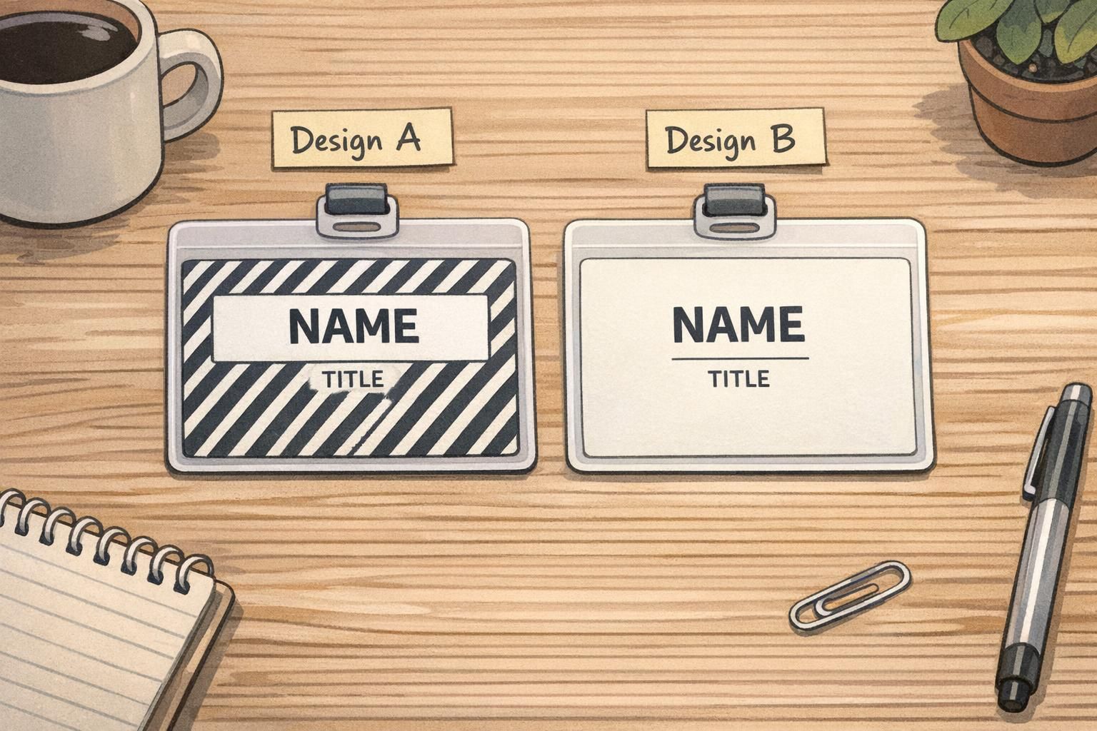
Better Alternatives: Subtle Gradients and Watermark Logos (Done Right)
You don’t have to choose between branding and clarity. The safest approach is to keep the identity elements, but move them into the background in a controlled way—so the text remains the strongest signal.
Better alternatives that tend to print and scan well:
- Very subtle single-hue gradients: Keep the gradient gentle and avoid crossing the middle brightness range behind the name line.
- One large, low-contrast watermark logo: Oversized, simple, and faint—placed away from the name and title area.
- A solid panel behind the name area: Let the rest of the badge carry color or imagery, but reserve a clean rectangle (or soft-edged shape) for text.
Watermark logos work best when they’re not tiled. Repeating a small logo across the entire badge creates a pattern field that competes with letterforms. If you want the logo to be “everywhere,” consider making it larger and lighter instead of smaller and repeated.
- Watermark checklist: oversized, low contrast, minimal detail, no repeating tile pattern
- Keep watermark edges out from behind the name line (avoid intersections with letter strokes)
- If the logo has fine lines, simplify it for the watermark version
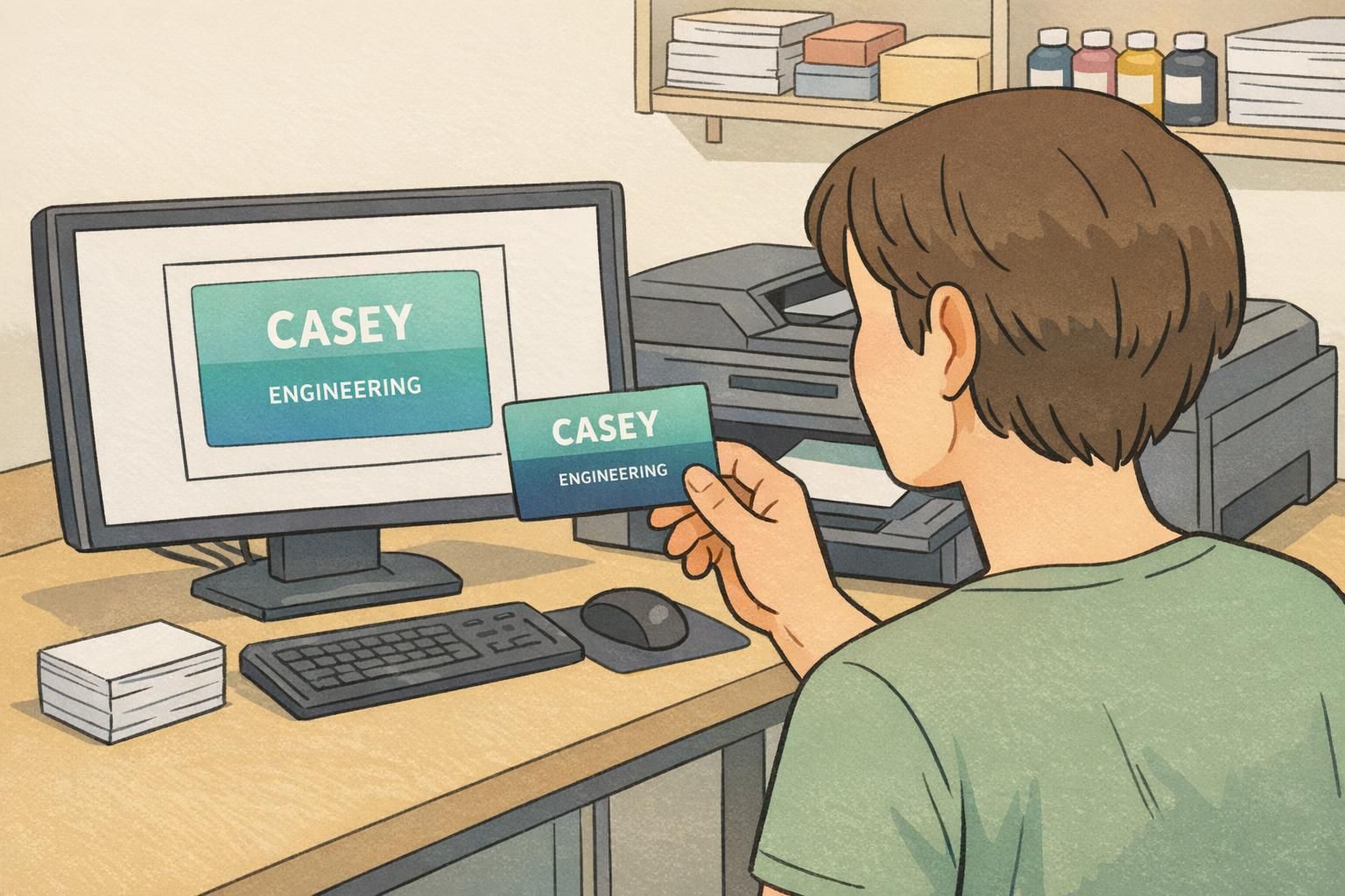
A fast approval routine before printing can prevent most legibility failures:
- Zoom out: If you can’t read the name at small size on screen, it won’t improve in real life.
- Squint test: Squinting simulates lower detail; the name should still “pop” as a single readable block.
- Check the full name length: Make sure contrast holds behind every letter, not just the first half.
- View on a different screen: A second display often reveals contrast issues you got used to.
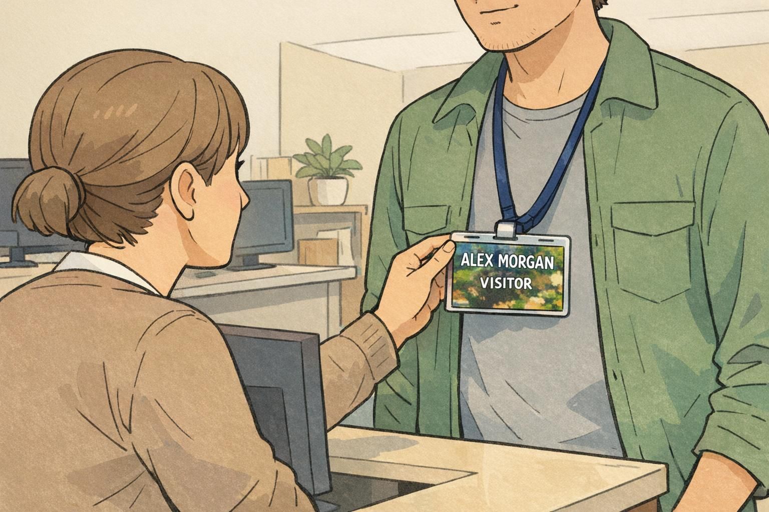
Role-Based Examples: What Works for Employees, Visitors, and Events
Different badges have different jobs, but the goal stays the same: fast, accurate identification in real environments like lobbies, hallways, and conference floors. Here are practical ways to keep templates clear without sacrificing the information people actually need.
Employees
- Use a consistent template across the organization so names appear in the same place every time.
- If you use role color, keep it as a small bar or corner accent placed away from the name line.
- Reserve the calmest area for the person’s name; keep department and title smaller and lower-contrast than the name, but still readable.
Visitors
- Make the visitor name extra prominent (larger size and heavier weight).
- Choose high-contrast backgrounds that remain clear in a badge holder or under lobby glare.
- Keep visitor status obvious but secondary—so the name remains the main element for quick interaction.
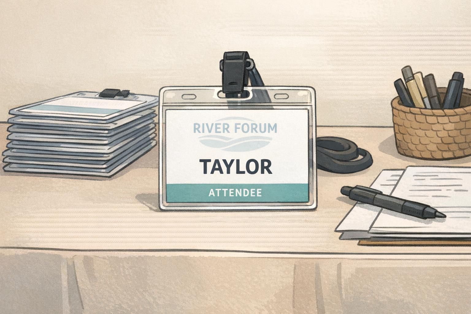
Event badges
- Keep the attendee’s name dominant; everything else supports it.
- Treat session info, company, or access icons as secondary blocks with ample spacing.
- Avoid putting schedules or dense text behind the name area—save detail for a QR code or a separate handout when possible.
“If someone has to tilt your badge or step closer to read it, the design is asking too much of the reader—especially in a busy lobby or on a conference floor.” – Event operations lead
Printing Reality Check: Screens Lie, Printers Don’t
A design that looks fine on a bright monitor can shift dramatically once it’s printed on a PVC card or a paper event badge. That’s when “almost readable” backgrounds become a real problem—especially if your background sits in mid-tones where neither black nor white text has enough punch.
Common print-world issues that reduce legibility:
- Backgrounds print darker than expected, reducing contrast with dark text.
- Gradients band slightly, creating visible lines behind letters.
- Lamination glare brightens certain angles and washes out light text.
- Scuffs and handling add haze or micro-scratches that further lower contrast.
- Clear badge holders add reflections and can dim already-low-contrast designs.
The simplest fix is also the most reliable: do a test print. Even one sample can reveal whether the name stays readable under typical lighting, at typical distance, and through the holder your team uses.
Make It Easy: Templates and Print-Ready Badges That Stay Legible
If you manage badges for a workplace or an event, the easiest way to protect legibility is to standardize a small set of templates. A consistent layout prevents one-off design choices (like a new texture or a dramatic gradient) from accidentally creating unreadable names.
A practical workflow looks like this:
- Pick one primary layout that reserves a calm, high-contrast area for the name.
- Decide where branding can live safely (corner logo, subtle watermark away from text, or a restrained color accent).
- Run the zoom-out and squint tests on the longest expected names and titles.
- Do a small test print before committing to a full batch—especially if you changed background color or finish.
If you’d rather start from a production-ready approach, professionally printed templates can reduce rework and help keep readability consistent across teams and events. BadgeZoo’s professionally printed custom ID badges can be produced in finishes like matte/silk that help reduce glare—one more small factor that can protect contrast in day-to-day use.
When in doubt, prioritize the name line: calm background, strong contrast, generous spacing. Everything else is optional—but clear identification isn’t.
Yes, but treat it like a design risk. Use a solid (or near-solid) panel behind the name and title, and keep the photo detail away from text. Test print it—photos often create uneven contrast that isn’t obvious on screen.
It can be, especially with a truly dark, uniform background. It’s less forgiving if the dark area prints lighter than expected or if glare hits the surface, so test prints and a calm background are important.
Do a zoom-out check and a squint test, then look specifically at the name line: is it sitting on the cleanest area, with consistent contrast across every letter? If not, adjust placement or add a solid name panel.