Event Name Tag Readability: The One-Line Rule for Large, Clear Names
Why the One-Line Rule Works for an Event Name Tag
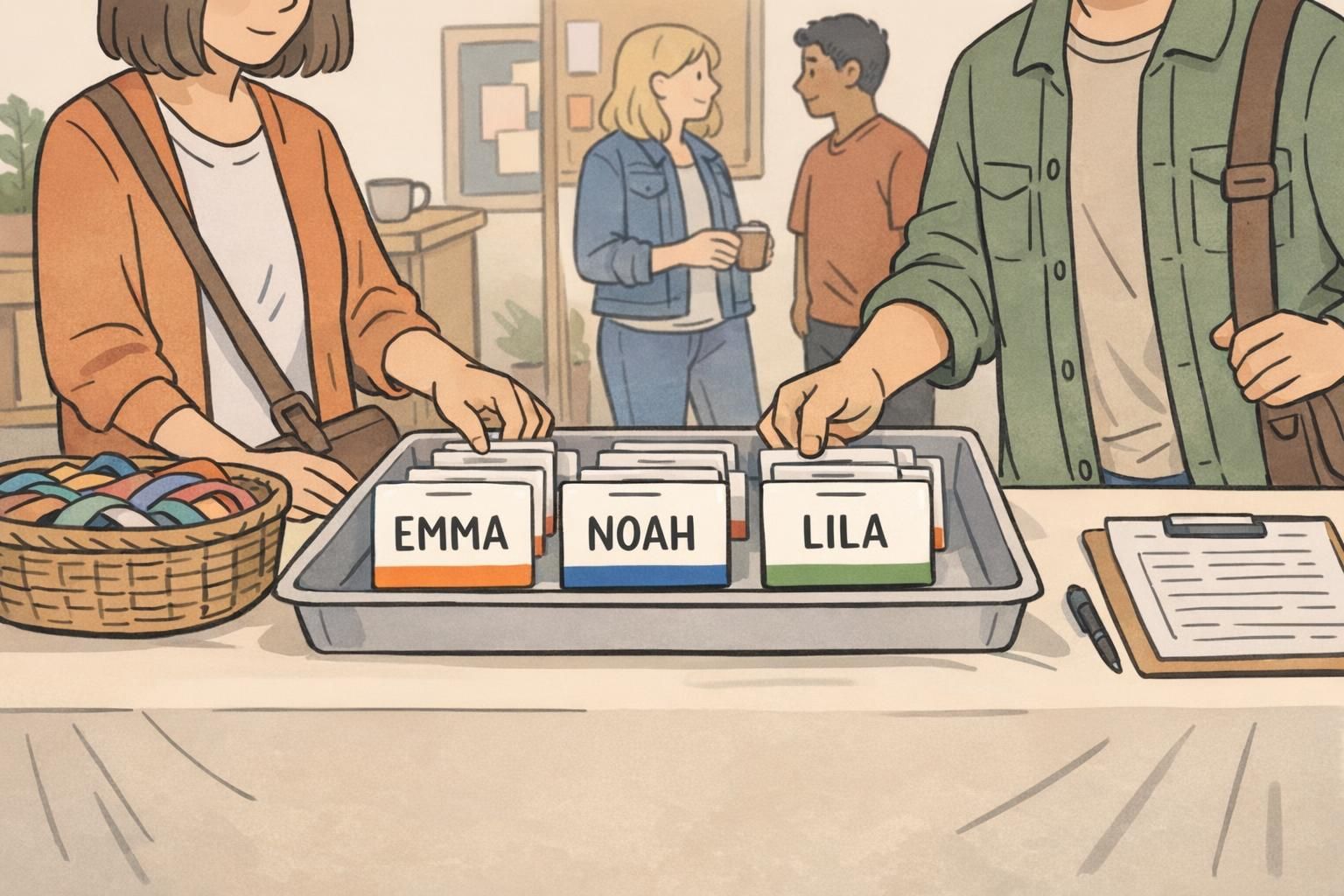
In a crowded room, people don’t read name tags the way they read a webpage. They glance while walking, while holding a drink, or while trying to match a face to a name in a split second. A great event name tag makes that moment easy: the name is obvious, the rest is supportive, and nobody has to lean in or squint.
That’s the idea behind the one-line rule: keep the preferred first name on a single, large, high-contrast line so it wins the visual hierarchy every time. When the name is allowed to be dominant, people can greet each other confidently—without awkward pauses, repeat introductions, or the “Sorry, what was your name again?” loop.
If someone can’t recognize the name at typical conversation distance, the badge is doing extra work—but the attendee is doing the reading.
- Faster greetings: one quick glance is enough to start a conversation.
- Less cognitive load: attendees spend less effort parsing small, competing text.
- More inclusive interactions: clear first names reduce friction for new attendees and nervous networkers.
- Cleaner templates: when the name is protected, all other details naturally become simpler and more consistent.
The One-Line Rule: What Goes on the Big Line (and What Doesn’t)
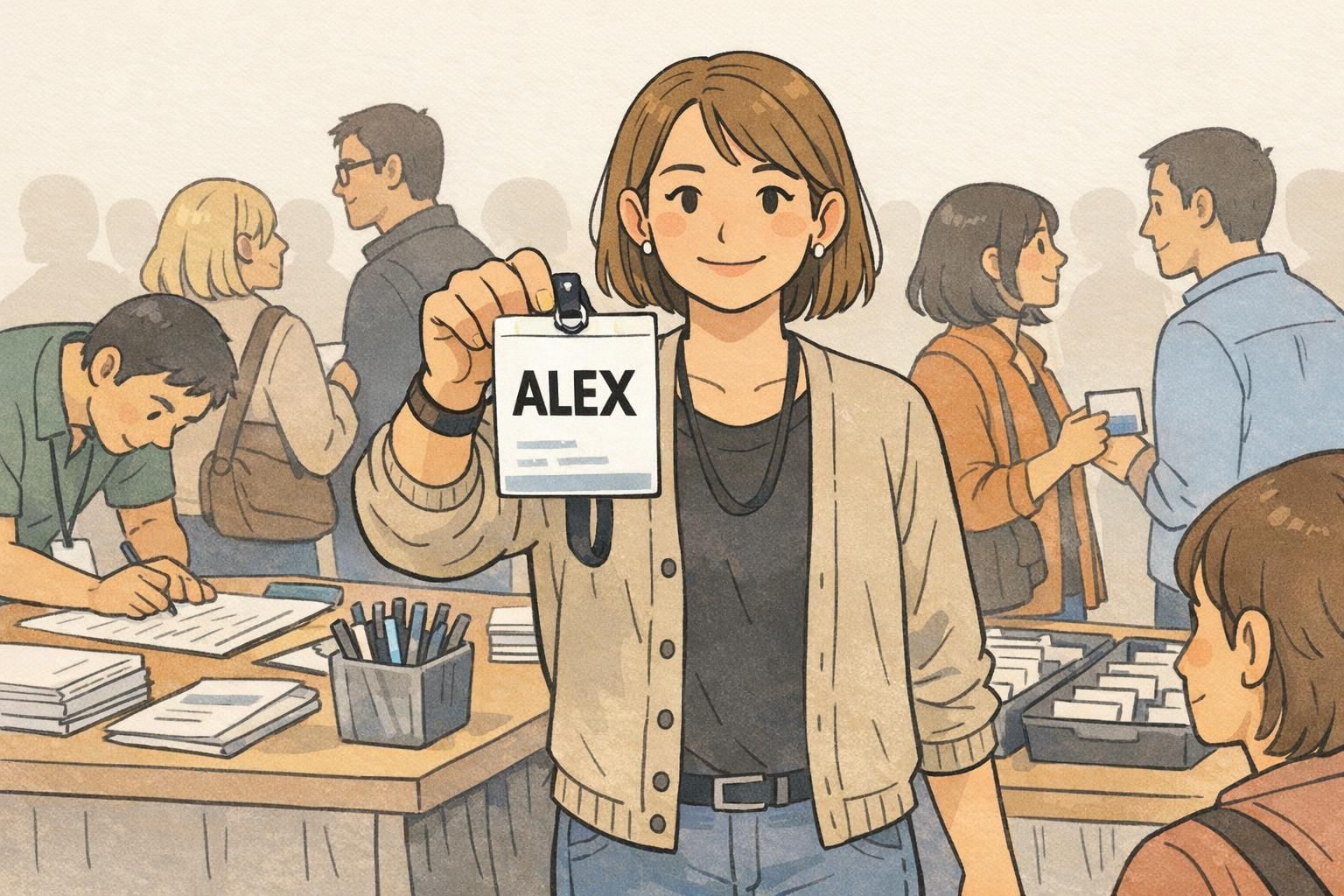
The big line is sacred territory. Whenever possible, put only the preferred first name on that line. Not a headline. Not a bio. Not a mini résumé. Just the name people will say out loud when they greet the wearer.
If you need a bit more specificity, add a last initial in the same large style (for example, “Jordan P.”). This keeps instant recognition intact without turning the primary line into a multi-part identifier.
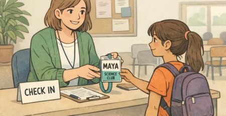
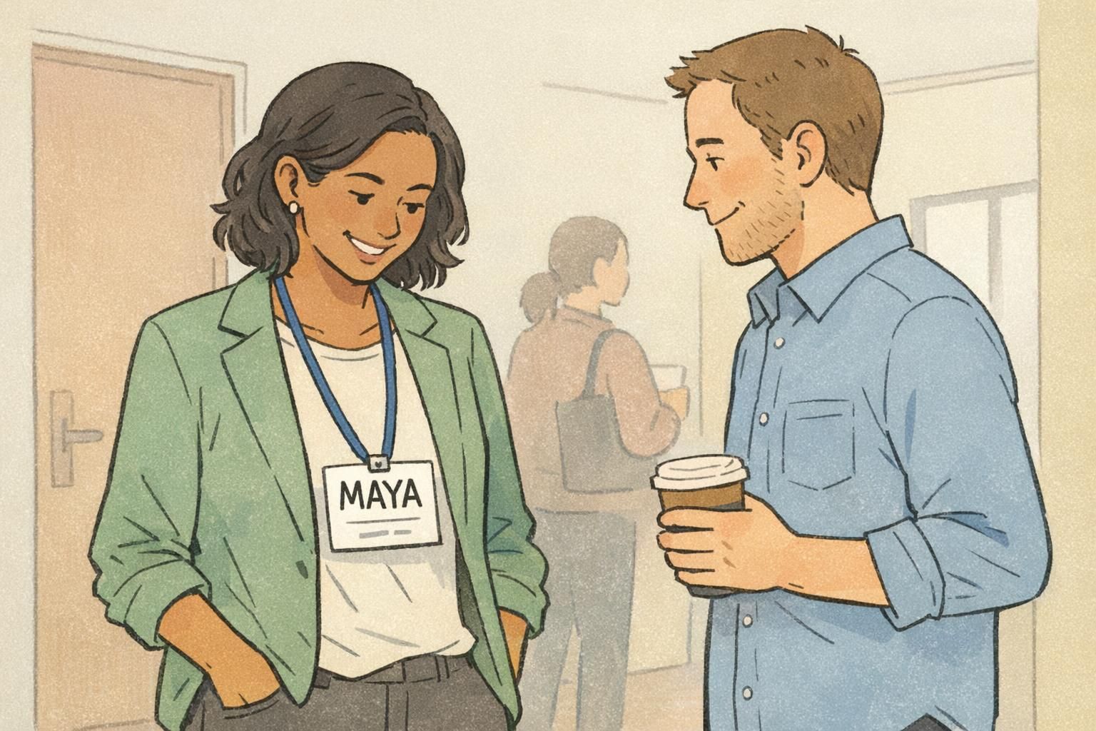
- Best default: Preferred first name only (example: “Maya”)
- If needed: First name + last initial (example: “Jordan P.”)
- If required: Full last name, but treated as secondary (smaller line below or abbreviated)
What doesn’t belong on the big line: job titles, departments, credentials, long taglines, and multiple identifiers stacked together. These details are useful—but only after the name does its job.
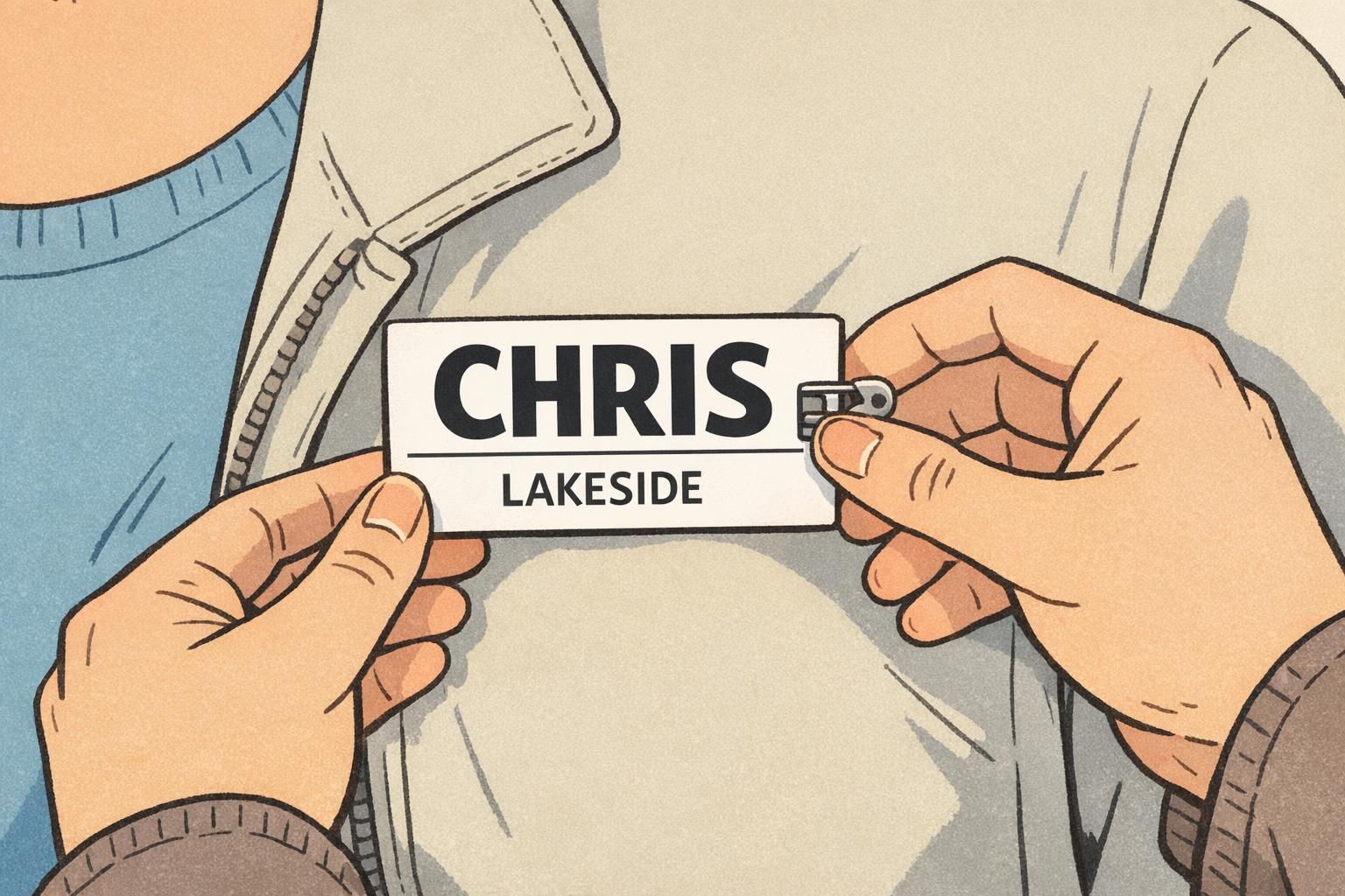
Keep the first name dominant on the large line, then add the last name on a smaller line below (or abbreviate where appropriate). The goal is still instant recognition before details.
Add a last initial to the big line (for quick differentiation) or add a smaller last-name line beneath. Avoid splitting the first name across two lines, because it weakens readability the most.
Size, Font, and Contrast: Quick Legibility Targets for Real Event Conditions
Real events are not ideal reading environments. People move, rooms are dimmer than you expect, and badges tilt, swing, or get partially covered by jackets and hair. That’s why readability comes down to three practical choices: big type, simple letterforms, and strong contrast.
Aim for a name that is very large relative to the badge, set in a clean sans-serif font with comfortable spacing. Dark text on a light background is usually the easiest to read quickly. Keep the background behind the name calm and plain—patterns and busy graphics add noise right where you need clarity most.
As a general readability principle, simpler text presentation improves comprehension and speed of reading, especially when information is scanned quickly. That practical takeaway is supported by broader readability research emphasizing clarity, reduced clutter, and legible presentation (source). For name tags, that translates to: make the name dominant, and keep everything else from competing with it.
- Contrast first: dark text on a light background for the name line
- Font choice: clean sans-serif with clear letter shapes
- Mixed case is often easier to parse than ALL CAPS for full names
- Avoid patterns or logos near/behind the name line
- Leave breathing room: generous margins keep letters from feeling cramped
If you only fix one thing for legibility, fix contrast and clutter around the name line.
Large Name Badge Layouts That Keep Roles and Affiliations Without Clutter
A large name badge gives you the best of both worlds: the preferred first name can stay huge, and you still have space for the context that helps people connect. The key is strict hierarchy—each line has a job, and the name stays in charge.
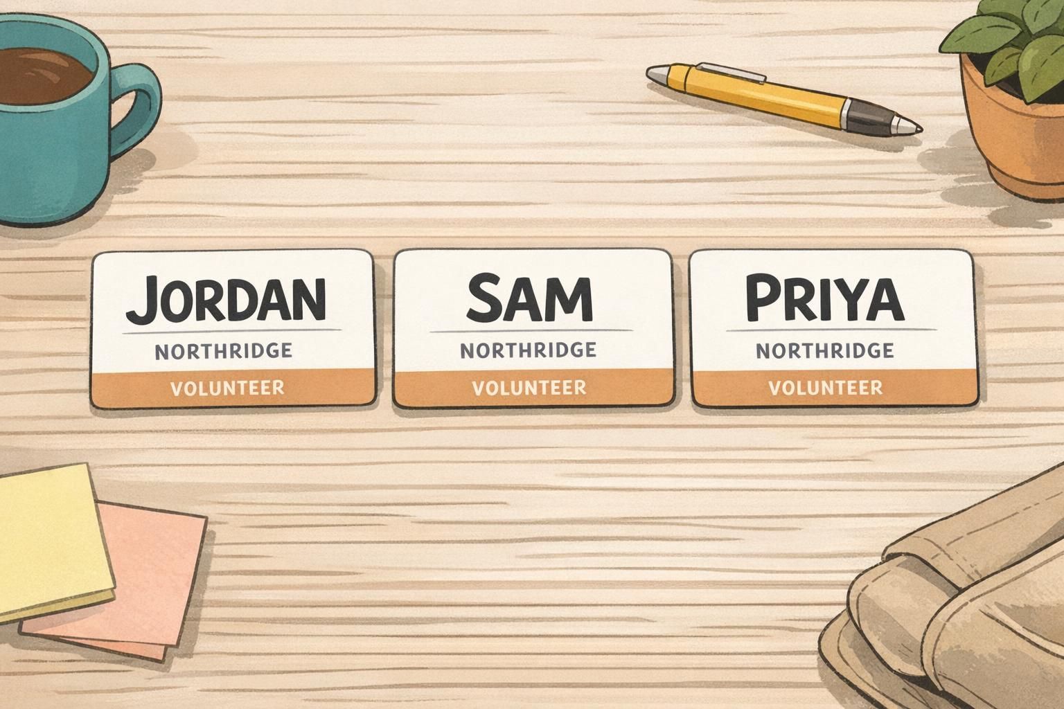
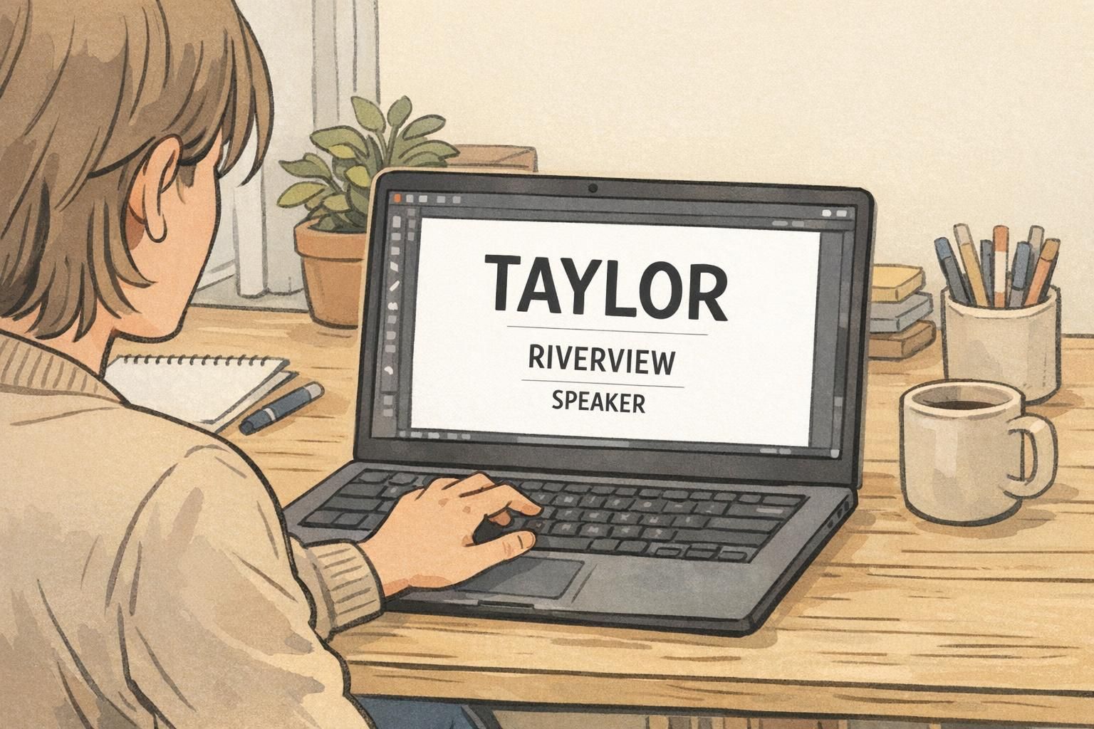
A reliable structure is: Line 1 (largest): preferred name Line 2 (small): company or organization Line 3 (smallest): role, team, location, or optional details
- Line 1: “Priya” (largest, bold, high contrast)
- Line 2: “Northridge” (smaller, regular weight)
- Line 3: “Volunteer” (smallest, subtle but readable)
If roles are important for networking—like “Sponsor,” “Speaker,” or “Volunteer”—a small color bar or icon area can help people identify roles quickly without stealing space from the name. The safest placement is away from the name line (for example, a bottom band or a small corner marker). Avoid placing any color or graphic behind the name itself.
“When we stopped putting job titles on the main line, people actually started using each other’s names. The conversations got warmer immediately.” – Event Coordinator
Three Practical Event Formats (Conference, Trade Show, School/Community)
Different events need different context—but the one-line rule stays the same. Start with a readable name, then add only what helps attendees orient themselves and connect.
Conference format: keep the name dominant and place organization beneath it for networking context. If pronouns are included, put them on a smaller, separate line so they don’t compete with the name. This helps the badge work for quick greetings while still offering respectful, useful detail.
Trade show format: emphasize the name and company. Role can be optional or shown as a subtle label, because booths already signal function and people are scanning quickly. Keeping the company line clear helps attendees remember where they met someone later.
School/community format: use larger names with minimal affiliation. Optional color coding (like a simple bottom bar) can help sort groups such as Staff, Guest, or Volunteer—without shrinking the name or adding extra text that most people won’t read.
- Conference: Name (big) + Organization (small) + Pronouns (optional, separate small line)
- Trade show: Name (big) + Company (small) + Role (optional, subtle)
- School/community: Name (big) + Minimal details + Optional color bar for group
Name Tag Design Checklist: Hierarchy, Spacing, and “No-Extras” Discipline
Good name tag design is less about adding and more about protecting the most important information. Start with the largest name line, then add only what the event truly needs. The more disciplined the template, the more consistent and scannable the room becomes.
- Lock the hierarchy: the preferred first name is the largest element
- Keep the main name on one line (avoid wrapping or squeezing)
- Use generous margins and line spacing for quick parsing
- Place organization and role below the name, smaller and simpler
- Avoid putting logos, patterns, or QR codes near the name line
- If any detail forces the name to shrink, move it lower, abbreviate it, or remove it
- Use consistent templates across attendees to reduce confusion
If your event chooses to include them, keep pronouns in a smaller, separate line so they’re available without competing with the name. The badge should still function instantly for greetings.
Keep it away from the main name line—typically lower on the badge—so it doesn’t force the name to shrink or add visual clutter near the most important text.
Production Choices That Support Readability (Sizes, Materials, and Fast Printing)
Even the best layout can fail if the badge format forces the name to shrink. Production choices—especially size and print clarity—directly affect whether you can keep the name on one large line for every attendee, including those with long organizations or multi-part roles.
If you want consistent one-line names, pick a badge size that gives you enough width for common first names in large type. A larger format often makes the difference between a clean single line and an awkward wrap. Also, choose a finish and print approach that keeps edges crisp under indoor lighting; blurry or low-contrast printing makes even good typography harder to read.
For on-site printing, templates matter as much as equipment. Use a layout that prevents secondary fields (like organization or title) from automatically shrinking the primary name. Planning for check-in realities—last-minute edits, odd characters, long affiliations—helps you keep the one-line rule intact across the whole room.
A readable badge is a system: template + size + print clarity + consistent rules for what gets included.
Product Options: Event Badges and Holders That Fit the One-Line Rule
If you’re aiming for consistent readability at scale, standardized event badges and compatible holders help keep layouts uniform and easy to wear. A larger badge format gives you more room for a dominant name line, and a stable attachment method (lanyard or clip) helps the badge stay front-facing instead of flipping or folding.
If you’re exploring formats that support large text and a clean hierarchy, you can look at custom event badges designed for quick readability and choose a size and holder style that keeps the name line clear.
When the badge stays oriented toward the person you’re speaking with, the big-name-first approach works the way it’s intended: quick recognition first, details second.
Common Mistakes That Shrink Names (and How to Fix Them Fast)
Most readability problems happen for one reason: secondary details are allowed to push the name around. The result is a smaller name, a wrapped name, or a crowded badge that people stop trying to read.
The fastest fixes are usually layout and editing decisions, not full redesigns. Move details to the bottom, abbreviate affiliations, and replace long titles with a small role label. Protect the name line first, then decide what still fits.
- Mistake: The name wraps onto two lines. Fix: Increase badge width/usable name area, shorten the main line to first name (or first + last initial), and move last name to a smaller line.
- Mistake: A long job title steals space from the name. Fix: Convert the title into a short role label (e.g., “Speaker,” “Sponsor,” “Staff”) or move it to the smallest line.
- Mistake: Multiple logos crowd the top. Fix: Use one small logo away from the name line, or place branding in a corner or bottom band.
- Mistake: A large QR code sits near the name. Fix: Move it lower or to the side, and keep clear whitespace around the name.
- Mistake: People edit templates inconsistently. Fix: Lock the template rules so individual changes don’t break hierarchy.
Abbreviate the organization, move it to a smaller line, or use a recognized short name. If the organization can’t be shortened, prioritize keeping the first name readable and let the organization line wrap instead.
Remove or shorten the longest secondary field (often titles or taglines), then re-center the remaining lines with more whitespace. Protecting the one-line name usually delivers the biggest improvement immediately.