Accessible ID Badge Design: Higher Contrast and Larger Names Without Starting Over
Why an accessible ID badge helps everyone (not just a few people)
An accessible ID badge is one of those small design choices that quietly improves a whole environment. When names and roles are easy to read at a glance, interactions move faster, mistakes drop, and people feel more confident approaching the right person—whether that’s a new employee on day one, a vendor arriving for a scheduled appointment, or a conference attendee navigating a busy hallway.
Accessibility isn’t only about supporting people with low vision or color-vision differences (though it absolutely matters there). It also helps in everyday “real life” conditions: poor lighting, glare from overhead fixtures, people walking past quickly, name tags that swing on lanyards, and moments when someone is juggling a coffee, a laptop, and a conversation.
The goal is clarity and inclusion without a full rebrand. Most teams can improve readability by changing hierarchy (what’s biggest), contrast (what stands out), and a few typography defaults—while keeping the same overall template.
Make names bigger with minimal layout changes
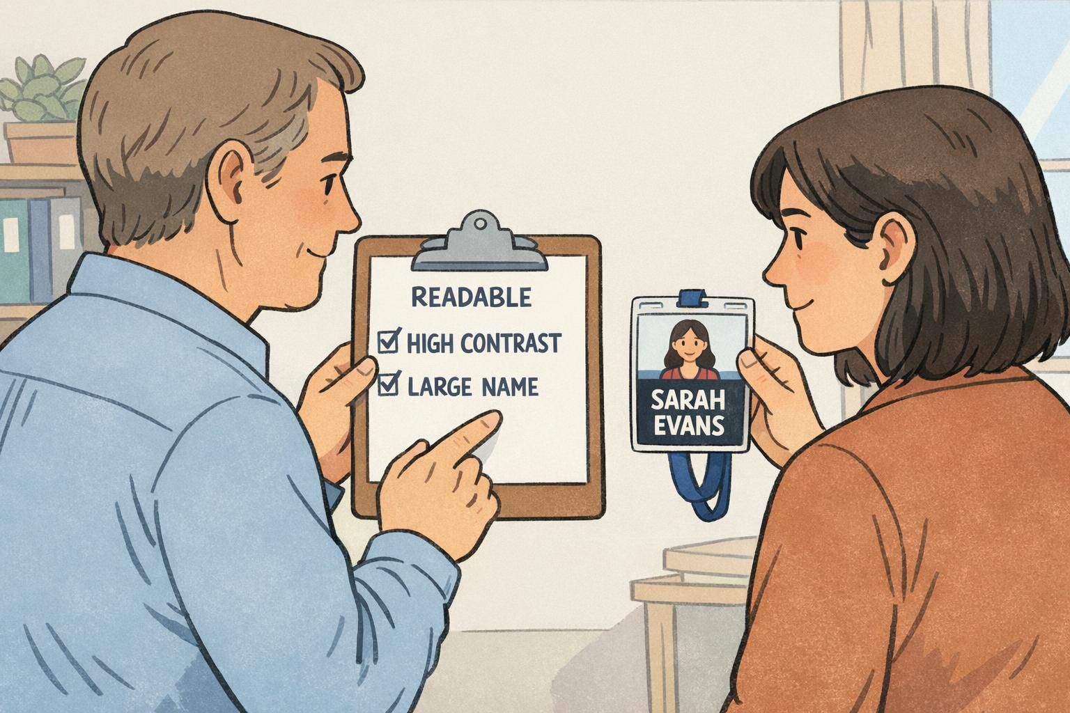
If you only change one thing, make the person’s name the most prominent element. In many workplaces and events, the name is the primary piece of information people need in the first two seconds of an interaction. Everything else supports that moment.
The simplest way to get there is to reallocate space rather than redesign the badge. That usually means shrinking or relocating lower-priority items (like building address lines, internal codes, or long department strings) so the name line can breathe.
- Start with a clear hierarchy: large name, medium role/department, smaller organization/location.
- Reduce low-value lines: if the badge has 5–6 text lines, ask which one can be removed or moved to the back.
- Shorten fields instead of shrinking type: “Customer Experience” may become “CX,” or “Information Technology Support” may become “IT Support.”
- Keep margins generous: bigger type needs whitespace to stay readable at a glance.
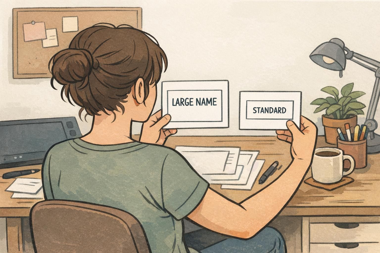
If you want a large print badge option without rebuilding artwork, create a “Large Name” variant that uses the same template style but fewer lines. Common approaches include limiting the role field to one line, moving secondary details to the back, or using a predictable two-size typography system (for example: name size scales up, supporting text stays consistent).
Choose high-contrast color pairs (and avoid busy backgrounds)
Contrast does a lot of the heavy lifting for readability. Even if you keep your brand palette, reserve your strongest light–dark contrast for the name line and any access-critical information. A readable badge is often less about “more color” and more about clearer separation between text and background.
Avoid putting patterns, photos, or gradients behind critical text. If you want a brand element, consider a logo in a corner, a clean color band, or a subtle background shape that never competes with the name. Many badges look fine on-screen but lose legibility in the real world due to printing variation, glare, and motion.
Research and practical low-vision guidance consistently show that stronger contrast and clear letterforms improve legibility, and that “standard” choices are not always sufficient without thoughtful design decisions (source).
- Use a simple light background with dark text, or a dark background with light text, for the name line.
- Keep department or group accents secondary, so they don’t overpower the name.
- Confirm the badge still works in grayscale (a quick way to test if contrast is doing the work).
- If you must place text over a color block, choose solid fills—avoid texture behind letters.
Readable name tag typography: fonts, weight, spacing, and casing
A readable name tag depends on typography choices that hold up at small sizes, at a distance, and under less-than-perfect lighting. Most of the time, simple sans-serif fonts with adequate weight are the safest option, because letter shapes stay clean when printed and viewed quickly.
Small changes can make a big difference. Thin strokes can disappear, condensed styles can blur letters together, and tight spacing can make names harder to parse—especially when badges are moving on a lanyard.
- Choose a simple sans-serif font that prints cleanly; avoid decorative styles for names.
- Use sufficient weight (regular to bold) so strokes don’t break up in print.
- Keep letter spacing normal; don’t compress names to “make them fit.”
- Increase line spacing slightly so the role/department doesn’t crowd the name.
- Prefer Title Case for names when possible; avoid ALL CAPS for long names because letter shapes become harder to recognize quickly.
“When we stopped squeezing long names into narrow fonts and gave the name line real space, hallway introductions got noticeably smoother.” – Workplace Administrator

Use more than color to show roles, access, or groups
Badges often need to do more than show a name. They may indicate role, access level, attendee type, or team. The accessibility issue is that color alone isn’t reliable—some people won’t distinguish certain colors, and even people with typical color vision can struggle under poor lighting or when badges are partially covered by holders or motion.
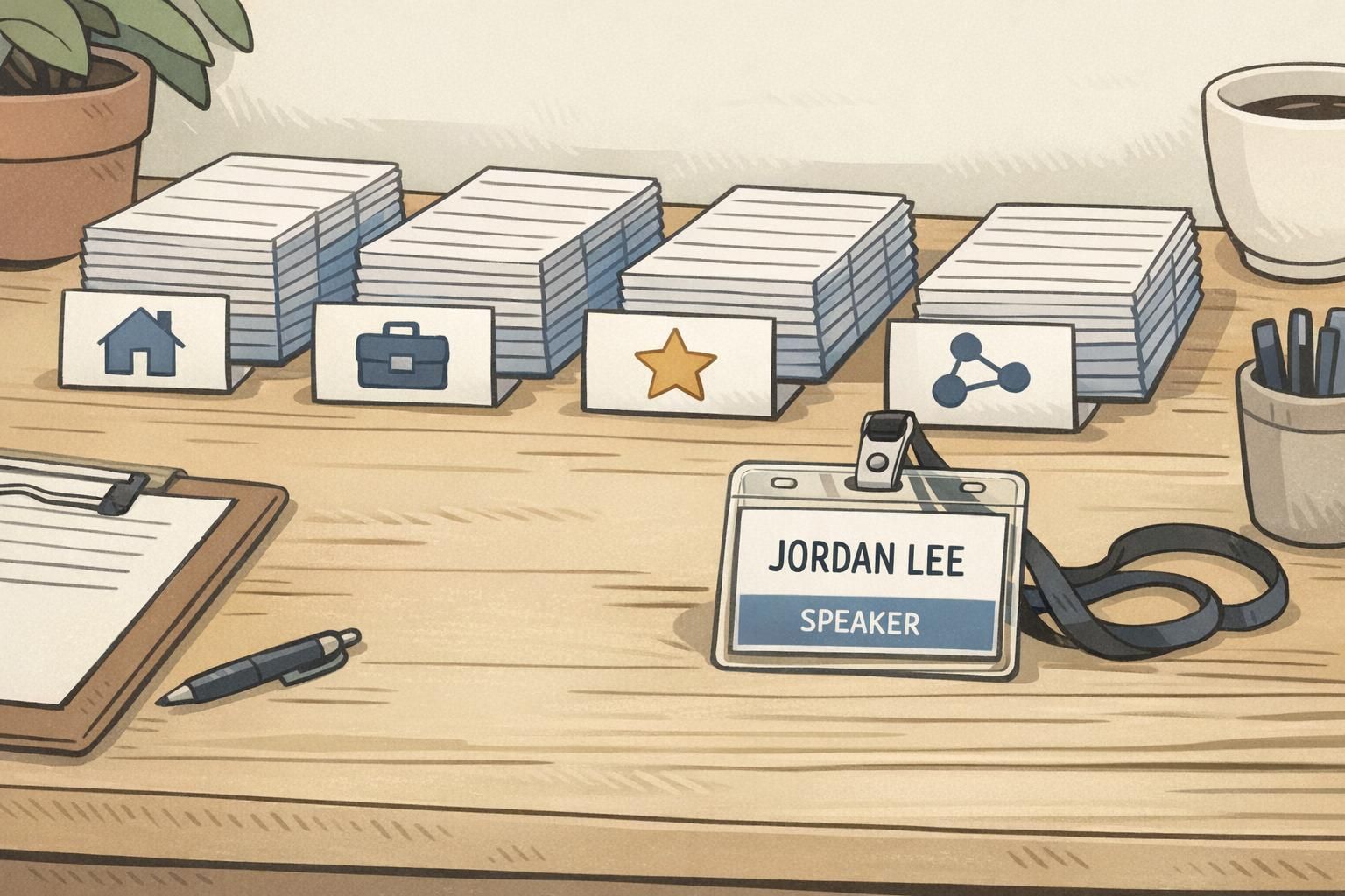
A practical solution that doesn’t require a new layout is to define one consistent “role band” area and encode meaning with both color and another signal: a short label, an icon, or a distinct shape block. That way, a badge is still interpretable even if someone can’t see the color clearly.
- Pair color with a short label (e.g., “STAFF,” “VISITOR,” “SPEAKER”).
- Add an icon for quick scanning (for example, a simple mic icon for speakers).
- Use consistent placement: if the role band is always in the same spot, people learn it quickly.
- Keep labels short and high-contrast so they don’t compete with the name.
Accessible defaults you can apply across templates (a quick standard)
The easiest way to keep accessibility from becoming a special request is to set accessibility-first defaults in your standard templates. This reduces one-off edits, improves consistency across departments, and makes badges easier to scan in busy environments.
A good “quick standard” is not a long rulebook—it’s a short set of template rules that your team can apply across ID cards, name tags, event badges, and badge buddies without constantly rethinking the layout.
- Name is always the most prominent element on the front.
- Highest contrast is reserved for key text (name and access-critical identifiers).
- Nonessential details are reduced, moved to the back, or removed.
- Limit the number of type sizes (for example: name, supporting text, small notes).
- Use consistent alignment and predictable placement to reduce scanning effort.
- Provide a large print badge variant using the same template system.
Consistency is an accessibility feature. When every badge follows the same hierarchy, people don’t have to “hunt” for names or roles.
Printing and materials that protect readability in the real world
Even a well-designed badge can fail if glare, smudging, or low-quality printing reduces contrast. In practice, readability depends on what happens after design: how the badge is printed, what it’s protected with, and the lighting conditions where it’s worn.
If badges will be used in high-visibility environments (busy lobbies, bright overhead lights, outdoor check-in, or reflective hallways), it’s worth selecting materials and holders that keep text crisp and reduce reflections.
- Consider matte/silk finishes when glare is a recurring problem.
- Test a printed sample under typical lighting (not just in a design proof).
- If badges are on lanyards, confirm the holder size and orientation keep names upright.
- Avoid placing critical text where clips, slot punches, or holder edges may cover it.
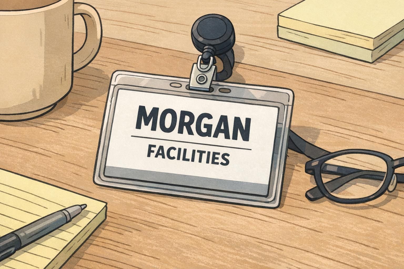
How BadgeZoo can help you standardize accessible badge templates at scale
When you issue identification across multiple departments, locations, or event types, standardization matters. A small set of accessibility-first templates—such as a standard layout plus a large-name variant—helps teams order consistently and reduces the need to rebuild artwork each time details change.
BadgeZoo produces custom ID badges, which can be a practical fit when you want consistent templates that still allow field changes (like name length, role labels, or department markers) without redesigning from scratch. If you’re unsure how to structure a “Large Name” variant or simplify fields for readability, you can also reach out with questions or custom requests at http://badgezoo.com/contact.
Scaling accessibility is often about designing two or three templates that cover most real-world cases—rather than creating separate designs for every edge case.
A fast accessibility check before you place your next order
Before you commit to a full run, do a quick test at actual size. On-screen proofs can be misleading because screens are backlit and zoomable—printed badges are not. A simple hallway test can reveal what needs adjustment immediately.
- Print a test sheet at actual badge size and cut out a few samples.
- Confirm the name is readable from typical interaction distance (a few feet).
- Check contrast for the name line and role label; ensure no key text sits on a busy background.
- View the design in grayscale to confirm color isn’t doing all the work.
- Ask a few people to read names quickly in a hallway setting and note misreads or hesitation.
- Adjust your template defaults (type size, spacing, contrast, field length) rather than creating one-off fixes.
Usually no. Most improvements come from increasing the name’s visual priority, using higher contrast for key text, and simplifying or relocating secondary details.
Keep the same layout system, but create a “Large Name” variant that limits optional fields and uses a predictable two-size typography approach so long names and short names both stay readable.
Use a consistent role band and pair color with a short word label and/or an icon. This keeps categories clear even for color-vision differences or poor lighting.