Multi location ID Design: One Brand, Local Details That Stay Consistent
Why multi location ID design needs both consistency and local clarity
A multi location ID program has two jobs at once: make your organization recognizable everywhere, and make the specific site information unmistakable in the moment. When those goals aren’t balanced, small issues add up fast—front desks hesitate, visitors get misrouted, transfers show up with the “wrong-looking” badge, and security staff lose confidence in what they’re seeing. The most effective approach is to keep the core badge familiar across every region (so people immediately recognize “this is our company”), while reserving a clearly defined area for local details (so people can confirm “this is the right site”). That combination reduces friction during onboarding, supports a professional workplace experience, and helps employees move between locations without feeling like they’re entering a different organization. The key is repeatability: a badge that looks like the same brand everywhere, with local information that’s obvious, accurate, and consistently placed.
Goal: make the badge instantly recognizable as one organization, while making site-specific information easy to scan in a busy, real-world environment.
- Consistency reduces confusion: one familiar layout across all sites
- Local clarity improves speed: site info is visible without close inspection
- A repeatable system scales: new sites don’t require a redesign from scratch
- Standard placement supports trust: staff learn where to look, every time
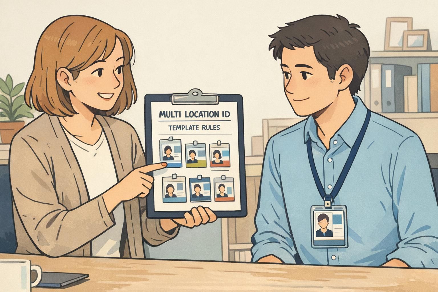
Define the non-negotiables: your core brand “kit of parts” for IDs
Before you decide what can vary by location, decide what must stay the same. Think of your ID as a modular brand “kit of parts”: a stable set of elements that never change, plus controlled areas where local information can be swapped in without changing the overall look. This is where many multi-site programs accidentally drift. If each location “makes a few tweaks” for readability or preference, you quickly end up with multiple versions of the brand—different logo sizes, different fonts, different photo crops, different name placement. The badges still function, but the organization no longer looks unified. Strong multi-site brand systems typically rely on a consistent core with structured flexibility, which is why modular rules work well for ID cards and templates source. In practical terms, that means you define the unchanging pieces once, document them clearly, and then let locations only edit the fields you intentionally designed to be editable.
- Logo: fixed placement, clear-space rules, and minimum size
- Core colors: a defined palette (including contrast-safe text colors)
- Typefaces: one or two fonts, with set weights (avoid ad-hoc substitutions)
- Photo placement: consistent size, aspect ratio, and crop guidance
- Hierarchy: name prominence, then role/department (if used), then local details
- Card orientation and margins: locked so layouts don’t “creep” over time
“When every site uses the same core layout, staff stop ‘studying’ badges. They just scan the same spots every time—and that’s exactly what you want.” – Facilities Operations Lead
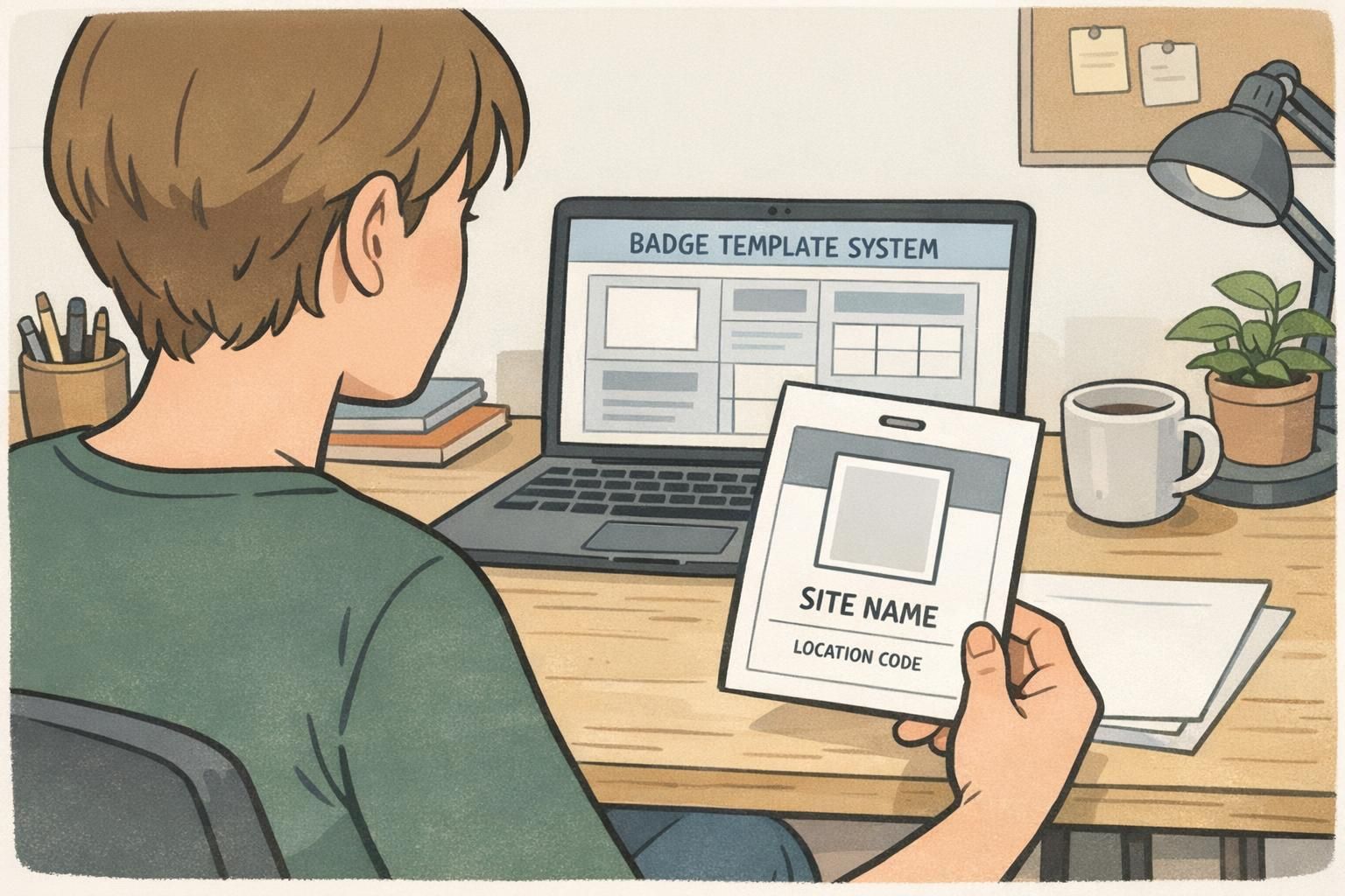
Build a badge template system that scales to dozens (or hundreds) of sites
Once your non-negotiables are defined, you can turn them into a badge template system: a set of master layouts that standardize design decisions and allow only approved fields to change. This is the simplest way to scale without relying on every location to be “good at design.” A practical model is a master template plus controlled variants. The master template locks layout, spacing, alignment, font sizing, and brand elements. The variants (or toggles) populate site name, location code, address line (if needed), and access indicators—without letting a local user move elements around. If you expect growth, build for it now. What works for three sites can become fragile at thirty. A template system stays stable when it treats local edits like data entry, not redesign.
- Lock the grid: margins, alignment, and baseline spacing should never change
- Standardize font sizes: set sizes for name, role, and local details
- Restrict editable fields: treat site and code like form inputs
- Create a variant method: either one template with toggles or a small set of controlled location variants
- Keep a “do not edit” note in your internal documentation for brand elements and spacing
A scalable template makes local updates safe: sites can change the correct details without unintentionally breaking readability or brand consistency.
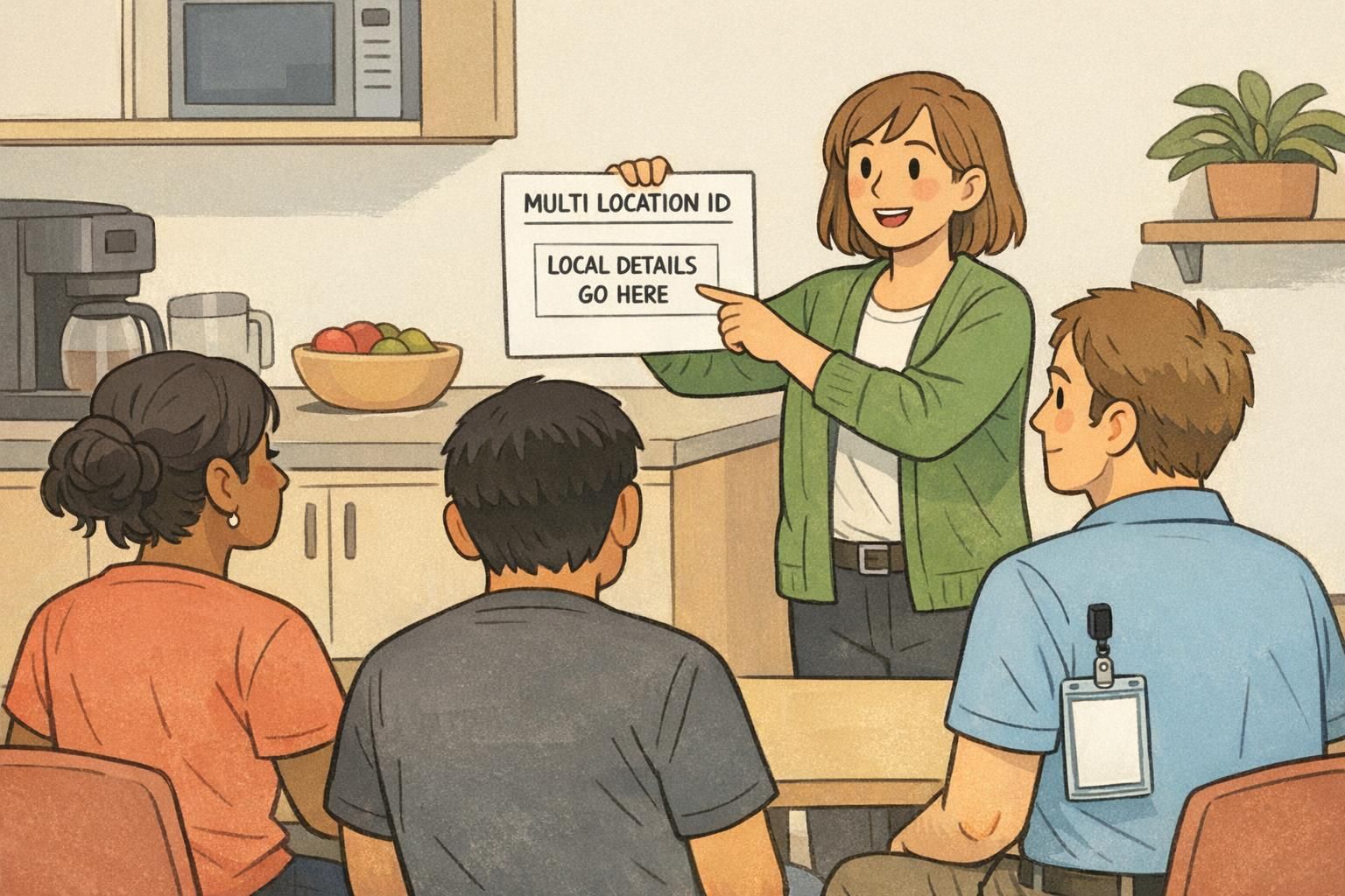
Local details to include: site name, codes, and wayfinding-friendly cues
Local fields should earn their place on the card. The best site details are the ones people actually use during day-to-day interactions: confirming you’re at the correct building, routing visitors, and making quick handoffs between departments. A simple, high-clarity set is usually enough: site name (or campus), city/state (if your sites share similar names), and a short location code that staff can confirm verbally. The trick is not just what you include, but where you place it. Put local details in one consistent zone on the badge—then never move that zone. Over time, employees learn exactly where to look even in busy, high-traffic spaces. Wayfinding-friendly cues can also help—like an icon set or a small label that indicates building or wing—so long as it stays controlled and doesn’t compete with the employee’s name and photo.
- Site name: the primary local identifier (keep it short and recognizable)
- City/state or region: helpful when sites share similar names
- Location code: short, unique, and easy to pronounce
- Optional wayfinding cue: building/wing indicator if it solves real routing problems
- Consistency rule: local details always appear in the same badge area, in the same order
Usually only if it solves a real operational need (like deliveries or campus routing). For most workplaces, site name plus city/state and a location code provide faster, cleaner scanning.
Place it in a consistent, easy-to-find zone (often near the site name), using a readable size and high contrast so it can be confirmed quickly.

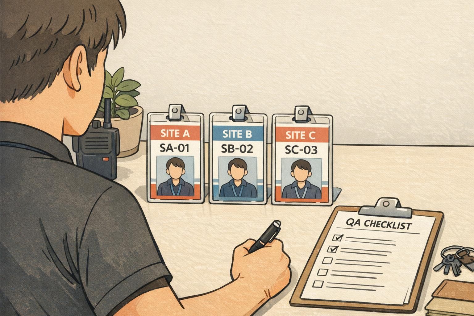
Location codes that stay consistent: naming rules, governance, and change control
Location codes are small, but they carry a lot of operational weight. If codes are inconsistent, duplicated, or change informally, you’ll see confusion across departments, mismatched records, and badge reprints that don’t match current standards. To keep codes consistent, treat them like a controlled naming system. Define a simple standard, assign an owner, and create lightweight change control. The goal is not bureaucracy—it’s preventing avoidable ambiguity as your organization grows, reorganizes, or adds new buildings. Most organizations do well with codes that are short, unique, and pronounceable. The more a code behaves like everyday language (rather than a long numeric string), the more likely staff are to use it correctly.
- Format rule: choose a consistent structure (example: ABC-01 or AB-001) and stick to it
- Uniqueness rule: no duplicates, even across regions
- Pronounceability rule: avoid confusing characters if staff need to say it out loud
- Ownership: assign one group (often HR, Security, or Operations) to maintain the official list
- Change control: define when codes change (new building, merger, relocation) and how old codes are retired
- Single source of truth: maintain the master list in one place that all sites and vendors reference
A good location code is less about “encoding everything” and more about enabling fast, unambiguous confirmation in real conversations.
Employee ID design tips for readability across roles, lighting, and distance
Great employee ID design is about recognition speed. In real workplaces, badges are viewed in mixed lighting, from different angles, and often from a few feet away. If the badge looks clean on a screen but isn’t legible in a hallway or at a front desk, it’s not doing its job. Prioritize the fundamentals: a clear, well-cropped photo; a large name line; and a readable hierarchy that doesn’t force people to hunt for the important parts. Then, if you add optional fields—department, credentials, pronouns, shift—make sure they sit below the name in importance and don’t crowd the local details. When your organization is multi-site, readability also means predictability. If the name is always in the same place, the photo is always the same size, and the site info is always in the same zone, staff can scan quickly regardless of where they’re working.
- Use strong contrast: dark text on light background (or vice versa) for fast reading
- Avoid thin fonts: choose weights that stay legible under glare and motion
- Test at distance: check the name and site details from a few feet away
- Keep the name prominent: make it the largest text element after the photo
- Standardize photo rules: consistent crop (head and shoulders), consistent framing, no extreme shadows
- Control optional fields: add them only if they support a real workflow, and keep them visually secondary
Include role or department when it helps others route questions or confirm access needs. If it changes frequently or creates clutter, consider keeping it in your system records instead.
Overcrowding. Too many fields compete with the photo, name, and site info—slowing recognition and increasing errors.
Use role tiers and badge buddies without redesigning every location’s badge
Many organizations need quick, visual role identification: employee vs. contractor vs. visitor, or clinical staff vs. support staff, or different access tiers. The common mistake is creating a new badge design for every role at every location. That approach doesn’t scale—and it undermines the “one brand” benefit you worked to establish. Instead, keep the main badge consistent and add role cues in a standardized layer. That might be a color band, a simple icon set, or an add-on accessory that communicates tier or access at a glance. The advantage is that your core badge stays stable across the entire organization, while role-based visibility remains flexible. A popular option is using badge buddies as a standardized backing card. They let you add bold, role-specific cues without forcing every site to maintain multiple badge layouts. If you go this route, standardize the buddy size and the placement relative to the ID so the overall system remains predictable everywhere.
- Keep one main ID layout for the whole organization
- Assign role tiers to a small set of clear visual cues (colors/icons/labels)
- Standardize tier meanings across all sites (so “green” doesn’t mean different things)
- Use add-on layers for fast identification instead of redesigning the badge per role per site
- Document how role cues interact with local details so nothing important gets obscured

Operational checklist: printing, reprints, and keeping data accurate across locations
Even the best design fails if operations are inconsistent. Multi-site programs need clear decisions about what’s controlled centrally and what’s handled locally. In general, template control and standards should be centralized, while day-to-day issuance may be local—provided local teams can only edit approved fields. Reprints are where errors often creep in: a transferred employee keeps the old site name, a temporary assignment isn’t reflected, or a new location code gets typed incorrectly. A simple workflow and a short QA step reduce those mistakes and save time. If your organization uses on-site printers at some locations, consider card backgrounds that support customer overprinting so the same branded base can be used while local data is printed consistently. For questions about ID card formats or multi-site ordering logistics, teams can also contact BadgeZoo at http://badgezoo.com/contact.
- Decide central vs. local responsibilities (template ownership, approvals, issuance)
- Standardize data entry fields (site name and location code pulled from the official list)
- Set photo standards (lighting, background, crop guidance)
- Restrict editing permissions (local sites can’t move brand elements or change fonts)
- Define transfer and temporary assignment rules (when to reissue vs. when to add a temporary indicator)
- Create a reprint checklist (spelling, code, photo crop, expiration date, correct template variant)
Treat local badge production like a controlled process: sites should be able to issue quickly, but not improvise the design.
Quality control: how to evaluate consistency and local relevance over time
Multi-site ID programs don’t usually “break” all at once—they drift. A new location adds a slightly different layout. A department starts abbreviating names differently. A site changes font sizing to fit longer titles. After a year, you have multiple mini-standards. Quality control doesn’t have to be heavy. A simple audit process—sampling badges from different sites and comparing them to your standard—keeps the system healthy. Evaluate three areas: brand consistency (does it look like the same organization?), local relevance (is site info clear and correct?), and functional performance (is it fast to scan, durable, and readable in real lighting?). If you find recurring issues, update the template system and documentation rather than letting each site create a one-off fix. That way, improvements benefit everyone and your ID system stays unified as you grow.
- Audit frequency: run periodic spot checks across a sample of locations
- Consistency check: logo, fonts, photo size, and layout match the standard
- Local clarity check: site name and location code are correct and placed consistently
- Readability check: name and key fields are legible at a few feet away
- Drift prevention: document fixes and update templates rather than allowing one-off local changes
“A quick quarterly sample audit saved us from ending up with five different badge styles. We caught drift early and corrected it in the template.” – Security Coordinator