Vertical ID Badge vs Landscape: Picking the Right Orientation
Why vertical ID badge vs. landscape is more than a design preference
Choosing a vertical ID badge or a landscape layout isn’t just about what looks nicer on a template. It changes how fast someone can read a name, match a face to a photo, and confirm key details in a quick glance—exactly what workplace identification is meant to support. Orientation also affects what “fits” without becoming cramped. A badge usually needs at least a photo, a name, and one or two supporting elements (like a department, role label, or scannable code). In portrait, these elements naturally stack. In landscape, they tend to sit side-by-side or run in a wide header band. Either can work well, but each pushes your layout toward different tradeoffs. The most practical way to decide is to think about real-life use: Where will the badge sit on the body? Will it hang on a lanyard or stay fixed on a clip or reel? Is it mostly for recognition across a room, or for frequent presentation to a door reader or check-in staff? This guide compares portrait and landscape options for offices, schools, and events, with a focus on readability and everyday wear.
A good badge orientation makes the name and photo easy to find first, with supporting details (role, department, code) clearly secondary.
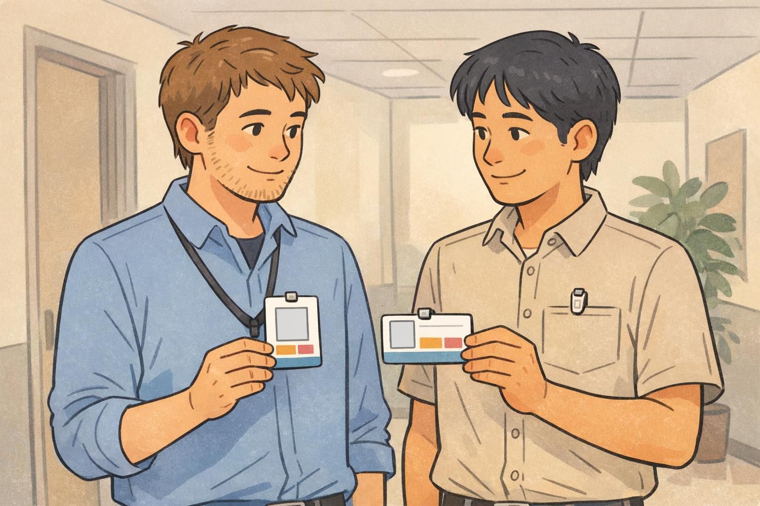
Portrait vs. landscape: what changes for readability and photo placement
Portrait (vertical) layouts usually support a clean, top-to-bottom hierarchy. A common pattern is photo at the top, a large name in the center, then role/department beneath. That structure helps the eye land on the most important information quickly—especially when the badge is hanging mid-chest on a lanyard. Landscape (horizontal) layouts can make different priorities easier. If you have long names, long job titles, or wide logos, the extra width can keep key text on one line and give branding room without squeezing the name smaller. In both orientations, readability depends more on layout discipline than on style choices. The best designs are simple, high-contrast, and spaced so information doesn’t blur together during real-world use (walking by in a hallway, meeting someone at a counter, or checking in at an event).
- Keep the name as the largest text element so it can be read quickly.
- Use strong contrast (dark text on a light background, or the reverse) and avoid busy background patterns behind text.
- Give the photo enough size to be recognizable at a glance; avoid shrinking it to make room for extras.
- Limit “supporting” fields to what people actually use (role, department, school/grade, affiliation).
- Leave breathing room around barcodes or QR codes so scanners can capture them without obstruction.
Not always. Portrait often wins for photo-first identification on lanyards, while landscape can be easier for long names or wide headers. The best choice is the one that keeps the name and photo largest and clearest for your wear method.
Yes. The physical card size stays the same; orientation is about how you arrange the printed layout and how the card is presented in holders or attached to clips and reels.
When a portrait layout works best in offices, schools, and events
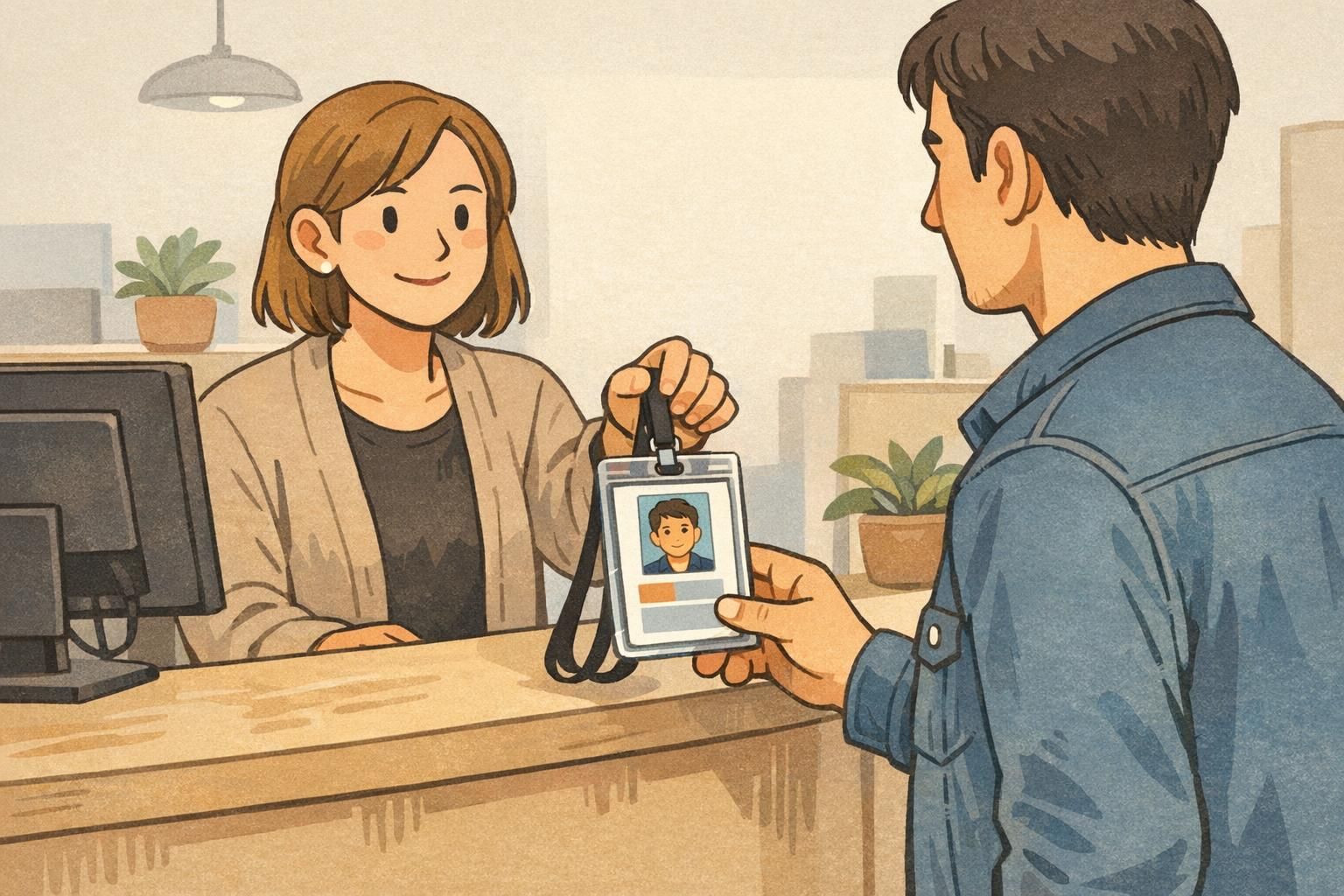
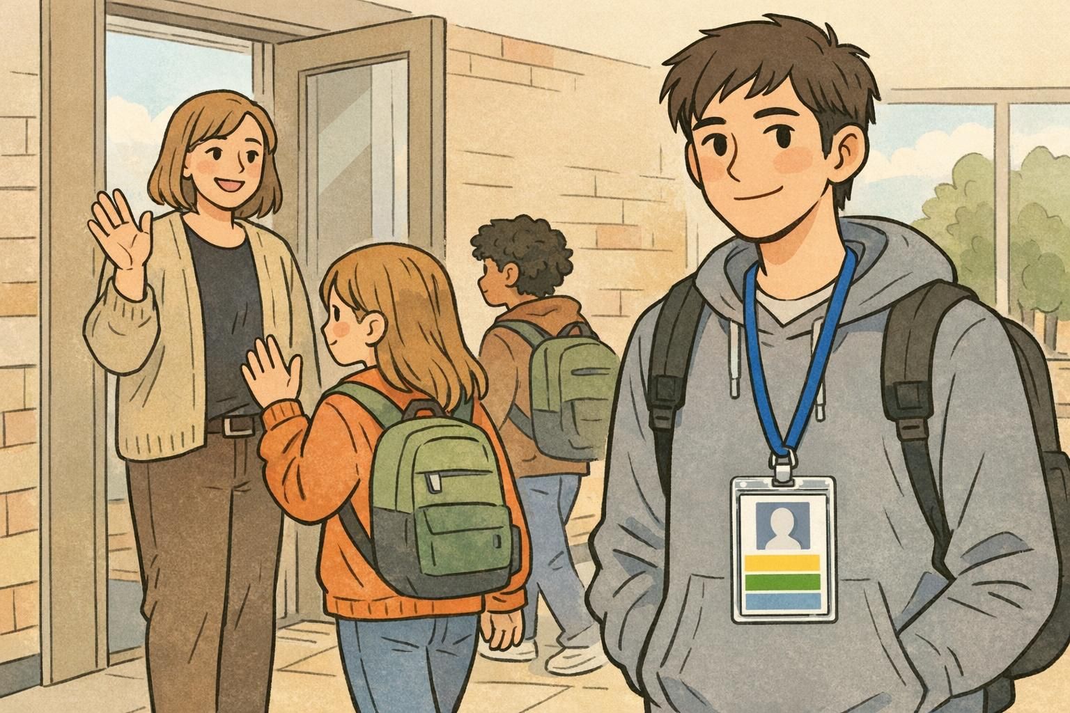
Portrait is a common default for a reason: it matches how a badge naturally hangs from a lanyard. When the badge falls straight, a vertical layout reads top-to-bottom without needing to tilt your head or rotate the badge. In offices, a portrait layout often supports “person-first” recognition. The photo is prominent, the name sits front and center, and the supporting details (like department) can remain legible without competing. In schools, portrait can help supervisors quickly match faces to names during busy moments like arrivals, lunch transitions, and hallway monitoring. A large, centered name with a clear student/staff identifier below is a practical, familiar pattern. For events, portrait tends to excel when you need a stacked structure: name, affiliation, and a role label (Speaker, Staff, Exhibitor) that is easy to spot without shrinking the name.
“If the badge is going on a lanyard, portrait usually reads the way people expect: photo first, name second, role third—without twisting the design to fit.” – Event Operations Lead
When a landscape layout works best (and stays stable on clips and reels)
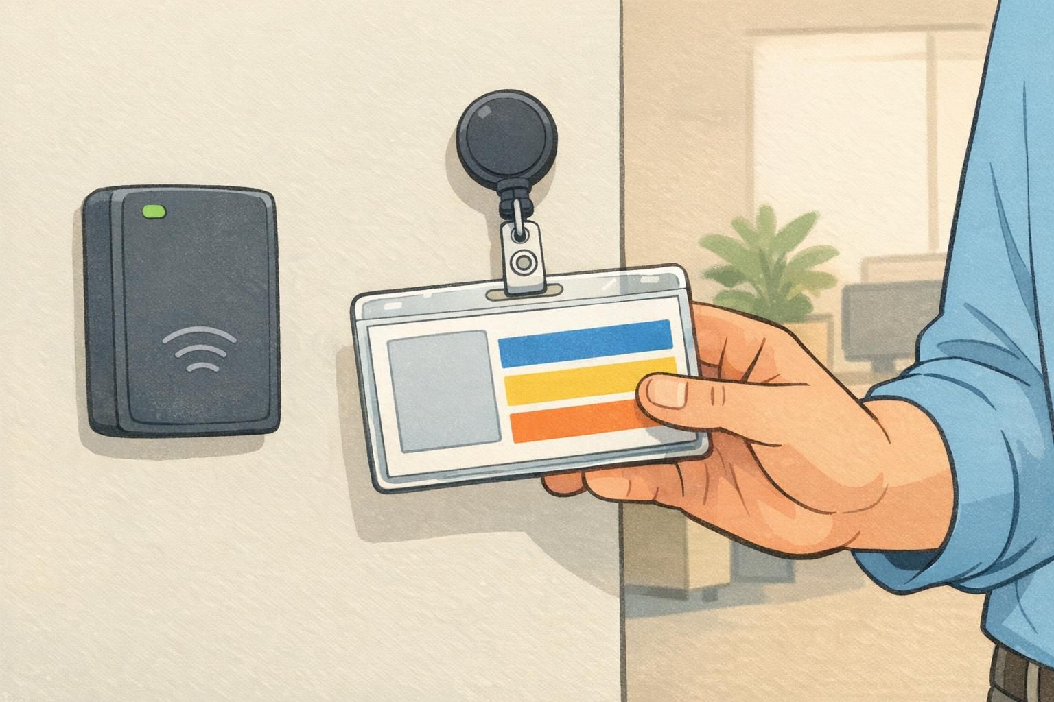
A horizontal ID badge can feel more natural when the card is clipped to clothing or attached to a retractable reel. Because the card is wider than it is tall, it often resists twisting and sideways hanging—especially when it’s secured near the top edge in a horizontal holder. Landscape is also useful when your design needs a wide header area. For example, a company logo that is naturally wide, a sponsor band for events, or a department strip that must be highly visible can sit comfortably across the top without compressing the name. If your environment involves frequent badge presentation—tapping in at doors, showing a badge at a security checkpoint, or scanning at a check-in station—landscape can be convenient because it’s easy to grip, hold flat, and align to readers.
- Choose landscape when badges are mostly clipped or used on retractable reels.
- Consider landscape when long names or long job titles must stay on a single line.
- Use landscape if your logo or sponsor band needs width without crowding the name.
- Test for twisting: if badges frequently rotate on lanyards, landscape may not solve it unless paired with the right holder or attachment points.
Hardware, holders, and standards: plan around slots, chips, and scanners
Even though your print design might be portrait or landscape, the underlying card is usually the same standardized, credit-card-like size (often referred to as ID-1). That consistency is helpful—holders, reels, and access readers are built around it—but it also means you have physical constraints that should shape your layout decisions. For example, slot punches remove material near the top edge. If your most important text sits too close to the slot area, it can be partially obscured by a clip or holder frame. Similarly, if your organization uses smart cards, you’ll want to keep important design elements clear of areas where chips, edge clearances, and reader alignment matter. Guidance around federal identity card standards reinforces the idea that physical card formats and their constraints need to be considered alongside the printed design, even when the badge orientation changes. source The safest approach is to decide badge orientation early, then build a template with “do not place text here” zones: around the slot punch, inside holder borders, and wherever a barcode or QR code must remain unobstructed and scannable. If you use a specific holder style (vertical vs. horizontal) and a specific scanning workflow, test a sample in the real setup before committing to a full run.
Office scenarios: choosing orientation by role, department, and visibility needs
In office environments, badges typically serve two jobs at once: day-to-day access workflows (like presenting an ID at doors) and social recognition (helping coworkers and visitors quickly learn who is who). Orientation can support either goal depending on how and where the badge is worn. Portrait often supports stronger person-first identification. A larger photo and a centered, large name are especially useful in visitor-facing environments—reception, clinics, customer service desks, or any role where quick recognition builds confidence. Landscape can work better when specific information needs to be prominent and wide. Think of departments with long names, credentials that must appear in full, or job titles that matter to workflow. A horizontal layout can keep those details readable without dropping the name down to a smaller size. If you want badge orientation to help signal role types (for example, one orientation for staff and another for contractors), keep it consistent and pair it with obvious visual cues like clear role labels or color bands. Orientation is easy to miss at a distance; labels and color do the heavy lifting.
In offices, the best badge orientation is the one that supports your most common interaction: recognition in conversation, or frequent presentation to readers and checkpoints.
School scenarios: balancing quick identification, long names, and durability
Schools need badges that work in motion. Staff may be identifying students during arrivals, transitions, and supervision—often from a short distance, in crowded hallways, and under time pressure. Portrait designs can make it easier to keep photos clear and names large. When a badge is on a lanyard, a portrait layout typically hangs in a way that keeps the photo upright and the name centered. Landscape designs can be helpful when student names are long, when grade/house identifiers need a wide label area, or when staff roles must be immediately visible (for example, “VISITOR,” “SUB,” or “STAFF”). With the extra width, you can keep a long name on one line while still reserving space for identifiers. Whichever direction you choose, consistency matters. A campus-wide standard reduces confusion for substitute teachers, volunteers, and staff who work across multiple buildings. It also makes it easier to create a single template that stays readable for the widest range of names, photos, and identifiers.
- Decide what must be readable during the busiest moments (name, photo, grade/role).
- Keep layouts consistent across the campus to support fast recognition.
- Avoid placing critical text where lanyard clips or holder borders will cover it.
- If you scan badges (library, lunch, entry), test barcode/QR placement for real-world angles and glare.
Event scenarios: registration flow, role labeling, and sponsor space
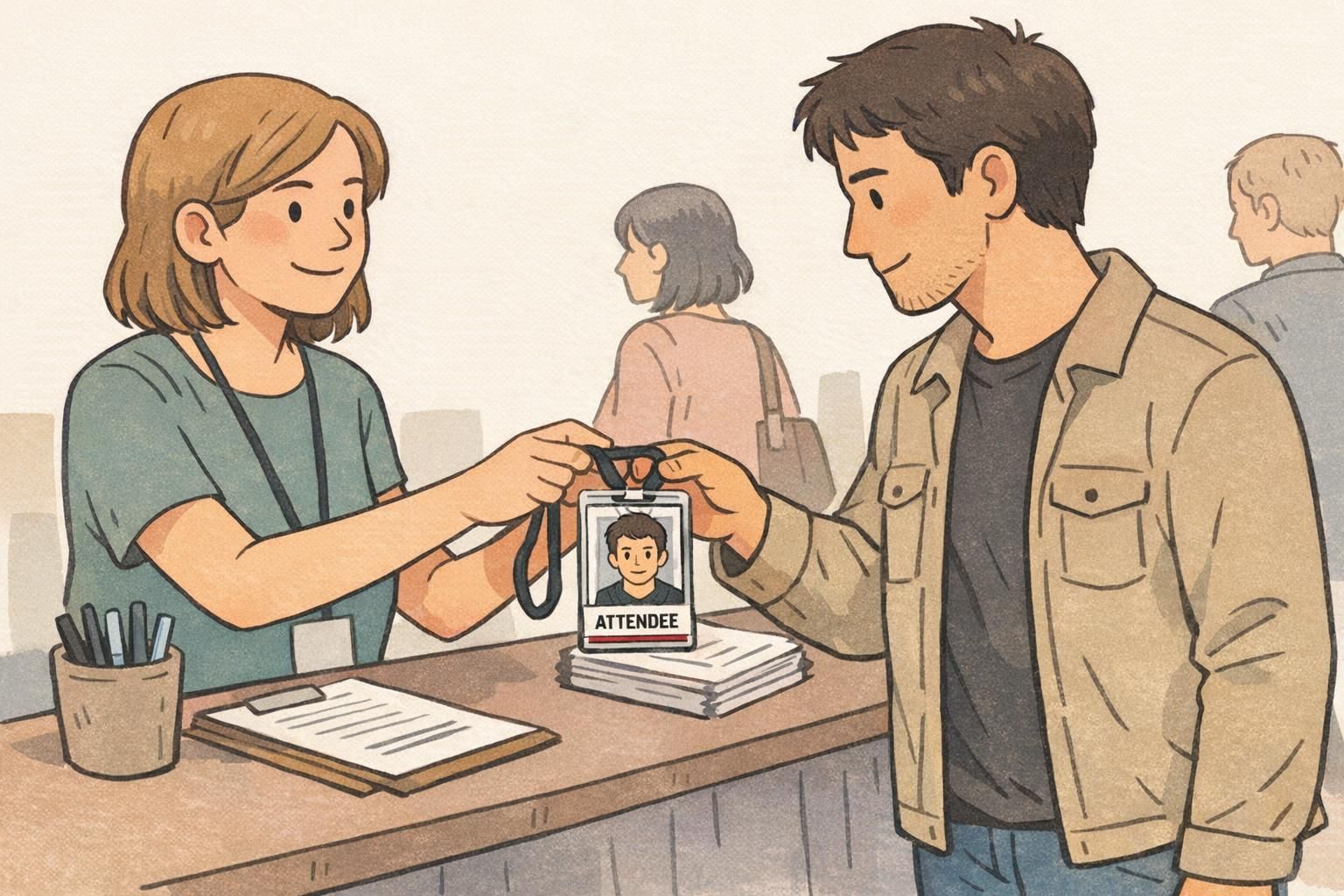
Events add two special pressures: badges must work instantly for strangers meeting each other, and they often carry role information that changes behavior (Speaker vs. Staff vs. Exhibitor). Orientation influences how comfortably you can place a large name, a readable affiliation, and a role label that stands out. Portrait event badges are popular because they support a tidy vertical stack: name large in the center, affiliation below, and a role band that’s easy to spot. Portrait also tends to work well when badges are distributed with lanyards at registration. Landscape event badges can shine when sponsors need a clean, wide band or when long affiliations are common. A well-designed landscape badge can keep the name prominent while still making room for a header area and a scannable code. If you use badge orientation as a role cue (for example, landscape for staff and portrait for attendees), be deliberate. Use it consistently across all printed sets and reinforce it with role labels or color bands so people don’t need to “decode” what the badge means.
Quick decision checklist: horizontal ID badge or vertical, and what to finalize
If you’re stuck between portrait and landscape, step away from the template for a moment and think about use. A badge orientation decision is easiest when you start with how it’s worn and what must be read first. Begin with wear method: lanyard, clip, or reel. Then choose the layout that allows the largest, clearest name and photo without cramming in extra elements. Finally, verify that required pieces—logo, role label, barcode/QR—fit comfortably with safe margins around slot/clip areas. If you’re leaning toward a horizontal ID badge, confirm long names stay readable and that the badge doesn’t become visually crowded from left to right. If you’re leaning portrait, confirm the photo and name remain centered and won’t be covered by the clip or holder frame.
- How is it worn most of the time (lanyard vs. clip/reel)?
- Can the name be the largest element without squeezing the photo?
- Does the photo remain recognizable at a glance?
- Is the role/department visible without competing with the name?
- Are scannable elements (barcode/QR) placed away from slot punches and holder borders?
- Is the orientation consistent across teams/attendee types (or clearly explained with labels/colors)?
It can work, especially at events, but only if it’s consistent and reinforced with clear role labels or color bands. Otherwise, it may create confusion rather than clarity.
Let your existing hardware guide you. A holder designed for one direction can obscure text or force awkward placement. Test your preferred badge orientation inside the actual holders before you finalize the template.
Printing and ordering tips: selecting the right BadgeZoo format
Once you’ve chosen orientation, treat your design like a repeatable template. Define clear zones for photo, name, role, and any barcode/QR code, and keep safe margins where slot punches, clips, or holder edges might cover the print. BadgeZoo can produce portrait or landscape IDs and event badges, so you can match the format to how people will actually wear and read them. If you’re building a program that needs flexibility—like different departments, campuses, or event roles—standardizing a few templates can help you stay consistent while still accommodating different information needs. A proofing step is worth it: print a sample, place it in the real holder, and view it at typical distances (across a counter, in a hallway, or during check-in). That quick test often reveals whether the name is truly large enough and whether any critical elements are being covered.
If you’re planning a new run, you can review options for finishes and layouts while ordering custom ID badges to match the orientation you choose.
Finalize orientation first, then lock in a template with safe areas for slot punches, holder borders, and scannable codes. That sequence prevents last-minute compromises that shrink names or crowd key details.