ID Badge Design: The Ultimate Guide to Professional Layout and Readability
What Great ID Badge Design Needs to Do (Fast)
In real workplaces and busy environments, people don’t “read” a badge—they scan it. Strong ID badge design makes identity and role clear at a glance, even when someone is walking past you, standing under harsh lights, or wearing a jacket that partially covers the card.
Before you choose colors, logos, or fonts, define the badge’s primary job. For most organizations, the front of the badge needs to answer three questions instantly: Who is this? What’s their role or access level? Do they belong here? When those answers are obvious, the badge supports security policies, reduces awkward introductions, and helps staff interact with confidence.
A readable ID card is less about adding information and more about prioritizing the right information—photo and name first, role/status second, everything else only if it earns its space.
- Quick recognition: a clear photo and a name that’s readable at conversational distance
- Clear status: role, department, visitor type, or access level that can’t be missed
- Consistent branding: enough visual consistency that cards look official and trustworthy
- Operational support: room for scannable elements (if needed) without clutter
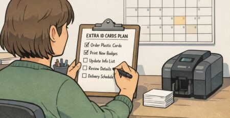
Treat this guide as a reusable blueprint—an internal hub you can return to whenever you add a new department, introduce badge buddies, redesign event badges, or standardize templates across staff, students, contractors, and visitors.
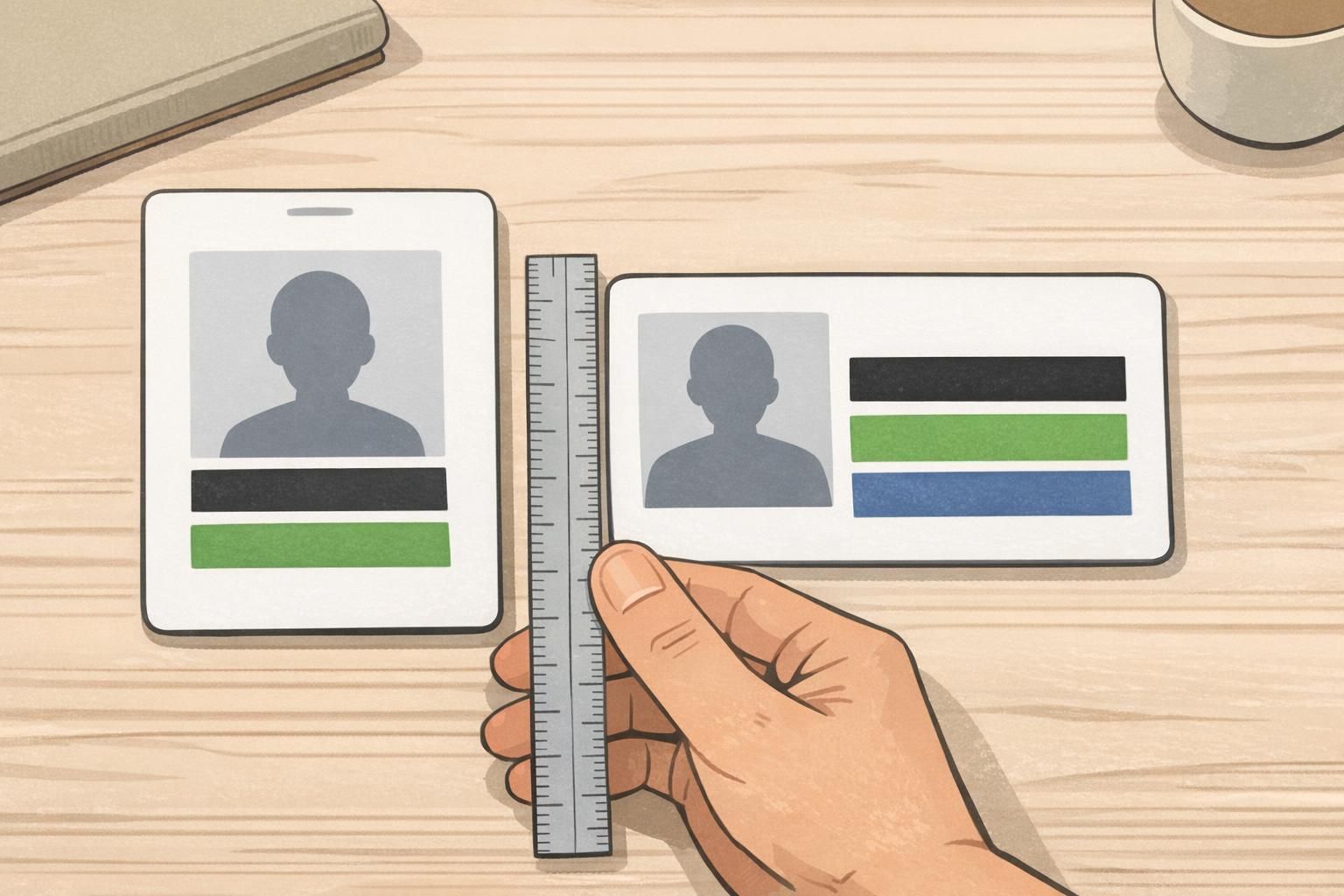
Choose the Right Badge Size, Orientation, and “No-Go” Zones
Most organizations default to the ISO/IEC 7810 ID-1 size (the same footprint as a credit card). That standard is useful because accessories—holders, reels, lanyards, and many printers—are built around it. But the size also sets hard limits: if you try to fit too much, your most important fields shrink until the badge stops doing its job.
Next, decide portrait vs. landscape. Portrait is often a natural fit for lanyards and vertical holders, especially when you want a tall photo. Landscape can work well when you have long names, when the badge is typically clipped to a pocket, or when you want a wide role band that reads quickly. Neither is “better”—the right choice is the one that stays visible and flat during everyday wear.
- Ask how the badge will be worn most often: lanyard, clip, retractable reel, or tucked into a holder
- Check how often badges get covered: jackets, lab coats, scrub pockets, safety vests
- Look at your data: do you have long names, multiple departments, or multiple credential types?
- Decide whether the photo or the role label needs to be the most dominant element
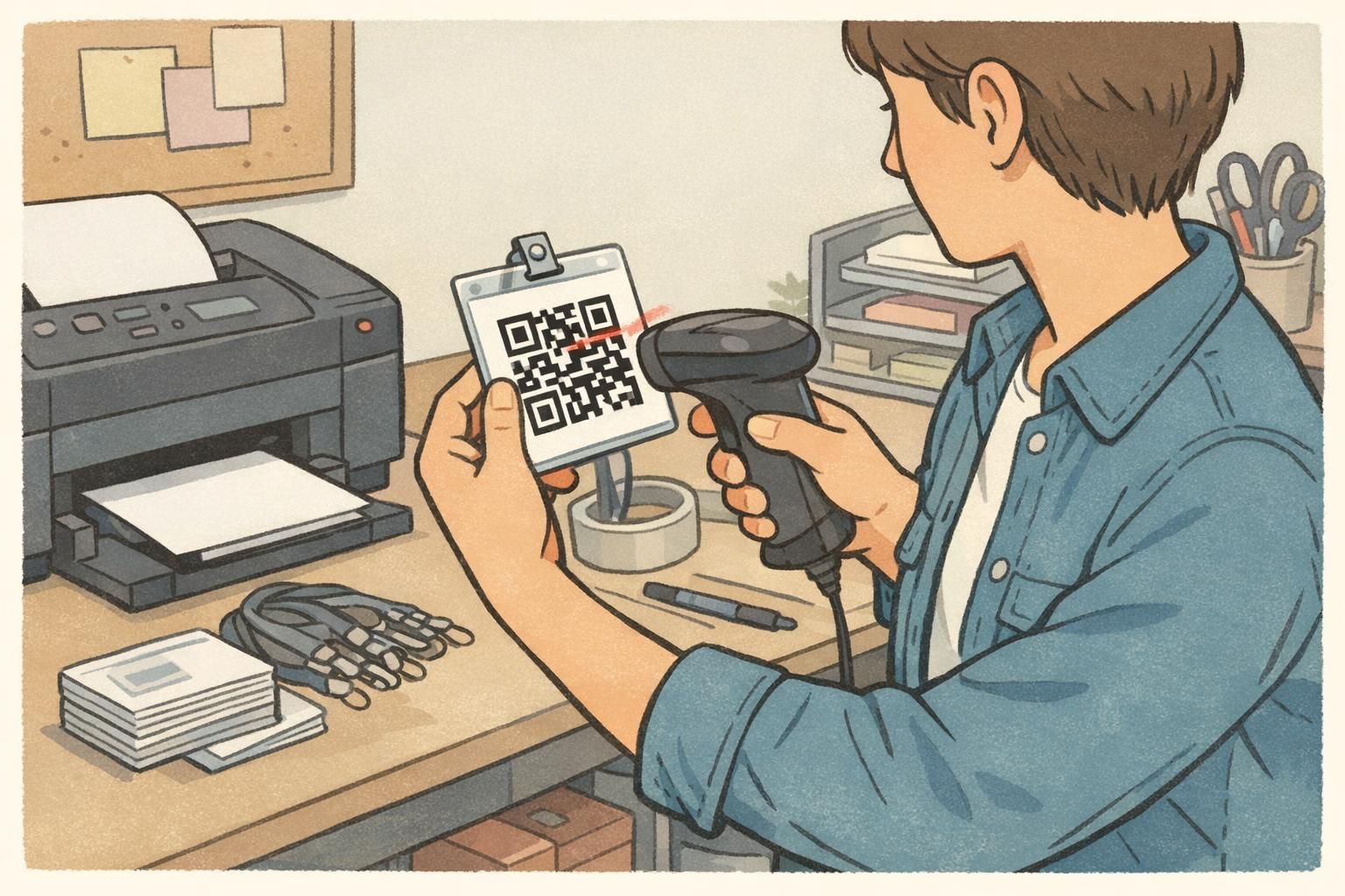
Finally, reserve “no-go” zones early. These are the areas where critical content can get blocked or fail to work in the real world—like where a slot punch cuts in, where a holder frame covers the edge, or where a magnetic stripe, chip, or antenna area needs to remain unobstructed. If your badge includes a barcode or QR code, it also needs breathing room so it scans reliably.
Build a simple template grid once (margins, alignment lines, and safe areas). Your future badges will look consistent—even as names, photos, and roles change.
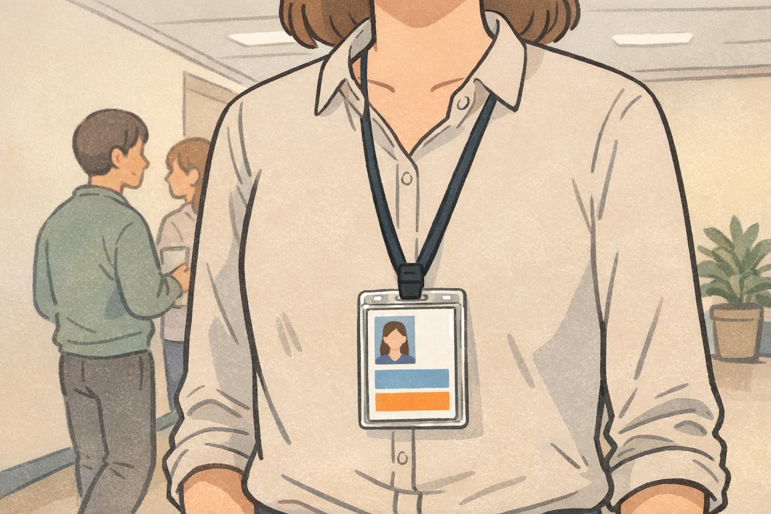
Layout Hierarchy: Photo, Name, Role, and Organization (Front vs. Back)
A professional badge layout has a clear hierarchy—meaning the eye knows exactly where to go first, second, and third. When hierarchy is weak, people start hunting for the name, guessing the role by color, or flipping the badge around to find what they need.
For most environments, the front should be designed for instant human recognition. That usually means: photo and name first, then role/department or a bold status label (like a visitor type), and then organization branding. Keep the front clean and predictable across badge types so staff can trust what they’re seeing.
- Front (human-first): photo, name, role/department or status label, organization branding
- Back (operations-first): barcode/QR, ID number (if needed), “If found return to,” help desk phone, basic policy text
Moving secondary details to the back reduces clutter where it hurts most. If your front side is overloaded with small fields (employee number, issue date, long disclaimers), your name and role shrink—exactly the opposite of what a readable ID card needs.
Use alignment and spacing to create a smooth reading path. Instead of scattering elements into corners, choose a system: a left-aligned column, a centered stack, or a structured grid. Consistency makes cards feel official and reduces errors when new templates are created.
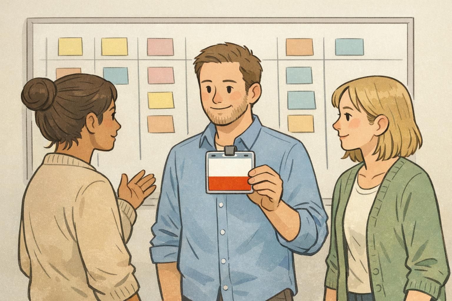
Use controlled variants to signal differences: for example, a consistent layout for everyone, plus a role band or badge buddy to make staff, contractors, students, and visitors unmistakable at a glance.
“If someone has to step closer and squint to find a name, the badge isn’t failing because of printing—it’s failing because the hierarchy wasn’t decided early.” – Facilities Coordinator
Typography and Contrast: Badge Layout Tips for Readability at a Distance
Typography is where good intentions go to die. On a screen, small type can look fine. On a laminated card, behind a glossy holder, moving under overhead lighting, it can become hard to read fast. The goal isn’t fancy typography—it’s legibility in real conditions.
Start with a simple type system: one clean sans-serif font (or two complementary fonts at most) and a limited set of weights. Then make the name the largest text on the front. Role/department should be clearly readable too, especially in environments where quick routing matters (schools, healthcare, manufacturing, or large offices). These badge layout tips keep design decisions consistent even when multiple people create templates.
- Use 1–2 fonts and 2–3 weights (avoid a different style for every field)
- Make the name the largest text element on the front
- Keep role/department large enough to read without leaning in
- Avoid ultra-thin font weights that disappear under glare
- Leave generous spacing around text blocks so the layout doesn’t feel crowded
Contrast matters as much as font choice. A neutral benchmark is to ensure sufficient text-to-background contrast to support readability and accessibility in varied lighting and for people with low vision or color-vision differences (source). Even if your badge is mostly “visual,” names and roles still depend on strong contrast to be reliable.
Also, don’t rely on color alone to communicate status. Pair color with a label area or an icon so the meaning is still clear if the badge is seen in dim lighting, printed slightly differently, or viewed by someone with color-blindness.
A role band works well when it’s bold, consistent, and paired with a clear label area. It’s one of the simplest ways to make status obvious without crowding the name and photo.
It’s usually risky. Patterns often reduce contrast and create visual noise. If you want texture, keep it subtle and reserve clean space behind the most important text.
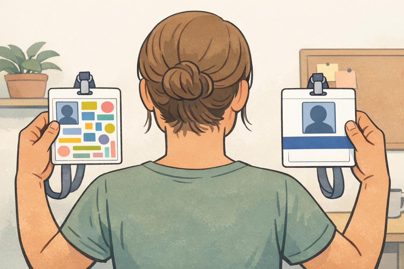
Photo Placement and Image Standards (So People Recognize the Right Person)
Photos are the fastest way to confirm identity—when they’re consistent. A mix of selfie angles, dark shadows, and busy backgrounds makes recognition harder and can undermine the badge’s credibility. A simple head-and-shoulders standard with neutral background and even lighting goes a long way.
Place the photo where it won’t be blocked by clips, lanyard attachments, or holder frames. If you’re using a vertical badge, that often means keeping the photo away from the top punch area and leaving safe margins so the face isn’t partially covered.
- Use consistent framing: head and shoulders, face centered
- Use neutral backgrounds and even lighting (avoid harsh shadows)
- Keep the face large enough to recognize at typical interaction distance
- Avoid busy graphics behind the face; use a subtle border if needed to separate photo from background
- Balance photo size with role/status label if role-first recognition is important
If your environment needs role-first recognition (like healthcare, security, or events), don’t shrink the role label to protect the photo. Aim for a clear balance: recognizable face plus unmistakable role/status.
Proofing, Security, and Production Checklist (Before You Print)
Even a great design can fail in production if it isn’t proofed under real conditions. Badges move, glare happens, holders cover edges, and scanners are picky about spacing. Build a quick proofing habit so every new template stays clean and reliable.
- Spelling and naming: confirm preferred names, capitalization, and diacritics before printing
- Alignment and spacing: verify margins, safe areas, and consistent placement across badge types
- Scannability: test barcode/QR readability and preserve required quiet zones (don’t crowd codes with borders or graphics)
- Glare and motion: check readability under overhead light and while walking
- Holder reality check: insert a test print into the actual holder to see what gets covered
- Data minimization: include what’s needed for identification and workflow; avoid unnecessary sensitive personal data
- Expiration clarity (events/visitors): make time limits and visitor status unmistakable
If your environment requires stronger anti-counterfeit measures, you can add durable laminates and optional visual security features (such as holographic overlays or microtext) while keeping the layout simple. The key is restraint: security elements should support trust without turning the badge into visual noise.
When you’re ready to move from a template to production, it helps to choose printing options and holders that match your real wear-and-tear. If you need a reliable way to produce consistent cards (including options like different finishes), you can explore BadgeZoo’s custom ID badge printing and pick formats that match how your badges are worn.
Too many “nice-to-have” fields on the front. Move secondary details to the back and protect the hierarchy: photo, name, then role/status.
Yes. A one-card test catches the issues that screens hide—glare, small type, holder coverage, and scan failures.