Accessible ID Badge Design: Higher Contrast and Larger Names Without Starting Over
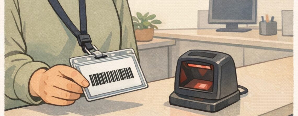
Why an accessible ID badge helps everyone (not just a few people) An accessible ID badge is one of those small design choices that quietly improves a whole environment. When names and roles are easy to read at a glance, interactions move faster, mistakes drop, and people feel more confident approaching the right person—whether that’s a new employee on day one, a vendor arriving for a scheduled appointment, or a conference attendee navigating a busy hallway. Accessibility isn’t only about supporting people...