Double sided ID card Front vs Back Design: Split Badge Info Without Confusion
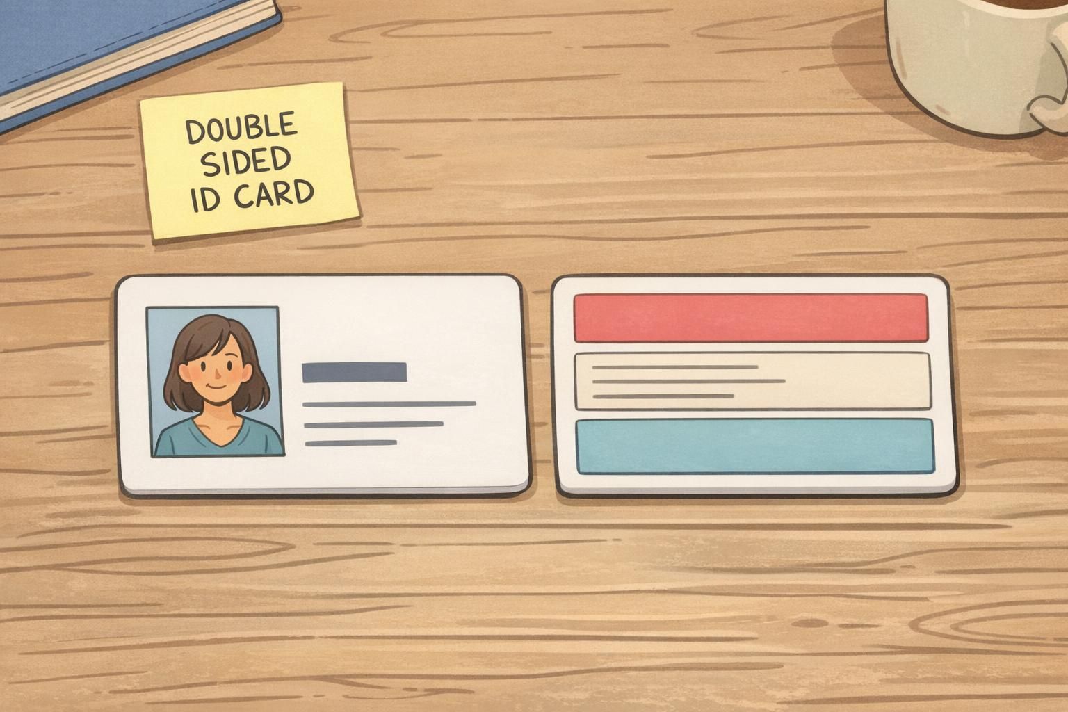
Why a double sided ID card needs a clear front/back plan
A double sided ID card only feels “easy” when people instantly know what to look at—and when they don’t have to pause to interpret badge information. The simplest way to get there is to give each side a job. Think of the front as the moment-of-action side: doors, check-ins, quick visual verification in a hallway, or a security guard confirming identity in a second or two. The back is the support side: details that matter, but not in the first heartbeat of the interaction. When the front is clean and the back is organized, you reduce hesitation (and the awkward flip-flip-flip) at entry points. You also make life easier for reception, security teams, event staff, and anyone trying to help in an emergency. The rest of this guide breaks down what belongs on each side, with practical examples for access control, emergency details, and policies—so your badge stays scan-friendly while still carrying the info people genuinely need.
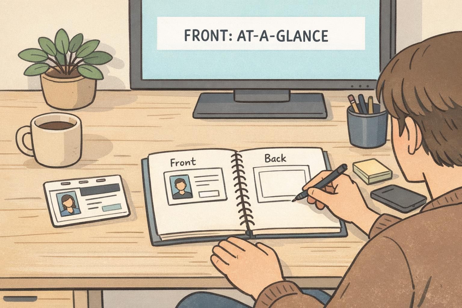
A good split is simple: front = decide and proceed; back = reference and respond.
Front of badge: “at-a-glance” info for fast recognition and access
Treat the front like a one-screen summary. Someone should be able to glance at it and answer: “Who is this?” and “Do they belong here (or in this area)?” without hunting. Most front layouts work best when there’s one dominant element—usually a photo or the person’s name—supported by just a few secondary details. If you try to make the front do everything, the result is typically smaller text, lower contrast, and more confusion right when speed matters.
- Photo (if used): large enough to recognize quickly, with a clean border and consistent placement
- First and last name: high-contrast and sized for quick reading from a comfortable distance
- Role, department, or attendee type: one short line (e.g., “Facilities,” “IT,” “Vendor,” “Speaker”)
- Organization, site, or event name: helpful context, especially for multi-tenant buildings or conferences
- Simple visual grouping cue: a color band or icon system that’s easy to interpret at a glance
- Scan target (barcode/QR) if required: kept unobstructed, away from busy backgrounds and away from elements people commonly cover with their hand
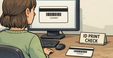
If you use QR codes or barcodes for speed, treat the scan area like a “no-fly zone” for design clutter. Busy patterns, gradients, or text behind the code can reduce reliability. Also consider common handling: people naturally grip the bottom edge or the center of a badge when presenting it, so place the scan target where it can be shown without covering the name or photo.
Back of badge: details that support safety, compliance, and edge cases
The back of badge space is where you put information that is valuable—but not required for split-second recognition. Done well, the back prevents interruptions (“What number do I call?” “What are the site rules?”) without adding noise to the front. The key is organization. If the back is a wall of small text, people still won’t use it. If it’s broken into labeled blocks, the back becomes genuinely helpful during edge cases: a lost badge, a systems issue at a door, or a quick policy reminder when someone is unsure.
- Emergency instructions: simple steps and what to do first
- “If found” message: where to return the badge or who to contact
- IT/help desk or facility contact: the number or channel people actually need when something breaks
- Site rules and short compliance reminders: plain-language bullets, not paragraphs
- Secondary identifiers: employee/attendee ID number or internal reference numbers that clutter the front
- After-hours or special-entry instructions (when appropriate): kept brief and clearly separated from general guidance
A useful back of badge reads like a mini reference card: clear headings, short bullets, and only the details that people might need after entry—or in an unusual situation.
Access control examples: what goes where for scanners and security teams
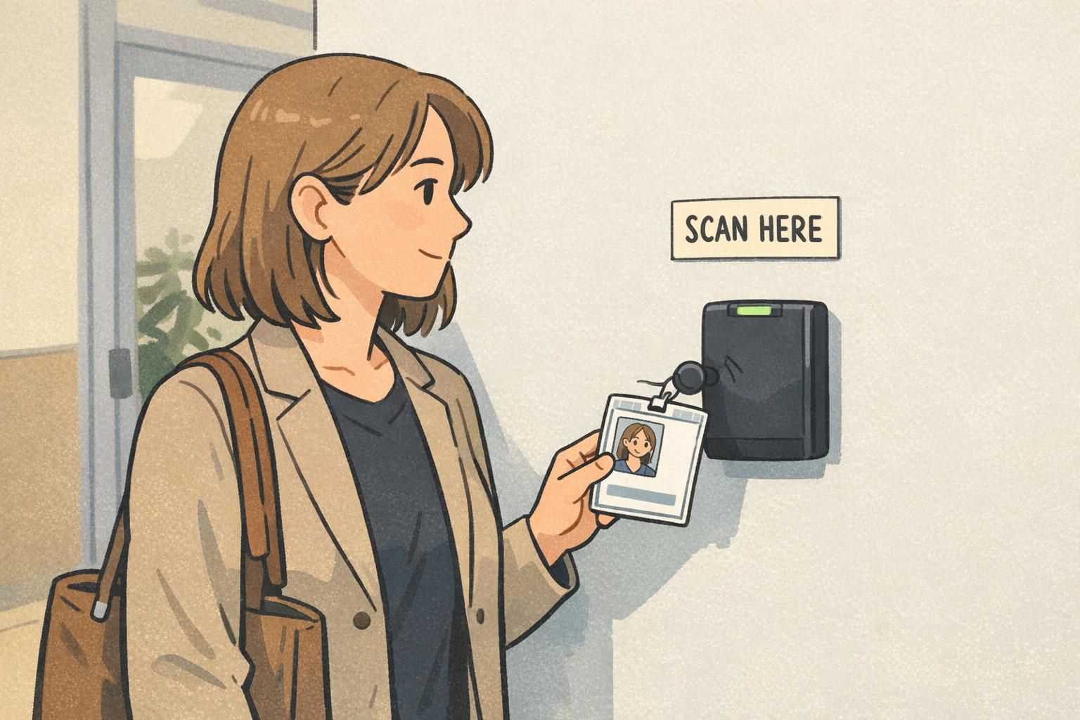
For access control, the goal is to make the “moment of presentation” frictionless. That moment might be a person tapping into a turnstile, showing a badge to a guard, or scanning at a reception desk. Your layout should help both humans and scanners succeed without extra steps. Start by identifying who needs to interpret the badge and how. A guard needs a quick identity check (photo/name/role). A scanner needs a clean, high-contrast code or a consistent presentation area. A receptionist may need both—plus a quick way to categorize (visitor vs employee, vendor vs staff, attendee type).
- Front: photo + name as the primary recognition elements
- Front: role/department or attendee type as the decision support line
- Front: a simple access indicator (such as a color stripe that maps to zones)
- Front: barcode/QR placed where it can be presented without covering the key identity elements
- Back: longer ID numbers, internal references, or secondary identifiers that a guard might occasionally confirm
- Back: facility contact details and after-hours instructions that are not needed during normal entry
One important rule: avoid splitting a single concept across both sides. If your security team uses a color system to interpret zones, keep the “how to interpret access” cues on the front. If the back explains the colors, but the front shows the color stripe, you’ve created a flip requirement during the exact moment you’re trying to speed up. Instead, put the immediate interpretation on the front (e.g., a clearly distinct color band and a short zone label if you use labels), and reserve the back for deeper reference or contact information.
Emergency and medical info: using the back without hiding critical cues
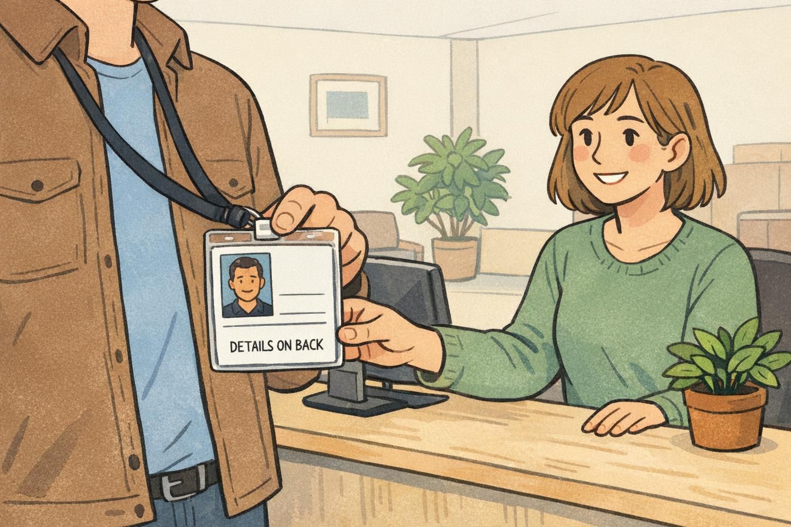
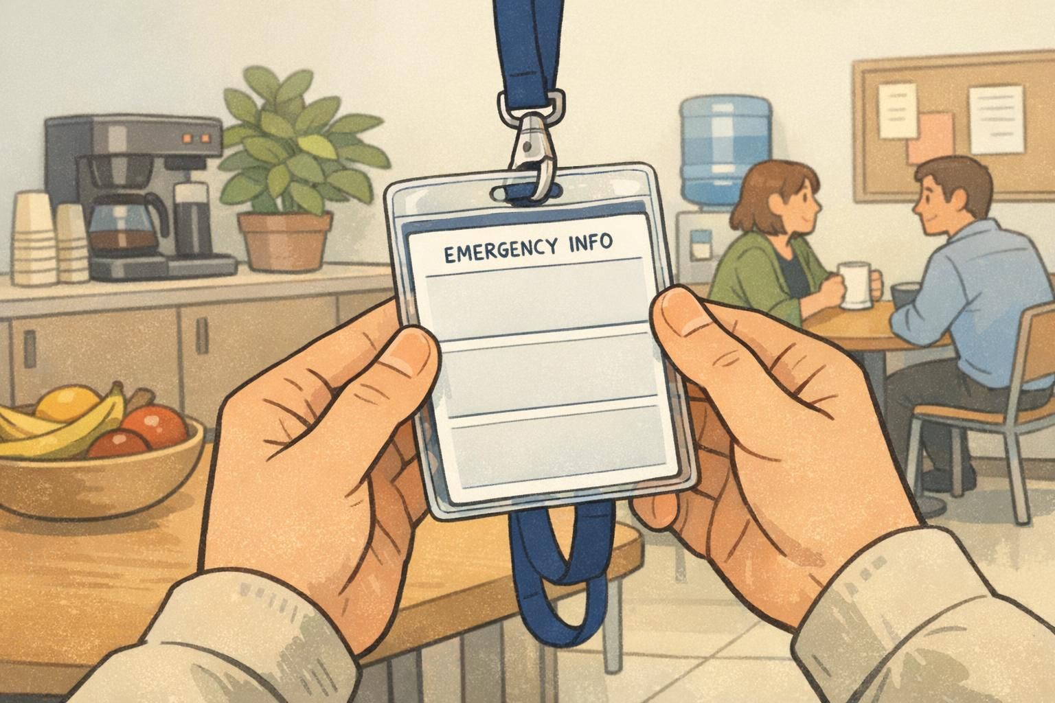
Emergency information often belongs on the back because it can be sensitive, situational, or simply too detailed for the front. But “on the back” shouldn’t mean “hidden.” A small cue on the front can prevent confusion and save time when it matters. A practical approach is to keep the front focused on identity and access, while adding a subtle indicator such as “Emergency info on back.” That way, a responder, supervisor, or coworker knows the badge has additional details without needing to guess. When emergency or medical details are appropriate for your environment and policies, keep them brief, grouped, and ordered the way people look for them. The goal is to reduce searching under stress.
- Back: emergency contact (primary), optionally a secondary contact if space allows
- Back: key medical alerts (when permitted and relevant), kept short and clearly labeled
- Back: evacuation or shelter instructions in a few steps
- Back: “if found” instructions (useful in both safety and lost-property scenarios)
- Front: small signpost that tells people the emergency details exist on the reverse
Privacy matters here. If information is sensitive, the back of badge can be a better place than the front because it reduces casual visibility during daily movement while still being available when needed. The balance is to keep the front limited to what supports routine operations, and reserve additional details for the back in a structured block.
Policies and instructions: keep them useful, not noisy
Policies belong on a badge only when they reduce questions or prevent predictable mistakes. The fastest way to make a badge harder to use is to cram it with legal text or long rules that nobody will read. Instead, use short headings and plain-language bullets. If a rule is likely to be needed while someone is actively trying to comply—like at a doorway, during PPE checks, or when moving through restricted areas—consider a minimal front reminder and a fuller back explanation.
- Good back candidates: PPE reminders, visitor escort expectations, “return badge at exit,” and basic conduct rules
- Better as a short bullet than a paragraph: the goal is recall, not documentation
- If it affects entry behavior: consider a tiny front prompt (e.g., “Show badge”) and place the detail on the back
- Avoid repeating the same instruction in multiple places unless it prevents a real point-of-use failure
“The best badge policies are the ones people can follow without stopping to decipher them. A few clear bullets on the back beats a dense block of text every time.” – Facilities Coordinator
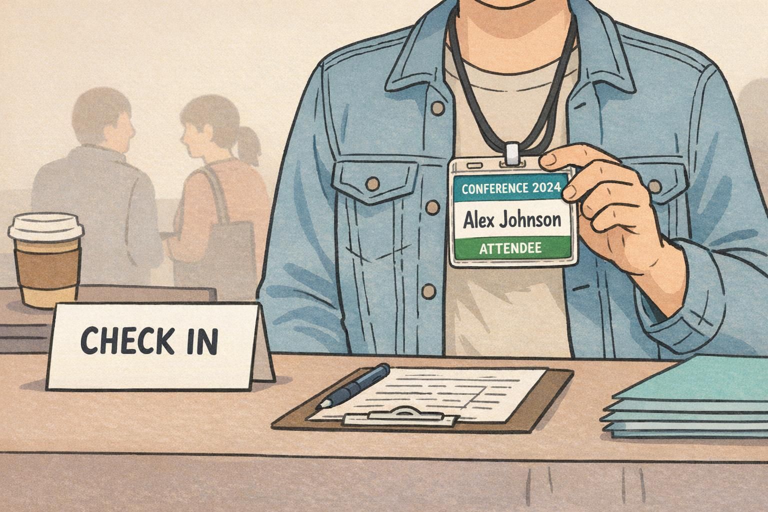
This same principle applies to event badges and workplace ID cards alike. Attendees want fast check-in and quick recognition; staff want fewer questions at doors and help desks. A readable split keeps badge information accessible without making the front feel crowded.
Layout cues that prevent flipping back and forth
Even with a good front/back plan, people can still get stuck if the layout forces constant switching. Your job is to reduce “split attention”—the mental effort of finding and interpreting information across two places—especially when someone is in motion or under time pressure. A reliable strategy is to keep interpretation close to the point of use: the front should contain the cues someone needs to act immediately (recognize, grant access, direct the person), while the back holds reference details that can be consulted when the situation calls for it. This general principle aligns with research on how people perform better when critical information is presented in a way that reduces unnecessary switching between sources (source).
- Use consistent structure across both sides: same terminology, similar spacing, and predictable reading order
- Add simple signposting on the front (e.g., “Turn over for emergency details”) so users know what’s on the reverse
- Keep related groups together: don’t split one procedure across both sides unless you clearly label the continuation
- Avoid “mystery codes”: if a color band indicates something important, make the meaning clear at the point of action
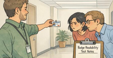
- Run a quick walkthrough test: if someone must flip repeatedly to understand the badge information, revise the split
Design test: a receptionist or guard should understand the front without flipping; a coworker should find emergency details on the back in seconds.
Production checklist: print-ready decisions for a clean two-sided badge
Once your content split is solid, production choices can either preserve clarity—or accidentally undermine it. Before you print, confirm the design still works in real life: under indoor lighting, behind a badge holder, and while someone is holding it at an angle. A practical print-ready checklist keeps the front scan-friendly and ensures the back of badge details stay readable when they’re actually needed.
- Front clarity check: can someone understand name/photo/role and the key access cue in one glance?
- Contrast and size: are the most important elements readable without squinting?
- Scan target: is the barcode/QR unobstructed and placed away from busy backgrounds?
- Back organization: are details grouped into labeled blocks (emergency, policy, support contacts) with clear headings?
- No first-contact dependency: is there anything on the back that a guard or receptionist would need immediately? If yes, move it to the front.
- Attachment reality check: will a slot punch, clip, or holder cover the scan area or important text when worn?
- Handling test: can someone present the scan area without covering the name or photo?
If you’re ordering printed cards, it helps to choose a printer that supports clean two-sided layouts so the front remains fast to interpret and the back remains a reliable reference. BadgeZoo’s
Keep the front focused: choose one primary scan target for the normal flow, place it in a clear area, and only add a second code if it solves a real operational need. If both are required, keep them visually separated from the name/photo and avoid putting them over patterns or images.
If the number is needed for first-contact verification (like a quick check at a desk), it can go on the front in small but readable type. If it’s mostly for help desk lookups or internal reference, it usually fits better on the back to reduce front-side clutter.
Use a small, plain cue on the front (for example, “Emergency info on back” or “Details on back”). Keep it subtle so it doesn’t compete with the name or photo.