Speaker badge Layout Ideas That Reduce Interruptions
Why a Speaker Badge Helps Reduce Interruptions
A speaker badge is a small tool that can remove a surprising amount of friction from an event. When the speaker is unmistakable at a glance, fewer people need to interrupt with quick-check questions like “Are you presenting?” or “Are you the moderator?”—especially during check-in, hallway transitions, and pre-stage moments when everyone is moving fast.
Clear identification also helps staff and volunteers do their jobs without stopping someone mid-thought. If a badge communicates “speaker” plus a simple cue about what’s happening right now (for example: available, next up, or now speaking), the event flow feels calmer and more intentional—without requiring extra explanations.
The goal is instant recognition: clear labeling first, with optional session or track cues that support wayfinding without cluttering the badge.
- Attendees can confirm who to approach (and when) without asking out loud.
- Volunteers can route speakers to the right room or green room more confidently.
- Stage managers can handle mic handoffs and lineup changes with fewer interruptions.
- Session transitions feel smoother because roles are obvious at a glance.
Design Principles: Make Speaking State Obvious (Without Adding Noise)
The most effective conference speaker ID systems borrow an idea from interface design: make “state” visible. In an event context, state means what a person is doing right now in the speaking workflow—speaking, about to speak, or available for questions. When that state is signaled consistently, fewer people need to verbally confirm it, and fewer awkward interruptions happen during conversations or transitions.
Research on visual indicators and turn-taking supports this general concept: clear, consistent cues reduce ambiguity and help people coordinate smoothly, especially in time-sensitive interactions (source). You don’t need to turn a badge into a dashboard—just choose one reliable signal and place it where people will naturally look.
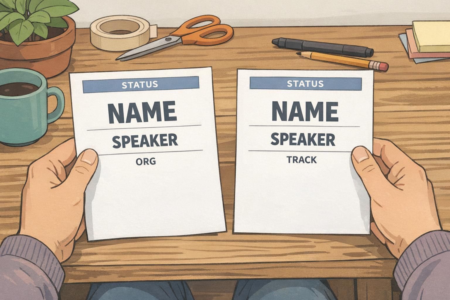
- Use a single dominant hierarchy: Name first, role second, then organization or context.
- Keep one consistent “status” location across all speaker identification materials.
- Prioritize high contrast so text reads quickly under indoor lighting and on camera.
- Avoid stacking multiple competing cues (too many icons, too many colors, too many labels).
- Design for a two-second scan at conversational distance, not close-up reading.
“If someone has to lean in and read your badge, it’s already too late—the interruption happened.” – Event operations lead
Speaker Badge Layout: A Simple Hierarchy That Reads in 2 Seconds
A strong speaker badge layout follows a predictable reading order. People should be able to identify the person (name), the reason they matter in that moment (role), and any helpful context (organization) almost instantly. That means you don’t treat every field equally. The name gets visual priority, and everything else supports it.
A practical hierarchy that works in busy hallways and loud networking areas looks like this: Name in the largest type, role clearly labeled (Speaker/Moderator), then organization. Optional details can be included, but they should never compete with identification.
- Line 1 (largest): Full name (first + last).
- Line 2 (bold/clear): Role label (SPEAKER or MODERATOR).
- Line 3 (smaller): Organization or affiliation.
- Optional micro-line: Pronouns, session time, or room—only if it stays readable.
Pick one strong visual channel for emphasis (a color bar, a border, or a single icon). When multiple cues compete, attendees hesitate—and hesitation often turns into an interruption.
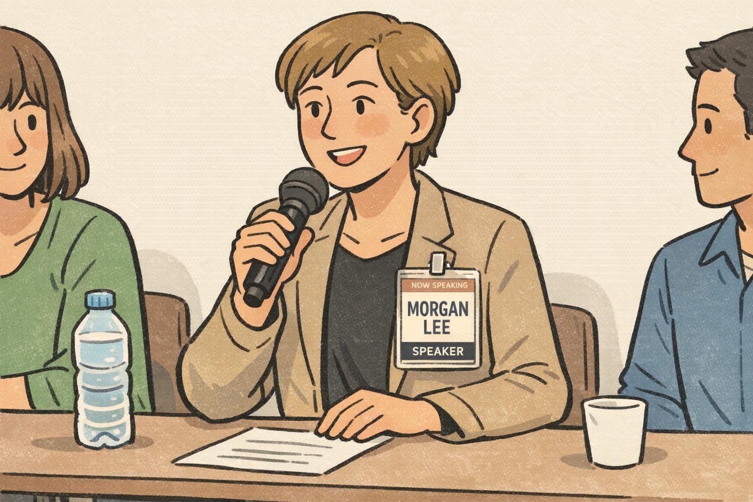
Status Cues That Don’t Clutter: Now Speaking, Next Up, Available
Status cues work best when they’re small, standardized, and always in the same place. The point isn’t to broadcast every detail of a schedule—it’s to reduce the number of times someone has to stop a speaker to confirm what’s happening right now.
For most events, a limited set of labels is more helpful than a long list. Too many categories dilute meaning and create edge cases (“Which label applies to me?”). A controlled set also helps staff coordinate mic handoffs, lineup management, and room entry without calling out names or interrupting private conversations.
- AVAILABLE: The speaker is approachable for questions and networking.
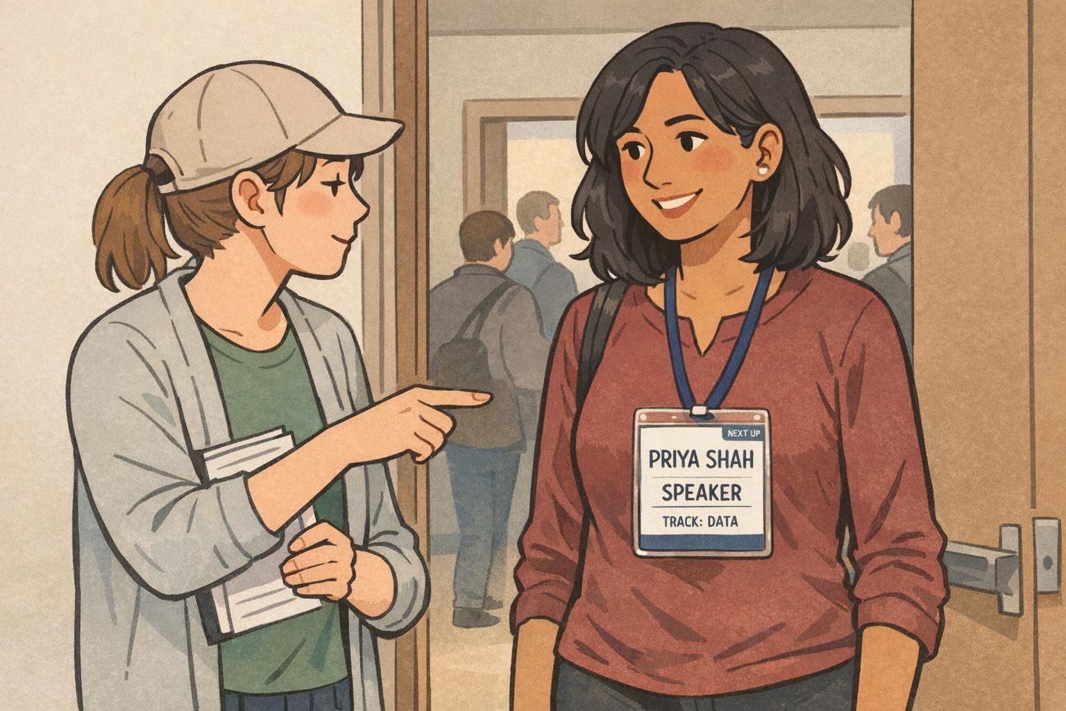
- NEXT UP: The speaker is coming on soon (useful near rooms and stage doors).
- NOW SPEAKING: The speaker is actively presenting or on mic (useful for panels and media).
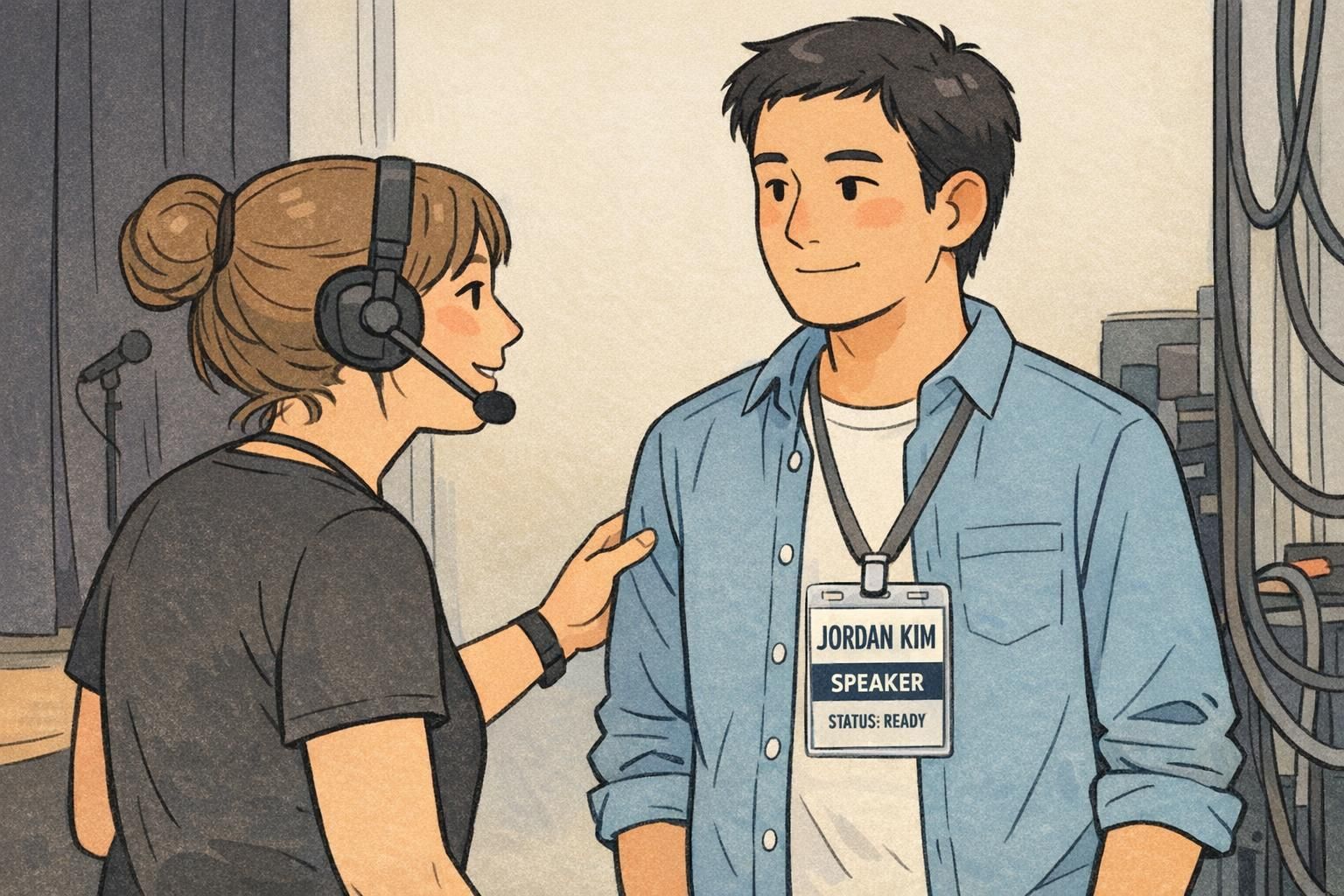
- READY (optional internal use): A stage-side status for staff check-ins and coordination.
Design tip: Put status in a thin top bar or a small corner label—then keep it identical across every speaker badge. Consistency is what makes the cue “read” instantly.
If you need live changes, use a controlled method (like a small insert, sticker, or consistent add-on) so the badge layout stays predictable. If speaking order is fixed, printing status can work—just avoid too many unique labels.
It can be helpful in networking-heavy events because it politely reduces mid-chat interruptions. Keep it subtle (corner label) so it doesn’t compete with the name and role.
Optional Session or Track Cues (Color + One Line of Text)
Track cues are most effective when they do two jobs: they prevent wrong-room confusion and help attendees decide where to go next. But they should never overpower the name. A good rule is “color + one short line of text.”
If your event runs multiple tracks, consider a single track color (a bottom band, a border, or a small tag) paired with a short label like “TRACK: DATA.” This supports wayfinding while keeping speaker identification clean. It also helps volunteers at doors quickly verify they’re sending speakers to the right place—especially during tight transitions.
- Keep the track line short and consistent: “TRACK: DESIGN,” “TRACK: DATA,” etc.
- Place it in a secondary position (bottom band or corner tag).
- Use one track color system across badges, signage, and schedules when possible.
- If you must include a session title, shorten it dramatically or omit it from the badge.
Size, Placement, and Wear Method for Easy Reading
Even a great layout fails if it can’t be read quickly. Badge size, placement, and wear method determine whether your speaker identification is visible during greetings, line checks, seated Q&A, and stage transitions.
Aim for a badge format that supports large type without squeezing. The badge should sit high enough on the torso to be seen when people are standing close, and it should stay oriented correctly (not twisting or flipping) so the key fields—name, role, and status—remain visible when it matters.
- Choose a size that allows large, readable name text at arm’s length.
- Wear it high on the chest (lanyard adjusted or a reliable clip).
- Use a holder/attachment that prevents twisting during walking and networking.
- Select matte finishes and high-contrast combinations for varied lighting and camera exposure.
Templates and Materials That Work Well for Events
Templates are what make a speaker identification system feel consistent. When every badge follows the same structure—same name placement, same role label style, same status location—attendees and staff learn the “pattern” quickly. That pattern recognition is what reduces interruptions over the course of a multi-day event.
Material choices matter, too. Durable stocks and crisp printing keep text legible through repeated handling. Clear vertical holders and dependable clips help prevent flipping and twisting, which can hide the very information you’re trying to make obvious in the moment.
If you’re standardizing event badges across speakers, staff, volunteers, and vendors, starting from a product-ready template can simplify production and keep the final result consistent. You can see options for
A consistent template does more than look professional—it reduces mental effort. People stop asking “Are you the speaker?” because they can tell instantly.
Quick Checklist: Build a Speaker Identification System That Scales
A reliable system is one you can scale across dozens (or hundreds) of presenters without making the design harder to understand. Use this checklist to validate your layout before you print your full run.
- Name is the largest element on the badge.
- Role label is unmistakable (SPEAKER, MODERATOR) and easy to spot.
- Status cue has one dedicated location and limited label options.
- Optional details are truly optional—and don’t compete with the name.
- Track/session info is limited to one short line if used at all.
- A printed sample reads clearly at arm’s length.
- The badge stays oriented correctly while walking, chatting, and sitting.
- Staff and volunteers can interpret the badge in under two seconds without explanation.

Treat the badge like a hierarchy: name first, role second, then one optional line (organization or track). If you add a status, keep it in a fixed spot with a short label set so it stays recognizable.
They’re often the same physical item, but “conference speaker ID” usually refers to the event-wide system: consistent layouts, status cues, and track labels used across all speakers so staff and attendees can interpret badges quickly.