
Start with a clear visitor badge design hierarchy
A professional visitor badge design helps staff answer two questions quickly: Is this person a visitor, and what is their name? Those answers should stand out before the logo, company name, or other supporting details. A temporary ID badge can look polished without being elaborate when its layout makes identification straightforward.
Start with a prominent VISITOR label and a clearly readable name. Give each its own space rather than placing them among several equally bold fields. Then add the host, company, and visit details in smaller supporting text. This creates a reading order that works whether someone is checking the badge at reception or noticing it during a conversation.
- First level: visitor status and the wearer’s name.
- Second level: visit date, expiration time, and relevant access information.
- Third level: host, company, badge number, and other supporting details.
For example, a vertical layout might place VISITOR across the top, the name in the center, and validity details below. The arrangement can vary, but the priorities should remain obvious. If every field competes for attention, simplify the layout before adding decoration.
Use contrast, spacing, and restrained branding
A light background with dark text is a practical starting point for professional visitor IDs. It keeps the information visually distinct and gives the badge a clean appearance. Avoid placing names over busy patterns, photographs, or large background logos that compete with the lettering.
Use consistent alignment to make the layout feel deliberate. Names, field labels, and visit details should follow a clear structure rather than shifting unpredictably across the card. Leave generous margins around the edges, and separate groups of information with open space. A little breathing room often improves the design more than another border or colored box.
Branding should support identification, not dominate it. A modest logo and a limited color palette can connect the badge to your organization while preserving space for the visitor’s details. Reserve a stronger accent for the VISITOR label or another important status cue.
Review the design at its actual printed size. A layout that looks spacious on a large screen may feel crowded once it is inside a badge holder.

Choose badge details that support quick identification
The most useful badge details are the ones staff need to identify the wearer and understand the visit. Include the visitor’s name, a prominent VISITOR label, the host, the visit date, and an expiration time. Arrange these details consistently so staff know where to look each time.
Additional fields should earn their place. A photo may support recognition when the setting calls for it. A badge number can distinguish individual visitor records, while access information can clarify where the visitor is expected to go. Do not add fields simply because the template has room for them.
- Use clear field labels, such as Host and Valid until, where the meaning might otherwise be unclear.
- Keep personal and visit-specific information limited to what staff need.
- Add a photo, badge number, or access detail only when it serves the setting.
- Use a QR code to identify a visitor record rather than placing sensitive details in the code itself.
Keep any QR code separate from the name and status label. It should be a supporting tool, not the visual centerpiece. Staff should still be able to understand the badge’s basic purpose without scanning it.
Match the temporary ID badge material to the visit
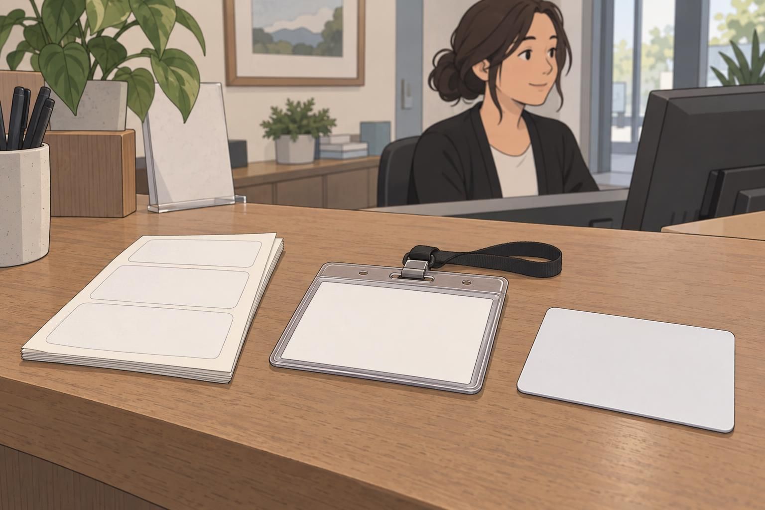
Material choice affects how a temporary ID badge looks and holds up during its intended use. The goal is not to choose the most substantial option every time. It is to match the presentation to the length and pattern of the visit.
- One-time office visit: an adhesive sticker can provide a simple, clearly marked visitor ID.
- Recurring visits: a printed insert in a reusable holder can offer a consistent presentation while allowing visit details to change.
- Contractor or multiday visit: rigid plastic or laminated stock can provide a more durable badge for extended use.
For a holder-based design, review the printed insert inside the actual holder. Make sure the edges, attachment area, and visible opening do not obscure important details. A neat design should remain neat when worn, not just when viewed as a flat print.
Consider durability and visible validity controls together: the badge needs to remain presentable, and its current status needs to stay readable. For related discussion of badge design and loss prevention, see this source. Choose the material for the visit, then keep the date and expiration information prominent within the finished format.
Make temporary status and validity easy to verify
A professional-looking badge should make its temporary nature unmistakable. Print the visit date and expiration time clearly, with enough separation from other details that staff can find them quickly. Use a consistent date and time format across visitor badges to reduce uncertainty.
A small set of consistent colors or a rotating design can help staff distinguish current badges. Keep the approach simple enough to recognize without studying the card. Color should reinforce the printed validity details rather than replace them; the badge still needs to communicate its status through readable text.
The same visitor badge design principles apply to event badges. Make attendee status, the valid day or period, and any relevant access zones easy to locate. If different groups need different access information, preserve the same basic layout while making those distinctions clear.
A familiar color accent can help draw attention, but the printed date, expiration time, and status label provide the details staff need to review.
Coordinate visitor IDs with the rest of your identification system
Visitor IDs look more intentional when they share a visual foundation with employee identification. A consistent typeface, compatible lanyard, and familiar arrangement of information can bring the system together without making every badge identical.
The distinction between visitors and employees must remain clear. Keep a prominent VISITOR label, a distinct accent color, or both. Coordination should make the badges feel related while preserving the role differences staff need to recognize at a glance.
When reviewing related name tags or badge buddies, consider how their colors and visual emphasis work alongside visitor IDs. A name tag may prioritize a person’s name, while a badge buddy may emphasize a role. The visitor badge should retain its own clear priorities: visitor status, identity, and validity.
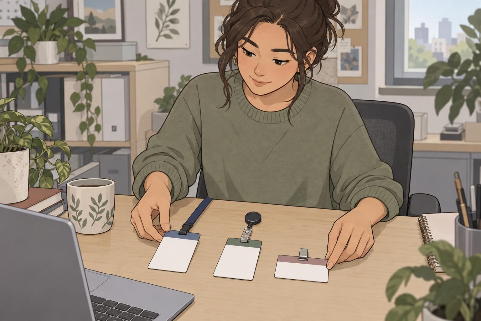
Place samples beside one another during the review. Look for unnecessary differences in alignment or typography, then check that visitor identification remains distinct. This comparison helps create a coherent system rather than a collection of unrelated designs.
Review a practical visitor badge design checklist
Before printing, review a finished sample rather than relying only on the design file. Put it in its intended holder or on its intended lanyard, and check how the information appears when worn. Focus on readability, visible validity, and a clean overall presentation.
- Do the VISITOR label and wearer’s name stand out first?
- Are the host and other supporting details readable without competing with the name?
- Are the visit date and expiration time easy to find?
- Does any relevant access information have a clear place?
- Do colors reproduce consistently on the selected material?
- Does the holder leave all essential information visible?
- Is the badge comfortable to wear with its intended attachment?
- Does the finished layout look clean rather than crowded?
If the sample feels busy, remove unnecessary information before shrinking the text. If it looks disconnected from your workplace identification, adjust the typography or restrained branding while preserving the visitor distinction. Successful visitor badge design combines a polished appearance with a simple purpose: helping people recognize who is visiting and whether the badge is current.