Matte ID Card vs Glossy Finishes: When Finish Hurts Readability
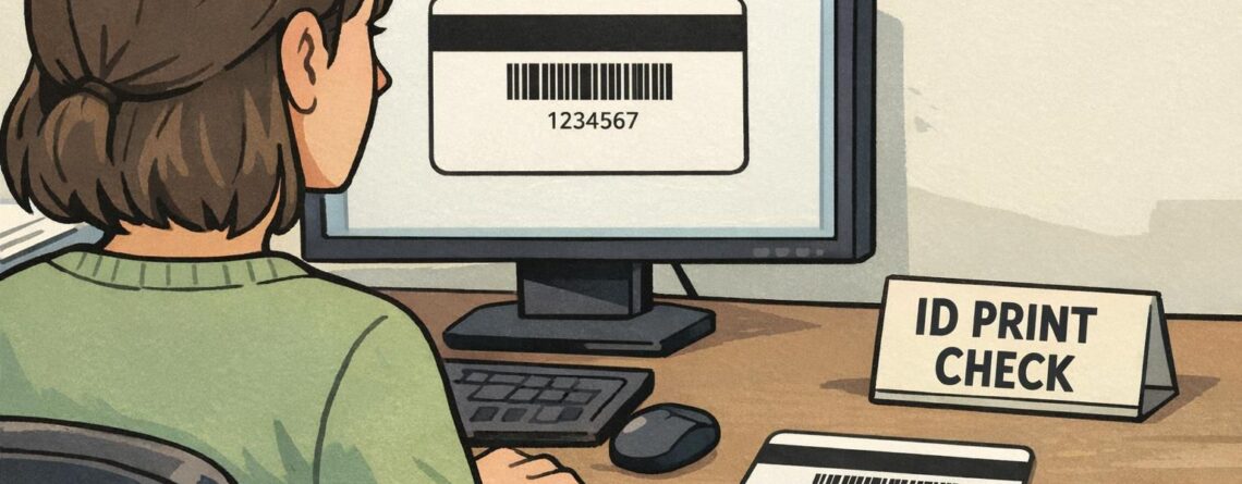
Why a Matte ID Card Finish Can Improve Everyday Readability A matte ID card finish is often chosen for one simple reason: it’s easier to read in the lighting people actually work under. In offices, hospitals, warehouses, and event venues, badges are viewed quickly, at arm’s length, and rarely at the “perfect” angle. When a surface reflects light strongly, names, photos, and role identifiers can look washed out—even if the print quality is excellent. Matte surfaces reduce the bright highlights that can...