ID photo background Choices: Neutral, Branded, or Transparent?
Why Your ID Photo Background Choice Matters (More Than You Think)
Choosing an ID photo background sounds like a small design decision, but it affects how your entire identification system performs day to day. The background impacts how quickly someone can recognize a face at a glance, how uniform your badges look across teams, and how smoothly you can produce (and reprint) cards when roles change or badges get replaced.
When photo standards vary by department or location, organizations often see avoidable reshoots, inconsistent printing results, and headshots that look like they belong to different companies—even when the badge layout is the same. A simple, standardized approach reduces rework and helps your employee headshot program stay consistent over time, even if photos are taken months apart or by different staff members.
A consistent ID photo background is less about aesthetics and more about operational clarity: faster identification, fewer reshoots, and easier reprints.
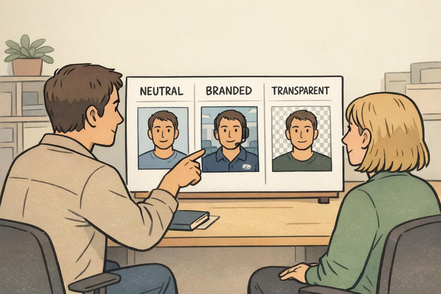
Neutral Backgrounds: The Best Default for Clarity and Consistency
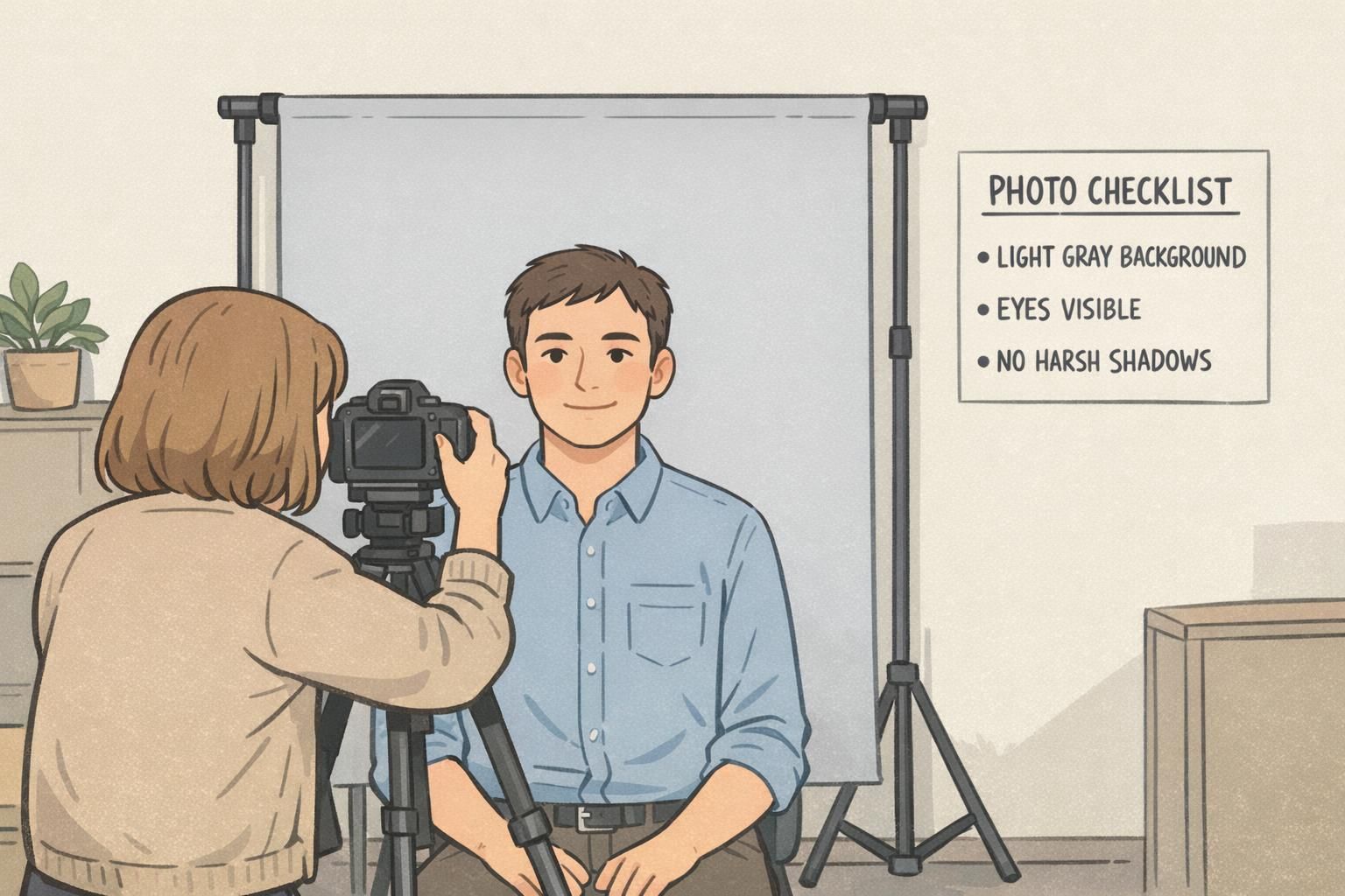
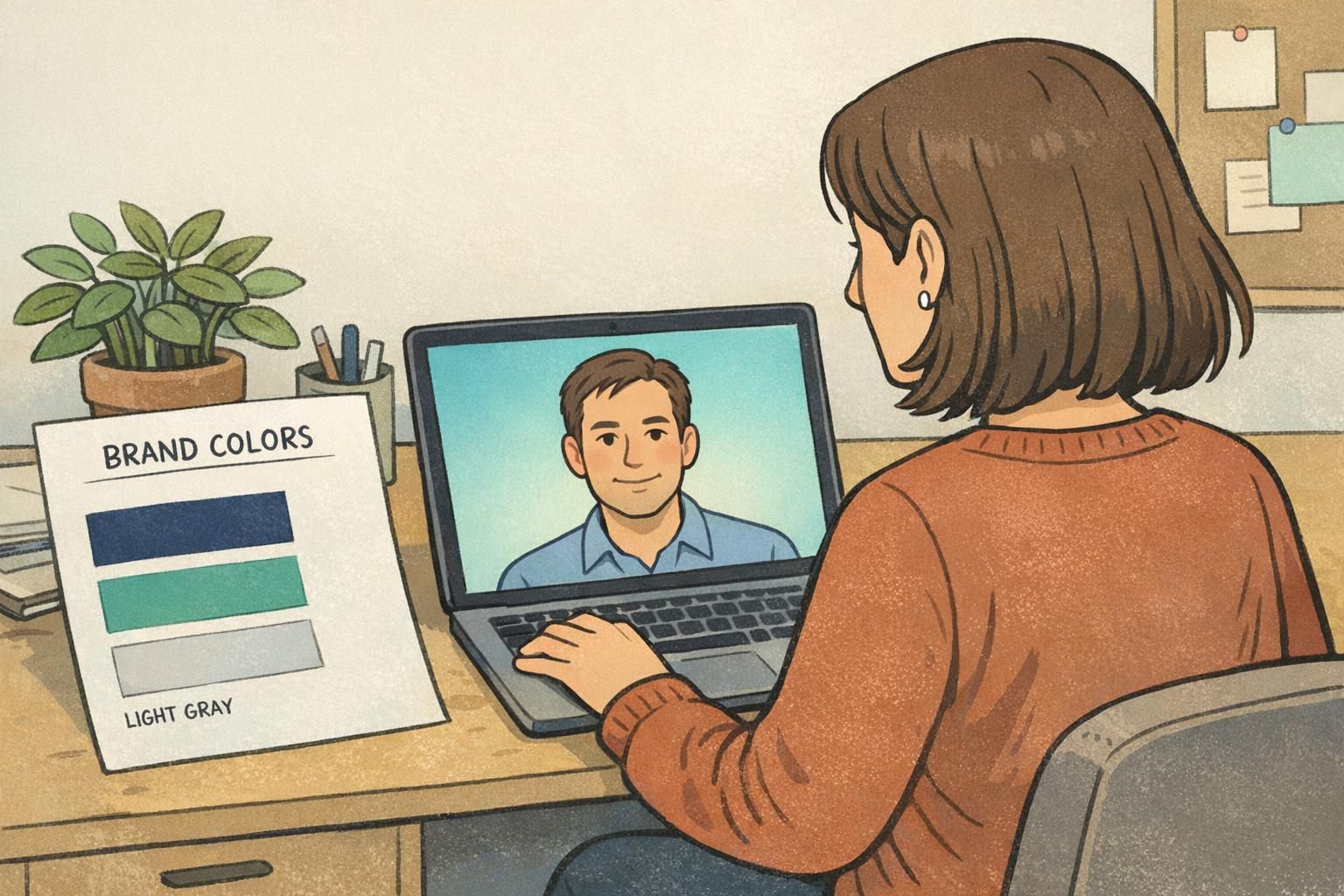
For most workplaces, a neutral background (white, light gray, or soft off-white) is the easiest way to keep attention on the face. That matters in real situations: a receptionist scanning a visitor list, a supervisor checking an employee roster, or a team lead trying to match a person to a photo quickly.
Neutral backgrounds are also forgiving. If photos are taken in mixed lighting conditions—or by different people at different sites—a simple light background helps reduce harsh visual differences. The long-term benefit is consistency: new hires photographed this month will still “match” employees photographed last year, so your directory and badge system looks like one unified program.
Research on visual attention and legibility commonly supports the practical idea that simpler, less distracting backgrounds help keep focus on the main subject—exactly what you want for identification photos where the face is the key information. See source.
- Best use case: fast identification and easy production across multiple locations
- Strongest advantage: consistent face visibility and clean printing
- Common colors: light gray, off-white, or white (choose one and standardize it)
- Operational win: fewer reshoots and less editing to make photos match
Branded Backgrounds: When Identity and Culture Should Show Up in the Photo
A branded background can add personality and reinforce your organization’s visual identity—especially for public-facing environments. Think conference staff, front-of-house teams, or organizations that want a cohesive “brand moment” in photos used across badges and public directories.
The trade-off is that branded backgrounds demand stricter controls. Saturated colors or busy patterns can steal attention from the face, reduce contrast (especially in print), and create inconsistency if different departments interpret the “brand background” differently.
If you go branded, keep it subtle: a soft gradient, a gentle tint, or a minimal pattern that stays behind the subject rather than competing with facial features. Then lock it in as a template so every photo follows the same look.
- Keep background designs minimal so the face stays dominant
- Check contrast in the final badge size (not just on a large screen)
- Standardize the exact color values and gradient direction (so every site matches)
- Avoid overly saturated backgrounds that can print darker than expected
“Branded backgrounds can work beautifully—but only if the template is strict enough that every new photo looks like it belongs in the same system.” – Operations Coordinator
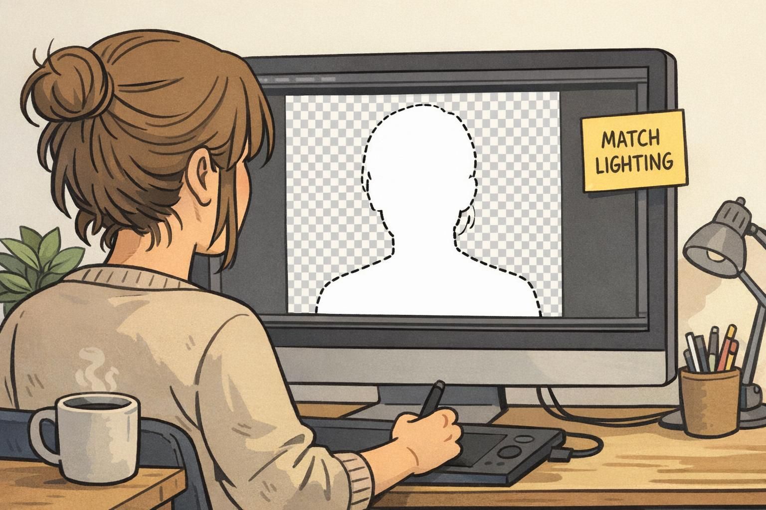
Transparent Backgrounds: Flexibility for Templates, Roles, and Reuse
Transparent backgrounds—typically created by cutting out the subject and saving the headshot as a PNG—are ideal for organizations that reuse the same portrait across multiple badge designs. For example, you might have different templates for departments, clearance levels, visitor categories, or seasonal event badges.
The biggest advantage is flexibility: you can update badge layouts without retaking photos. Your employee headshot becomes an asset that can be placed into any approved template. This is especially helpful when you want the photo to appear consistent across ID cards, badge buddies, and event credentials.
The operational trade-off is quality control. Cutouts must be clean around hair and shoulders, and the lighting has to match whatever background the template uses. Otherwise you may get halos, jagged edges, or a “sticker” look that reduces professionalism.
- Best use case: multiple badge templates by role, location, or event
- Strongest advantage: reuse the same portrait without retaking photos
- Biggest risk: inconsistent lighting makes cutouts look unnatural in the final layout
- Quality tip: define a standard crop and edge cleanup rule so every cutout looks consistent
Operational Consistency Checklist: Make Photos Look Like One System
Consistency is what makes any background choice work. Even the best background policy will fail if framing, lighting, or distance changes from person to person. The goal is simple: photos should look like they were captured in the same place, even when they weren’t.
A written standard prevents “tribal knowledge” from drifting. It also speeds up onboarding because everyone knows what a passable photo looks like before it gets uploaded to a directory, badge software, or access control system.
- Background policy: choose neutral, branded, or transparent—and document it as the default
- Framing: consistent head-and-shoulders crop with eyes at a predictable height
- Lighting: even light on both sides of the face; avoid harsh shadows on the background
- Camera distance: keep it consistent so face size doesn’t vary by employee
- Pass/fail checks: glare on glasses, heavy shadows, low contrast, or hair covering eyes
- File handling: standard naming convention and a single place to store final approved photos
If badges and directories are shared across the organization, one standard is usually the simplest way to keep the system uniform. If you must vary designs (for example, role-based templates), keep the photo capture standard the same and vary only the layout.
They work together. A good background can’t fix poor lighting, and great lighting can still look inconsistent if the background varies. Standardizing both reduces reshoots and helps photos stay usable for years.
Quick Recommendations for Most Organizations
If you want a practical default that scales across locations and time, choose a light neutral ID photo background and enforce consistent framing. This tends to produce the cleanest results for badges, directories, and access-control rosters with minimal editing.
If brand identity is a priority and your organization can enforce strict templates, branded backgrounds can work well—especially when you test print readability and keep the design subtle. If you regularly redesign badge layouts or need role-based designs, a transparent workflow provides maximum reuse, as long as you’re ready to manage cutout quality.
Practical default: neutral background + consistent crop. Upgrade to branded or transparent only when you have the workflow discipline to keep results uniform.
- Choose neutral when: you want the simplest policy with the fewest reshoots
- Choose branded when: you have firm brand governance and can lock templates
- Choose transparent when: one employee headshot must be reused across many badge designs
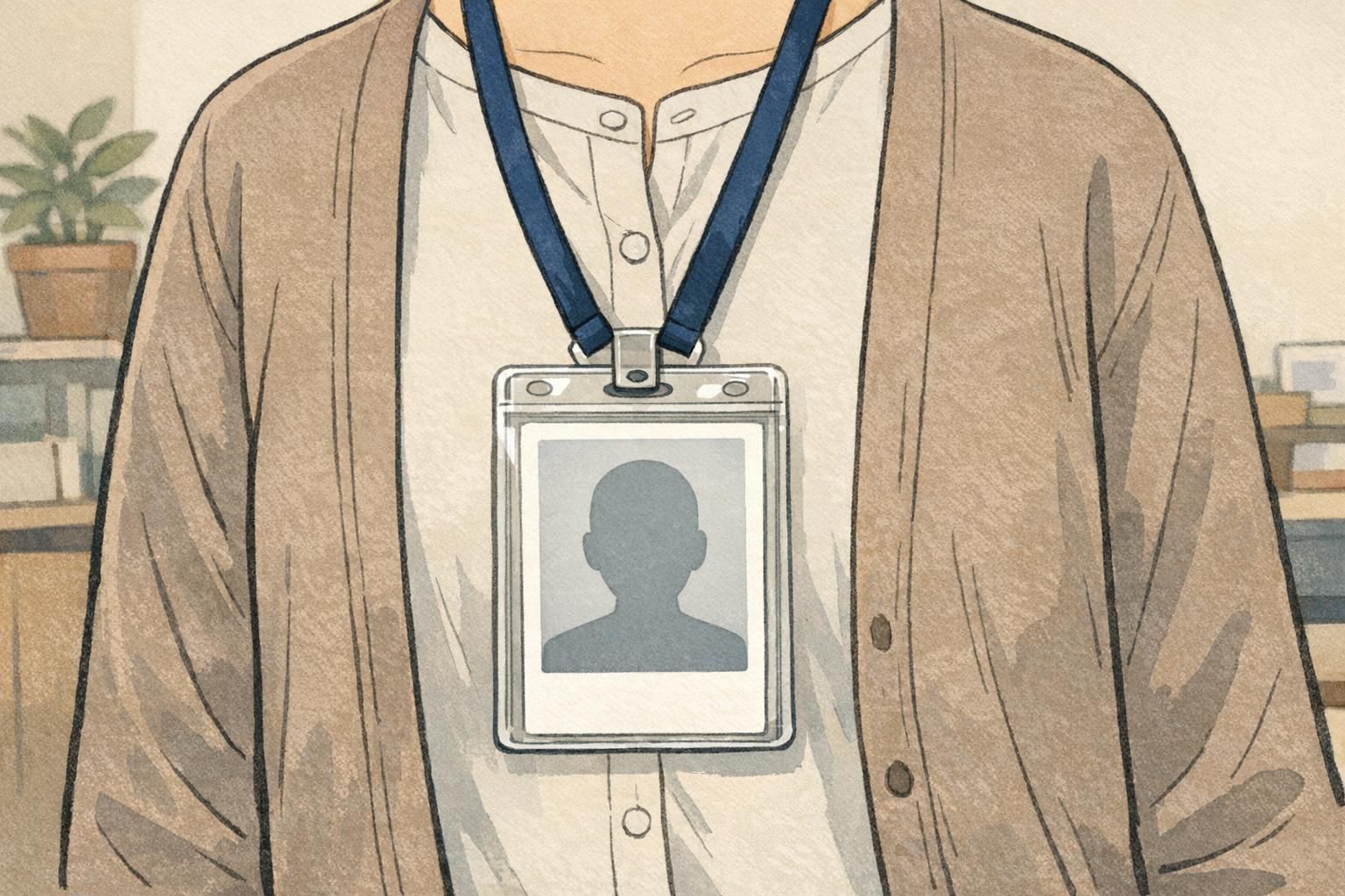
Turning Your Photo Standard Into Better Badges and Name Tags
Once your photo standard is set, the next step is applying it consistently across ID badges, visitor passes, event credentials, and even name tags where photos are used. A unified photo approach helps the whole identification system feel like one program—not a mix of one-off designs.
Standardized photos also reduce print errors and make reprints easier. When someone transfers departments, changes a name, or needs a replacement, you can update the badge layout without needing to redo the employee headshot—assuming the original image meets your standard.
If you’re updating layouts or starting a new badge program, aligning photo rules with the card design (photo size, placement, and contrast) keeps faces readable at a glance. For example, a subtle neutral background often allows slightly smaller photos without sacrificing clarity—useful when your badge also needs room for role indicators or access cues.
When it’s time to produce or refresh cards, consistent photos pair well with predictable print specs and templates. If you’re sourcing cards, BadgeZoo’s custom ID badges can be designed to keep portraits clear and consistent across reprints.
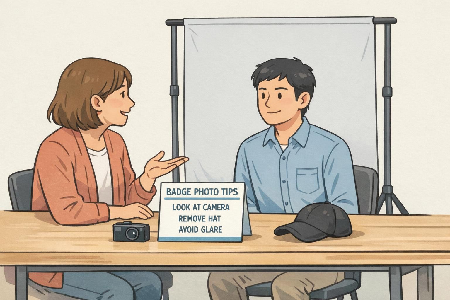
Common Pitfalls (and Simple Fixes) Across All Background Types
Most ID photo issues aren’t caused by the background choice alone—they come from low contrast, inconsistent lighting, and lack of a clear pass/fail standard. The good news is that small adjustments usually fix the problem without changing your entire process.
If you’re building your checklist, include a short set of badge photo tips that the photographer (or the employee) can follow every time. Simple guidance reduces rework and helps every photo meet the same baseline quality.
- Pitfall: background matches hair or skin tone, making edges disappear. Fix: switch to a lighter or slightly darker neutral for better separation.
- Pitfall: branded colors overpower the face. Fix: desaturate the brand color or use a subtle gradient instead of a solid fill.
- Pitfall: glare on glasses hides the eyes. Fix: raise the light source, angle it slightly, or ask the subject to tilt their chin down a touch.
- Pitfall: harsh shadows on the wall. Fix: move the subject farther from the background and use softer, more even lighting.
- Pitfall (transparent): halos and jagged edges around hair. Fix: standardize cutout settings and allow light cleanup around edges.
- Pitfall (transparent): mismatched lighting makes the portrait look pasted in. Fix: keep capture lighting consistent and match the template’s shadow direction.
If you’re unsure where to start, standardize a neutral background, consistent crop, and a short checklist. That combination solves most identification-photo problems with the least operational effort.