
How facility badges support recognition and navigation
Facility badges help people recognize who works at a large site, what role they hold, and whom to approach for assistance. In a campus, multi-building workplace, or sprawling facility, that recognition can also support navigation. A readable name and role label make it easier for a visitor to identify a staff member who can explain where to go next.
The strongest systems connect personal identification with the language used throughout the facility. If a badge identifies someone as part of the North Building reception team, maps and signs should use that same building name. Visitors should not have to work out whether “North Building,” “Building N,” and “North Center” mean the same place.
Badges and location signs serve different purposes. A badge identifies a person; a sign identifies a destination or explains a route. Coordinating them creates useful wayfinding support without asking visitors to rely on someone’s badge to find an entrance, elevator, or department.
Use facility badges to answer “Who can help me?” and maps and signs to answer “Where should I go?” Shared names and visual cues connect those answers.
Create a consistent color coded ID and location system
A color coded ID system works best when every color has a documented meaning and a written identifier beside it. Instead of referring only to “the blue building,” use “North Building — B1” with a blue accent. Someone who cannot distinguish that color can still confirm the destination using its name and ID.
Keep personal roles and geographic locations separate in the design. For example, a badge might show “Contractor” in a clearly labeled role area and “North Building — B1” in a separate assignment area. The location accent can match the map, while the role remains readable in plain text. A person’s assigned building should not be mistaken for their role or authorization.
- Give each building or zone one stable, plain-language name.
- Assign a unique number or letter code to each destination.
- Pair geographic colors with the same names and IDs on maps, signs, and relevant badge fields.
- Keep role labels visually separate from location identifiers.
- Explain any role colors in a shared reference rather than expecting people to guess.
Choose labels that staff can use naturally in conversation. “Take the elevator to Level 2 in North Building, B1” provides more confirmation than “Follow blue.” Color makes the instruction easier to scan; the words and numbers make it specific.

Choose a scalable color scheme for buildings, zones, and roles
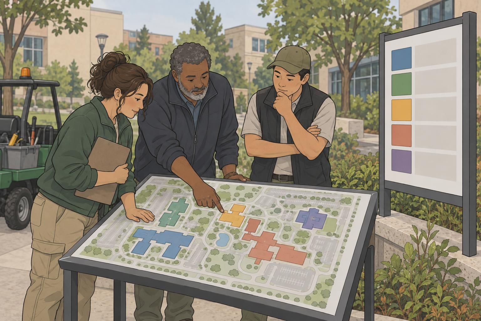
Start with the largest geographic divisions: buildings, wings, or campus districts. Assign each a stable, easy-to-distinguish color, then repeat that color across the relevant maps and signs. Smaller destinations can use names and numbers within that larger grouping instead of receiving a new color for every room.
For example, North Building could use blue and the ID B1, while South Building uses orange and B2. Rooms within North Building would keep the building cue and add their own room identifiers. This approach leaves room for growth without creating a palette that visitors must memorize.
If color also identifies roles on facility badges, document that separate meaning carefully. Avoid making blue mean “North Building” on a wall map but “Visitor” on a badge without a clear distinction. One straightforward option is to reserve color accents for geography and use prominent written labels for employees, contractors, and visitors.
A scalable scheme uses a manageable set of geographic colors and expands through clear names and IDs—not through an ever-growing collection of similar shades.
Connect badge identifiers with signage and wayfinding
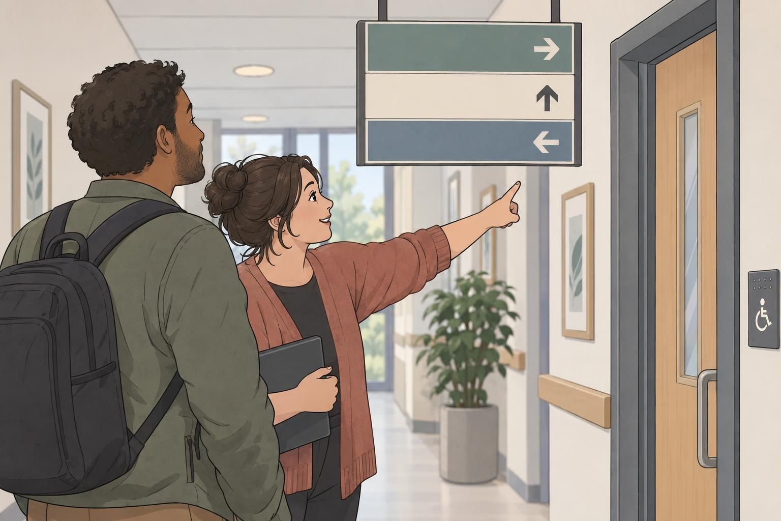
Once the naming and color standards are established, carry them across the places where people make decisions. A visitor should encounter the same destination name on a lobby map, at a corridor junction, and outside the destination itself. Familiar pictograms can provide another supporting cue when their meaning is clear and consistent.
- Directional signs show which way to travel, using destination names, IDs, and arrows.
- Identification signs confirm arrival at a building, room, or department.
- Informational signs explain details such as where to check in or find assistance.
- Safety signs communicate safety information and should remain distinct from decorative zone colors.
Repeat location cues at entrances, intersections, elevator lobbies, and other decision points. A colored marker at the main entrance is not enough if the next turn offers no confirmation. Think of wayfinding as a sequence: orient the visitor, indicate the next direction, and confirm arrival.
Staff identification can reinforce that sequence. A reception badge with a clear role label helps visitors find assistance, while a written building assignment gives staff and visitors a shared reference. Keep the destination wording identical wherever it appears rather than shortening it differently on each item.
Make color-coded systems accessible and easy to read
Color should support recognition, not carry the entire message. People may distinguish colors differently, and lighting can change how a printed accent looks. Every destination should remain identifiable through its name, number, letter, or a clear combination of those elements.
Use strong contrast between text and its background, simple labels, and symbols that are easy to recognize. Keep sign placement consistent so people know where to look. On badges, give names and role labels enough space rather than letting a large colored design compete with the information.
The Federal Highway Administration’s traffic-sign guidance provides a related reference for controlled, consistent use of sign colors together with identifying information: source. Its context is traffic control, not an indoor facility design standard, but the practical principle is useful here: color belongs within a defined visual system rather than standing alone.
Test actual badge and sign samples under the facility’s lighting. Invite users with different visual needs to check whether they can read role labels, distinguish destinations, and follow a route without depending on color. Use their feedback to improve contrast, wording, placement, and the repetition of route cues.
Select facility badges that make roles easy to recognize
Choose a badge layout that makes the person’s name and role easy to find. Use the same position for those fields across employee, contractor, and visitor identification. Consistent placement lets people scan for useful information without learning a different layout for every badge.
Keep the design focused. A readable name, a clear label such as “Reception” or “Contractor,” and a relevant assignment identifier are more useful than several unexplained color bands. If a badge buddy adds a role label, coordinate it with the main badge so the two pieces reinforce one another.
Wear facility badges where others can see them, on the outer layer of clothing, with the information facing outward. Whether the badge uses a clip or lanyard, check that its usual position keeps the name and role visible. A well-planned layout loses its value when it is covered or turned around.
When considering badges, name tags, ID cards, or badge buddies from BadgeZoo, start with the information people need to recognize—not the decorative treatment. Then choose a format that presents those identifiers clearly and fits the facility’s shared visual system.

Plan, test, and maintain the system as the facility changes
Set naming, numbering, and color standards before producing badges, maps, and signs. Keep a central reference that records each location’s official name, unique ID, color, and any associated symbol. Include role labels and badge layout rules so future updates follow the same logic.
- Ask visitors to follow sample routes and note where they hesitate.
- Ask staff to identify roles and assignments from sample badges.
- Check that maps, signs, and badge fields use matching names and IDs.
- Review samples under real lighting and at their intended viewing positions.
- Update affected materials together when a space, route, or role changes.
Do not treat testing as a one-time task. A renamed wing or relocated department can leave conflicting cues behind if only the main map changes. Review the complete route and any related identification materials, then replace outdated references consistently.
Effective facility badges belong to a coordinated system: people are recognizable, destinations are clearly named, and route cues remain consistent. When color supports readable information across badges, maps, and signs, a large facility becomes easier to understand without requiring visitors to decode it.