Badge Template Consistency: Making Badges Look Like One System
Why a badge template keeps every ID looking like one system
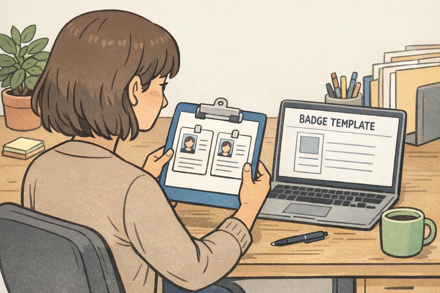
A badge template is the easiest way to make identification feel intentional instead of improvised. When every badge starts from the same structure, your team doesn’t have to reinvent the layout for each new hire, volunteer group, or event. Names, photos, roles, and access indicators land in predictable places, which helps reduce misprints, rework, and “almost right” designs that look slightly different from one batch to the next.
That predictability matters in everyday use. People learn where to look for the name, where to confirm a role, and how to spot the “official” look of your organization’s IDs. Research on structured, consistent systems supports the idea that clarity and consistency help people understand what a system is trying to communicate and recognize it as coherent and legitimate (source). In practical terms: a consistent badge system is faster to read, easier to trust, and simpler to maintain over time—especially when multiple departments or locations issue badges.
Consistency isn’t about making every badge identical—it’s about making every badge recognizable as part of the same system.
Where inconsistency causes mistakes (and how templates prevent them)
Most badge errors aren’t dramatic—they’re small layout choices that add up to confusion and reprints. One badge has a condensed font that’s hard to read; another crops the face too tightly; a third pushes the role title into a corner because the spacing isn’t consistent. When these variations accumulate over time, the result is a pile of IDs that look “close enough,” but don’t work like a single system.
- Mismatched fonts and font sizes that make names harder to scan at arm’s length
- Misaligned or inconsistently cropped photos that reduce quick recognition
- Role titles that don’t fit the available space and end up squeezed, wrapped awkwardly, or truncated
- Color choices that reduce readability (low contrast) or confuse meaning (different colors used for the same role)
- Inconsistent placement of key fields like expiration dates or ID numbers, causing missed checks
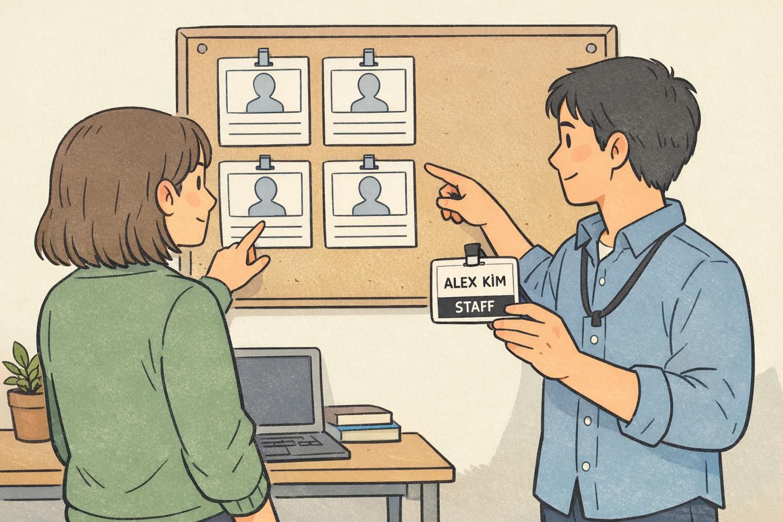
Templates prevent these problems by locking down the grid, font hierarchy, and spacing rules so the only changes are the variable fields—like name, photo, department, or expiration date. This is the backbone of consistent ID design: predictable placement and controlled flexibility. It also shortens approvals because reviewers know exactly where to look to confirm accuracy. Fewer surprises mean fewer last-minute fixes and fewer reprints.
“Once we standardized the layout, proofing got faster. Instead of debating design every time, we just confirm the photo, the name spelling, and the role.” – Operations Coordinator
A simple style guide your team can maintain (1 page, not a novel)
A template is strongest when it’s paired with a lightweight style guide—something anyone can follow without a design background. The goal is not to document every possible scenario; it’s to make everyday decisions consistent so you don’t rely on memory or personal preference.
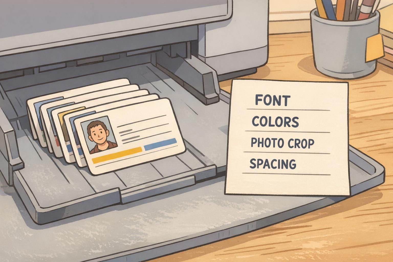
If you keep it to one page, people will actually use it. Think of it as a “badge rule sheet” that lives next to the template file and answers the questions that cause drift: Which font do we use? How should photos be cropped? What colors are allowed? Where does the logo go?
- Logo usage: approved version(s), clear space rules, and where it can appear on the card
- Typography: two fonts max, with defined sizes/weights for name, role, and secondary details
- Color palette: a small set of approved colors with accessible contrast for text
- Photo rules: background guidance, consistent crop (e.g., head and shoulders), and placement
- Spacing and alignment: margins, grid rules, and what must stay aligned
- Do/don’t examples: one “correct” sample and a few common mistakes to avoid
If more than one person can produce IDs, you need rules that survive handoffs. A one-page guide is often enough to keep standardized badges uniform across teams and locations.
Template anatomy: the few elements you standardize—and the few you vary
A good system doesn’t standardize everything—it standardizes the things people depend on. The best badge template designs create “anchors” (fixed elements) that keep recognition and readability stable, while allowing limited variation for quick identification.
- Standardize: card size and orientation so badges sit consistently on lanyards and clips
- Standardize: margins and a grid so text and photos line up from badge to badge
- Standardize: photo position and size so faces are equally recognizable
- Standardize: name placement and name size so the most important field is always easy to find
- Standardize: organization branding placement so badges read as official
- Standardize: consistent placement of role/clearance label (even if the wording changes)
Then choose a few variations that are intentional and controlled. For example, a department color stripe can help staff identify teams quickly, but it should be limited to an approved palette. If you use icons for roles, keep them simple and consistent, and avoid introducing new icons without updating your controlled list. This is where standardized badges shine: variation helps recognition, but constraints prevent the design from drifting into a patchwork over time.
- Vary intentionally: department color stripe (from a fixed palette)
- Vary intentionally: role icon (optional, from an approved set)
- Vary intentionally: role title (from a controlled list, with defined abbreviations if needed)
Naming conventions and field rules that reduce reprints
Many reprints come from “data drift,” not printing problems. If one person enters a role as “HR,” another types “Human Resources,” and a third uses “People Ops,” your badges won’t look consistent—and people won’t know if those differences mean something. Field rules are the quiet work that keeps your badge template clean.
- Name format: choose a casing rule (e.g., “First Last” or “FIRST LAST”) and stick to it
- Preferred names: define when and how they appear (and whether legal name is stored separately)
- Pronouns (optional): decide whether they appear and where, so it’s consistent when used
- Character limits: set max lengths for name, role, and department to prevent overflow
- Controlled lists: one official list for departments and roles to avoid near-duplicates
- Dates: define the exact format for issue/expiration dates (and whether they are required)
- Other fields: document whether location, shift, or ID number is required and where it appears
If you want fewer reprints, reduce free-typing. Controlled lists and clear field limits prevent the most common “it didn’t fit” and “we labeled it differently” problems.
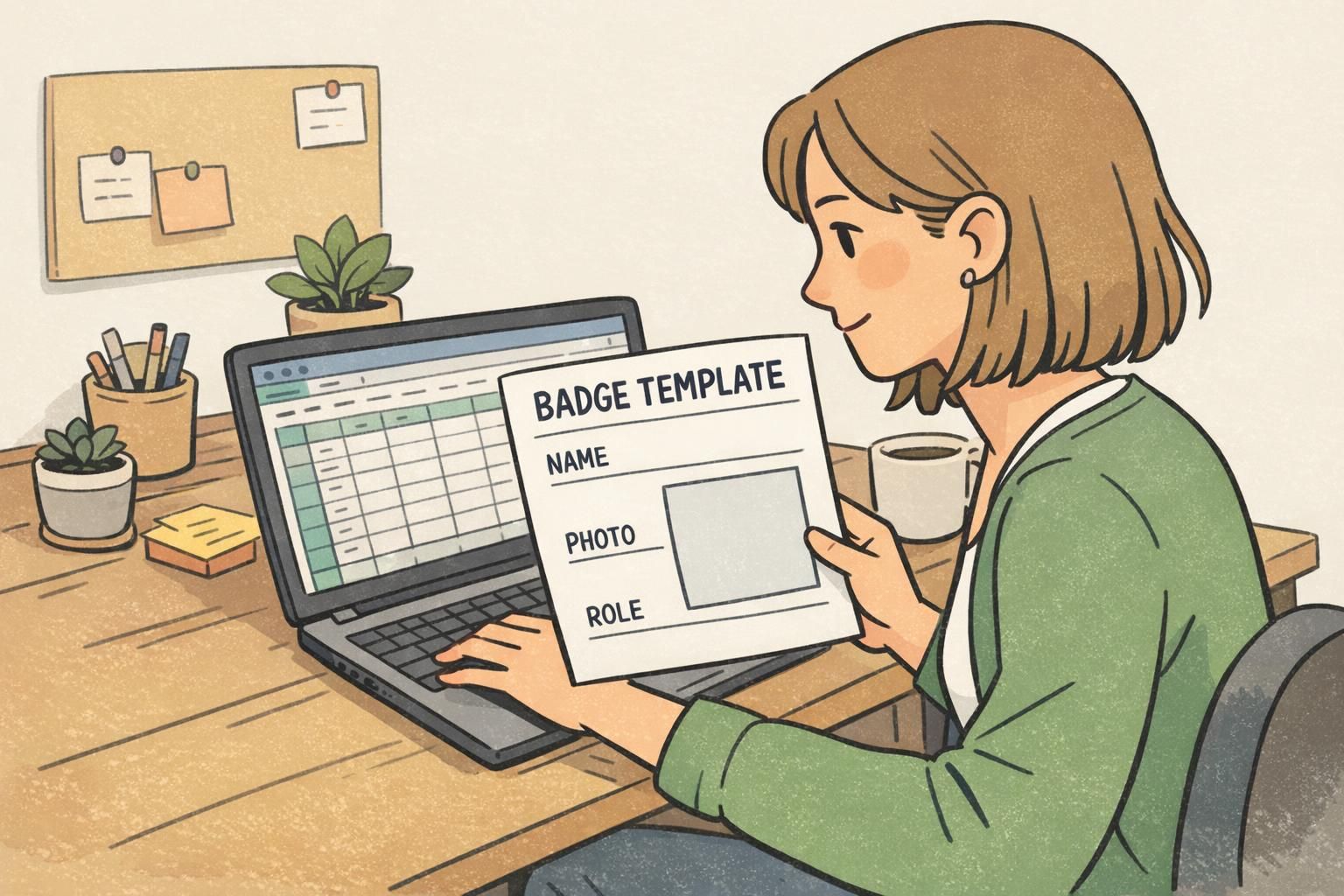
Designing for readability, scanning, and real-world wear
Badges aren’t read in perfect conditions. They’re viewed at arm’s length, under mixed lighting, sometimes through glare, and often while people are moving. That’s why consistent ID design should prioritize readability first, then aesthetics.
- Make the name the largest text element, with strong contrast against the background
- Keep the layout uncluttered so the important details aren’t competing for attention
- Use a consistent photo crop and size so faces are easy to recognize
- Avoid relying on color alone to communicate role or clearance—pair color with text
- Reserve small text for truly secondary information (ID number, issue/expire date, location if needed)
Also consider how badges will be worn. A clip may tilt; a lanyard may flip; a badge holder may add glare. When you keep the primary fields (photo, name, role) in predictable, high-contrast locations, the badge still works in the real world—even when the conditions are less than ideal.
Big enough to read quickly at arm’s length. In practice, that usually means the name is the most prominent element, with a clear typeface and high contrast. The exact size depends on your card format, but the hierarchy should be obvious.
Department colors can be helpful if they’re consistent and accessible. Limit the palette, keep contrast strong, and always include text labels so color isn’t the only indicator.
How templates scale across departments, sites, and events
The bigger your organization—or the more frequently you issue IDs—the more a single system pays off. When clinics, campuses, warehouses, or satellite offices all follow the same template rules, people can instantly recognize what “official” identification looks like, even if they don’t know the individual.
Templates also help when staffing changes quickly. Seasonal staff, temporary teams, visiting contractors, and multi-day conference attendees can be added without starting from scratch. You can build controlled variations—like a site code, an event day indicator, or a visitor label—without breaking the overall system. Over time, standardized badges make onboarding and check-in smoother because the format stays familiar, and the process stays repeatable.
Putting templates into production with BadgeZoo printing
Once your layout and rules are set, production is about consistency from batch to batch. Materials and finishing choices should match how the badge will be worn and how often it will be replaced—daily workplace wear, multi-day events, or frequent re-badging. The goal is simple: when someone receives a new card, it should look and feel like it belongs to the same system as the last one.
If you’re aligning multiple identification types—like name tags, ID cards, and event badges—use the same template rules (grid, fonts, hierarchy, and role labeling) so the experience is cohesive. When it’s time to print, BadgeZoo can produce custom ID badges that follow your established layout, helping your system stay consistent as names and roles change. If you’re unsure how to translate a template into a print-ready setup for your workflow, you can ask questions through http://badgezoo.com/contact.
The template creates the structure; production choices help that structure look consistent in real-world use, across every batch.
Quick checklist: your “one-system” template rollout plan
Rolling out a template is less about design and more about process. The more your team can rely on a single source of truth, the less likely the system is to drift over time.
- Confirm the final template files (and store them in one shared location)
- Define which fields are required vs. optional (and when optional fields are used)
- Publish the one-page style guide alongside the template
- Create an approval workflow for roles, photos, and expiration rules
- Maintain one official list for department names, role titles, and department colors
- Run a small pilot batch to catch spacing, cropping, and long-name edge cases
- Lock the template after launch so edits require a deliberate version update
- Document what changes trigger a new version (e.g., rebranding, new role taxonomy, new compliance needs)
“Our biggest improvement wasn’t the design itself—it was agreeing to one template, one list of roles, and one way to format names. Everything got easier after that.” – HR Generalist