Company Logo Badge Design: Branding Without Stealing the Spotlight
Why a Company Logo Badge Works Best When the Person Comes First
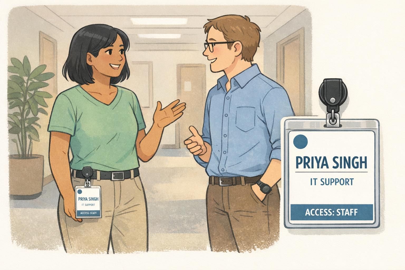
A company logo badge succeeds when it helps people identify each other quickly and confidently—without making anyone squint. In real workplaces and events, most badge interactions happen in motion: passing in hallways, greeting at a front desk, or scanning a crowd for the right person. That’s why the wearer’s name should be the star of the layout, with the logo acting as a steady brand cue in a supporting role.
A practical way to think about it is visual hierarchy. Your badge should answer, in order: “Who is this?” then “Why are they here / what do they do?” and only then “What organization is this connected to?” When you design the hierarchy first, the branding looks cleaner and the badge performs better—because the most important information is the easiest to read at a glance.
- Primary: Name (largest type, highest contrast)
- Secondary: Role/title or access cue (clear, not tiny)
- Optional: Photo (if your program uses photos for verification)
- Supporting: Department, location, barcode/QR, ID number
- Brand signal: Logo (consistent placement, clearly secondary)
The best badge branding feels almost effortless: you notice the logo, but you never struggle to read the person’s name.
Information Hierarchy That Prevents Crowding
Crowding is the most common reason badges become hard to use. It usually happens when every element is treated as equally important—logo, name, title, department, QR, internal codes—so nothing stands out. A clean hierarchy prevents that by assigning each element a “job” and giving it the space to do that job.
Start with a simple order of importance: name first, role/title (or access level) second, photo (when used) third, and only then supporting elements like department and codes. If your badge must include scanning elements, remember that barcodes and QR codes need breathing room too; cramming text near the code can make scanning less reliable and makes the whole badge feel busy.
- Set a “name safe zone”: reserve a consistent block where the name will always fit, even for long names.
- Stress-test with long inputs: hyphenated last names, longer titles, and departments with two words.
- Use fewer text sizes: typically 2–3 sizes is enough (name, role, supporting).
- Avoid stacking too many lines at the top third of the badge—this is where eyes go first.
- Keep margins print-safe: leave comfortable outer padding so nothing feels squeezed.
Prioritize what must be read by a person versus what can be scanned. Put “human-readable” info (name, role) first, and move less-used details to smaller supporting text or to a barcode/QR.
Usually no. A consistent logo that’s easy to spot works better than an oversized mark that competes with the name. Recognition comes from repetition and consistency, not maximum size.
Subtle Logo Placement Patterns That Stay Out of the Way
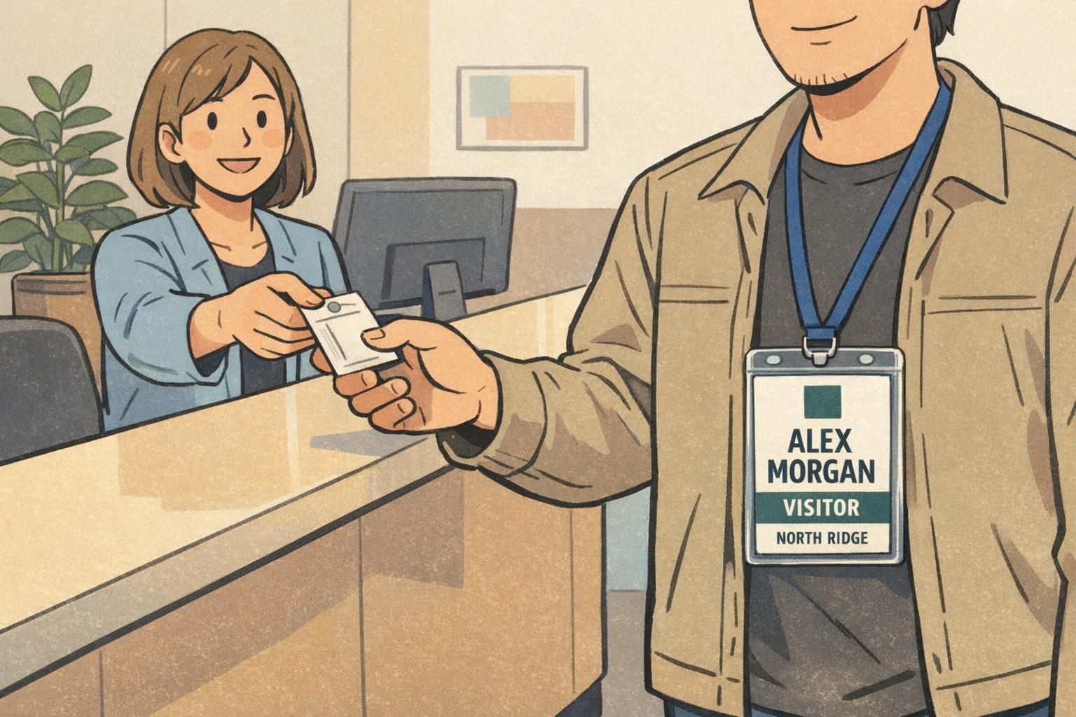
Once the name and role are clearly prioritized, the logo can be placed in a way that feels intentional, consistent, and quiet. The goal isn’t to hide your logo—it’s to keep it from interrupting the fast read of the badge.
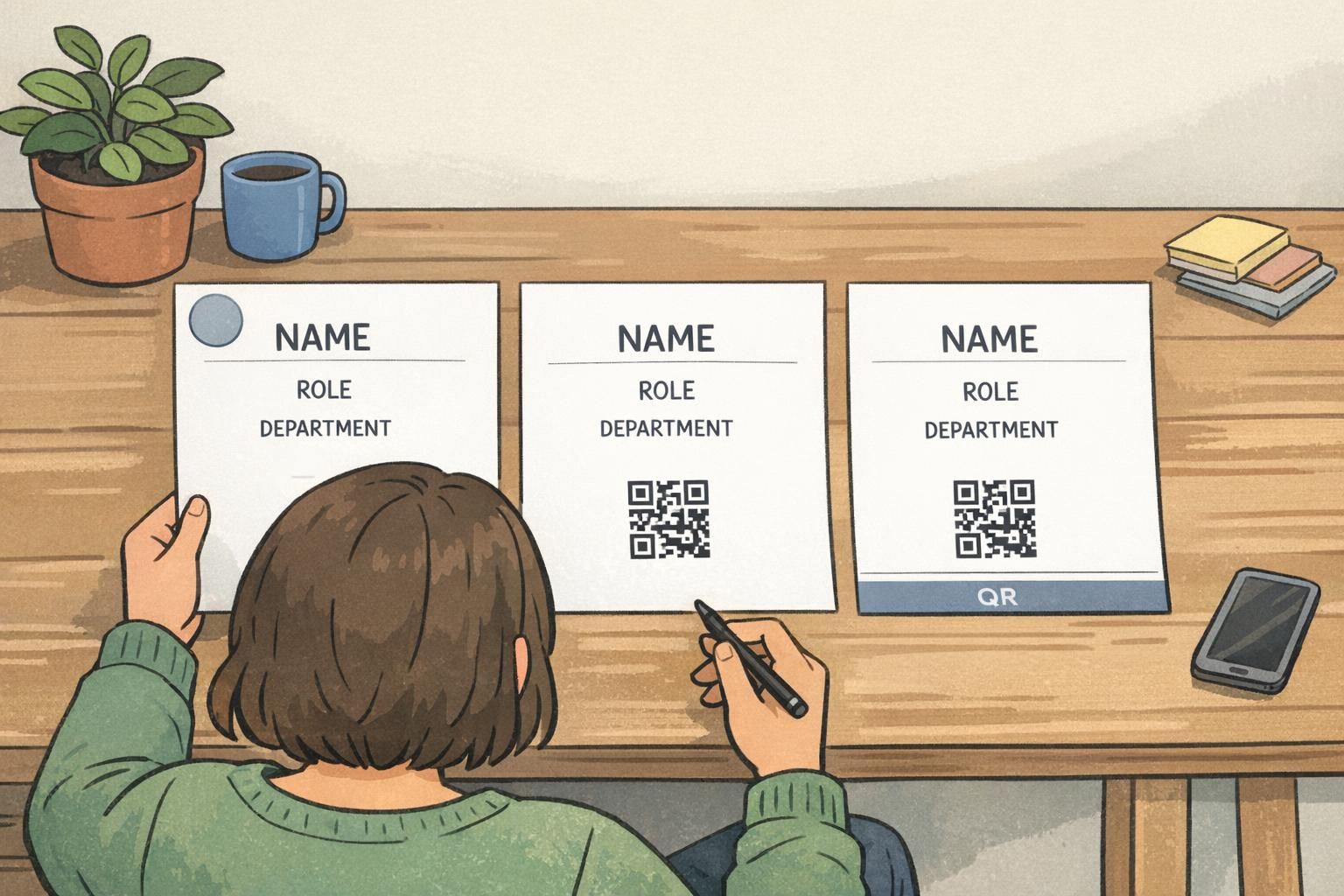
Two placement patterns tend to work well across workplaces, visitor programs, and event floors. First is the small corner logo (top-left or top-right). Second is a footer strip logo that reads more like a seal—present, but not competing with the identity information.
- Corner logo (top-left/top-right): Great for everyday employee and visitor badges; stays consistent across layouts.
- Footer strip logo: Works well when you need a strong but contained brand element; keeps the top area clean for the name.
- Avoid placing the logo behind text: Watermarks can look attractive, but they often reduce readability.
- If using a tint or watermark: Keep contrast very low so text stays crisp at a distance.
“When the logo sits in the same place on every badge, people recognize the organization instantly—without the badge ever feeling cluttered.” – Facilities Coordinator
Size, Contrast, and Simplicity: Making the Logo Readable on Small Prints
Badges and ID cards are small objects that need to work from a few feet away. That changes what “good branding” means. Fine details, thin lines, and complicated multi-color marks can blur or fill in when printed small—especially if the badge is viewed through a clear holder or under indoor lighting.
In many cases, a simplified mark or an approved one-color version of your logo prints more cleanly than a detailed full-color treatment. It can also look more official, because it reads as intentional rather than “shrunk to fit.” This aligns with the practical design principle that simpler, well-balanced visuals improve recognition and reduce clutter in constrained formats (source).
- Use strong text-to-background contrast: prioritize readability over decorative backgrounds.
- Prefer a simplified logo mark on small formats: fewer tiny details, fewer thin strokes.
- Avoid busy patterns behind the name: even subtle textures can reduce clarity at distance.
- Keep the logo smaller than the name: the badge is primarily an identification tool.
- Check how it looks in real life: printed, inside the holder, under typical lighting.
If you’re choosing between “more branding” and “easier to read,” choose easier to read. A clean badge still strengthens the brand because it looks professional and consistent.
Framed vs. Unframed Logos: Choosing the Right Feel for the Setting
A logo’s container—whether it sits inside a small frame or stands alone—changes the tone of the badge. Neither is inherently better. The right choice depends on the environment and the kind of trust signal you want the badge to communicate.
A subtle framed logo can feel formal and security-oriented, which may fit hospitals, labs, schools, or any setting where credentials need to look standardized and official. An unframed logo can feel lighter and more flexible, which often suits creative teams, startups, or casual events. The key is restraint: the frame shouldn’t turn the logo into a headline element.
- Choose framed when: the setting is security-sensitive, regulated, or needs a uniform “credential” look.
- Choose unframed when: you want a clean, modern feel with less visual weight.
- Keep containers thin and minimal: avoid heavy outlines that pull attention from the name.
- Use the same treatment across roles: consistency is what makes the system feel intentional.
“We used a small framed mark for staff badges because it reads like an official credential—but we kept the name block dominant so visitors can still identify people quickly.” – Front Desk Supervisor
How to Handle Multi-Brand Needs and Sponsor Rows Without Clutter
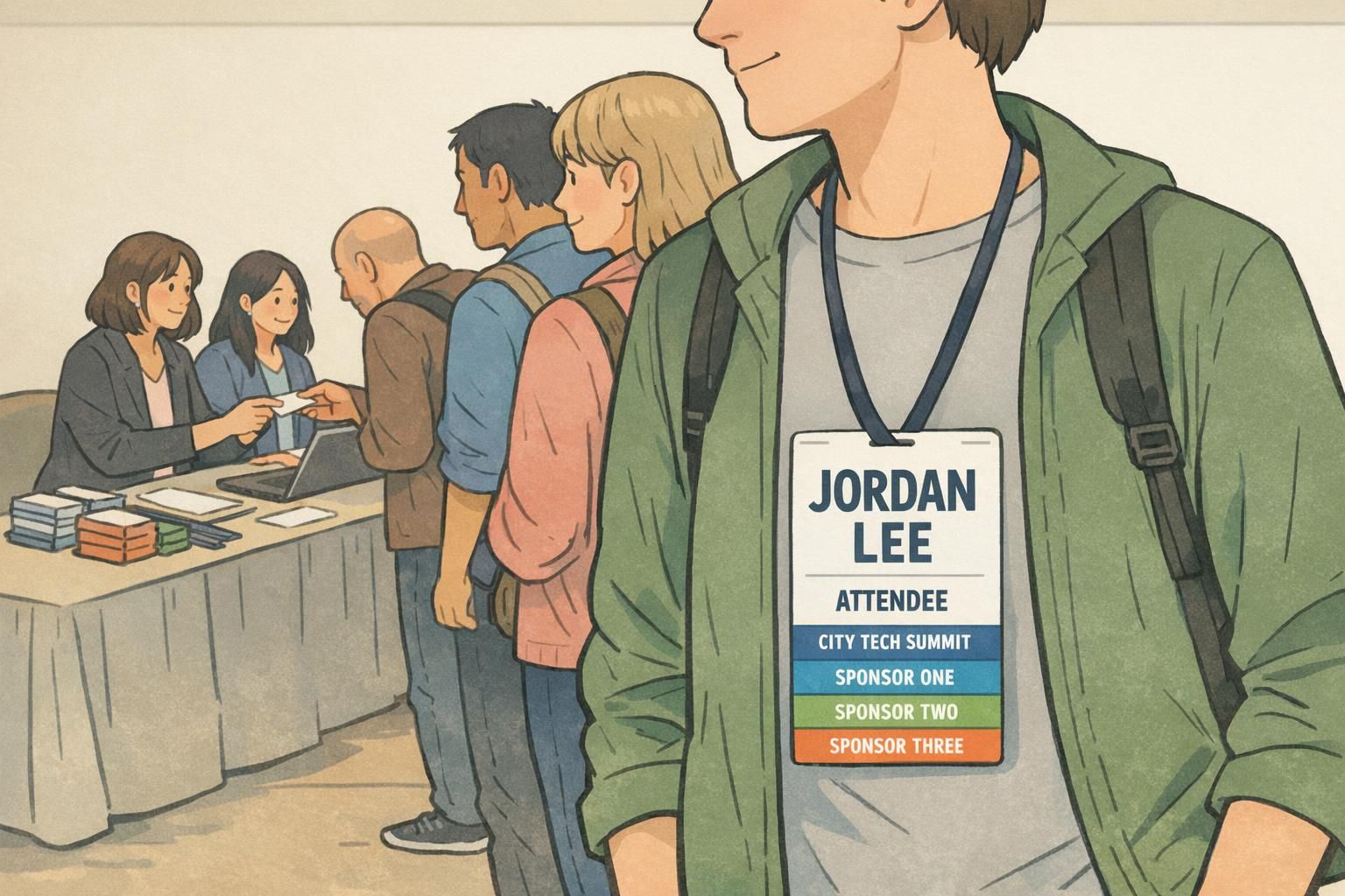
Multi-brand badges—like conferences with sponsors or partner programs—are where badge branding can spiral into visual noise. The best approach is to contain additional marks in a dedicated area so they don’t fight the attendee’s name.
A simple sponsor row works well: equal logo heights, consistent spacing, and a clear boundary (often at the bottom). That boundary can be a footer band, a light divider line, or just a well-spaced row with enough margin to feel separate from the main identity block.
- Use a dedicated sponsor row near the bottom to protect the name area.
- Normalize sponsor size: equal heights read calmer than mixed, competing sizes.
- Use official supplied logo files: they reproduce more accurately and look more trustworthy.
- Avoid “retyping” brand names as a substitute for logos: it reduces recognition and looks inconsistent.
As a rule of thumb, include only what fits comfortably in a single contained row without shrinking the name or tightening margins. If you need more, consider printing sponsors on the back or using a separate sign/handout.
No. The event mark is part of the badge’s identity system, so it should have a consistent placement and size—usually larger than sponsors but still secondary to the attendee’s name.
Brand Rules and Legal Basics: Use Official Files, Don’t Modify Marks
Logos aren’t just graphics—they’re controlled brand assets. If you stretch, recolor outside approved palettes, or rebuild a logo from scratch to make it “fit,” you risk creating inconsistency and confusion. On a badge, those issues show up fast: the mark can look unofficial, low-quality, or simply “off.”
The most reliable practice is straightforward: ask for brand guidelines and use the correct file formats. If your badge layout is tight, it’s better to adjust placement, simplify the mark using an approved alternate, or reduce less important text than to distort the logo. And if you’re designing for a security-sensitive environment, authenticity is better supported by additional design and production features than by making the logo oversized.
- Use official logo files (don’t screenshot or copy from a website header).
- Don’t stretch or skew to fill space—resize proportionally.
- Don’t recolor outside approved palettes without permission.
- If the logo is too detailed, request an approved simplified or one-color version.
- Choose clarity over “fitting everything”: the badge must function first.
A logo that follows brand rules—clean, consistent, and undistorted—tends to look more official even when it’s smaller.
Applying the Same Branding Logic to a Branded ID Card Program
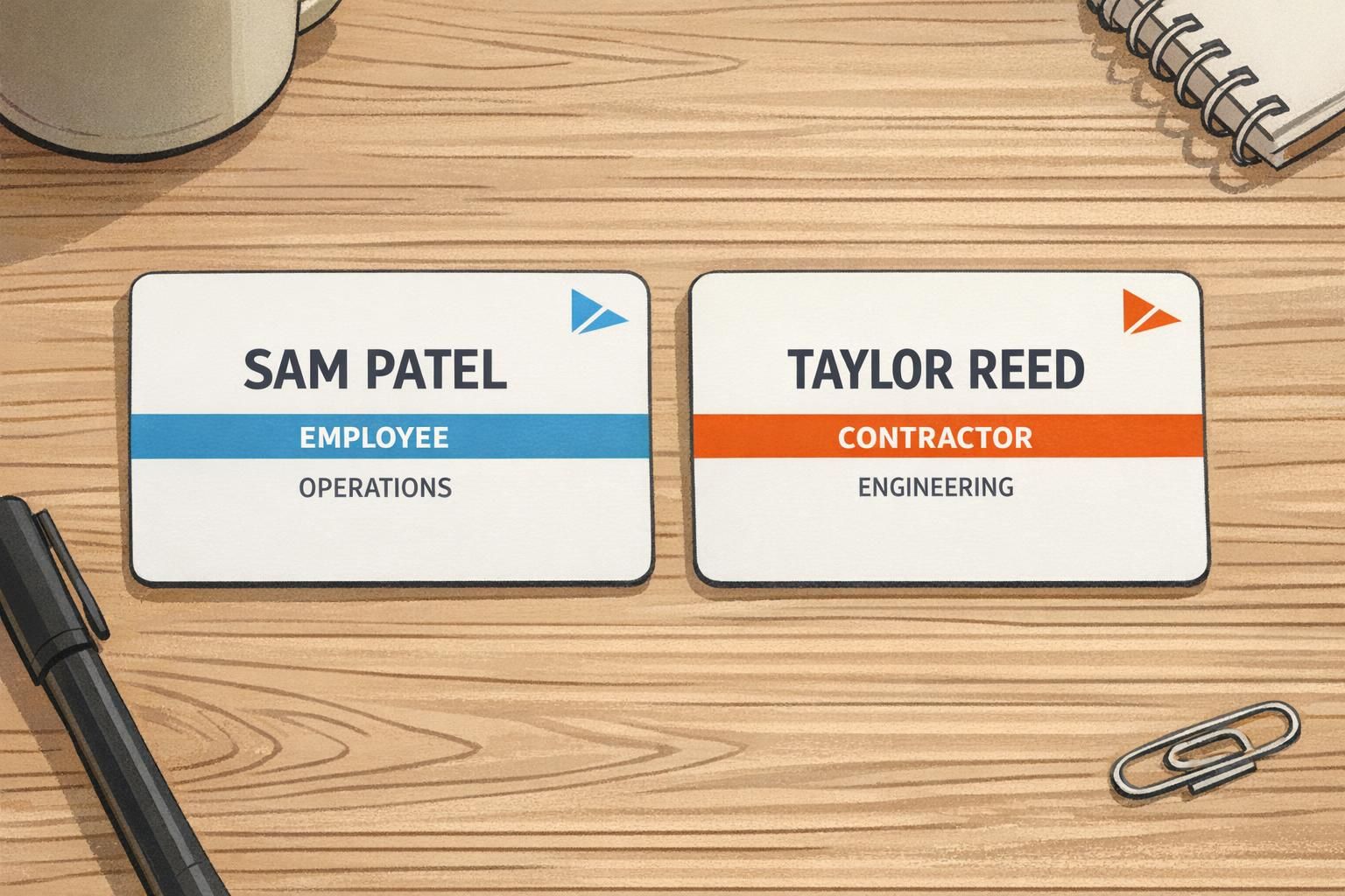
The same hierarchy that makes a company logo badge easy to read also makes a branded ID card program easier to manage. The key is standardization: consistent logo placement, consistent size, and consistent margins across every card type—employee, visitor, contractor, and VIP.
Instead of redesigning each card from scratch, keep the core structure the same and differentiate roles with a clear label, a color bar, or simple icons. This reduces confusion for staff who check credentials and makes the whole system feel unified. Your logo stays consistent in the same place, while the role cues do the work of quick recognition.
If you’re building or refreshing an ID program, printed cards are a common starting point—especially when you need durable credentials that can support barcodes/QR or other access workflows. For example, BadgeZoo offers custom PVC ID cards that can be designed with consistent layout rules across multiple role types.
- Keep the name block dominant on every version of the card.
- Standardize logo placement and size across roles so the system looks coherent.
- Use role labels that are readable at a glance (avoid tiny all-caps lines).
- Differentiate roles with a color bar or clear tag, not with larger logos.
- Use templates: fewer variations make ordering and reprints simpler.
Quick Layout Checklist (and Common Mistakes to Avoid)
When you’re close to finalizing a badge, a quick checklist can catch the small issues that cause real-world problems—like hard-to-read names, cramped spacing, or logos that accidentally become the loudest element. A clean badge should feel obvious: you can spot the person’s name instantly, understand their role, and still recognize the organization.
- Name is the largest element and easy to read from a few feet away.
- Role/title or access cue is immediately visible (not buried in small text).
- Logo is secondary but consistent (same placement across badges).
- Long-name stress test passes (no awkward shrinking or squeezed margins).
- Print-safe margins are preserved (nothing hugs the edge).
- Barcode/QR has a quiet zone (no text or graphics too close).
- No logo background or watermark reduces contrast behind the name.
- Top third isn’t overcrowded (avoid stacking too many elements up high).
- Logo files are high-resolution and official (not pixelated or improvised).
Letting the logo compete with the name. When the name shrinks to make room for branding, the badge stops doing its main job: quick identification.
It can be, as long as it stays subtle and never reduces text contrast. If you’re unsure, keep the background clean and let the logo and color accents do the branding work.
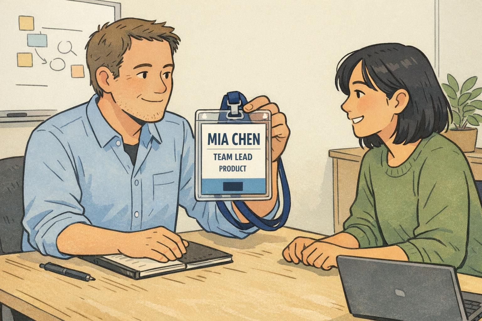
A well-designed company logo badge makes introductions smoother: the person is readable first, and the brand is recognized effortlessly second.