ID Badge Photo Placement: Where the Face Belongs on an ID
Why ID Badge Photo Placement Matters for Fast Recognition
An ID badge photo does a job that text can’t always do quickly: it lets people recognize the wearer at a glance. In a busy workplace, a clinic hallway, a warehouse floor, or a check-in line at an event, that split-second recognition reduces awkward pauses and prevents mix-ups.
Good photo placement also makes the whole badge feel more professional and easier to verify. When every badge follows the same pattern, coworkers and security staff don’t have to “hunt” for the face, then re-orient themselves to find the name, role, or access indicators. Consistent placement keeps the photo prominent without crowding out the information that also needs to be readable.
The goal of strong photo placement is simple: make the face immediately findable and clearly readable, while leaving space for names, roles, and scannable elements.
- Faster recognition in high-traffic areas (reception desks, hallways, events)
- Less confusion when multiple people have similar names or roles
- Cleaner badge design that doesn’t force text to shrink
- Easier security checks when comparing a badge to a roster or access list
Card Layout vs. Face Placement: Two Different Decisions
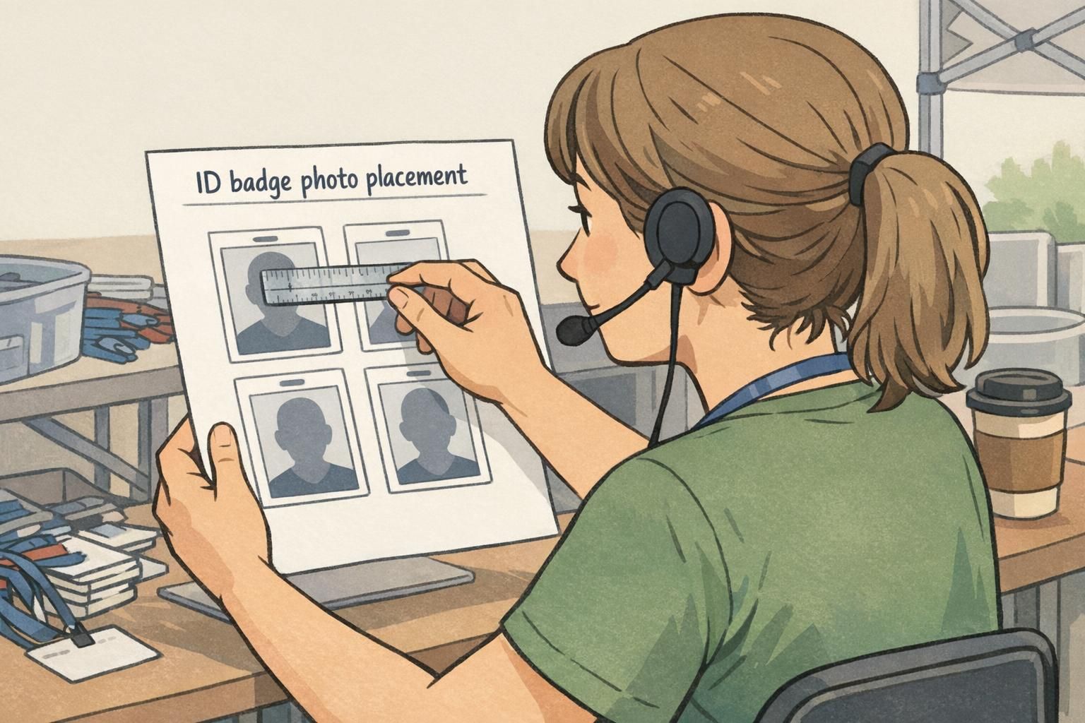
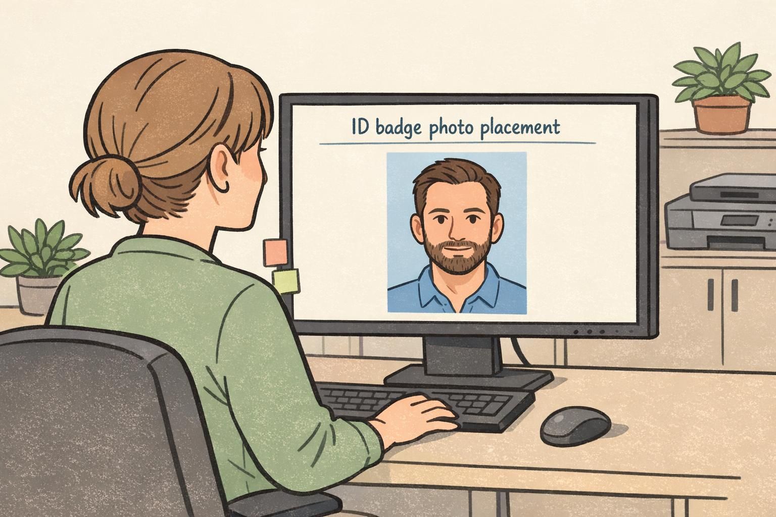
It helps to separate two choices that often get blended together: (1) where the photo sits on the badge layout, and (2) where the face sits within the photo itself. You can have a well-designed badge layout but inconsistent headshots—or perfectly framed headshots placed into a cluttered layout. The best results come from standardizing both.
The layout decision is about the “photo block” on the card: does it live on the left or right, top or center, vertical or horizontal format? A clean layout keeps the portrait in a prominent, uncluttered area and reserves space for names, departments, barcodes/QR codes, expiration info, or visual role cues.
The face placement decision is about framing inside the portrait box: are the eyes at a consistent height, is the head centered, and does the crop leave comfortable margins? Treating these as separate decisions makes it much easier to keep badges consistent across departments—even when different roles need different fields.
Yes. A template can lock the photo box position, but it can’t guarantee that people submit headshots with consistent framing. Simple face-placement rules prevent tiny faces, awkward crops, and misaligned eyes.
They can, but recognition improves when the photo block and headshot framing are standardized as much as possible. If layouts must vary, keep the face placement rules the same so the portrait still “reads” consistently.
The Standard Framing Rule: Centered Face, Eyes in a Consistent Band
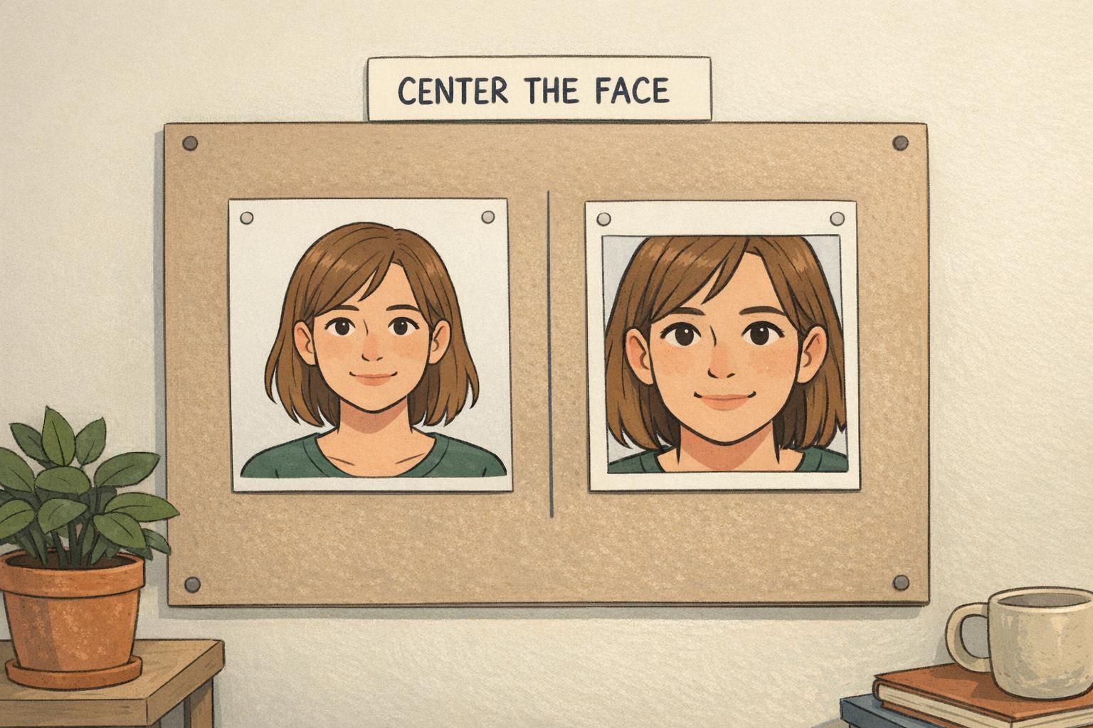
For most workplace and event badges, the most reliable framing rule is: center the face horizontally and keep the eyes in a consistent vertical band (often in the upper half of the image). Viewers naturally look for the eyes first. When eye position is predictable across badges, recognition becomes quicker because the brain doesn’t need to re-locate the key facial features each time.
Aim for a straight-on head-and-shoulders view with a natural, neutral expression and level chin. The full head should be visible, with no accidental cropping at the top, and the sides of the head should not be pressed against the frame. This approach keeps the portrait readable even when badges are viewed at arm’s length or under less-than-perfect lighting.
Many teams improve consistency by using face-aware capture tools that provide real-time feedback—helping keep the face centered, properly scaled, and away from the edges during photo capture. That kind of immediate guidance is one reason standardized framing tends to improve usability and recognition in real settings (source).
- Center the face left-to-right (avoid drifting to a corner)
- Place eyes at a consistent height across photos (a predictable “eye line”)
- Keep the head straight-on (avoid strong angles that hide features)
- Use a neutral, everyday expression that resembles how the person typically looks
Head Size and Margins: Avoid Tiny Faces and Tight Crops
If the head is too small in the frame, the badge loses its main benefit: quick recognition. If it’s too large, the photo feels cramped and may cut off hair, ears, or chin—features that often help differentiate people with similar facial structure.
A practical target is a head that fills most of the frame while leaving comfortable margins. You want visible space above the head and on both sides, plus a complete chin. Those margins are not “wasted space”—they keep the portrait from feeling crowded and help badges look uniform when printed in batches.
When in doubt, choose slightly more breathing room over a tight crop. It prints more reliably and stays clearer at small sizes.
- Avoid over-zooming: don’t let the top of the hair or chin sit on the edge
- Avoid under-zooming: don’t let the head become a small dot in a large box
- Keep shoulders visible (head-and-shoulders framing reads more naturally)
- Check uniformity: faces should appear roughly the same size across a batch
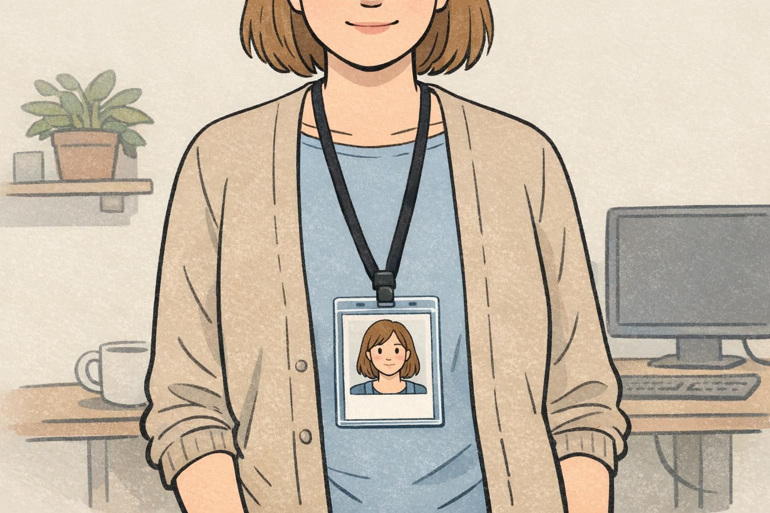
Photo Placement That Prevents Clutter on the Badge
Clutter is one of the fastest ways to make a badge less useful. Even when the portrait is well-framed, the overall photo placement can create problems if it competes with names, titles, icons, or machine-readable elements. The portrait should be visually distinct—clearly its own area—so the eye knows exactly where to look first.
Start by ensuring the photo block doesn’t overlap text or codes and doesn’t force important fields to shrink. Leave “breathing room” around the portrait box so it doesn’t feel jammed against a name line or barcode. Also consider the background of the headshot itself: busy patterns or high-contrast scenery can compete with facial features and reduce quick recognition.
- Keep the portrait in a dedicated box with visible spacing from other elements
- Avoid placing the photo behind text or partially under icons
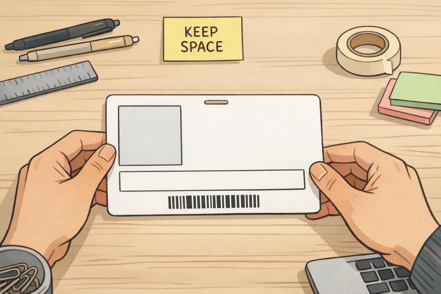
- Reserve separate zones for: portrait, name/title, and barcode/QR code
- Prefer plain or low-texture backgrounds so facial features stand out
“If the badge design makes you squint to find the face or the name, it’s working against you. A clean portrait area and clear text zones make checks faster and friendlier.” – Facilities Coordinator
Consistent Headshot Capture Tips (So Every Badge Matches)
Standardizing photo placement is much easier when you standardize capture. When every person is photographed from a different distance, with a different camera height, and a different crop, the final badges look inconsistent—even if you’re using the same template.
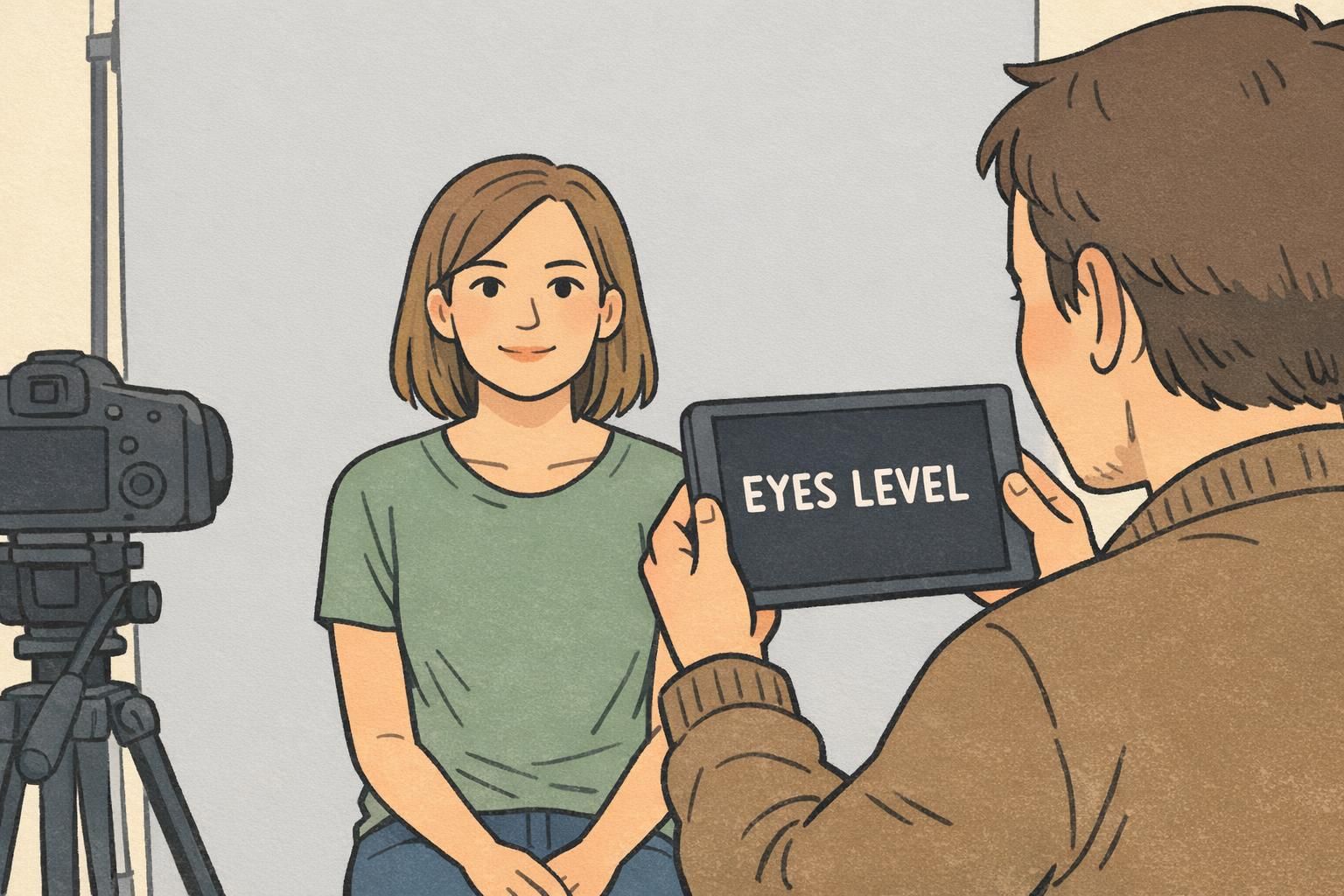
A simple checklist can dramatically improve consistency without making photo day feel complicated. The goal is repeatability: same distance, similar framing from shoulders to top-of-head, centered face, level chin, neutral expression, and a plain background. Even a basic on-screen guide can help staff line up eye height from person to person.
- Use the same spot for photos (same background and lighting each time)
- Keep camera height at eye level (avoid shooting up or down)
- Use a consistent distance so head size stays uniform
- Frame shoulders to just above the head (don’t cut off the top)
- Ask for a neutral expression that resembles their everyday look
- Do a quick preview to confirm the eyes sit in the same band as previous photos
How to Handle Common Exceptions (Glasses, Hair, Headwear, Mobility Needs)
Real workplaces and events include real needs and real variations—so good standards should be flexible enough to handle exceptions without sacrificing recognition. The priority stays the same: keep the face unobstructed, centered, and consistently sized, while accommodating what the person needs to wear or what makes capture accessible.
If someone wears glasses, focus on keeping the eyes clearly visible by reducing glare and reflections. For voluminous hair, avoid cutting off the top—step back slightly or adjust framing so the full head fits comfortably. If headwear is worn for religious or medical reasons, keep it as-is, but make sure it doesn’t obscure the face and that the framing rules (centered face, consistent eye height) still apply.
For mobility needs, adjust the setup rather than forcing the person into a difficult position. Small changes—like moving the camera height, providing a stable seated position, or allowing a helper to align the shot—can keep photo placement consistent while making the process respectful and practical.
- Glasses: reduce glare; confirm pupils and eyelids are visible
- Hair: avoid top cropping; keep the head fully in frame
- Headwear: allow it; keep facial features unobstructed
- Mobility needs: adjust camera height/distance to match the standard framing
If they normally wear glasses at work, it’s often better to keep them on—just reduce glare and ensure the eyes are clearly visible for recognition.
Keep the framing consistent and ensure the face is unobstructed. Slightly widening the crop can help preserve margins without crowding the top edge.
Printing and Template Setup: Making Photo Placement Repeatable
The easiest way to make photo placement repeatable is to lock it into a template. When the portrait box has a fixed size and position, the team creating badges can focus on getting the headshot framing right, rather than re-designing the card each time.
Template setup is also where you plan safe spacing for names, titles, and machine-readable elements so the badge stays readable at arm’s length. A common approach is to define separate zones (portrait, identity text, scan area) and keep clear padding between them. That prevents last-minute “squeezing” that shrinks text or crowds the photo.
If you’re standardizing badges across teams, it can help to pick a consistent portrait box for both vertical and horizontal formats. BadgeZoo’s custom ID badges can be paired with standardized photo boxes so headshots can be dropped into place without constant layout changes.
- Fix the portrait box size and location (don’t let it drift from badge to badge)
- Define spacing rules between portrait, text, and barcode/QR code areas
- Use a preview step at actual badge size to confirm readability
- Keep background and role indicators from competing with the portrait
Quick Checklist: What “Correct” Looks Like Before You Print
A final check saves time and avoids reprints. Before you print a batch, review one badge at actual size (on-screen or a test print) and confirm both the portrait framing and the overall layout are doing their jobs: fast recognition and clear, uncluttered information.
- Face is centered horizontally in the ID badge photo
- Eyes sit in a consistent vertical band across photos
- Head fills most of the frame without touching edges
- Margins are visible above the head and on both sides
- Top of head and full chin are not cropped
- Background is clean and doesn’t compete with facial features
- Photo area is separate from names, titles, and icons (no overlap)
- Barcode/QR code has clear space and isn’t crowded by the portrait
- Preview at actual badge size still supports quick employee identification
If you can identify the person and read the key fields in one quick glance, your photo placement and layout are doing what they should.