Guidance on creating badges that are easy to read, visually clear, and professionally designed. Covers layout choices, font selection, color contrast, and visibility from a distance.
Badge Color Psychology for Badges: What Your Palette Communicates
iggy2026-04-22T22:29:44+00:00Why Badge Color Psychology Matters in Everyday Identification Badge color psychology isn’t about making a badge look “nice.” It’s about making identification work in the real world—where people are walking, talking, multitasking, and making quick judgments. In seconds, a color choice can help someone feel oriented (“I know who to ask”), reassured (“this person belongs here”), or warned (“restricted role—pay attention”). In workplaces, schools, healthcare environments, and events, color is one of the fastest cues the brain can process. Done well, it...
Minimalist ID Badge Design: Clean, Modern, and Easy to Read
iggy2026-04-22T13:39:14+00:00Why Minimalist ID Badge Design Looks Premium and Reads Faster A minimalist ID badge works because it respects how people actually scan information: fast, from a few feet away, often while walking or mid-conversation. When the design removes distractions, the eye lands immediately on what matters—name, role, and organization—without hunting through extra shapes, lines, or decorative elements. This approach also tends to feel more “premium” because it’s harder to hide behind clutter. Minimal layouts depend on confident typography, deliberate spacing, and a...
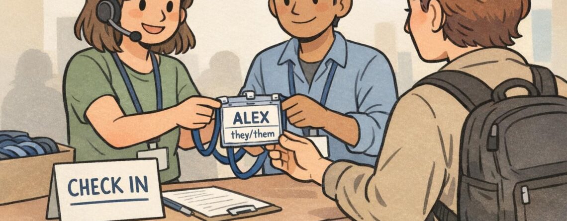
Networking Name Tag Ideas That Actually Help People Meet at Events
iggy2026-04-21T22:29:06+00:00Why a Networking Name Tag Should Do More Than Show a Name A networking name tag is often the first “introduction” people see. Before anyone says hello, the tag is already doing social work: it reduces uncertainty, signals approachability, and helps someone decide how to start a conversation. When the layout is hard to read or overloaded, it creates friction—people lean in, squint, or default to the same awkward opener: “Sorry, what was your name again?” The best tags are designed for...
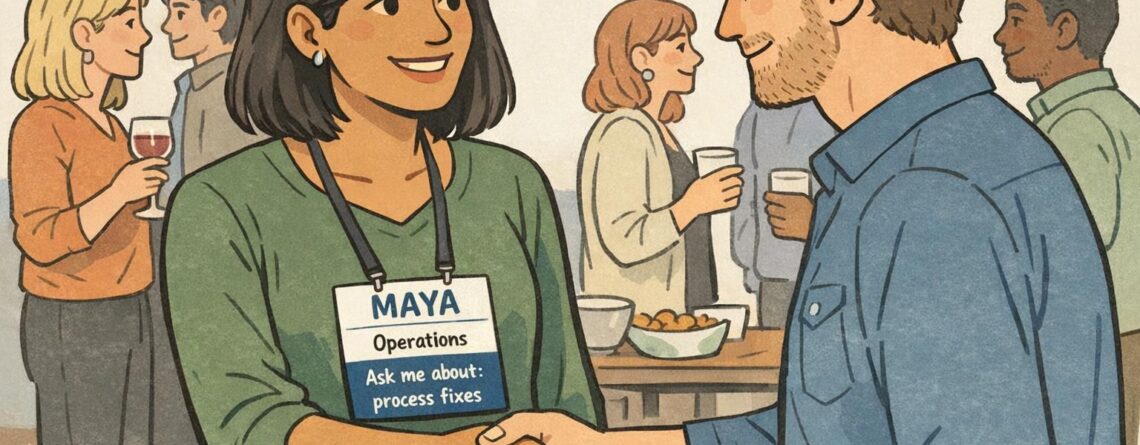
Role Identifier Card Design: How to Make Role Cards Pop Without Looking Loud
iggy2026-04-20T17:50:37+00:00What makes a role identifier card feel clear and polished A well-made role identifier card should be easy to understand in a split second. The best designs use hierarchy, spacing, and restraint so the most important information is the first thing the eye sees. That is what makes a card feel polished: not extra decoration, but a layout that is calm, organized, and quick to scan. In workplaces, events, and service settings, clarity matters because people need to recognize roles fast...
Matte ID Card vs Glossy Finishes: When Finish Hurts Readability
iggy2026-02-02T21:58:37+00:00Why a Matte ID Card Finish Can Improve Everyday Readability A matte ID card finish is often chosen for one simple reason: it’s easier to read in the lighting people actually work under. In offices, hospitals, warehouses, and event venues, badges are viewed quickly, at arm’s length, and rarely at the “perfect” angle. When a surface reflects light strongly, names, photos, and role identifiers can look washed out—even if the print quality is excellent. Matte surfaces reduce the bright highlights that can...
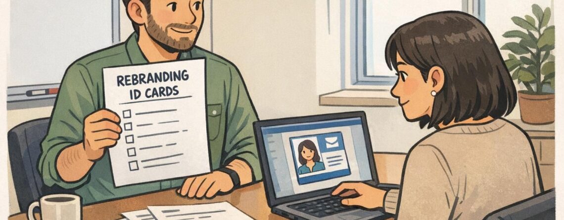
Rebranding ID Cards: A Practical Plan to Update Your ID System Without Security Gaps
iggy2026-01-29T18:14:37+00:00Why rebranding ID cards should be part of your brand rollout plan Rebranding ID cards is one of the fastest ways employees, contractors, and visitors experience a new identity in the real world. Unlike a website update or a slide deck template, a badge is worn in lobbies, hallways, job sites, and events—so mismatched logos or outdated card designs can make a rebrand feel incomplete (or even unofficial). Just as important, an ID card is not only a brand artifact—it’s part of...
Job Title on Badge: How to Standardize Titles and Departments Across Your Organization
iggy2026-01-28T21:56:49+00:00Why standardizing the job title on badge matters A standardized job title on badge helps people understand roles quickly—without needing introductions, hallway questions, or guesswork. When a workplace uses a consistent set of titles and departments, staff, visitors, and partners can identify who to approach (and for what) in seconds. The alternative is familiar: one person’s badge says “People Ops,” another says “HR,” another says “Human Resources,” and a fourth uses a location-specific label that only their building understands. Even when everyone...
Job Title on Badge: How to Standardize Titles and Departments
iggy2026-01-28T18:25:01+00:00Why standardize the job title on badge and department naming? When someone is trying to find help—whether it’s a visitor in a lobby, a patient family member in a hallway, or a new employee on their first week—they don’t have time to decode internal org-chart language. A standardized job title on badge makes roles recognizable in a glance, and consistent department labels reinforce where that person “fits” in the organization. Standardization also solves a practical problem: badge programs tend to sprawl. One...
Back of ID Card Design: Smart Uses Without Overloading
iggy2026-01-23T12:57:43+00:00Why the Back of ID Card Matters (and When to Use It) The back of ID card is some of the most useful “hidden” space in workplace identification. The front usually needs to stay clean and people-first: photo, name, department, and maybe a role color—details that help coworkers and visitors recognize someone at a glance. The reverse side can then do the job of supporting actions: scanning for access, quick reference information, or short safety prompts. Used well, the back becomes a...