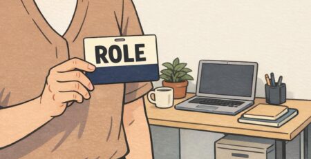
Badge Template Errors: How to Prevent Cropped Photos and Cut-Off Text
Why badge template errors lead to cropped photos and cut-off text
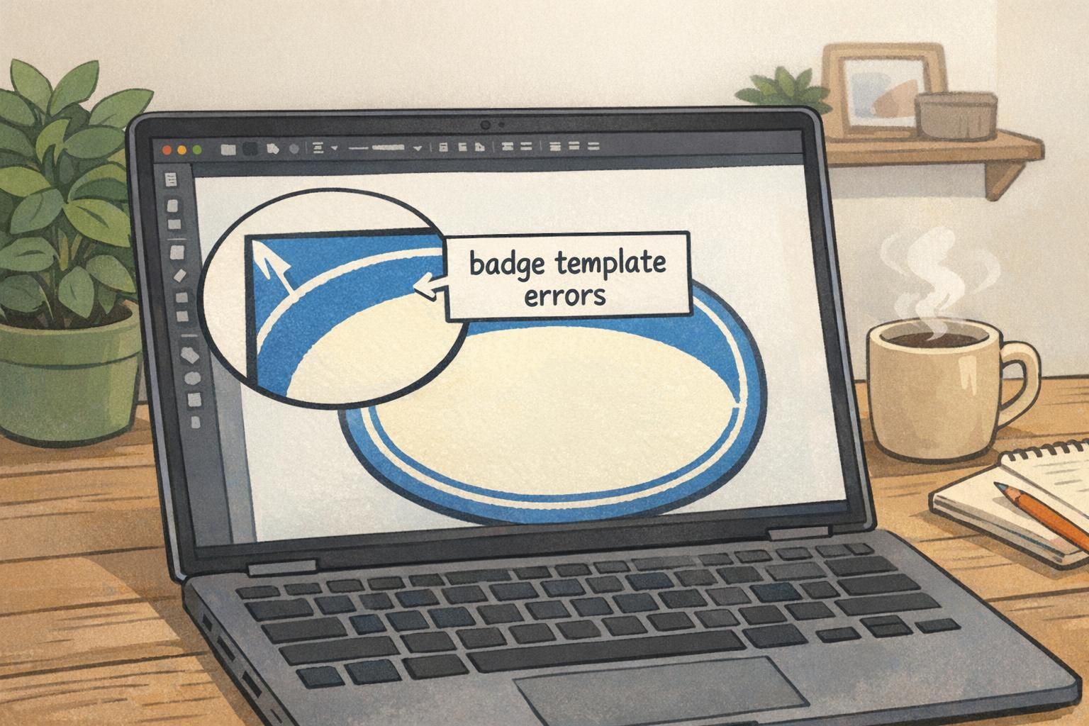
Badge template errors usually show up at the worst possible time: after you’ve clicked “order” or when a stack of badges arrives and a name is missing a few letters. On-screen, everything can look perfectly aligned—until printing and trimming remove a sliver from an edge or a design tool silently reframes your content.
The root issue is that your design canvas and the final printed badge don’t behave like a static screenshot. Printers, cutters, and badge holders introduce real-world constraints. A tiny shift in trim, a small scale change, or a “fill” crop can turn a readable layout into a cropped badge photo or cut-off text.
This matters most on ID badges, event badges, and name tags because the content is highly functional: a face photo must be recognizable, a name must be readable at a glance, and details like roles, departments, or QR codes have to remain intact for scanning and access workflows. Proofing isn’t busywork—it’s what keeps identification professional, consistent, and usable in real environments.
- Mismatched aspect ratios: a photo or layout that looks right on screen gets reframed at print time
- Ignoring safe areas: important text and faces sit too close to an edge
- Scaling to fit without checking: resizing the template pushes content out of bounds
The most common template traps (and what they look like in real badges)
Most cropping problems come from a handful of repeat mistakes. They’re easy to make because design tools try to be helpful—auto-centering, auto-fitting, and snapping elements into place—even when those choices aren’t print-safe.
Here’s what these traps look like when they land on an actual badge:
- Faces placed too close to the top edge: hairlines, foreheads, or the top of the head get trimmed or cropped
- Long names running into the right border: the last 2–6 characters disappear, especially on reprints if the layout subtly reflows
- Auto-fit text that shrinks or jumps lines: job titles become tiny, or a two-line title becomes three lines and drops into the trim zone
- Designing right up to the edge: logos, borders, or background shapes look “off” after trimming—even if nothing is technically missing
- QR codes pushed off the bottom: a code that was barely inside the canvas becomes unscannable with a small crop
If your design only works when everything trims perfectly, it’s fragile. A print-safe template works even when trimming shifts slightly.
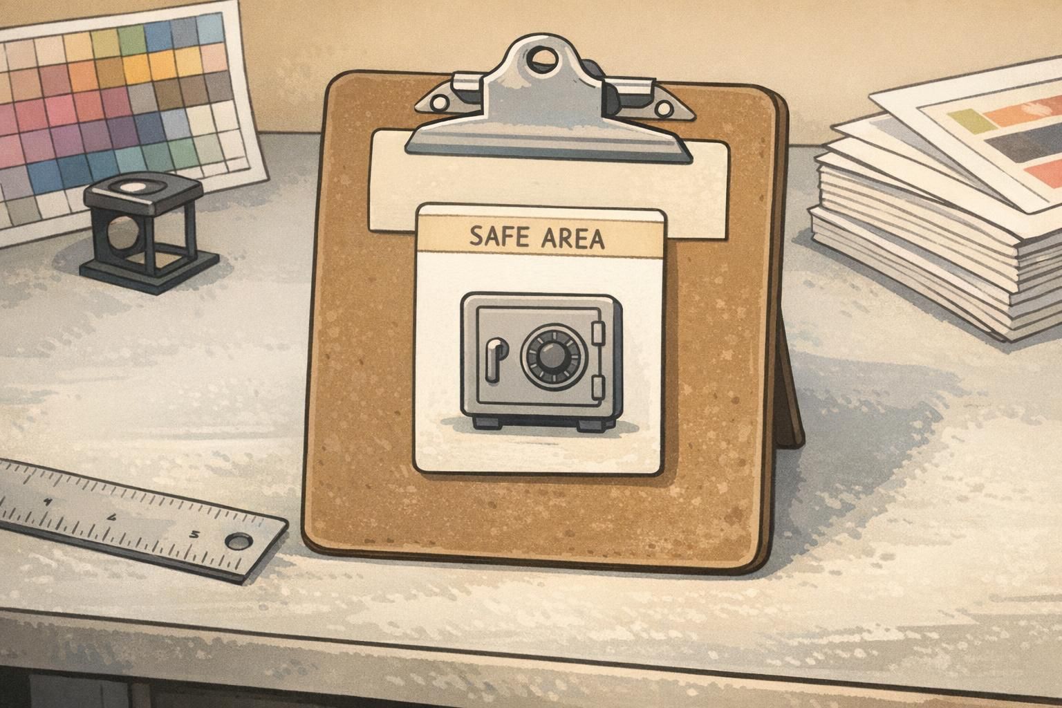
Safe margins 101: build a “text safe box” and keep faces centered
Safe margins are your simplest defense against both cut-off text and awkward-looking crops. Think of your badge as having two zones: an outer area where trimming variability can happen, and an inner “safe box” where your must-keep content lives.
A practical approach is to keep critical content inside an inner box that’s roughly 80–90% of the canvas. That translates to keeping faces, logos, and QR codes away from edges by about a 10–15% margin. You don’t need to be mathematically perfect—what you need is consistency and enough breathing room so small shifts don’t cause damage.
This matters because cropping and trimming aren’t always identical from one print run to the next. Many workflows involve aspect-ratio constraints and reframing to a final rectangle, which can change what remains visible near the borders. Keeping important elements away from edges is a widely used way to reduce loss when a design is mapped into a final frame (source).
- Draw a “text safe box” guide (your inner boundary) and keep all critical text inside it
- Center faces comfortably (avoid tight crops on hair and chin)
- Keep machine-readable items (QR codes, barcodes) away from corners and edges
Simple rule: if it would be painful to lose it, it doesn’t belong near the border.
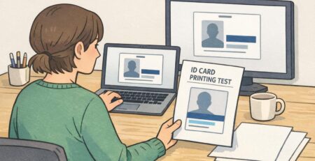
Scaling and export settings that quietly cause cropping
Some badge template errors don’t come from your layout choices—they come from workflow steps that change the layout after you’ve already “finished.” That’s why badges can look right in your editor but crop when exported or printed.
The most common culprits are resizing the template after content is placed, exporting at the wrong dimensions, flattening layers too early, or choosing a tool setting that crops to “fill” instead of resizing to “fit.” Even small changes can reframe photos (moving a head too high) or reflow text (pushing a job title downward).
- Avoid resizing the canvas at the end: finalize the badge size first, then design
- Check your export size matches the final badge dimensions (not just “close enough”)
- Keep editable layers until after proofing so you can adjust margins quickly
- Watch image placement settings: “fill” commonly crops; “fit” commonly preserves content but may add space
- View at 100% before proofing so you see tight edges and small text accurately
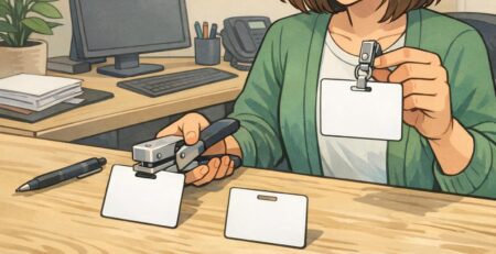
ID card proofing checklist: verify every edge before you print
A repeatable ID card proofing routine prevents most reprints. The goal is to stop trusting the center of your design (which usually looks fine) and start inspecting the edges (where failures happen).
- Confirm final dimensions: verify the badge size and orientation are correct before reviewing layout details
- Turn on guides: show your safe box and keep key content inside it
- Zoom into all four corners: look for text, logos, borders, and QR codes that creep toward the edge
- Check photo framing: ensure the top of the head and chin have breathing room; avoid tight crops
- Test the longest-name scenario: use your longest known first/last name and longest department/title to see what breaks
- Check line breaks and auto-fit behavior: confirm nothing shrinks to unreadable sizes or jumps into a risky area
- Do a quick paper mockup if possible: cut it to badge size and view it from arm’s length
- Review “best case” and “worst case”: imagine a small trim shift in any direction and confirm nothing critical disappears
Proofing isn’t only about catching mistakes—it’s about building a template that stays stable across new names, new photos, and reorders.
- Red flags that often lead to reprints:
- Tiny text used to “make it fit”
- Names aligned flush to the left or right edge
- QR codes near corners
- Faces placed high with minimal space above the head
- Important details positioned on the very bottom line
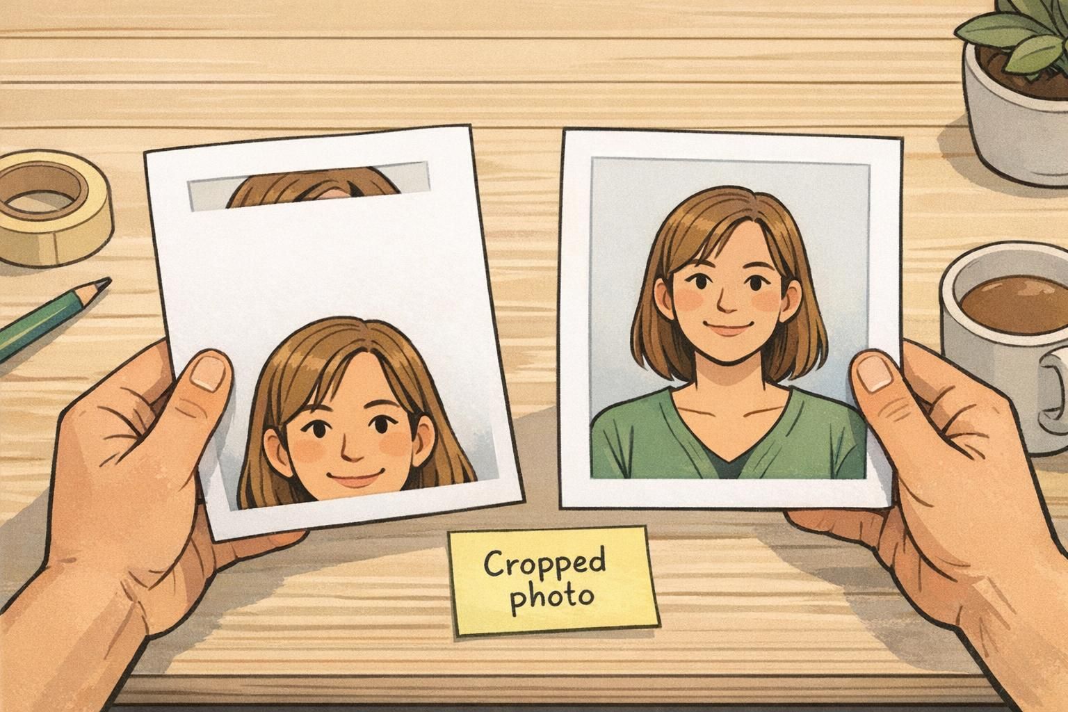
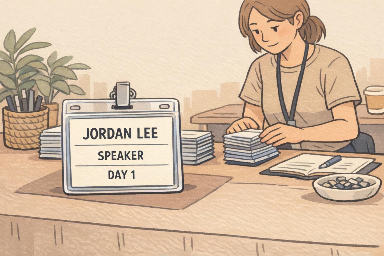
Photos and names: preventing the most visible badge failures
If a badge fails, people notice it fastest in two places: the portrait and the name. A cropped photo looks careless, and a cut-off name slows recognition. In busy environments—schools, clinics, offices, events—badges need to be readable instantly.
For photos, the main risk is tight framing. Even if the photo is high quality, placing it too close to the badge edge (or allowing a “fill” crop) can cut off hair, ears, or chin. A comfortable centered portrait is more forgiving across different face shapes and photo sources.
For names and other variable-length text, the risk is designing for the average case. One long last name can break alignment, force a line wrap, or cause shrinking text that becomes hard to read.
- Portrait placement: center the face and avoid tight crops; leave space above the head and below the chin
- Use consistent font sizes: don’t rely on extreme auto-fit shrinking to handle longer names
- Reserve extra width for names: plan for longer-than-average names so the right edge stays safe
- Avoid stacking too much at the bottom: multi-line titles near the bottom edge are easy to trim into
- Prioritize legibility: if it’s not readable from arm’s length, consider fewer lines or a clearer hierarchy
“We stopped losing letters on last names once we treated the right edge like a danger zone and gave every text line extra room. The template became much easier to reuse.” – Event Operations Lead
Event badges and multi-role layouts: avoid crowded grids and corner placement
Event badges are especially vulnerable because they often try to do too much: attendee name, role, company, day access, QR code, sponsors, and decorative design elements—sometimes all on one side. Multi-role layouts (speaker/vendor/staff/attendee) can become fragile when each role introduces a slightly different set of text lengths.
A resilient event badge puts the most important information in the visual center and treats the edges as expendable. If trimming shifts, you want it to affect a background pattern or a small sponsor mark—not the name or role.
- Put primary content in the center: name, role, and organization should be the easiest items to spot
- Keep corners clean: corners are where small trim shifts are most noticeable
- Treat sponsors as secondary: place sponsor rows nearer the outer area so a small trim doesn’t damage critical ID details
- Test realistic variants: long company name, multi-word role (e.g., “Community Partnerships”), and different day labels
- Avoid crowded grids: too many boxes and separators near edges can look misaligned after trimming
Choosing a print-ready template and supplies for consistent results
Design choices work best when they match the real badge format you’ll print and wear. The right size, orientation, and holder style can reduce the temptation to cram content into corners or shrink text to fit. A template built for the final cut size also lowers the odds of badge template errors because your guides and margins align with the physical product.
If you’re ordering or reordering plastic badges, a print-ready layout for the correct format (for example, a standard PVC ID card) helps you keep safe margins consistent across batches—especially when different people update the template over time. For teams that want a dependable standard format, you can use products like custom PVC id cards as a reference point for building repeatable templates.
Consistency comes from alignment between three things: the badge size, the template’s safe area, and how the badge will actually be displayed in a holder or on a lanyard.
Fast pre-order review: a 2-minute “no-crop” final check
Before you place an order, a quick final pass catches the small spacing issues that cause most cropped badge photo problems and cut-off text. The goal is to confirm your template still works after all edits, exports, and last-minute name updates.
- Confirm dimensions one last time: correct size and orientation, no late-stage canvas changes
- Turn on guides: safe box visible, key content inside it
- Scan every edge and corner: look for anything “hugging” the border
- Verify photo crops on at least two sample people: one with a higher hairline and one with a tighter original photo framing
- Check longest-name stress test again: confirm it stays readable without touching edges
- Simulate real use: imagine it in a holder and viewed from arm’s length—if anything feels tight, add breathing room
Most fixes are small: a few pixels of padding, a slightly smaller photo frame, or a wider text area. Those adjustments prevent the majority of cropping and trimming surprises.
On-screen previews don’t always reflect how a file is exported, scaled, or trimmed. Small shifts during printing/cutting, or “fill” style cropping, can remove content near edges unless you build in safe margins.
Keep the portrait comfortably centered and avoid tight framing near hair and chin. Then keep the entire photo area away from the badge edges so small trim or crop changes don’t clip the face.
Edges and variability: check all corners at high zoom, and test the longest names/titles you expect. A template that survives worst-case inputs is the one that stays reliable over time.