QR code badge Sizing and Placement That Scans
Why QR codes on badges fail (and how to prevent it)
A QR code badge is only as useful as its first scan. If the camera hesitates, locks onto the wrong target, or forces multiple retries, check-in slows down, lines grow, and staff start improvising workarounds. Most failures come from a few practical issues: the code is too small for the distance, the pattern is too dense to print cleanly, there isn’t enough blank space around it, or it’s placed where it gets covered by a clip, lanyard, fingers, or glare. The good news is that you can prevent nearly all of these issues with a handful of layout rules that work for event badges, name tags, and everyday ID cards.
Reliable scanning comes from three basics: enough physical size, a clean quiet zone (blank margin), and a placement that stays visible and relatively flat to the camera.
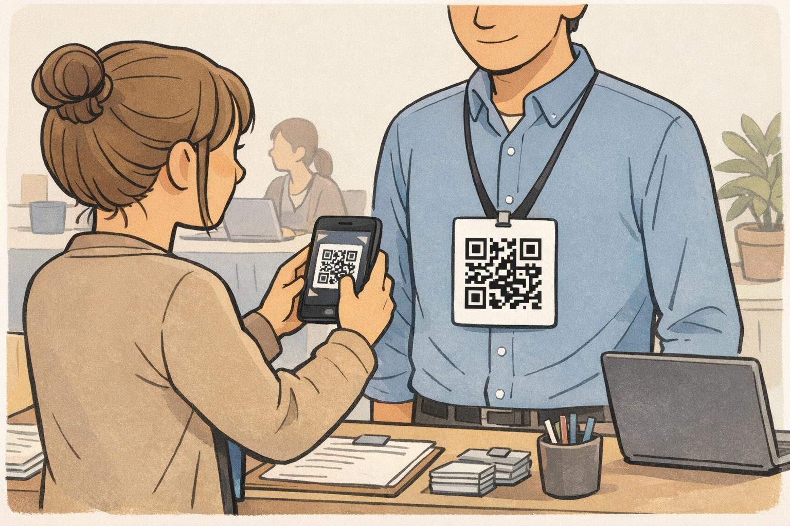
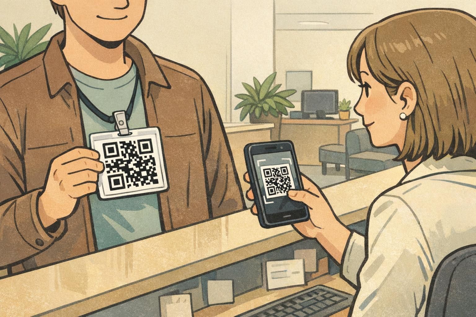
If you’re designing for a busy check-in environment, plan for real behavior: attendees walking up while talking, badges hanging at chest height on a lanyard, and staff scanning quickly with a phone. That context is why “it scanned on my screen” doesn’t always translate to “it scans in a line.” If you’re producing event credentials and want a layout that balances branding, readable names, and consistent scanning, BadgeZoo’s custom event badges are one common format where these QR sizing and placement rules apply directly.
- Design for the real scan moment: chest height, slight tilt, mixed lighting, and quick movement.
- Make the code bigger than you think you need, then protect it with a proper quiet zone.
- Place it where it won’t be blocked by hardware, hands, or badge flipping.
Badge QR code size: practical minimums that work in real life
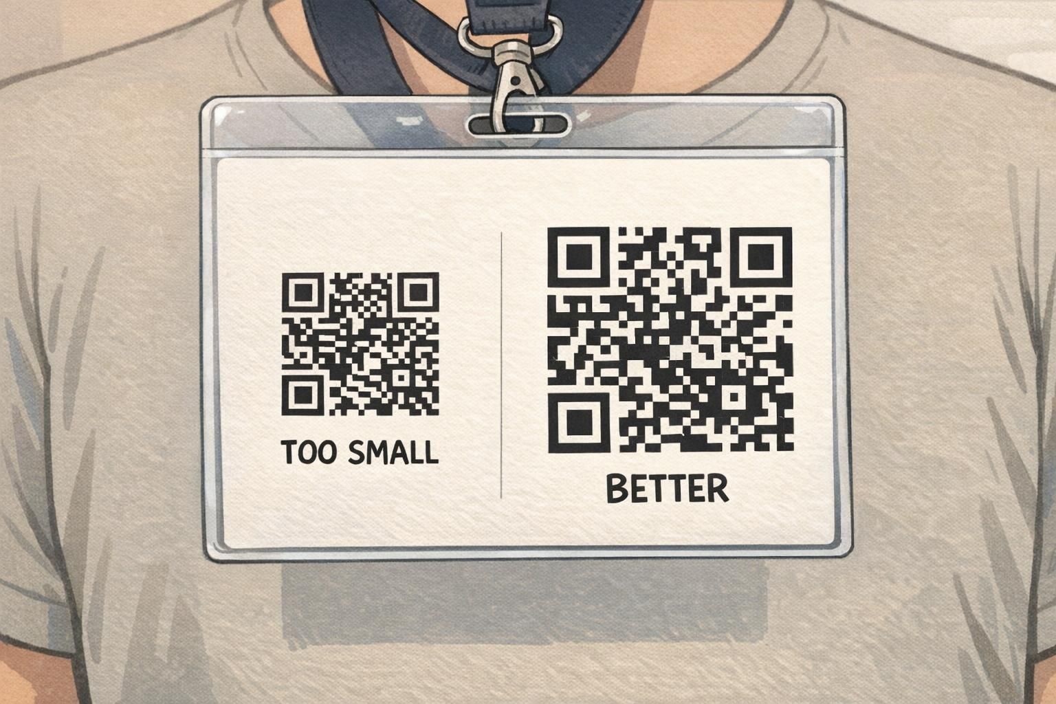
When people ask about badge QR code size, they often want a single minimum number. The more reliable approach is to pick a baseline that works under motion and imperfect angles, then increase it when your scanning setup adds distance or speed. On a typical 3 x 4 inch event badge, a practical baseline is about 25 mm (1 inch) per side for a code that points to a short URL or a short attendee ID. If staff are scanning from farther away, scanning while the line is moving, or using devices with less capable cameras, sizing up to about 35–40 mm per side keeps check-in smoother. If you’re deciding between “it fits” and “it’s comfortably scannable,” prioritize scannability. A slightly larger code is usually less disruptive than repeated scan attempts—especially when the attendee name still has enough room to remain the most prominent element.
- Baseline for many event check-ins: about 25 mm (1 in) per side for a simple URL or ID.
- More forgiving for fast-moving lines or longer reach: about 35–40 mm per side.
- If you’re unsure, choose the largest code your layout can support without crowding the attendee name.
Bigger generally helps because each square (module) prints more cleanly and stays readable at a distance. It won’t fix everything—poor contrast, missing quiet zone, or glare can still cause problems—but it’s one of the most consistent improvements you can make.
Reduce what the code stores (use a short URL or ID), keep the quiet zone completely clear, and test on multiple phones. If scans still hesitate, reclaim space from non-essential design elements rather than shrinking the code further.
Distance vs. size rule-of-thumb for scan planning
Scan speed isn’t just about the QR code—it’s about how comfortably a camera can frame it. At events, most scanning happens with a phone held roughly 30–80 cm (about 1–2.5 feet) from the badge at chest height. That distance changes constantly as people step forward, turn slightly, or wear the badge at different heights. A helpful way to plan is to match your QR size to the “comfortable” scan distance you expect, not the best-case. If staff need to scan without asking attendees to reposition their badge every time, size up and keep the code in an easy-to-aim area. That reduces the number of times the camera has to refocus or hunt for edges. In practice, larger codes make the scanning experience feel less picky. Staff can hold the phone where it’s comfortable and still get a quick lock, even when the badge isn’t perfectly flat.
Design for comfortable scanning, not maximum scanning: faster check-ins come from fewer retries, not from the smallest code that technically works.
Quiet zone rules: the margin that scanners need
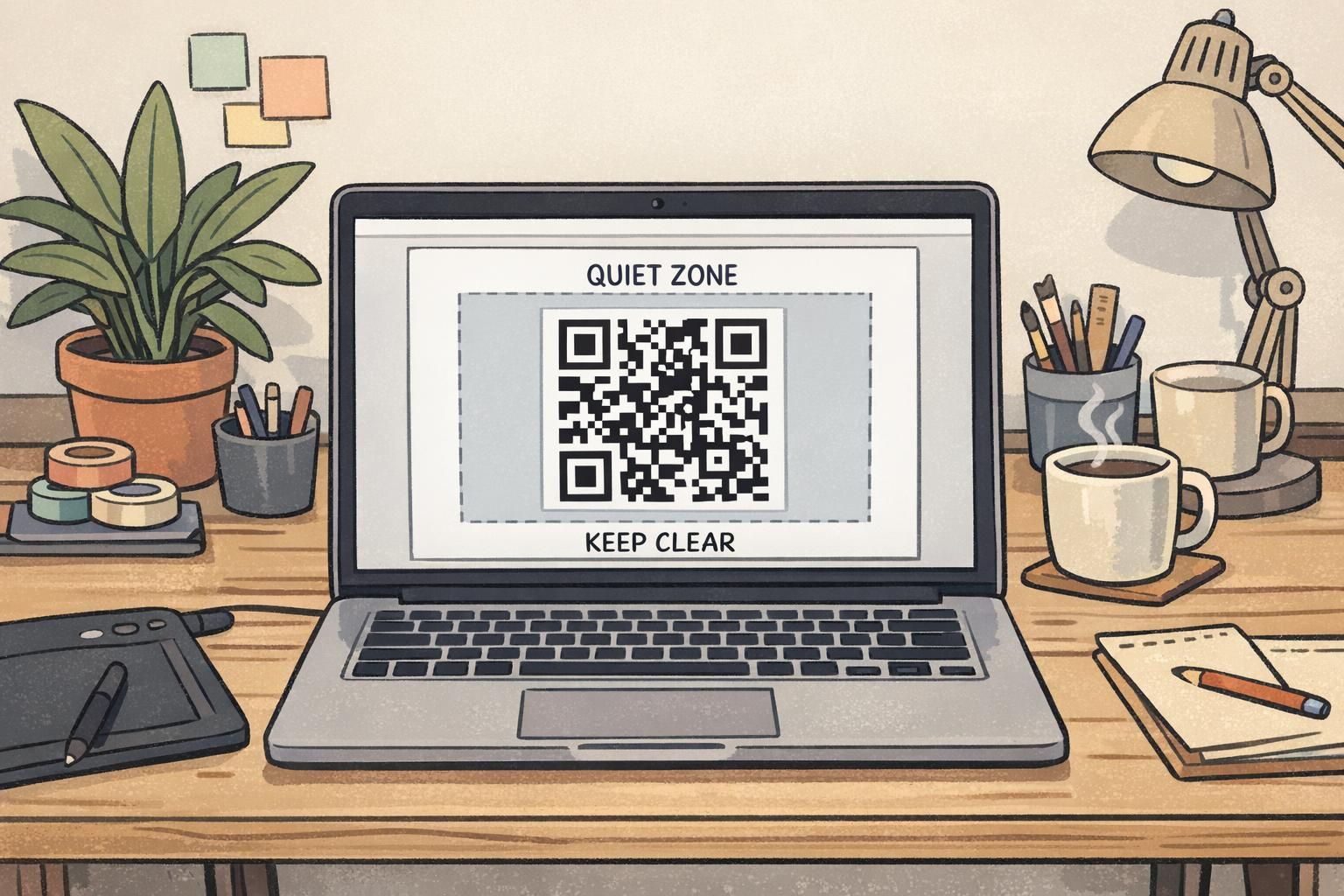
The quiet zone is the blank space around a QR code. It’s not decorative whitespace—it’s part of what helps scanners find the code’s boundary quickly. A practical rule is to keep at least 4 modules of clear, blank margin on all sides of the QR code. In other words, if the code is made of tiny squares, you want a border of empty space that’s about four of those squares thick. Avoid letting borders, background patterns, photos, nearby text, or shapes intrude into that margin. Also watch for “real-world intrusions” that aren’t visible in your layout file: badge holders, lanyard clips, slot punches, and the slight bend that happens near edges. Keeping the quiet zone away from edges reduces the chance it gets partially covered or distorted.
- Keep a clear quiet zone around the entire code (at least 4 modules on every side).
- Do not place lines, frames, photos, gradients, or small text inside the quiet zone.
- Avoid putting the code too close to badge edges where holders, clothing, or bending can hide the margin.
“If the code looks fine but scans inconsistently, the quiet zone is often the hidden culprit—especially when a holder edge or background pattern creeps too close.”
These visibility and margin considerations align with common detection principles: QR markers need sufficient physical size, strong contrast, and clear visibility in the camera’s field of view for reliable detection in indoor conditions (source).
Contrast, color, and print choices for scan-friendly results
A scan friendly badge depends heavily on contrast and edge clarity. Phone cameras need to distinguish the dark modules from the light background quickly, even when lighting is uneven. For best results, use a dark foreground (typically black) on a light background (typically white). Avoid putting the QR code directly on gradients, photos, or textured patterns. If your badge design uses color or imagery, reserve a plain, light rectangle beneath the code so the scanner sees clean edges. Print quality matters too. Crisp edges help, while fuzzy edges and low-resolution output can blur the tiny squares together. When possible, generate the QR code from a vector source so it scales cleanly in design software. Finally, watch for glare. Glossy finishes and overhead lighting can create reflections at chest height right where the code sits. If glare is common in your environment, consider adjusting the layout to reduce reflections on the code area (for example, by keeping the code away from high-gloss design elements) and test under the same lighting where scanning will happen.
- Use dark-on-light with strong contrast (clean black on white is a dependable standard).
- Avoid gradients, photos, and patterns behind the code; use a plain light backing area.
- Prefer crisp, scalable QR artwork so edges stay sharp at print size.
- Test for glare under real overhead lighting and at chest height.
It can work in some cases, but it’s less forgiving and more sensitive to lighting and camera behavior. Dark-on-light is typically the safest choice for fast scanning in mixed indoor conditions.
Usually it’s fine as long as the white box is truly plain, the quiet zone is preserved, and nothing visually touches the code boundary. Testing is the best way to confirm.
Placement that scans: where the code should live on the badge
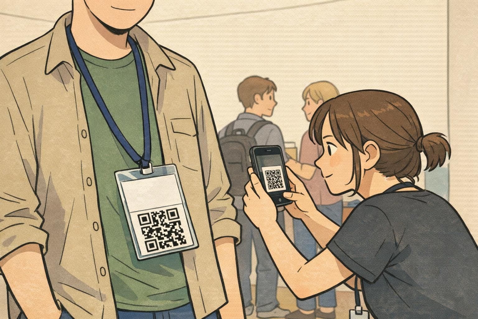
Where you place the QR code can matter as much as how you size it. The goal is simple: put it where a camera can see it nearly head-on, without hardware or hands getting in the way. On many event badges and name tags, bottom-right or bottom-center is a strong choice because it avoids the lanyard hole area and tends to remain visible when the badge hangs naturally. Avoid placing the code too close to the top where clips, holes, and badge buddies may overlap, and avoid the extreme bottom edge where bending is common. Also think about how people interact with the badge. Attendees often point to their printed name or hold the badge while talking to staff. If the QR code sits too close to where fingers naturally land, the code may be partially covered at the exact moment someone tries to scan it. A clean placement habit: reserve a dedicated zone for the QR that is visually separated from the attendee name and away from the clip path. That makes scanning faster for staff and reduces the need to ask attendees to reposition their badge.
- Good default placements: bottom-right or bottom-center on the front.
- Keep away from lanyard holes, clip areas, and any area that will be covered by a badge buddy.
- Avoid the extreme bottom edge where the badge bends or gets bumped.
- Separate the QR zone from high-touch areas where fingers often cover the badge.
Payload and error correction: keep the code simple so it prints bigger
Two QR codes can be the same physical size and still scan very differently. A major reason is payload: the more data you encode, the denser the pattern becomes. Denser codes create smaller modules (the tiny squares), which are harder to print crisply and harder for a camera to resolve quickly. For badges, the most reliable approach is usually to encode a short URL or a short ID that resolves to the attendee record on the back end. This keeps the code visually simpler and easier to scan at real check-in speeds. Be cautious with long URLs (especially those with lots of parameters) or large vCard-style payloads. They may still scan in ideal conditions, but they often become sensitive to slight blur, glare, and angle—exactly what you get on a lanyard. Error correction is also a balance. Higher error correction can help when a code is partially blocked, but it can also increase density. In badge layouts, a moderate level is often a practical compromise: resilient enough for normal wear while remaining quick to detect.
If you need better scanning, first shorten what you encode. A simpler QR pattern often improves reliability without changing your layout.
A quick testing workflow using common phone cameras
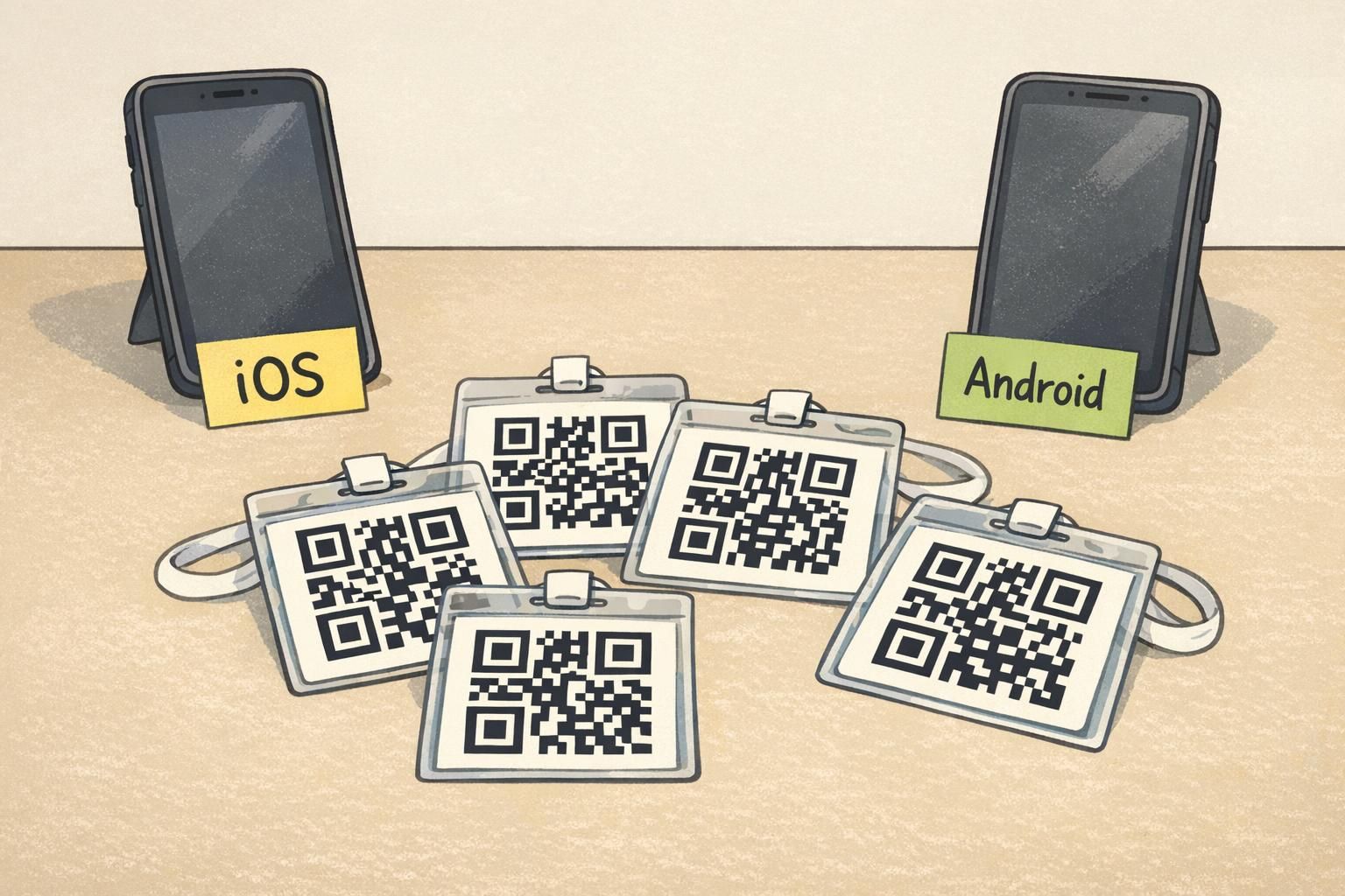
Testing is where your design becomes dependable. The fastest way to avoid surprises is to print a small batch and test the exact way people will scan: at chest height, under indoor lighting, with normal movement. Use multiple devices. A QR code that scans instantly on a new phone might take longer on a mid-range or older model. You don’t need a lab setup—just a realistic mix of phones and a stopwatch mindset.
- Print a small batch on the actual material/finish you plan to use.
- Test with at least three devices: a recent iPhone, a recent Android, and an older or mid-range phone.
- Use default camera apps first (they’re the most common scanning method at events).
- Test at realistic distances: about 30–80 cm from the badge at chest height.
- Test under lighting you expect: bright, dim, and mixed indoor light.
- Tilt the badge slightly as it would hang on a lanyard; don’t force it perfectly flat.
- Time the first successful scan. Adjust size, contrast, and placement until most scans land in under about a second.
Start with the easiest wins: increase the physical code size, ensure the quiet zone is fully clear, and improve contrast by placing the code on a plain light rectangle. Then shorten the payload if the pattern is very dense.
Yes. Holders and laminates can add reflections, obscure edges, or slightly warp the badge. Testing the complete assembled badge is the most realistic way to catch those issues early.
Common pitfalls: multiple QR codes, clutter, glare, and flipping badges
Even when a code is sized correctly, a few common design choices can make scanning inconsistent. Multiple QR codes on one face can confuse detection or cause the camera to lock onto the wrong code. If you need more than one code, separate their purposes clearly and consider putting one on the back. In many event contexts, one code per side is the simplest, fastest approach. Clutter is another frequent issue. Busy backgrounds, decorative frames, and small nearby text can visually compete with the code, especially if they crowd the quiet zone. Keep the QR area visually calm. Glare is particularly sneaky: a badge can look perfect until someone walks under overhead lights and a reflection washes out part of the code. That’s why testing in the actual venue lighting (or something close) matters. Finally, badge flipping is real. Some lanyards and clips let badges rotate, and attendees often fidget with them. If your environment makes flipping likely, printing the QR on both sides can keep scanning consistent, regardless of which way the badge faces.
- Limit to one QR code per badge face when possible to reduce misreads.
- Keep the area around the code uncluttered; protect the quiet zone from design elements.
- Watch for glare from glossy surfaces and overhead lighting at chest height.
- If badges flip frequently, consider printing the QR on both sides for consistent access.
A dependable scan friendly badge comes from designing for people, not perfection: bigger codes, clear margins, strong contrast, and placement that stays visible during real use.