Badge whitespace: How Negative Space Makes ID Designs Cleaner and More Premium
Why badge whitespace is the most underrated design tool
Badge whitespace is one of the simplest ways to make a name tag or ID card easier to read in real life—and to make it feel “designed” instead of improvised. When a badge is crowded, people have to work harder to find the one detail they need (almost always the name). That extra effort shows up in everyday moments: a receptionist greeting a visitor, coworkers meeting across a hallway, or event attendees networking from a few feet away.
Whitespace is the breathing room around key information. It reduces visual noise, helps the eye land on the most important line faster, and makes the badge feel more premium at first glance. In other words: you’re not just making the badge prettier—you’re making it more functional.
A badge that scans quickly is a badge that works. Whitespace helps the badge do its job without adding more ink, more rules, or more decoration.
This article walks through where whitespace matters most, why it improves clarity, and how to declutter a busy layout without removing essential details. Along the way, you’ll see quick edits that support clean badge design while keeping your workplace identification practical and complete.

What “whitespace” really means on a badge (and what it isn’t)
Whitespace is the empty area around and between badge elements: the name, title, department, logo, photo, QR code, borders, and any access indicators. It can be literal white space, or it can be a quiet area of any color—as long as it stays visually calm and doesn’t compete with the information.
Importantly, whitespace is not wasted space. On a physical badge, it functions like margins and padding in a well-designed document. It separates information into recognizable chunks so the brain can identify what it needs quickly, even when the badge is viewed at an angle, under overhead lights, or from several feet away.
- Whitespace is space that improves recognition: gaps between blocks, margins around edges, and breathing room around the name.
- Whitespace is not “empty for emptiness’ sake”: it is intentional separation so elements don’t blend together.
- Whitespace can be any quiet background: white, a light tint, or a solid color area—so long as it stays uncluttered.
If two elements look like they’re “touching” from a distance, they’re too close. Whitespace prevents accidental blending that makes badges harder to scan.
Legibility first: make the name the headline, and give it room
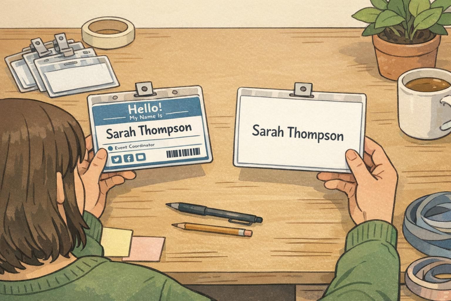
In most workplaces and events, there’s a single line that matters most in the first second: the person’s name. A fast way to improve readability is to treat the name like a headline, then build everything else around it. When the name is large and surrounded by whitespace, people can recognize it quickly without squinting, leaning in, or searching.
A simple hierarchy usually feels both functional and premium:
- Name (largest, highest contrast, most whitespace around it)
- Role or Department (second, smaller, still readable)
- Organization (third, smallest, often paired with a small logo)
This is a core principle behind uncluttered ID layouts: prioritize what people actually need in the moment, and keep the rest supportive rather than competitive. When spacing is generous, you often don’t need heavy boxes, drop shadows, or thick outlines to “separate” content—because whitespace is already doing that job.
More broadly, effective visual structure improves clarity and recognizability because it reduces cognitive load: the viewer doesn’t have to decode the layout before they can read it. Research on learning and information presentation consistently supports the idea that clear structure and readable design improve comprehension and usability, which is directly relevant when you’re designing small-format identification meant to be scanned quickly in real environments (source).
“If someone can’t find the name instantly, the badge is doing extra work for them. A clean hierarchy with real breathing room fixes that fast.” – Event Operations Lead
Quick edits to declutter a busy badge in 10 minutes
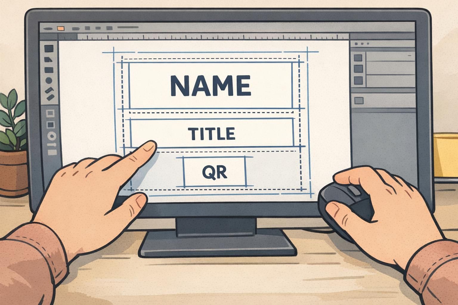
If a badge layout feels cramped, you don’t have to start over. A handful of quick edits can create whitespace and bring focus back to the name—without removing required information. The goal is to reduce competition between elements so the badge reads like a tiny sign, not a mini flyer.
- Remove duplicates: if the organization name appears twice, keep the better placement and delete the other.
- Shrink and relocate the logo: a slightly smaller logo in a corner often looks more intentional and frees space for the name.
- Increase outer margins: pull everything away from the edges so the badge feels balanced and less busy.
- Replace thick borders: swap heavy frames for a thin rule, or remove the border entirely if spacing already separates content.
- Reduce icon clutter: keep icons minimal and consistent, or remove them if they don’t add real meaning.
- Give the QR code its own zone: add quiet space around it so it scans reliably and doesn’t fight the name for attention.
A common mistake is adding more shapes to “organize” information. Often the better fix is subtracting shapes and adding whitespace.
Spacing rules of thumb (margins, padding, line spacing, and alignment)
Good spacing is mostly consistency. When your margins, padding, and alignment follow a predictable rhythm, the badge looks calmer—and it becomes faster to scan. These small decisions are a major part of clean badge design because they create structure without extra decoration.
- Use consistent outer margins: keep similar space on all sides so nothing feels like it’s sliding off the badge.
- Add internal padding: text should never touch a border, color band, photo edge, or QR boundary.
- Increase line spacing for stacked text: multi-line names and titles need breathing room so they don’t become a dense block.
- Align within each block: left-align name/title blocks (or center-align consistently) so the eye can scan faster.
- Group related items tightly, separate unrelated items widely: close spacing implies “these belong together,” while larger gaps signal a new zone.
Not necessarily. Centering can work well for a large name, but left alignment often scans faster for multi-line fields. The cleanest option is whichever you can apply consistently across the badge.
No. Whitespace can be any calm, uncluttered background color. What matters is the breathing room and contrast around the critical information.

When you can’t remove info: use zones to protect whitespace
Some IDs must carry a lot: photo identification, credentials, access level indicators, and a barcode or QR for check-in. When you can’t simplify the content, shift your goal from elimination to containment. In practice, that means creating clear zones and protecting whitespace between them.
A zoning approach keeps the layout readable because each area has one job. It also prevents the common “everything is important” look that makes an ID feel crowded, even if all the information is technically required.
- Top zone: organization or event branding (small logo, light presence).
- Center zone: the name as the focal point, with role/department nearby.
- Side or bottom zone: scannables (QR/barcode) with quiet space around it for reliable scanning.
- Optional tag zone: access indicators as a small band or label with margins—avoid flooding the entire background with an access color.
Zoning is how you keep an uncluttered ID even when the badge has multiple compliance or security fields.
Print and wear considerations: whitespace that survives real use
Badges aren’t read in perfect conditions. They’re worn on lanyards, clipped to pockets, tucked into holders, and viewed while people are moving. That’s why whitespace should be planned with real-world wear in mind—so the layout stays clear even when hardware and glare get involved.
- Leave extra room near slot punches and clip holes so hardware doesn’t cover a name or title.
- Keep key text away from edges where holders can create reflections and glare.
- Avoid placing critical details right at the bottom where a holder lip can obscure them.
- Plan for minor print and trimming variation: strong margins make small shifts less noticeable.
If your badge will be used in holders, test the design inside the holder before finalizing. A layout can look perfect on screen but lose clarity when plastic edges, clips, and reflections enter the picture.
Examples that pair well with BadgeZoo products (name tags, event badges, and ID cards)
Whitespace-forward layouts shine when badges are used for quick human interaction—like conferences, meetings, and workplaces where people need to identify one another fast. The same design approach also supports machine scanning, because clean separation helps QR and barcode areas stay reliable.
Here are a few practical layout examples that tend to work well across common formats:
- Event badges (vertical): a large centered name, a small logo in a corner, and a clearly separated QR zone at the bottom with quiet space around it.
- Employee ID cards (horizontal): a clean photo area on one side, a strong name block with generous margins, and role/department in a secondary line below.
- Badge buddies: a single, bold access message with lots of breathing room, so it can be recognized quickly behind a primary badge.
If you’re building conference layouts where quick recognition matters most, whitespace-friendly templates are a natural fit for custom event badges, since the format rewards large names and clear zoning.
The most “premium-looking” badges usually aren’t the most decorated. They’re the ones where every element has a place—and enough space to be read without effort.
A simple pre-print checklist for a premium, whitespace-rich badge
Before you print a full batch, a fast check can confirm your whitespace is doing real work. The goal is to make sure the badge reads instantly, stays clear in a holder, and doesn’t rely on design tricks that won’t survive real use.
- Step back: can you read the name instantly from a few feet away?
- Check the focal point: is there one obvious “headline” (the name), or does everything compete?
- Confirm consistent margins: do all edges have comfortable breathing room?
- Look for edge crowding: is any text too close to the border, punch area, or holder lip?
- Scan the zones: does each area have one job (name, org, scannable) with clear gaps between them?
- Print one test copy: view it in the actual holder or on the actual lanyard you’ll use.
Increase whitespace around the name and use consistent margins. Often, that single change removes the need for heavy borders and busy boxes.
Give the QR code its own dedicated zone with quiet space around it. Treat it like a separate block so it doesn’t compete with the name.