Badge Color Contrast for High-Contrast Badge Design: Simple Pairings That Stay Readable
Why badge color contrast matters in real-world badge viewing
Badge color contrast is the foundation of a badge that works in the real world—not just on a screen. Most people read badges quickly, at arm’s length, while moving through a hallway, entering a building, or greeting someone at a desk. In those moments, you don’t get perfect lighting or a steady, front-facing view. You get quick glances, odd angles, and distractions.
A few everyday factors reduce readability more than most designers expect: glare from laminate or a glossy finish, shadows from lanyards and clips, and motion as someone walks or turns. Even a great-looking color palette can lose clarity when reflections wash out mid-tones or when a name sits in a shadowed area.
Practical goal: design for fast recognition of the person’s name, role, and key identifiers—without squinting—under mixed lighting and quick viewing.
When contrast is strong, interactions tend to feel smoother and more professional. In workplaces, it helps colleagues greet each other and verify access quickly. In schools, it supports staff and visitor recognition. At events, it helps volunteers, speakers, and attendees find the right person faster. In healthcare settings, clear identification helps reduce confusion and supports faster, calmer communication.
Contrast basics: lightness beats hue (and why “different colors” still fail)
Contrast isn’t mainly about picking “two different colors.” It’s about the difference in lightness (how light or dark two areas are) between text and its background. Two colors can be far apart on a color wheel and still be close in lightness—meaning the text won’t separate cleanly from the background at a glance.
Common examples of “different but still hard to read” combinations include red-on-green and blue-on-purple. The hues are different, but their lightness values can be similar, especially after printing or under certain lighting. The result: letters that look like they’re vibrating, blending in, or fading out.
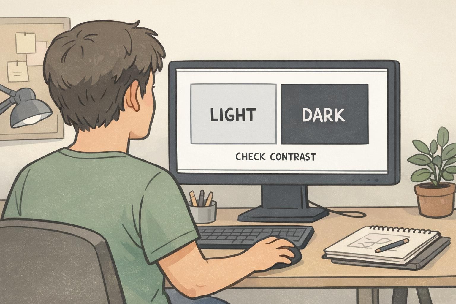
- Start in grayscale: temporarily remove color and check whether text stands out clearly from its background.
- Then add color: keep the same light-dark separation, and use color mainly as a role cue or brand accent.
- Size and font weight matter: thin fonts and small text need stronger contrast than bold, large lettering.
If you want a neutral standard to reference, accessibility guidance often uses minimum contrast ratios (for example, 4.5:1 for normal text) to support readability. Even if your badge isn’t a web page, using those ratios as a check can prevent designs that look fine on-screen but fail in the hallway. See the WCAG explanation here: source.
Common pitfalls that make ID cards hard to read (even with ‘bright’ colors)
“Bright” is not the same thing as readable. A neon or saturated background can feel energetic, but it can also overpower text—especially if the text color is a mid-tone, the font is thin, or the lighting creates glare. In practice, the most readable ID colors usually leave the text area calm and simple.
- Mid-tone backgrounds with dark-ish text (or light-ish text): both sit in the middle, so nothing pops.
- Low-opacity overlays behind names: trendy, but they often reduce clarity once printed.
- Busy patterns behind key fields: patterns compete with letters and destroy quick recognition.
- Gradients that pass under text: parts of the name will land on low-contrast zones.
- Placing key text over photos: faces and clothing create unpredictable light/dark patches.
Real printing adds another layer: colors can shift from screen to printer, and glossy finishes can wash out mid-tones under overhead lighting. If your design relies on subtle differences (like charcoal on dark blue), the badge may look fine in a digital proof but turn muddy when produced and laminated.
A reliable approach: reserve saturated colors for accents (role bars, borders, icons) and keep the primary text field solid and high-contrast.
Simple, proven color pairings for high-contrast badge design
If you want high-contrast badge design that holds up under fluorescent office light, daylight at entrances, and dim event venues, start with pairings that create strong lightness separation. The goal is to make names and roles readable instantly—even when the badge is swinging on a lanyard or catching reflections.
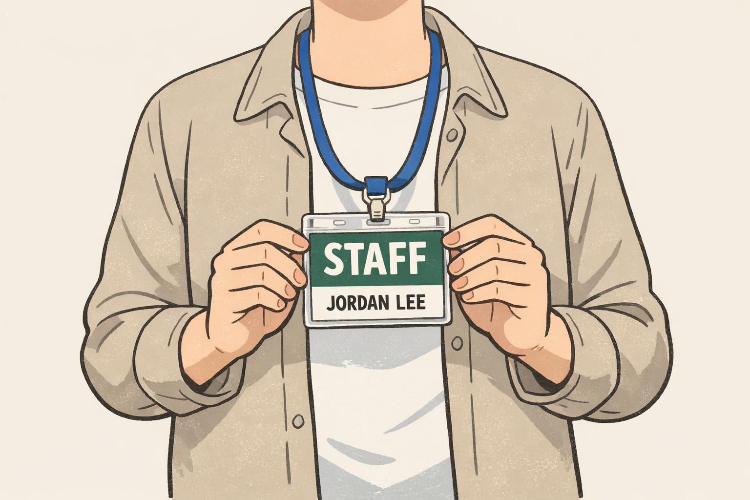
- Black on white: maximum legibility for names; great default for most workplaces and schools.
- White on black: strong contrast; useful when you want a bold, authoritative look.
- Black on pale yellow: readable and warm; helps names stand out without feeling harsh.
- Black on light blue: clean and professional; works well for staff identification.
- Black on light green: friendly and distinct; useful for visitors or temporary access.
- White on dark blue: stable and highly readable; common for security or night-friendly environments.
- White on dark green: excellent for staff or operations roles; stays readable in dimmer spaces.
- White on dark red/maroon: strong and attention-getting; useful for restricted areas or special roles.
When should you choose light badges vs. dark badges? Light backgrounds with dark text typically deliver the most effortless reading for names (especially at small sizes). Dark backgrounds with white text can be excellent for role-first designs—like SECURITY, STAFF, or CREW—where the role label needs to pop from a distance.
Before production, it’s smart to test final combinations with a contrast checker. A quick numeric check can catch issues like “white” that’s actually off-white on a medium blue, or “black” text that’s been softened to charcoal and no longer separates well.
Readable ID colors for multiple roles: building a small, consistent badge palette
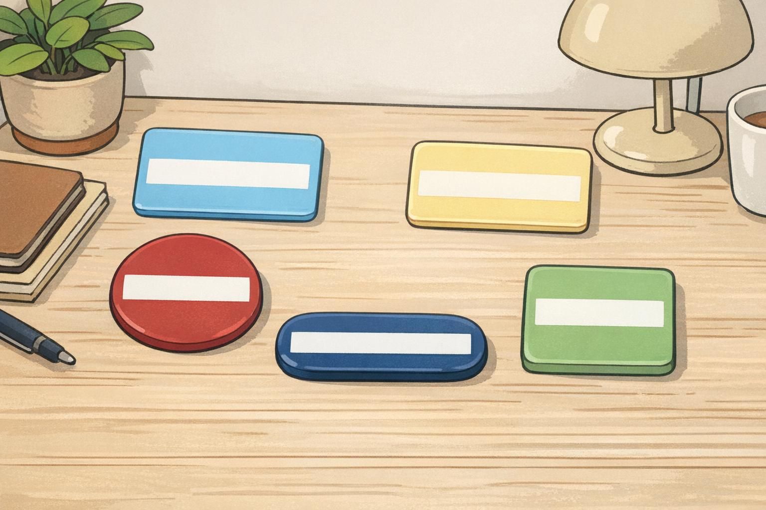
Once you have a few dependable pairings, the next step is creating a small palette that works across roles without turning into a rainbow of edge cases. Readable ID colors should be distinct at a glance, still distinct in grayscale, and consistent enough that teams don’t accidentally swap text colors or backgrounds.
A practical target is 3–5 role or status colors (for example: Visitor, Staff, Vendor, Speaker, Security). The key is not just different hues, but clearly separated lightness levels—so roles don’t blur together at a distance or under glare.
- Pick backgrounds with noticeably different lightness (some light, some dark).
- Assign one text color per background: near-black for light backgrounds, white for dark backgrounds.
- Avoid “almost the same” options (e.g., two medium blues) even if they feel like different colors.
- Keep the name field treatment consistent across roles so names are always easy to find.
Rule of thumb: if two badge backgrounds look similar in grayscale, they’re likely too close for fast recognition.
ID card design layout: where contrast matters most (name, photo, role, and barcode areas)
Good ID card design doesn’t rely on one big background color choice. It succeeds because the most important information is placed on the cleanest, highest-contrast surfaces. Think of contrast as something you allocate intentionally: the more critical the element, the cleaner and simpler the background behind it.
For most badges, the “must-read” items are the person’s name, role/department, and any access-critical indicators. These should never compete with photos, patterns, or gradients.
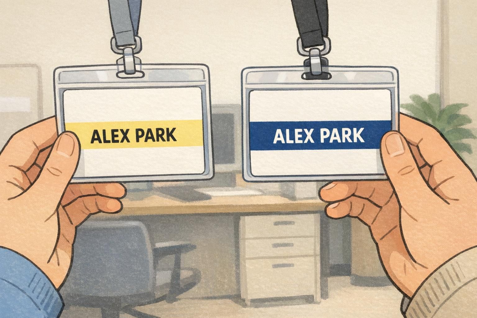
- Use a dedicated name band: a solid light strip with dark text, or a solid dark strip with white text.
- Keep role/department clear: place it near the name and maintain strong contrast (often slightly smaller, but still crisp).
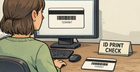
- Protect barcode/QR readability: put codes on a plain, non-patterned field to support consistent scanning.
- Let photos stay full color: keep text in a separate solid block so faces and clothing don’t interfere.
A small structural detail can also help in the real world: adding a thin border around the badge can make it stand out against clothing of a similar color. This is especially helpful for darker outfits, uniforms, or jackets where the badge edges otherwise disappear.
Designing for real lighting: glare, laminate, distance, and quick ID checks
Badges live in imperfect conditions: overhead lights, bright windows, dim hallways, and reflections from laminate or holders. That’s why a design that feels “pretty good” on a monitor can become borderline when it’s printed, worn, and viewed while moving.
- Increase font weight for key fields (especially names): medium-to-bold beats thin styles for quick reading.
- Avoid light gray text: it’s often the first thing to disappear under glare.
- Prefer solid fills over subtle gradients: gradients can vanish when reflections hit the badge.
- Choose slightly darker darks and slightly lighter lights than you think you need: this helps counter reflections and shadowing.
- If contrast is borderline, add a simple outline (stroke) around text to rescue legibility without changing brand colors.
A simple “hallway test” can reveal issues early. View the badge at arm’s length, then step back to about 6–10 feet. Look at it under a ceiling light and then near a window. If you can’t read the name instantly in both spots, increase the light-dark separation or simplify what sits behind the text.
“If someone has to tilt a badge to catch the light just to read a name, the contrast is doing extra work. A cleaner name band usually fixes it.” – Facilities Coordinator
Product and printing considerations: matching materials to contrast goals
Your color choices and layout do most of the readability work, but materials and production can change how contrast is perceived. Print process, laminate finish, and holder glare can all soften mid-tones and reduce the separation between text and background—especially in designs that are already close.
Two practical ways to protect contrast are (1) choosing crisp printing and durable finishes that keep edges sharp and (2) keeping critical text away from edges that might be covered by holders, clips, or slot punches. This is especially important for names and any access-critical identifiers.
If you’re producing durable employee credentials or event credentials where clarity matters every day, products like custom PVC ID cards can support consistent printing and wear resistance. If you’re unsure how your colors will translate to a specific finish, it’s reasonable to ask questions before you standardize a palette.
Quick checklist: confirm contrast before you order or roll out a new badge
Before you commit to a new design, a short preflight can prevent the most common readability surprises. The goal is to confirm that badge color contrast holds up outside of your design software and that your readable ID colors stay readable once printed and worn.
- Verify text/background contrast numerically (use a contrast checker and aim for at least 4.5:1 for normal text).
- Review the design in grayscale: names and roles should still be obvious.
- Test under two lighting conditions: overhead indoor light and natural light near an entrance work well.
- Make the name the highest-contrast element on the badge.
- Keep backgrounds simple behind text (no patterns, no photo under the name).
- Proof at actual printed size (not zoomed in), because small text reveals contrast problems fast.
High-contrast choices make badges easier to use, faster to verify, and more consistent across teams and events—especially during quick, real-world ID checks.
Usually not. Keep brand colors for accents (like a top bar, border, or icon), and use a dedicated high-contrast name band for text. That way you preserve brand identity without sacrificing clarity.
Check the badge in grayscale first, then lock in one text color per background (near-black on light backgrounds, white on dark backgrounds). This reduces “almost readable” combinations and prevents inconsistent templates.