Badge Readability Test: A Simple ‘Hallway Check’ Method for ID Designs
Why a quick hallway check beats guessing before you print
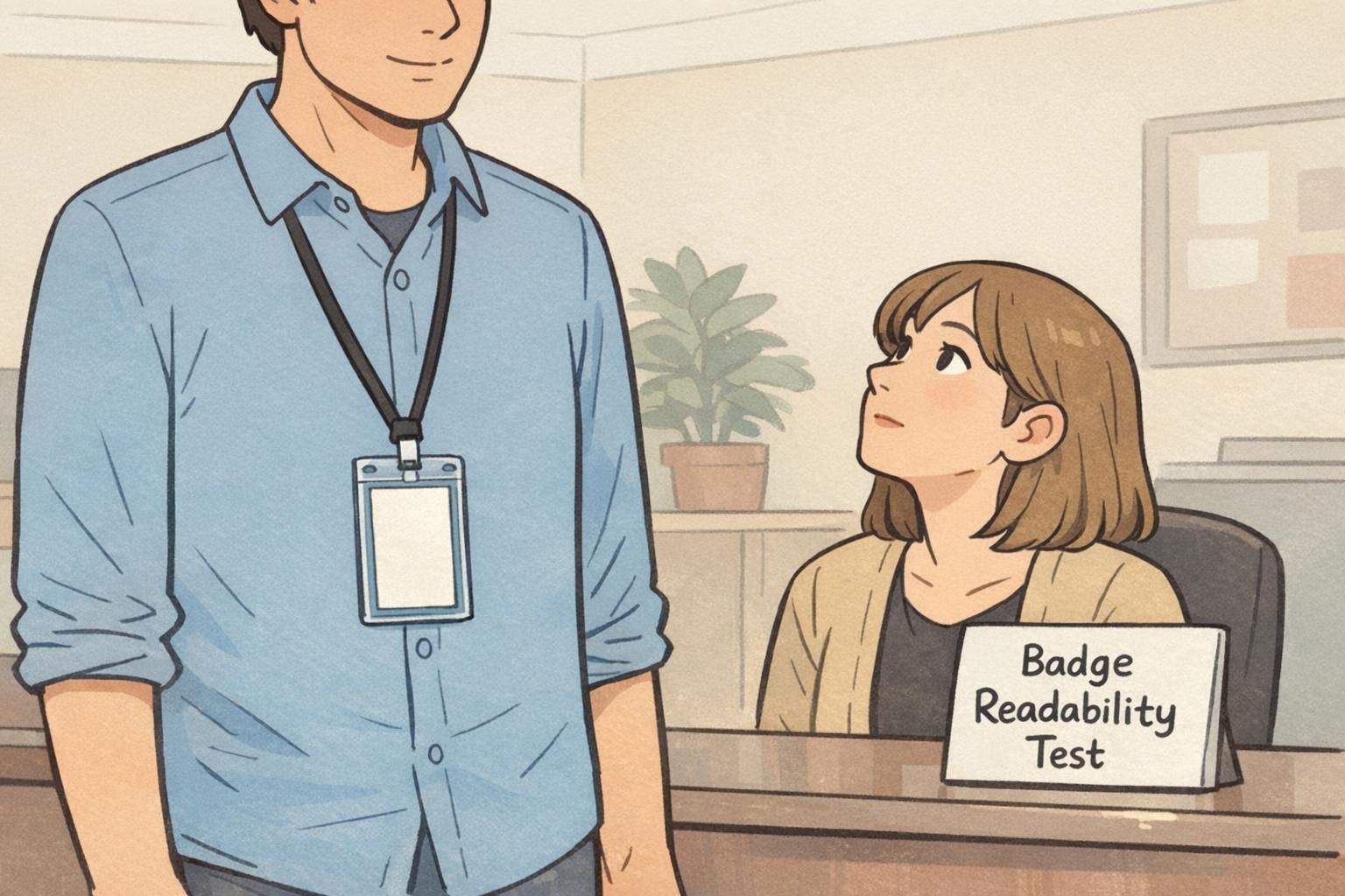
A badge readability test doesn’t require special equipment or weeks of debate. It just needs a realistic viewing situation and a few people who haven’t been staring at the design for days. That combination—real conditions plus “fresh eyes”—is often the fastest way to catch problems before you commit to a full print run.
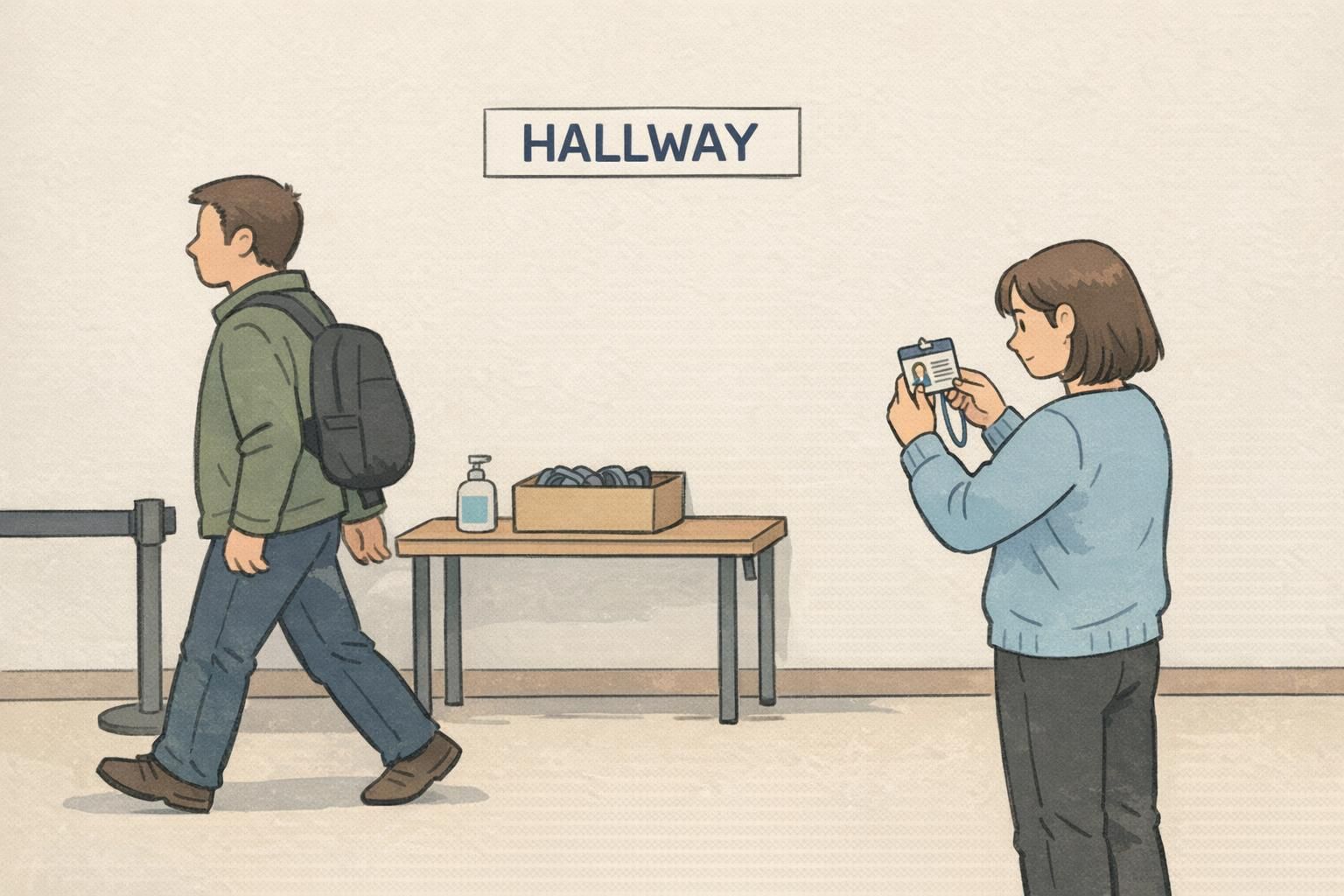
In busy environments like schools, hospitals, offices, and events, badges have to work at a glance. If someone needs to lean in, ask for confirmation, or squint under overhead lights, the badge isn’t doing its job. A hallway check is a simple way to see whether your layout communicates the essentials (who someone is, what role they’re in, and whether they belong) quickly and consistently.
This is especially useful when you’re planning a batch of photo IDs for staff, students, volunteers, or visitors. A quick test can prevent common, expensive mistakes—like tiny name text, low contrast, or a layout that looks fine on a monitor but fails in real lighting. If you’re preparing to print or update a program, your starting point might be a set of custom photo ID cards, but the readability test is what helps you feel confident the design will actually work day-to-day.
The goal isn’t to make the badge “pretty.” The goal is to make it instantly understandable in the places and moments it will be used.
What the “hallway check” method is (and what it isn’t)
A hallway check is a lightweight, informal usability test for identification materials. You ask 3–5 people who were not involved in the badge design to look at the badge and tell you what they think it says—while you observe where they hesitate, misread, or interpret things differently.
It’s intentionally simple: you’re testing the badge the way it will be used in reality, where people only give it a second or two of attention. For workplace identification, that matters more than any internal debate about what “should” be obvious.
What it isn’t: a statistically rigorous study, a brand review, or an exhaustive accessibility audit. It won’t tell you how every person will perform with every edge case. But it will reliably surface obvious breakdowns—exactly the kind that lead to day-one confusion and reprints.
- Is: quick, practical, and repeatable with minimal setup
- Is: focused on unassisted comprehension (no hints, no explanations)
- Is: great for catching layout hierarchy and contrast problems
- Isn’t: a substitute for compliance requirements your organization may have
- Isn’t: meant to “vote” on aesthetics—only on clarity and speed
Set up the test: what to print and what to test for
Set yourself up to get useful feedback, not a pile of opinions. Start with a realistic printout or a sample badge on the closest material you can manage. If your program uses both sides (for example, a front-facing photo and name, with a back-side barcode, emergency info, or policies), prepare both sides for review.
Before anyone looks at the badge, decide what must be readable under real conditions. Most programs have a handful of “must-read” elements, and everything else is secondary.
- Name (usually the highest priority)
- Photo (large and clear enough to confirm identity quickly)
- Role/department (important, but typically secondary to the name)
- Organization (company, school, site/campus)
- Color coding (if used for roles, access, or visitor types)
- Expiration date (if applicable)
- Access indicators (icons, labels, or other cues people rely on)
Then define 2–3 questions you want the badge to answer instantly. Keep them consistent so you can compare versions and see whether tweaks improved real comprehension.
Paper (or a physical sample) is better for a hallway check. Screens hide common problems like glare, low-contrast printing, and how small text feels at real viewing distances.
No. Focus on the essentials first. If the must-read elements fail, extra details won’t matter—and you’ll get more actionable feedback by keeping the scope tight.
Run the test in the real world: distance, lighting, and motion
Badges are worn while people move through hallways, check in at reception, pass in doorways, and talk briefly in shared spaces. That means your test should reflect the three things most likely to break readability: distance, lighting, and motion.
Start with typical interaction distances. Test at about arm’s length (the “normal conversation” distance) and then from a few steps away (the “approaching” distance). Many designs look acceptable up close but fail as soon as you add even a small gap.
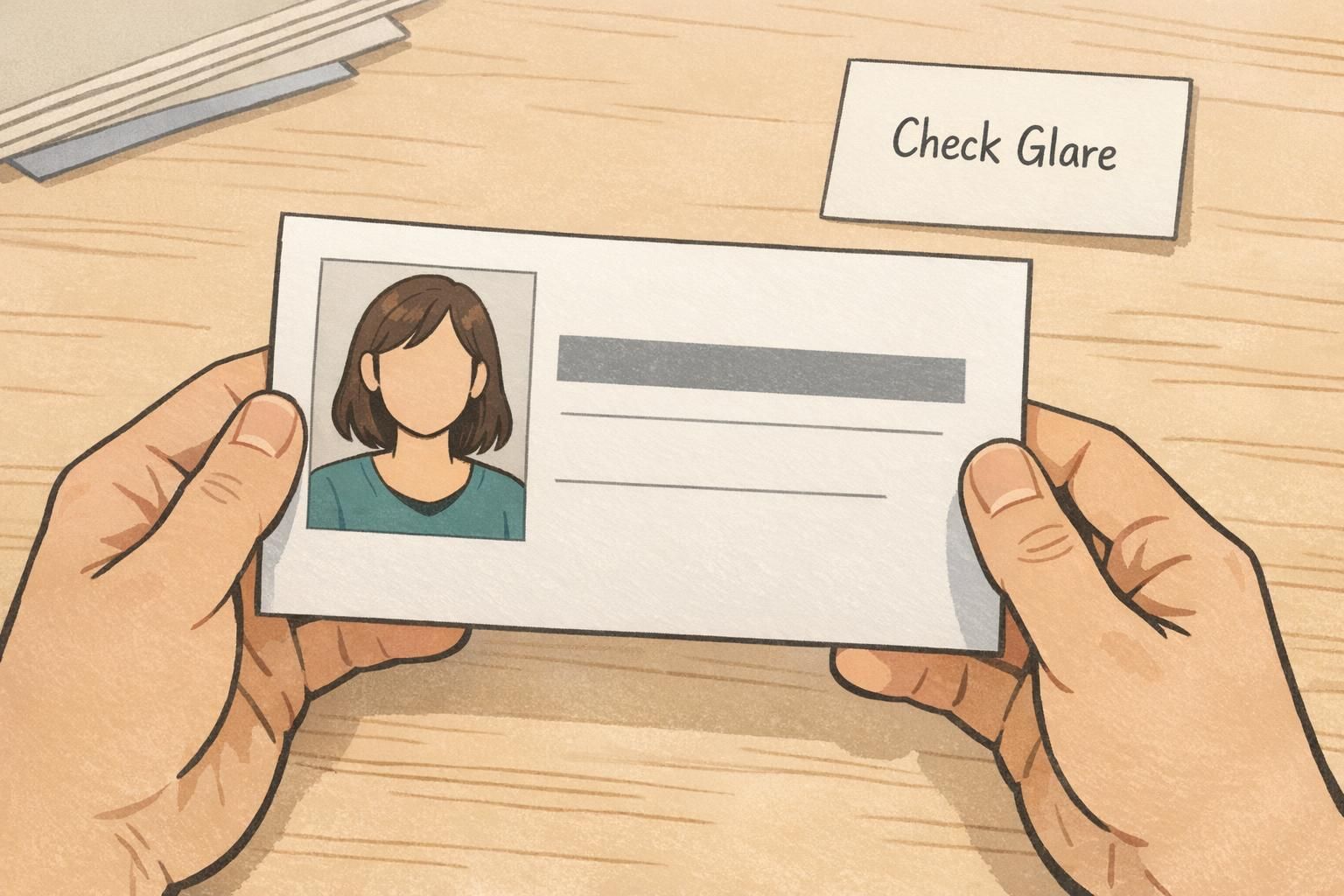
Next, test in mixed lighting: bright lobbies, fluorescent hallways, and spots near windows where glare can wash out text. A background color that seems fine under even desk lighting can become muddy under overhead fixtures, especially if the badge has a glossy finish.
Finally, add motion. Have someone wear or hold the badge while walking past at a normal pace or turning slightly as they talk. This is where tiny fonts, thin type weights, low-contrast color pairs, glossy glare, and busy background patterns show up immediately.
- Arm’s length: Can you read the name and role without leaning in?
- A few steps away: Can you confirm identity fast from the photo and name block?
- Mixed lighting: Does any text disappear or blend into the background?
- Motion: Can observers read key fields in 1–2 seconds?
- Glare check: Does the surface reflect light in a way that blocks the name or photo?
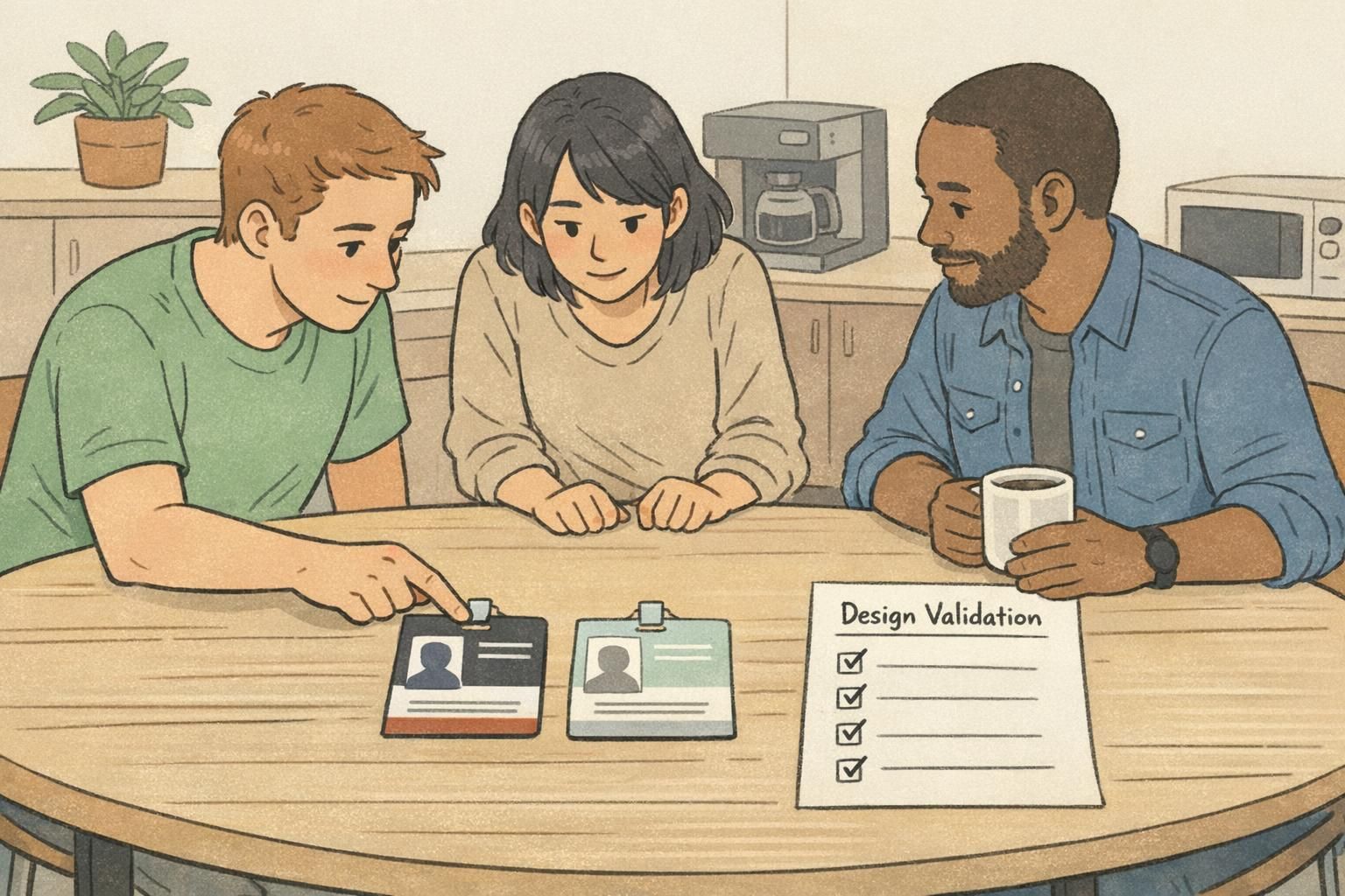
A fast script: 10 minutes, 3–5 people, repeatable questions
Keep the test short and neutral. You’re not trying to teach people how to read the badge—you’re checking whether the badge “teaches itself” when someone sees it briefly.
Use 3–5 observers who weren’t involved in the project. That could be coworkers from a different department, staff from another shift, or anyone who will realistically interact with badge-wearers. Show one badge at a time and ask the same prompts in the same order.
- “What do you think this person’s name is?”
- “What’s their department or role?”
- “What stands out first?”
- “Is anything confusing or easy to misread?”
- “If you saw this quickly, what would you remember?”
Don’t coach, correct, or explain while they answer. Just record what happens: where they pause, what they misread, and whether different people interpret the same element differently. Patterns matter much more than a single comment.
“We weren’t looking for perfection—just the moment where someone hesitates. If three people hesitate in the same spot, that’s the design telling you what to fix.” – Operations Coordinator
Common failures a badge readability test catches (and quick fixes)
Most badge problems aren’t mysterious—they’re predictable. The hallway check surfaces them quickly because it forces the badge to perform under real attention limits. If your observers struggle, it’s usually one of a few common issues.
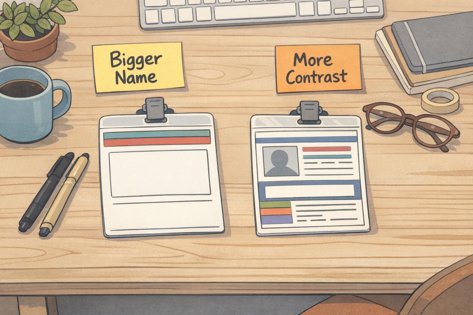
- Name text too small or too thin: Increase font size and weight; reduce competing elements near the name.
- Low contrast between text and background: Darken text, lighten the background, or remove patterns behind text blocks.
- Photo too small or poorly placed: Enlarge the photo area and keep it clean of overlays so faces remain clear.
- Unclear hierarchy: Make the name the most prominent element; keep role/department clear but secondary.
- Color coding fails in dim light: Choose more distinct hues and ensure labels don’t rely on color alone.
- Cluttered layout: Remove nonessential lines, icons, or extra labels that slow scanning.
- Gloss/glare hides key fields: Test alternate finishes and ensure critical text sits away from hotspots.
Quick fix approach: change one or two things at a time, then rerun a mini hallway check with 1–2 new people. Small iterations beat major redesigns driven by guesswork.
Treat disagreements as valuable data. If half your observers think the department is the person’s last name (or vice versa), that’s a labeling and layout issue—not a “people weren’t paying attention” issue.
When to add an ID card proof step (and what to verify)
Once the hallway check stops revealing major issues, an ID card proof is the next practical step before printing a full batch. A proof helps confirm that what you designed on a screen translates cleanly into the physical world—where color shifts, trimming, and surface reflections can change what people actually see.
This step is especially helpful if you have multiple badge variants (different roles, campuses, shifts, or access levels) where consistency matters. The layout may be the same, but small changes in color bands, titles, or icons can create real-world confusion if they’re too subtle.
- Photo clarity: Faces should be recognizable quickly, with no unexpected darkening or loss of detail.
- Alignment and trimming: Confirm safe margins so names, photos, and key elements aren’t too close to edges.
- Bleed handling: Ensure background artwork extends correctly without leaving unintended borders.
- Barcode/QR placement and scan reliability: Verify that scanners can read codes easily and that nothing overlaps the quiet zone.
- Glare and finish impact: Check whether lighting reflections obscure the name or photo under typical indoor lights.
Pair quick hallway checks with simple tools for smarter decisions
It’s tempting to look for a single score or tool that can “prove” a design is readable. Automated readability measures can be useful for bodies of text, but badges are glance-based and visual—meaning the real question is whether humans interpret the layout correctly in realistic conditions.
That’s why a hallway check is so effective: it’s an empirical check with real readers. It can reveal misunderstandings that formulas won’t catch, such as jargon that doesn’t land, labels that look like names, icons that people interpret differently, or a hierarchy that causes the wrong element to stand out first. Research on readability measurement has also noted limitations of relying only on quantitative measures without direct reader-based evaluation (source).
If your badge program covers multiple audiences—employees, contractors, volunteers, students, visitors—test at least one sample for each group. The same design can be “obvious” to one audience and confusing to another because of different role names, acronyms, or expectations.
Look for repeated points of confusion and consistent hesitations. If people disagree on what a field means, the label or hierarchy likely needs adjustment.
Any time you make a meaningful change to hierarchy (name size, photo size, role placement), color coding, finish, or background. A mini-check with 1–2 new people is usually enough between iterations.
Practical checklist: finalize the design, then print with confidence
A good badge is one that works reliably in normal use—quick glances, imperfect lighting, and busy moments. Before you finalize, do one last pass that reinforces what your hallway checks already taught you.
- Name is the most readable element, even at a few steps away
- Role/department is clear but secondary to the name
- Photo is large and clear enough for fast recognition
- Text has strong contrast against its background (no patterns behind key fields)
- Color signals (if used) remain distinct in multiple lighting conditions
- Front and back layouts (if used) are consistent and easy to understand
- Critical fields sit within safe margins and won’t be trimmed off
- Codes (barcode/QR) are placed cleanly and scan reliably
- Design is consistent across departments/variants so people learn what to look for
- Replacement badges can be produced without redesigning the whole layout
The simplest test of design validation is this: can someone identify the person and their role correctly, quickly, and without help—in the actual places the badge will be seen?
Once your badge readability test results are consistent and your physical proof matches expectations, you can move forward knowing you’ve reduced the risk of confusion, delays at check-in, and costly reprints. It’s a small investment of time that supports smoother interactions everywhere badges are worn.