Long Names on Badges: Designing for Readability Without Tiny Fonts
Why Long Names Break Badge Readability (and How to Prevent It)
Long names on badges create a common design trap: to “make it fit,” the name shrinks until it’s no longer readable in real life. But the real purpose of a badge isn’t to display every detail equally—it’s fast recognition. If someone can’t scan the name quickly from a few steps away, the badge isn’t doing its job.
This matters everywhere people rely on quick, low-friction identification. At events, readable names make introductions smoother and reduce awkward “Sorry—what was your name again?” moments. In hospitals and clinics, clear identification supports service and safety because patients and coworkers can confirm who they’re speaking with. In schools, readable staff and visitor identification helps communication and day-to-day security. In corporate offices, it speeds up collaboration, helps new hires learn faces, and supports visitor management.
A practical rule: keep the name large and easy to read first. Everything else—role, company, pronouns, credentials—should be treated as secondary information that earns space only after the name is protected.
- Primary (largest text): the person’s name
- Secondary (smaller text): role or department (useful, but not at the cost of legibility)
- Optional (smallest text): pronouns, credentials, location, or team name—only if they remain readable
Badge Layout Tips That Protect the Name First
The best badge layout tips start with hierarchy. Treat the badge like a sign: the most important message (the name) gets the clearest, largest zone. Then you arrange supporting details around that zone instead of competing with it.
A “name-first” layout usually means reserving the top half (or top two-thirds) for the name block, then placing secondary lines below. Predictable alignment helps scanning—either left-aligned for a clean, structured look, or centered for a classic event badge feel. Mixing alignments tends to create visual noise, especially when names vary in length.
- Start with a dedicated name zone: block out space before adding anything else
- Use safe margins: keep text away from edges so it doesn’t feel cramped or get lost in holders
- Keep whitespace intentional: blank space is what makes the name feel bigger without changing font size
- Use one alignment style (left or center) across the whole template for consistency
- Prioritize contrast: dark text on a light background is usually the easiest to read quickly
- Use simple color blocking (not busy patterns) to separate name vs. role without shrinking type
Quick real-world checklist: Can you read it at a glance from typical viewing distance, under indoor lighting, while both people are moving (walking and talking)? If not, adjust layout before you adjust font size.

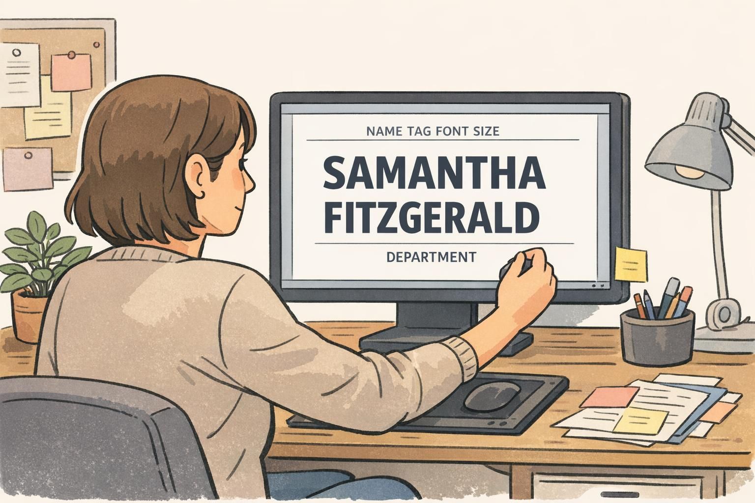
Name Tag Font Size: Minimums, Weight, and Spacing Tricks That Still Read
When name tag font size starts dropping to accommodate a long surname, readability usually collapses faster than you expect—especially in motion. Before you make the name smaller, try techniques that preserve letter clarity and word shape.
First, use weight strategically. A semi-bold name can read better than a larger but thin font, especially under glare from badge holders. Next, check spacing: slightly improved kerning or a modest tracking adjustment can help a long name fit without looking squeezed. If you need more space, a condensed-but-legible typeface can work—just avoid extremes that make letters blend together.
- Try semi-bold for the name before shrinking the size
- Increase line spacing slightly when using two lines (it often improves clarity at a distance)
- Use condensed typefaces carefully—choose ones with open counters and clear shapes
- Avoid overly thin fonts (they disappear under reflections and low lighting)
- Avoid overly tight tracking (letters start to merge when people are moving)
- Be cautious with all-caps for long names: it often reduces legibility and makes names feel longer
When should you reduce name tag font size at all? A small reduction can be fine if the name still passes real-world testing. But if you’re shrinking more than “just a touch,” it’s usually better to reflow the layout—most often by moving the name to two lines—so the badge still reads instantly.
Test-it method: print at actual badge size and do a 6–10 foot check. If you have to squint, slow down, or lean in, the font is too small or the layout is too dense.
Two-Line Name Formats That Look Intentional (Not Cramped)
Two-line names are one of the cleanest ways to handle long names without resorting to tiny type. The key is making the break look designed—balanced, consistent, and aligned—rather than like an afterthought.
A reliable default is splitting between given and family name. If your workplace culture uses last-name recognition (common in healthcare, education, and many formal office settings), consider keeping the last name visually prominent—either by placing it on its own line with equal size, or by giving it slightly stronger weight.
- Given name on line one, family name on line two (clean and predictable)
- Balanced break for multi-part surnames: keep connected parts together when possible
- Break after a natural space or hyphen so the name reads correctly at a glance
- Aim for visually similar line lengths (a balanced block reads as intentional design)
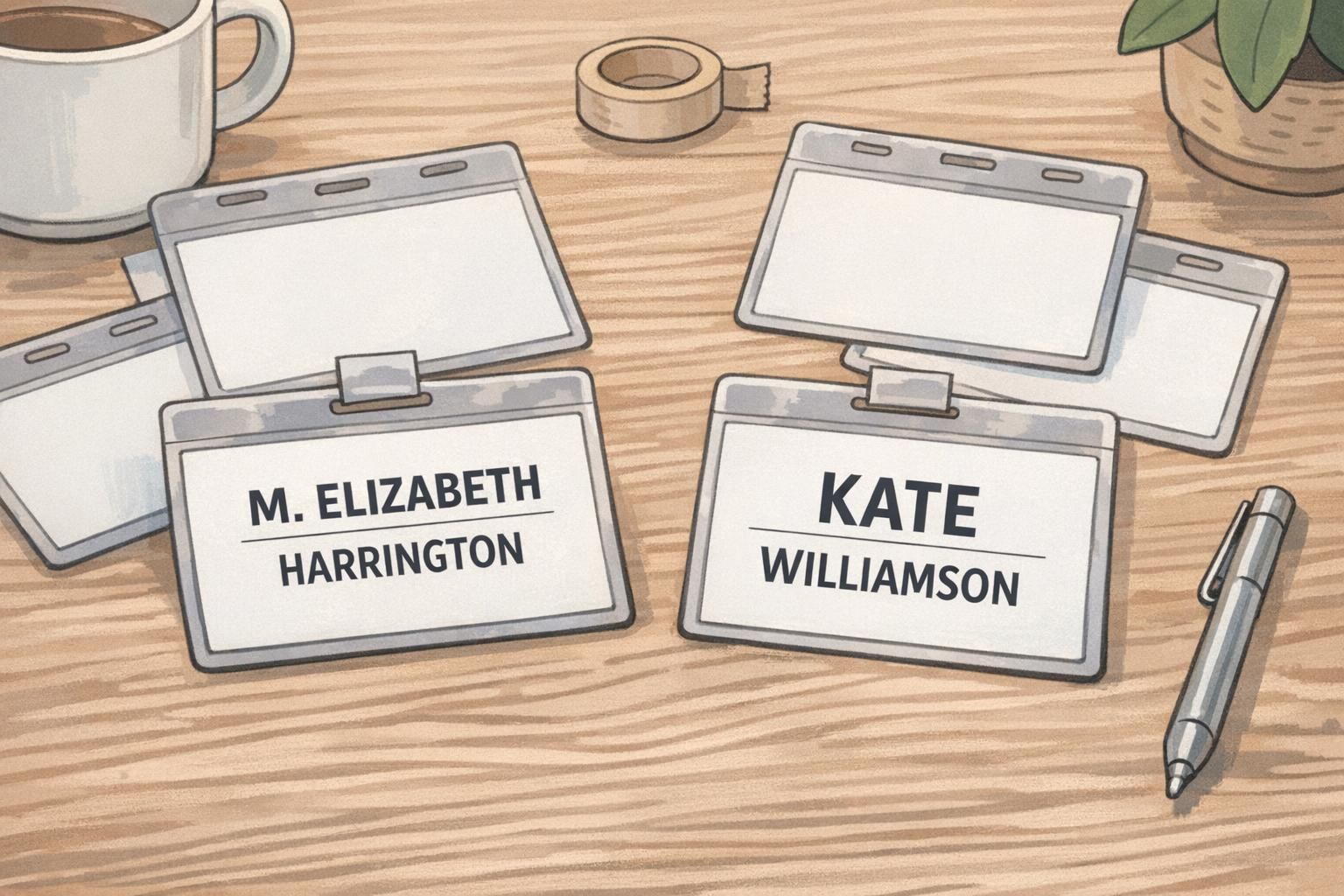
Examples in everyday terms: A name like Jonathan De La Cruz often reads best with Jonathan on the first line and De La Cruz on the second. A long first name with a long last name can still look clean if the two lines feel balanced rather than squeezed.
If you need supporting info, add it as a smaller third line below the two-line name—such as title or department. This preserves the name block while still giving context.
Abbreviations and Preferred Names: Clear Rules That Respect People
When space is tight, abbreviations can help—but only when they respect the person and remain clear to the reader. The safest approach is to use the name someone prefers to be called, when that preference is provided, and avoid guessing abbreviations based on what “seems shorter.”
Consistency also matters. If one person’s name is shortened but others aren’t, badges can feel uneven or unfair. A simple organization-wide rule makes the outcome more readable and more respectful: confirm how each person wants their name displayed, then apply the same layout logic to everyone.
- Preferred given name plus full last name (often the clearest and most human)
- First initial plus full last name when space is limited and last names matter most
- Shortened given name plus full last name only when the person uses that name
- Middle initial only if it improves clarity (for example, differentiating two similar names)
The goal is legibility and accurate identification—not forcing names into a one-size format that creates confusion or discomfort.
Smart Truncation Rules (When You Truly Can’t Fit Everything)
Truncation should be a last resort because it can reduce identification quality. Before cutting a name, reduce or remove secondary fields first—department, location, long credentials, or other supporting text that isn’t needed for quick recognition.
If you truly cannot fit the full name, truncation needs rules so the result stays clear and consistent. The printed version should still map cleanly to internal records, reprints, and replacements. Most importantly, the visible name must remain unambiguous within the group—if two people could end up looking identical on a badge, truncation is not acceptable.
- Truncate secondary fields first (title, department, credentials) before touching the name
- Only truncate a surname when there is no other viable layout option
- Use consistent truncation markers and apply the same rule across the organization
- Ensure internal records match the printed format so reprints remain consistent
- Avoid truncation if it creates duplicates or confusion among people in the same setting
“If a badge forces us to double-check who someone is, the layout is working against the purpose of identification.” – Operations Coordinator
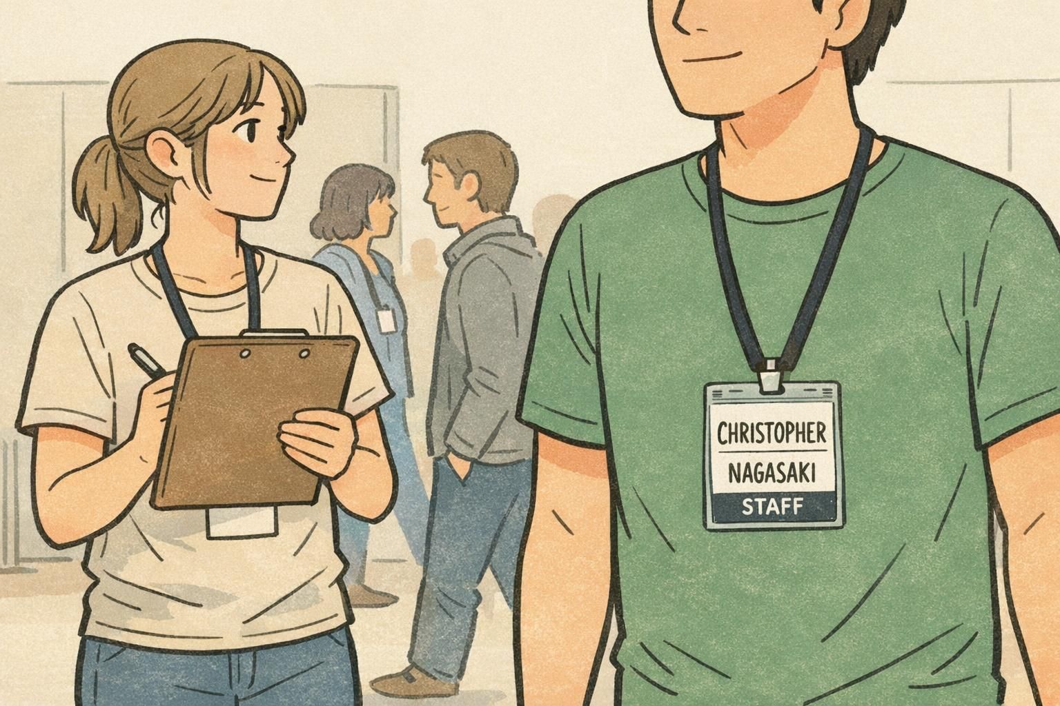
Designing for Lanyards, Clips, and Motion: Real-World Readability Checks
Badges aren’t read in perfect conditions. A lanyard can swing, a clip can angle the holder, and glare can appear under overhead lights. Long names are especially vulnerable because readers have less time to decode more letters.
Design adjustments that help in the real world are often simple: keep the name block higher on the badge so it’s visible even when the holder tilts, add slightly larger top padding to avoid crowding near clips, and choose backgrounds that don’t compete with the text. Clean, quiet design makes long names easier to scan.
- Place the name block higher so it stays visible when the badge tilts forward
- Use generous top padding to accommodate clips and holder edges
- Avoid busy textures behind the name (they reduce contrast in motion)
- Keep the name in a consistent location across badges so eyes know where to look
Movement test: try reading the badge while walking, turning slightly, and standing under indoor lighting. If the name isn’t instant, refine layout and hierarchy before shrinking fonts.
Template and Print Choices That Make Long Names Easier (BadgeZoo Options)
Long-name problems often show up late—right before printing—when someone realizes a few attendees or staff members don’t fit the template. Using consistent templates and standard badge sizes reduces last-minute font shrinking because you’re designing with real constraints from the start.
It also helps to standardize holders and wear methods across a group. If everyone uses the same orientation (for example, vertical holders on lanyards), you can place the name zone where it will be most readable and keep reprints consistent.
Constraint-aware design benefits from iteration: try multiple layouts, test-print, and refine rather than forcing a single layout to work for every edge case. Research on ideation under constraints supports the practical value of iterating within space limits—such as reflowing to two lines before shrinking text—because exploring alternatives can produce clearer, more effective outcomes even when the format is fixed. source
If you’re standardizing an event or workplace format, it can help to start from a ready-to-customize template designed for readable names—then apply consistent rules for two-line names, secondary fields, and edge cases. BadgeZoo offers custom name tags that can be used with these layout approaches so long names remain readable without redesigning from scratch each time.
Quick Examples: 5 Long-Name Layout Patterns You Can Reuse
Below are five reusable patterns you can apply to long names without relying on tiny type. Each one is designed to keep the name readable at a glance, with secondary info clearly secondary.
- Two-line split (given name / family name): Best general-purpose option for events and workplaces; preserves size and improves scanning.
- Bold given name with lighter last name (same size): Useful when first-name recognition drives introductions, but you still want the full name clearly present.
- Condensed type with increased line spacing: Works when the template is strict and you can’t expand the name zone; keep letterforms clear and avoid over-condensing.
- Preferred name plus full last name: Great for conferences and customer-facing roles where people introduce themselves verbally; reduces confusion and respects identity.
- Initial-based format when needed (first initial + full last name): Helpful for very tight layouts or last-name-forward environments; use consistently and avoid guessing.
Try two lines first. A small font reduction can work, but two lines usually preserves readability better—especially for long surnames that need to be recognized quickly.
Shrink or simplify secondary fields (department, credentials, location) before shrinking the name. The name is the primary job of the badge.
Do a test print at actual size and check it from about 6–10 feet away. Also try reading it while walking or turning slightly, since real conversations rarely happen perfectly still.
Standardize your rules (two-line breaks, abbreviation policy, and last-resort truncation) and always test-print. That’s how you keep badges fair across a group and readable in the situations they’re meant for.