Name Badges Workplace: How Visible Names Make Teams More Approachable
Why name visibility changes everyday interactions
In a name badges workplace environment, the biggest wins often come from the smallest moments. Instead of pausing to remember names, guessing who belongs in a space, or scanning for “someone who looks in charge,” people can start the conversation immediately. That simple shift reduces friction in day-to-day team communication—especially when the work is fast, shared, or public-facing.
Think about the places where “who’s who” changes by the hour: front desks, hallways, shop floors, campuses, clinics, and hospitals. Even in friendly organizations, you won’t know every colleague personally—new hires join, teams rotate, and departments overlap. When employee visibility is built into the routine through readable name badges, introductions happen faster and handoffs feel less awkward.
- Fewer hesitations: It’s easier to start with “Hi, Maya—quick question” than “Sorry, what’s your name again?”
- Smoother handoffs: People can confirm they’re speaking to the right person without a detour
- More confident requests: Visitors and coworkers can approach someone by name instead of guessing
The science of first impressions: names signal warmth and trust
First impressions form quickly, and people use simple social cues to decide whether it feels comfortable to speak up. A visible name is one of the most straightforward cues: it’s human, specific, and inviting. When someone can address you by name, the interaction tends to feel less transactional and more like a real conversation.
This doesn’t mean a badge magically makes everyone outgoing. But in everyday work—where questions, clarifications, and quick confirmations are constant—removing a small social barrier matters. Teams with frequent cross-functional touchpoints (facilities, IT, HR, clinical support, operations, teaching staff) often see that visible names make “micro-interactions” smoother: a nod, a quick ask, a simple redirect.
Approachability is often about reducing uncertainty. A clearly visible name gives people a low-effort way to start the conversation respectfully.
Role clarity reduces friction (and makes asking for help easier)
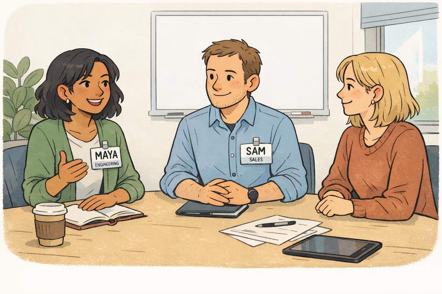
Names are a great start, but role clarity is where a workplace identification system often earns its keep. When people can see both a name and a role, they can route questions correctly: who can approve a request, who’s covering a station, who’s in training, and who’s assigned to a specific unit or team.
In busy environments—healthcare, education, events, manufacturing, warehousing, and large offices—unclear roles create avoidable “handoff loops.” A person asks someone nearby, gets redirected, repeats the question, and loses time (and sometimes confidence). Clear role identification via badges has been studied in team-based settings and can measurably improve perceived role clarity and the smoothness of interactions (source).
- Faster help: People can find the right person on the first try
- Fewer awkward escalations: Clear signals reduce guesswork about who has authority or responsibility
- Better support for new staff: “In training” or “Student” identifiers set expectations respectfully
- Safer workflows in high-stakes environments: Role clarity reduces confusion when timing matters
“When roles are visible, the whole room works better. People stop guessing and start collaborating.” – Team Lead
Readable design basics: what makes a name badge easy to use
The most “professional-looking” badge isn’t always the most readable one. In practice, the best name badge is the one people can use without squinting or stepping closer. Strong employee visibility comes from a few consistent design choices that make names easy to catch at a glance.
Start by thinking about viewing distance. Across a counter or reception desk, larger text matters. Around a meeting table, you can often read smaller text, but clarity still wins—especially for new teams or cross-team project groups.
- Prioritize the first name: Make the first name the largest element on the badge
- Use high contrast: Black or near-black text on white (or a very light background) is reliably readable
- Choose simple fonts: Clean sans-serif or straightforward serif styles are easier to scan quickly
- Keep the layout uncluttered: Avoid cramming extra lines, logos, or decorative elements near the name
- Standardize placement: If badges are consistently worn at chest height, people learn where to look
Common readability pitfalls: low-contrast colors, overly decorative type, reflective glare on glossy surfaces, and role text that competes with the name.
Culturally respectful naming: helping everyone feel recognized
A name badge is also a small but meaningful signal of respect. When someone’s name is displayed correctly—and in the way they want to be addressed—it supports belonging and reduces the emotional friction of constant corrections. Inclusive naming practices help teams stay focused on work, not on repeated “Actually, it’s pronounced…” moments.
- Allow preferred names: Let people choose the name they use day-to-day (within your organization’s policies)
- Support diacritics and correct capitalization: Names should be spelled accurately, including accents and case
- Don’t force nicknames or anglicized spellings: Default to the employee’s preference, not convenience
- Plan for longer names: Use two-line name layouts or reduce nonessential elements rather than shrinking the name too far
- Make corrections easy: Create a simple, no-drama process for fixes and updates
It depends on your setting and privacy policies. Many workplaces use larger first names for approachability and readability, with a role line for context. If full names are required, keep the first name visually prominent so conversations still start naturally.
Treat it like any other important record update: confirm the preferred display name, reprint promptly, and retire outdated badges so the system stays consistent.

Where approachability matters most: meetings, shared spaces, and customer-facing moments
Approachability isn’t just a customer service concept. It’s a daily teamwork advantage. Visible names reduce interruptions in meetings (“Sorry—what was your name again?”) and make shared spaces feel more navigable, especially when departments overlap.
In shared environments, a name badges workplace standard can help conversations start cleanly: a quick greeting, a direct question, a confident handoff. That supports team communication because people spend less time orienting themselves socially and more time exchanging the information that moves work forward.
- Meetings and trainings: Faster introductions and fewer repeat name questions
- Break rooms and hallways: Easier cross-team rapport without awkward guessing
- Warehouses and shop floors: Faster identification during shift changes and quick requests
- Clinics and campuses: Visitors and patients know who to ask (and who they already spoke with)
- Receptions and front desks: A clear name builds accountability and reduces misdirected requests
“New hires told us the badges helped them learn names faster—and helped others learn theirs, too.” – Operations Coordinator
Badge formats that fit your workflow (clip, lanyard, magnetic, holders)
The most readable badge design can still fail if it’s uncomfortable or constantly flipping around. Choosing the right wear format is part of protecting employee visibility—so names stay in the expected spot and remain easy to read throughout the day.
- Clip: Good for uniforms, pockets, and consistent chest placement; tends to stay steady during movement
- Lanyard: Useful for highly mobile roles and frequent scanning; may swing or turn when bending or reaching
- Magnetic fastener: Helpful for delicate fabrics and a clean look; ensure it fits your workplace safety policies
- Clear holder: Protects printed inserts and reduces wear; great for ID cards that are reissued or updated often
Many organizations standardize one or two formats across teams so people learn where to look at a glance. Consistency helps reduce the “badge hunt” moment—especially when teams are large or shift-based.
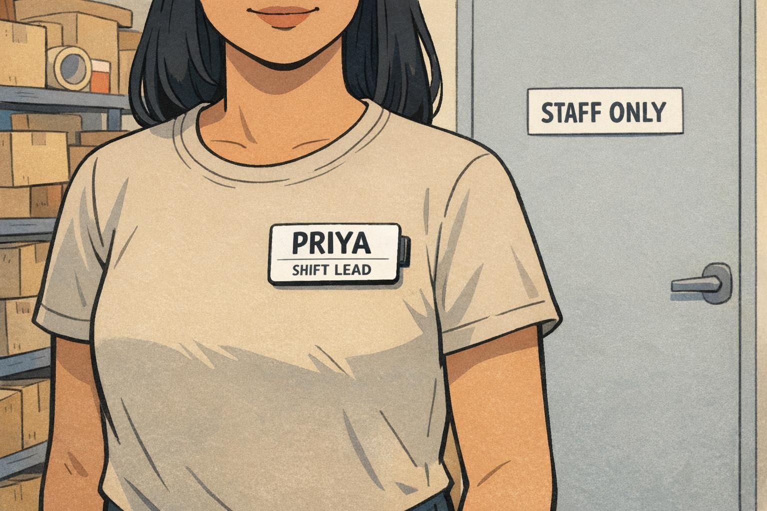
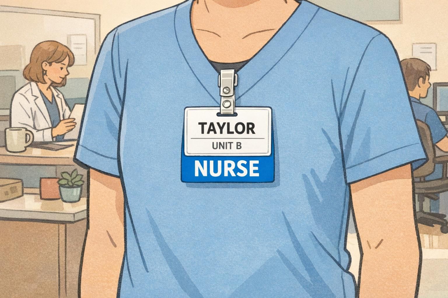
Role-backed identification with badge buddies for quick scanning
In some environments, role clarity needs to be readable instantly—without someone leaning in to read a small title line. That’s where badge buddies can help. A badge buddy is a rigid rectangular backing card worn behind an ID badge, designed to make role text bold and easy to spot while keeping the main ID readable.
Used well, badge buddies support team communication by reducing “wrong person” interruptions. If a visitor needs a nurse, a supervisor, or a specific team (like Security or Facilities), the role label helps them approach the right person quickly—while still preserving your standard ID practices.
- Best for: hospitals, clinics, schools, event staff, and multi-shift operations
- Works well when: roles must be recognized at a distance or during fast-paced interactions
- Design tip: keep role text large and high-contrast; avoid too many role categories that people can’t remember
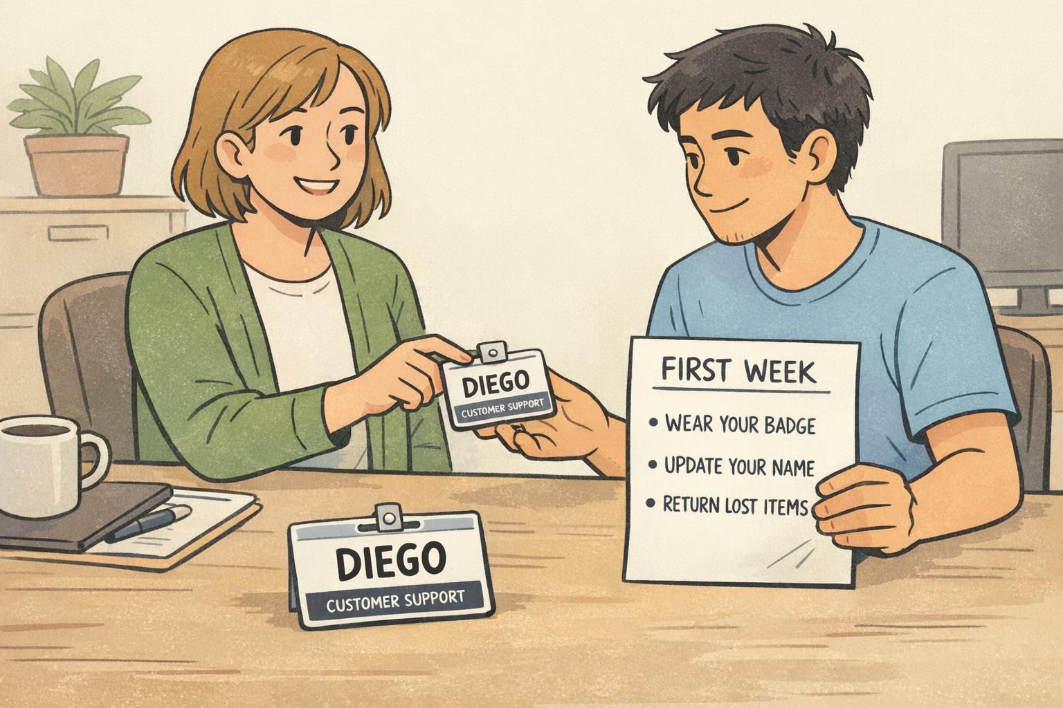
Getting started: a simple rollout plan that people actually follow
A successful rollout is less about strict enforcement and more about making the “right way” the easiest way. When badges are readable, comfortable, and consistent, people are more likely to wear them correctly—and the organization gets the benefits of smoother collaboration and stronger employee visibility.
- Pick a standard template: define name size, role placement, and color rules
- Confirm naming preferences: preferred name, diacritics, capitalization, and role titles
- Set role rules: decide which roles appear on the badge and when a badge buddy is used
- Choose wear location: e.g., upper chest on the dominant side for easier reading during conversations
- Document replacements: what to do for lost, damaged, or updated badges
- Plan simple maintenance: cleaning guidance and when to reprint worn or faded badges
- Check in after a few weeks: gather quick feedback on readability, comfort, and naming accuracy
If you want better adoption, optimize for real life: badges that stay facing forward, are easy to read at normal distances, and are quick to replace when something changes.
Products to support an approachable, consistent identification system
If you’re building a more approachable identification system, the goal is consistency: the same kind of badge, the same placement, and the same readable design rules across teams. That’s what helps names and roles do their job in everyday interactions.
BadgeZoo offers tools that can support that system—whether you’re standardizing employee name tags, issuing ID cards, setting up event badges, or adding role backers for quick scanning. If you’re exploring options for templates or formats, you can review custom name badges as a starting point for readable, consistent name display.
For teams that are piloting a new approach, it can help to start small (one department or one shift), then expand once you’ve confirmed what’s most readable and comfortable in your real workspace.