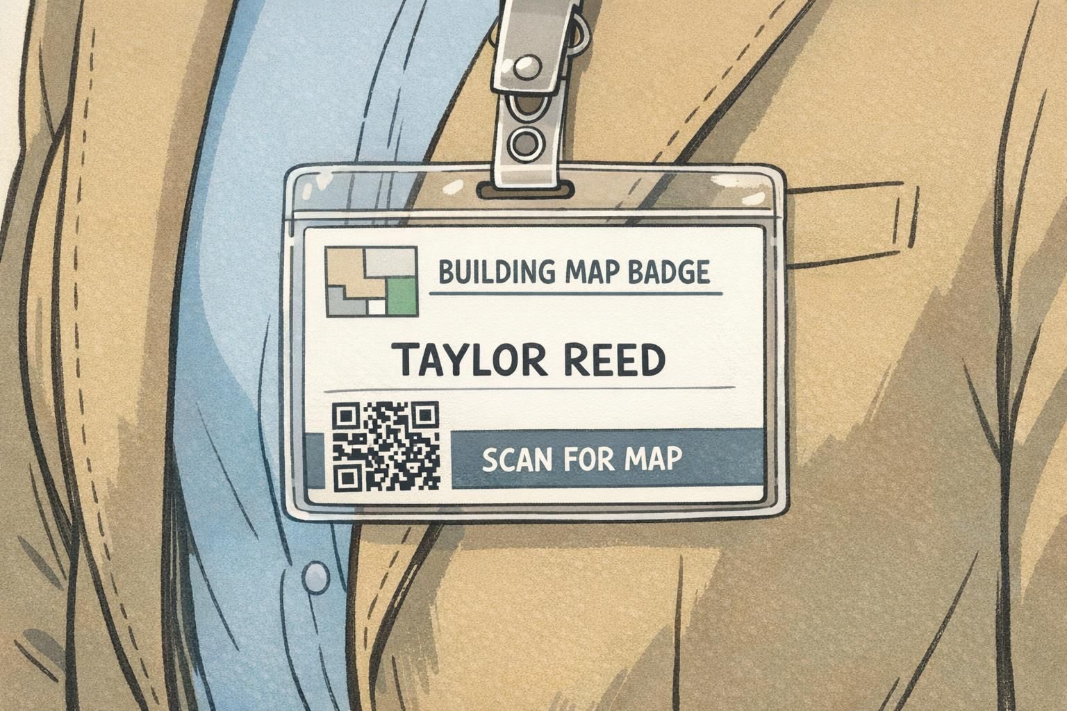
Building Map Badge Micro-Maps: Helping Visitors Navigate Buildings Without Confusion
Why a Building Map Badge Helps Visitors Feel Oriented Fast
A building map badge is a simple idea with an outsized impact: it puts basic navigation help exactly where visitors already look—their visitor badge. For a first-time guest, even a well-run lobby can feel uncertain once they leave reception and face elevators, hallways, or multiple wings. A micro-map reduces that “Where do I go now?” moment without turning the badge into a tiny poster.
The best micro-maps are designed for quick glances. Instead of squeezing in a detailed floorplan, they highlight a couple of key landmarks (like Reception or Elevators) and a minimal directional cue that matches the building’s real signage. This keeps the visitor moving confidently while still allowing staff to verify identity quickly.
A building map badge works best when it answers the first two questions visitors have after check-in: “Where am I?” and “What’s the next landmark I should head toward?”
- Reduces hesitation at hallway intersections and elevator banks
- Supports self-serve navigation without replacing staff guidance
- Keeps the visitor badge doing its primary job: clear identification
- Pairs well with a QR link for deeper directions when needed
Micro-Map Goals: Wayfinding Without Crowding the Front
A micro-map should feel like a helpful hint, not the main event. The front of the visitor badge needs to be readable at a distance so employees can greet the visitor by name, confirm they’re in the right place, and keep entry procedures professional. That’s why it’s smart to treat wayfinding as a secondary layer that supports (but never competes with) identity.
A practical rule: keep the front to one or two floor icons plus one directional cue. If the visitor needs more information than that, it’s a signal to place the details on the back or use a QR link. This approach also prevents check-in from slowing down—staff can hand over the badge and give a quick verbal cue that matches what’s on the micro-map.
- Front priority #1: visitor name and affiliation (and photo if used)
- Front priority #2: clear “VISITOR” identifier (if part of your program)
- Micro-map on front: minimal landmarks + one direction cue
- Everything else: back printing or QR code
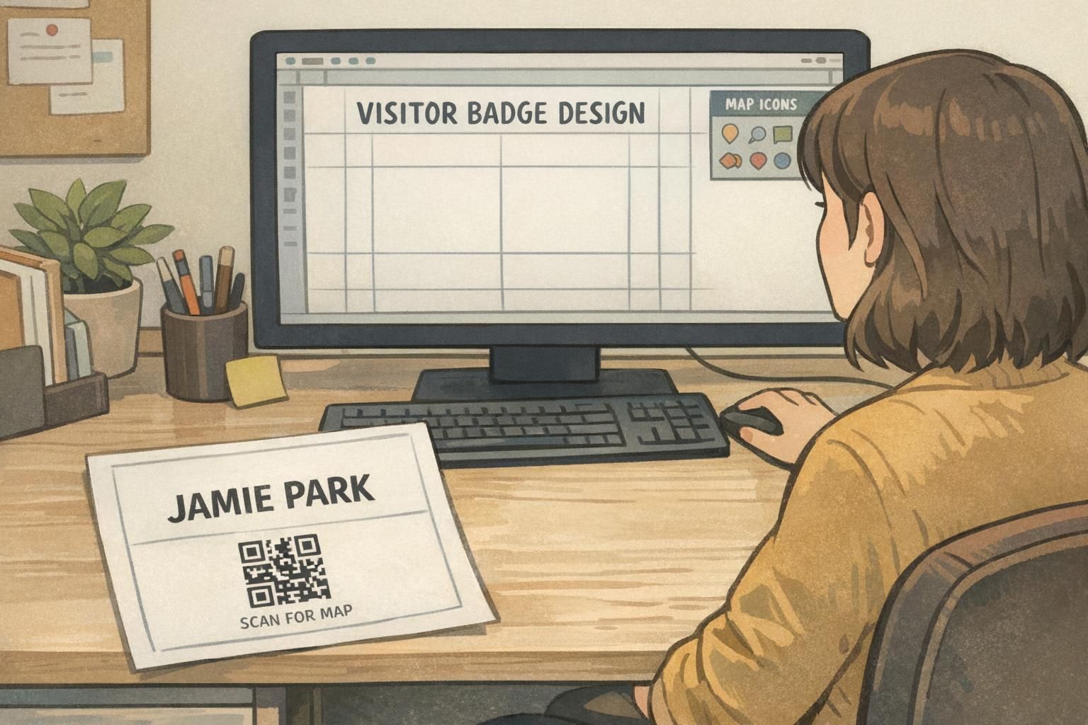
Visitor Badge Design Layouts That Keep Identity Clear
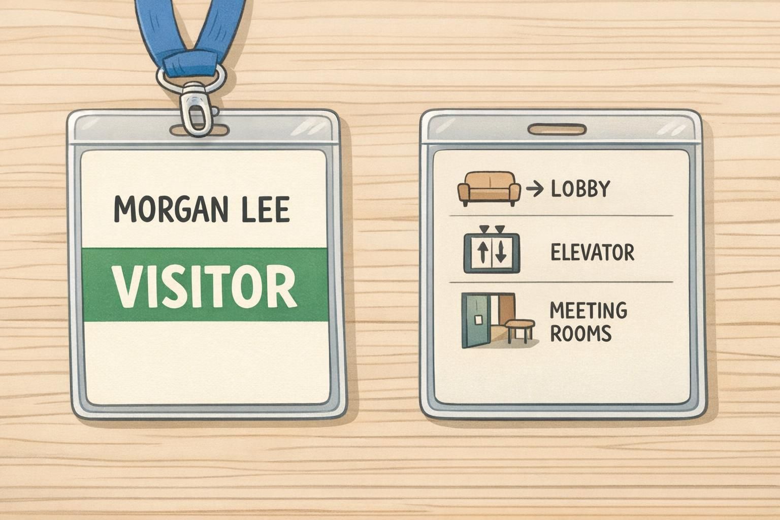
Strong visitor badge design starts with a clear visual hierarchy: the name should be the first thing someone sees, and the map should be the second or third thing. The simplest way to achieve that is to reserve a small corner area for the micro-map and keep it consistent across badges so returning visitors (and staff) know where to look.
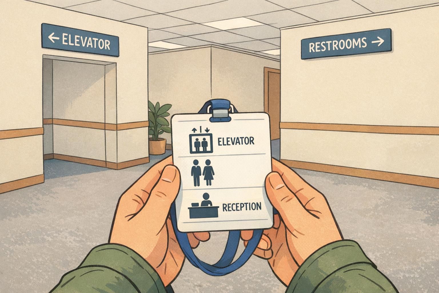
Micro-map elements that tend to work well on the front include a tiny corner diagram, a small “You are here” dot when appropriate, or a single destination zone label such as “Elevators →”. Use high-contrast shapes and simple pictograms so the map remains legible under quick glances while walking.
If your badges are reused, keep map elements generic rather than tied to a specific date, event, or one-off room assignment. Labels like “Lobby,” “Reception,” and “Elevators” stay useful across many visits, while the QR link can handle updates when routes or rooms change.
- Top/center: visitor name in the largest text size
- Secondary line: company or host name (optional, smaller)
- Corner micro-map: icons + one short directional cue
- Keep wide margins so nothing feels cramped in the holder
Simple Floor Icons and Landmark Cues (What to Include on the Badge)
The easiest way to make a wayfinding badge feel intuitive is to use universally understood icons and the same destination names people will see on your walls. A small set of pictograms—used consistently—beats an overloaded legend that requires decoding.
In complex indoor environments, landmark-based instructions can be more effective than purely metric directions (like “walk 200 feet”). That supports the logic behind badge micro-maps: prioritize the next recognizable place to go rather than trying to compress an entire floorplan onto a small card (source).
A good micro-map combines icons with one short cue that mirrors how a staff member would give directions in real life. Examples include “Elevator to 2” or “Left after Reception.” The goal is not perfect navigation for every destination—it’s reducing confusion at the first decision point.
- Elevator
- Stairs
- Restroom
- Reception / Front desk
- Meeting rooms / Conference area
- Security / Checkpoint (if appropriate for your facility)
- “ELEVATOR →” (paired with the elevator icon)
- “RECEPTION ←” (paired with the reception icon)
- “Restrooms: next to elevator” (short, landmark-based phrasing)
- “Meeting Rooms: 2nd floor” (simple floor cue instead of a dense map)
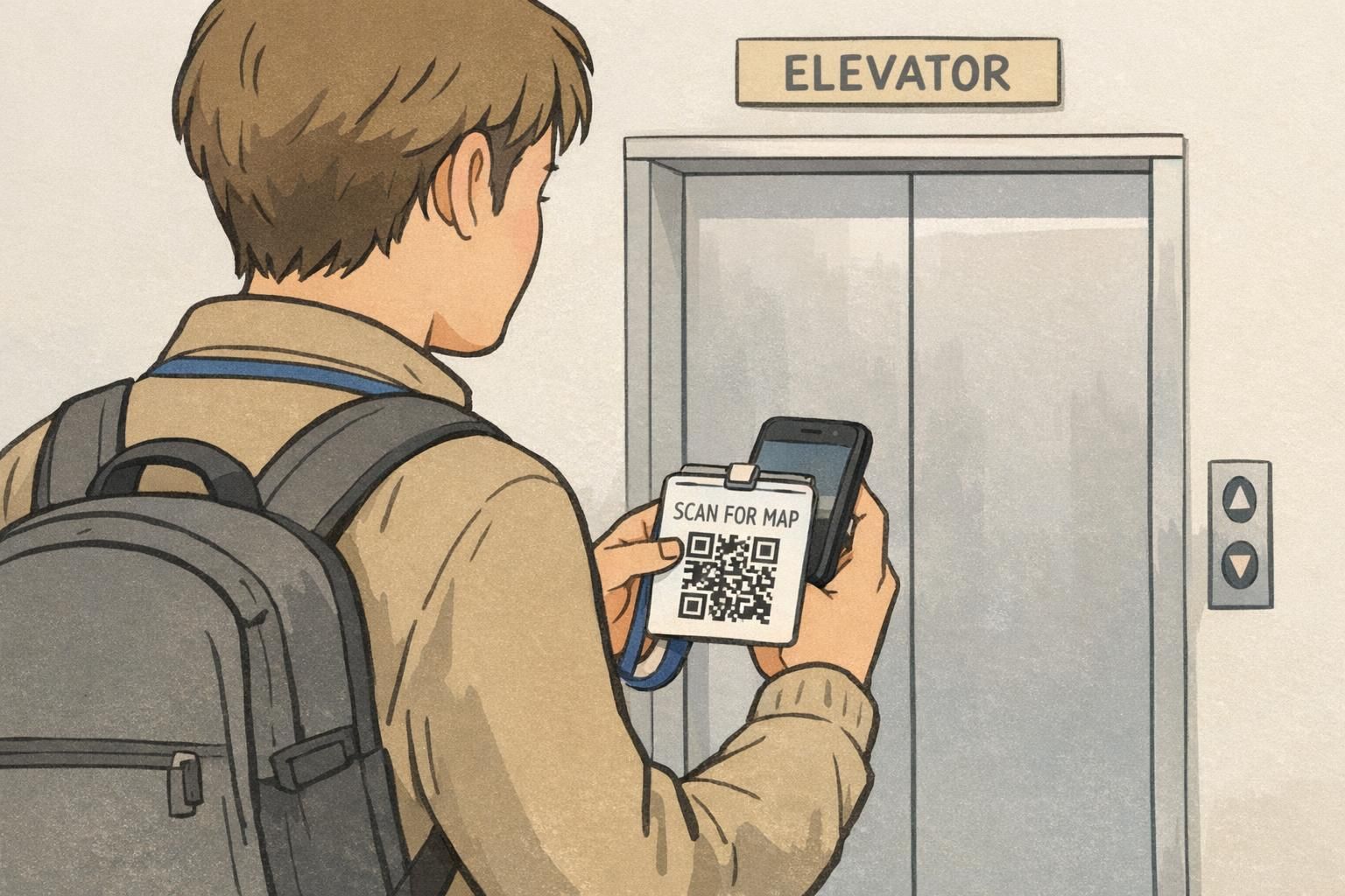
Add a QR Link for Full Wayfinding (Without Overloading the Badge)
A QR code is a clean way to offer detailed navigation without shrinking the badge’s main text. The printed badge stays readable and professional, while the QR link can open a mobile-friendly indoor map, a single-page directions hub, or a short list of common destinations.
To keep the QR from competing with the visitor’s identity, label it simply—“Scan for map”—and place it where it won’t pull attention away from the name. Many teams place it on the lower corner or on the back of the badge, depending on how much else needs to fit.
The biggest advantage of the QR approach is flexibility: if a route changes due to construction or a meeting room moves, the destination page can be updated without reprinting every badge layout. The badge stays stable; the linked content stays current.
Keep it simple: a single mobile page with a few common destinations (reception, elevators, meeting rooms) and clear labels that match your building signage. If you have an indoor mapping tool, link directly to the visitor-friendly view.
If the front is already busy with name and required labels, put the QR on the back. If the front has room, a small QR with a short label can work—just ensure the name remains the most readable element.
Front vs. Back Printing: Practical Micro-Map Placement Options
If you need more than a couple icons, the cleanest solution is to keep the front focused on identification and place the micro-map on the back. This preserves fast visual verification for staff while still giving visitors a self-serve reference they can check as they walk.
The back of the badge can support a simplified floor diagram, destination “zones,” or step-by-step landmark cues (for example: “Elevator → 2nd floor → Left at Reception → Meeting Rooms”). Because the back isn’t typically used for quick identification, you can include slightly more detail without sacrificing readability on the front.
A good rule: if the micro-map makes the visitor’s name harder to read, move the map to the back or to a QR link.
- Front-only micro-map: best for one decision point (like “Elevator →”)
- Back micro-map: best for 2–4 landmarks or a simplified floor diagram
- Front + QR: best when you want minimal cues plus optional deep detail
- Back + QR: best for campuses or multi-wing buildings where visitors may need more support
Operational Tips: Consistency With Signage, Security, and Check-In Flow
Micro-maps succeed or fail based on consistency. If your badge says “Reception” but your wall sign says “Front Desk,” visitors have to translate terms mid-walk—and that defeats the point of a quick-glance tool. Match destination names, arrow directions, and even icon styles to what’s already posted in the building.
It also helps to decide who gets which level of navigation support. Some facilities may prefer minimal wayfinding on badges for security reasons, while others may provide broader directions to reduce the need for escorts. Whatever your policy, the badge should support it: keep identity prominent, avoid revealing restricted areas, and make sure staff can still do fast visual checks.
Before rolling out a new building map badge layout, run a quick test walk with someone unfamiliar with the space. Watch for moments where they hesitate, then refine the micro-map so it addresses those exact decision points. If you use a QR link, test the loading speed on typical guest Wi-Fi or cellular connections so it’s actually helpful in the moment.
“We stopped trying to fit the whole floorplan on the badge. Once we switched to two icons and one landmark cue, visitors were noticeably more confident leaving the lobby.” – Facilities Coordinator
- Use the same words on the badge that appear on wall signage
- Keep arrows and left/right cues consistent with posted wayfinding
- Avoid including restricted destinations on the micro-map
- Test the route with a first-time visitor and refine based on where they pause
- If using QR, keep the linked page short and mobile-friendly
BadgeZoo Options for Visitor Badges and Holders That Support Micro-Maps
A micro-map is only useful if it stays readable while people move. Crisp printing, consistent placement, and a holder that keeps the badge facing forward all help visitors glance down and immediately understand what to do next—without rotating a swinging card or squinting at small text.
If you’re building a repeatable process, dedicated formats (including double-sided printing when you want identity on the front and navigation on the back) can make your visitor badge design more consistent from day to day. You can explore BadgeZoo’s custom visitor badges for layouts that support clean identity text alongside a compact wayfinding badge micro-map.
If you have questions about a specific layout—like keeping the front extra clear while still adding icons, or setting up a QR area that doesn’t compete with the name—BadgeZoo can help with custom order requests through http://badgezoo.com/contact.
The most successful micro-map badges feel effortless: identity first, navigation second, and a clear path to more detail through a QR link or a back-side guide.