Why a rounded corner ID card can feel more finished
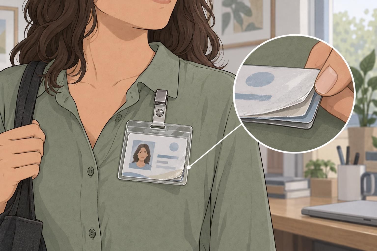
A rounded corner ID card can feel thoughtfully made before anyone reads the name on it. Its outline, edge smoothness, and corner shape all contribute to that first impression. These details do not replace clear identification or a readable layout; they help those essentials look and feel complete.
The amount of rounding changes the visual tone. A restrained radius—the curve at each corner—can feel precise and understated. A softer, more noticeable curve can feel welcoming. Neither approach is automatically better. The right choice depends on the organization’s identity and how the badge will be handled and worn.
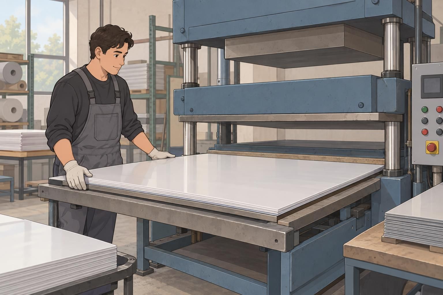
Execution matters as much as the chosen shape. Accurate trimming keeps the outline balanced, while smooth edges make the card more pleasant to handle. Consistent corners help the whole design feel intentional rather than uneven. A simple badge with careful finishing can look more resolved than an elaborate design with an off-center border or rough edge.
A premium feel comes from details working together: readable content, a suitable corner radius, accurate trimming, and a consistent finished shape.
What a CR80 cut means for badge shape
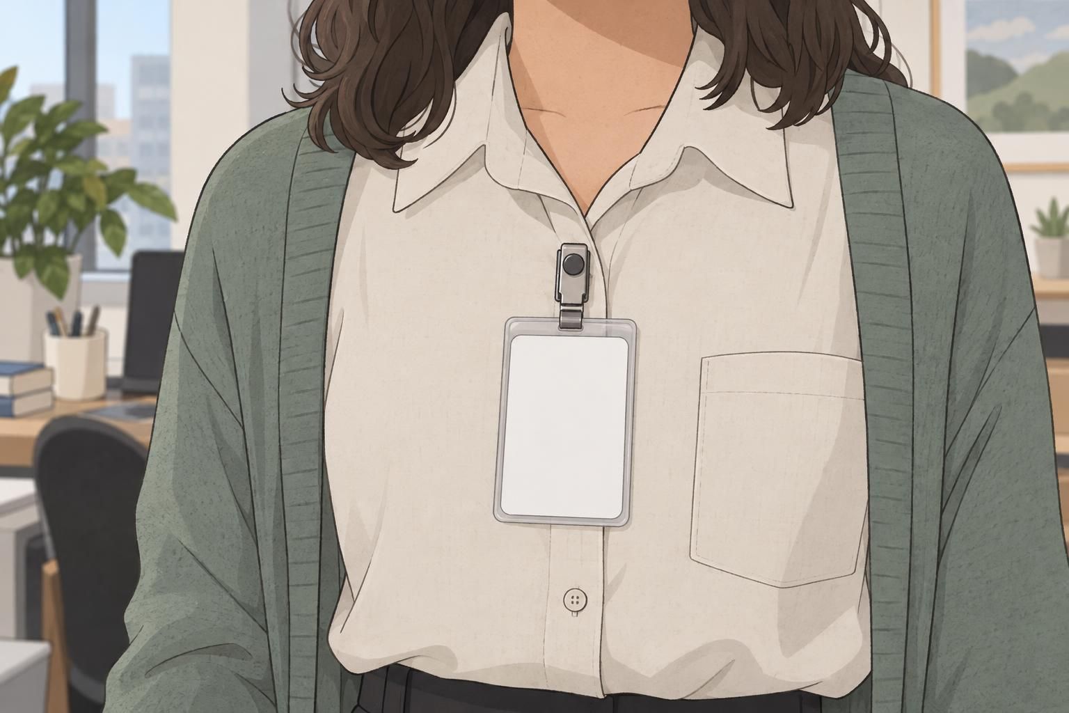
CR80 is a common ID card format. In production discussions, a CR80 cut describes the finished outer shape associated with that format, including the card’s dimensions and corners. It is useful to distinguish this physical outline from the printed artwork: the design sits within the card, while the cut establishes its actual boundary.
Do not rely on a format name alone to communicate every finishing expectation. Ask the selected manufacturer to confirm the finished dimensions, corner radius, and trimming tolerances. That gives the designer and production team a shared reference, especially when matching an existing set of cards.
Small differences become easier to notice when several badges sit side by side. One card may have a border that appears closer to an edge, or a corner that looks more rounded than its neighbors. Comparing samples together helps reveal variation that might be missed when examining each card separately.
For premium badges, consistency across the set matters as much as the appearance of an individual card. Check both the outline and the print’s position within it.
Choosing a radius that fits the brand
Corner rounding should support the badge’s visual language rather than compete with it. Subtle rounding can suit formal, technical, or institutional identities because it keeps the silhouette restrained. Moderate rounding can work well in contemporary, service-oriented settings where the overall design is intended to feel approachable.
These are design tendencies, not fixed rules. A formal organization can use softer corners successfully, just as a service team can choose a more precise outline. The important question is whether the shape feels connected to the typography, icons, borders, and other brand materials.
- Compare the corner shape with the curves and angles in the logo and icons.
- Check whether a printed border follows the rounded outline comfortably.
- Review the badge alongside existing name tags, signage, or other identification materials.
- Judge subtle and moderate rounding at the intended finished size, not only on an enlarged screen.
Card finishing is easiest to evaluate when the artwork and physical sample are considered together. If a radius looks attractive by itself but crowds the logo or makes the border feel awkward, revise the layout or discuss the available cut options before approving production.

How card finishing affects comfort and pocket wear
Professional ID cards are handled throughout the working day, so edge quality deserves attention. Smooth, accurately trimmed edges can feel more comfortable against the fingers. Rounded corners also reduce exposed projecting points, which may make a card less likely to catch on clothing than a card with rough or projecting edges.
Rounded corners are a practical finishing option, not a guarantee against snagging or wear. This source describes rounded-corner finishing as an available production choice. Confirm the achievable tolerances and material-specific performance with the selected manufacturer rather than assuming that every rounded card will behave the same way.
Consider the whole wearing arrangement. Material, thickness, attachment method, and intended use all influence comfort. A card carried in a pocket presents a different handling situation from one worn inside a clear holder. When a holder is used, its edges and attachment also become part of the everyday experience.
Review a rounded corner ID card in the setup people will actually use. Handle it, place it in the intended holder or pocket, and check how it sits against clothing. This practical review is more useful than judging comfort from the printed design alone.

Keeping names and logos clear of the cut line
A clean cut cannot compensate for content placed too close to the edge. Names, logos, and small text need adequate clearance from both the straight trim edges and the rounded corners. Near a corner, the curved boundary leaves less usable space than a square outline would suggest.
Avoid choosing a clearance by appearance alone. Use the selected manufacturer’s layout guidance and confirm how trimming variation should be accommodated. Essential information should remain comfortably inside the finished shape, without depending on the cut landing at one exact position.
Borders deserve particular care because they make alignment differences easy to see. A narrow border may look balanced on screen but appear uneven after trimming. An inset margin should look deliberate around the entire card, including where straight edges transition into curves.
- Review the printed layout and finished sample together at actual size.
- Check names, logos, and small text near every edge and corner.
- Compare the space between the border and the cut around the full outline.
- Confirm that the intended holder does not obscure essential identification.
Finishing details that help premium badges feel cohesive
Premium badges feel cohesive when the physical and printed details support one another. Clean cuts establish a balanced outline. Smooth edges improve handling. Suitable thickness helps the card feel appropriate for its intended use, while a consistent surface finish gives the design a unified appearance.
No single choice guarantees quality. Greater thickness is not automatically the right answer, and a particular coating cannot correct poor print alignment. The goal is a combination that suits the badge’s purpose, attachment method, and visual identity.
When comparing samples, inspect more than the front-facing artwork. Look at all four corners, examine the edges, and compare several cards from the same set. Then check the surface and the way the card wears in its intended setup.
- Corner symmetry: Do all four curves look consistent?
- Edge smoothness: Are there rough areas or projecting points?
- Coating coverage: Does the selected finish appear even?
- Print alignment: Is the artwork positioned consistently within the cut?
- Comfortable wear: Does the finished card work well with its intended attachment or holder?

A practical checklist for professional ID cards
Before approving professional ID cards, turn visual preferences into clear production questions. A request for a polished appearance is easier to act on when it identifies the cut, corner shape, layout clearance, and expected consistency.
- What finished cut and dimensions are specified, and is a CR80 cut appropriate?
- What corner radius is available, and does it suit the brand’s design?
- What trimming and finishing tolerances should be expected?
- How much clearance do names, logos, small text, and borders need?
- Does a finished sample show consistent corners, smooth edges, and balanced print alignment?
- Do the material, thickness, surface finish, and attachment suit everyday use?
Use the same checklist when comparing BadgeZoo’s ID badge options. Start with the identification task and the intended wearing setup, then consider which finishing choices support them. That keeps the decision focused on practical suitability rather than appearance alone.
A well-resolved rounded corner ID card does not need elaborate decoration. Clear information, an appropriate radius, accurate trimming, and comfortable edges can give a straightforward design a finished, professional feel.