How card finishes affect everyday ID cards
A matte ID card is often a practical starting point for everyday workplace identification, but the best finish depends on how the card will be used. A glossy ID card emphasizes photos and color, while a frosted ID card offers a distinctive translucent or textured appearance. Each option changes how the surface interacts with light—and how the finished design looks during daily handling.
These differences matter when someone needs to read a name, recognize a photo, or scan a code. Reflections can compete with printed details, fingerprints can become distracting, and small scratches may look more obvious on one surface than another. The finish also influences whether printed colors appear bold or more subdued.
Still, card finishes are only one part of the decision. Think about the workplace lighting, the amount of handling, the cleaning routine, and the printing method. A finish that looks appealing on a desk should also remain readable when the card is worn or presented to a reader.
Matte ID card vs. glossy ID card: a practical comparison
The main difference is how the two surfaces reflect light. A matte ID card generally produces less noticeable glare, making it a useful choice when a badge needs to be read from different angles. A glossy ID card has a more reflective surface that can make photos and colors look vivid, although overhead lighting may create bright reflections.
- Glare: Matte usually reduces distracting reflections. Gloss can look bright and polished but may require a change in viewing angle.
- Fingerprints: Matte tends to make handling marks less noticeable. Gloss often reveals fingerprints and smears more readily.
- Cleaning: A smooth glossy surface can be convenient to wipe, but visible smears may prompt more frequent cleaning. Matte still needs an appropriate cleaning routine.
- Color and photos: Gloss often gives images more visual impact. Matte offers a softer appearance that can keep attention on names, roles, and other printed information.
For a staff card handled throughout the day, lower glare and less visible smudging may be more useful than maximum color impact. For a photo-forward or promotional card, gloss may better support the design. Neither choice eliminates the need for clear printing or care that suits the finished card.

What a frosted ID card finish changes
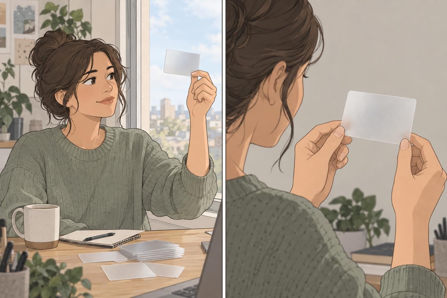
A frosted ID card can introduce a translucent appearance, a textured surface, or both. Unlike choosing between a more reflective and a less reflective opaque card, choosing frosted may change how the background contributes to the design. That makes it best suited to projects where translucency or texture is intentional.
The trade-off is potential loss of print clarity or contrast. A design that looks clear against one background may be harder to read against another. Fine details, small text, and photo features deserve particular attention when evaluating a printed sample.
Texture may also affect signatures, scanning, or direct-to-card printing. Before choosing this finish, check that the exact card surface works with the intended printer and that machine-readable areas remain clear. Do not assume that a visually appealing frosted sample will perform the same way as a smooth card.
Choose frosted for its intended visual effect—not as an automatic substitute for matte. Confirm that names, photos, signatures, and codes remain usable on the finished design.
Glare, fingerprints, scratches, and photo appearance
Appearance is not just about the printed artwork; the surface changes what viewers notice. Surface finish can influence visual perception, so it helps to evaluate the print and its reflections together rather than judging either in isolation. For background on surface appearance and perception, see this source. That distinction concerns appearance, not a guarantee of card durability.
Gloss can make a photo pop, with colors that appear stronger and details that look crisp under suitable lighting. However, a bright reflection may temporarily obscure those same details. Matte generally reduces that distraction and can conceal fingerprints, supporting a more consistent appearance during ordinary handling.
Scratches require a more careful comparison. Finish affects how scratches appear, not whether they can happen. Some matte surfaces make light handling marks less conspicuous, but dark matte areas may reveal scuffs or burnishing—spots that become shinier through rubbing. Glossy surfaces can also show scratches when light catches them.
Less visible wear is not the same as greater scratch resistance. Compare finished samples with your actual artwork, especially if the design includes large dark areas.
Choosing a finish for employee IDs and badge buddies
For many daily-wear employee IDs, matte is a sensible default. Reduced glare helps keep names and photos readable, while less noticeable smudges can help the card stay presentable between cleanings. The same priorities apply to badge buddies, where role information needs to remain easy to spot.
A matte ID card and a coordinated matte badge buddy can provide a consistent, low-glare appearance. This is especially useful when identification is viewed under changing office or school lighting. Matte may also make some everyday handling marks less obvious, although dark designs still need checking for visible scuffs.
- Choose matte when everyday readability, reduced glare, and less noticeable smudges are the main priorities.
- Consider gloss for photo-forward or promotional designs, or when a smooth, wipeable surface suits an established cleaning routine.
- Choose frosted when translucency or texture is part of the design and the printed information has been checked for clarity.
The best choice supports the identification task first. A finish should help people recognize a name, face, or role without competing with the information.

Check printing, scanning, and real-world lighting
Finish is not the same as durability. Card material, lamination, thickness, and printer compatibility also matter. A matte surface alone does not establish how well a card will withstand wear, just as a glossy surface alone does not establish how reliably it will print or scan.
Evaluate the complete card rather than an unprinted finish sample alone. Names, photos, codes, and signatures can change the practical result. Keep barcodes, QR codes, signature areas, and relevant reader areas smooth and clearly defined, and confirm compatibility with the equipment that will actually be used.
- Check printer compatibility before selecting the card surface, especially for textured or frosted options.
- Inspect a printed sample under the overhead light, daylight, and other lighting where it will be used.
- Tilt the card through normal viewing angles to check whether reflections obscure names or photos.
- Test barcodes, QR codes, and other reader functions with the intended equipment.
- Review appearance after representative handling and cleaning, looking for smears, scuffs, or changes in sheen.
This practical check helps separate an attractive finish from a suitable identification product. It also makes trade-offs easier to judge before committing to a design.

Quick guide to choosing among card finishes
There is no single best finish for every card. Start with what people need to see and do, then choose the surface that supports those tasks.
- Matte ID card: A practical, low-glare everyday option for employee identification and coordinated badge buddies. Smudges tend to be less noticeable, but some dark surfaces can show scuffs or burnishing.
- Glossy ID card: A good fit when stronger color impact and photo appearance are priorities. The smooth surface is wipeable, but reflections and fingerprints may be more visible.
- Frosted ID card: A distinctive choice when a translucent or textured look is intentional. Check print contrast, signatures, and scanning compatibility before use.
If you are looking for fingerprint resistant badges, remember that no finish alone guarantees that result. Handling, cleaning routines, and the card’s design all affect how noticeable marks become. For many everyday identification setups, matte offers a useful balance of readability and appearance; gloss and frosted are worthwhile alternatives when their visual qualities serve a clear purpose.