Personalized Lanyards: Balancing Uniformity and Individuality in Badge Programs
Why personalized lanyards can strengthen a badge program (without reducing clarity)
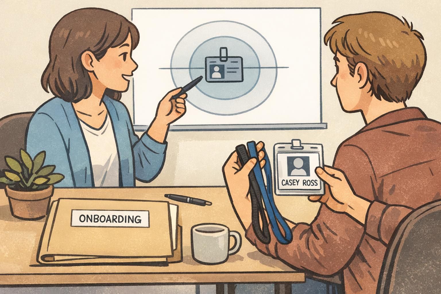
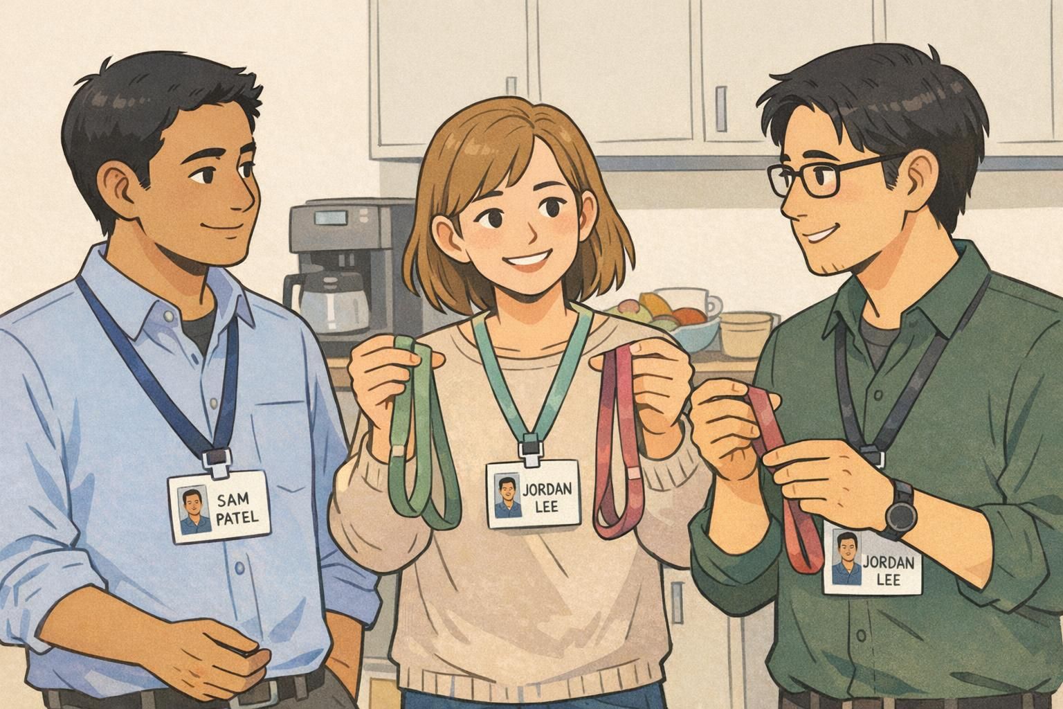
Personalized lanyards are one of the easiest ways to add a human touch to a credential system—without changing what matters most: quick, accurate identification. When people can choose from a small set of approved options, it supports belonging and team pride, while the badge itself stays consistent and easy to verify.
The most reliable approach is simple and repeatable: keep a uniform base badge design for recognition and security, then allow limited personalization around it. In other words, individuality lives on the accessory—not on the name, photo, or access features that others rely on for fast decisions in real time.
A good program balances two truths: people like to personalize what they wear, and workplaces need credentials that are instantly readable at a glance.
- Uniform badge template: same layout, same required fields, same placement
- Controlled personalization: a small, approved set of lanyard colors/patterns and attachments
- Clear boundary: accessories never cover the name or photo, even partially
- Consistent trust signal: anyone can quickly tell “this is a real, valid badge”
Start with non-negotiables: readability, verification, and safety
Before you approve any personalization, define what cannot change. These non-negotiables protect day-to-day clarity for coworkers, visitors, patients, customers, and security teams. They also reduce friction: when the “must-haves” are explicit, people are less likely to guess or improvise.
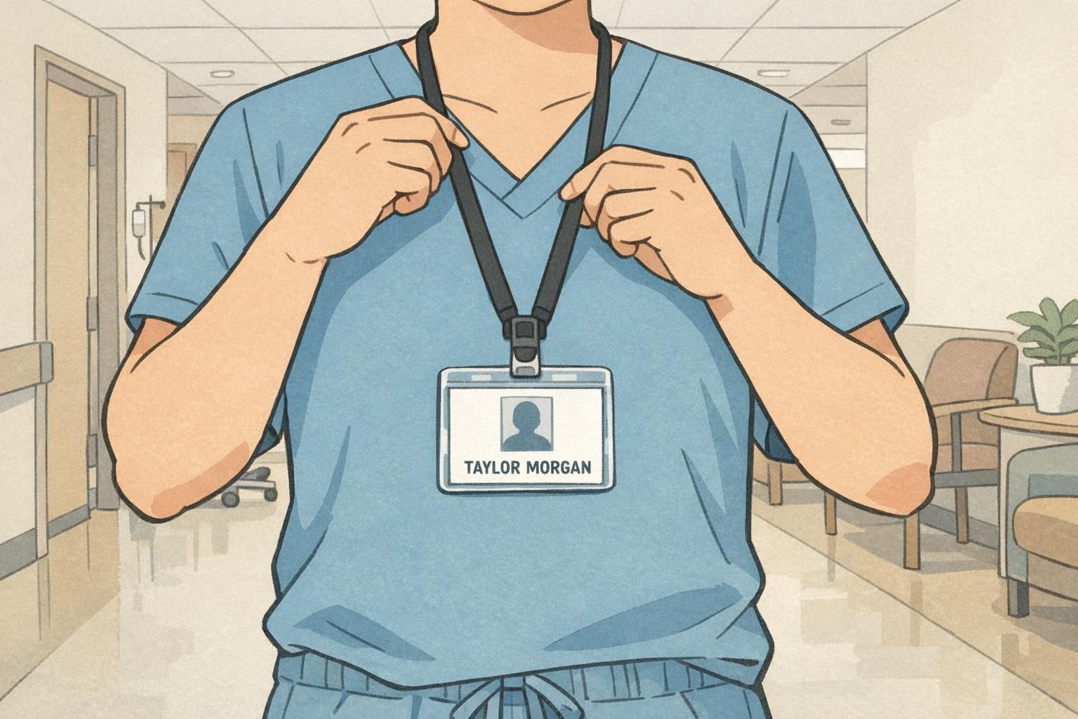
At minimum, the person’s name and photo should remain unobstructed and consistent on every credential, along with the organization name and any access-control features (such as a barcode or QR code zone). If your badge program uses additional verification features, treat those as protected areas too: the point is that a badge must work reliably in the environments where it’s used.
- Visibility: Name and photo are always fully visible—no pins, stickers, or clips overlapping the badge face
- Consistency: Organization name and key fields appear in the same place on every badge
- Scan reliability: Barcode/QR code zones stay clear and flat (not bent, scratched, or covered)
- Readability: High contrast and legible text from typical conversation distance
- Safety: Lanyard and attachment choices must meet your workplace safety requirements
If someone has to lean in, squint, or ask to see the badge closer, the system is working harder than it should.
Badge personalization rules: a simple policy framework that scales
The difference between “reasonable personalization” and ongoing confusion is usually policy clarity. The most scalable badge personalization rules are written in plain language, easy to share during onboarding, and specific enough that supervisors can apply them consistently.
A helpful way to think about policy is: standardize the core requirements, then allow controlled flexibility on the edges. In many systems (including training and governance models), clear criteria and consistent structures make it easier to support individualized pathways without losing alignment. That same principle adapts well to physical ID program governance: keep the badge template stable, and define small, approved choices around it (source).
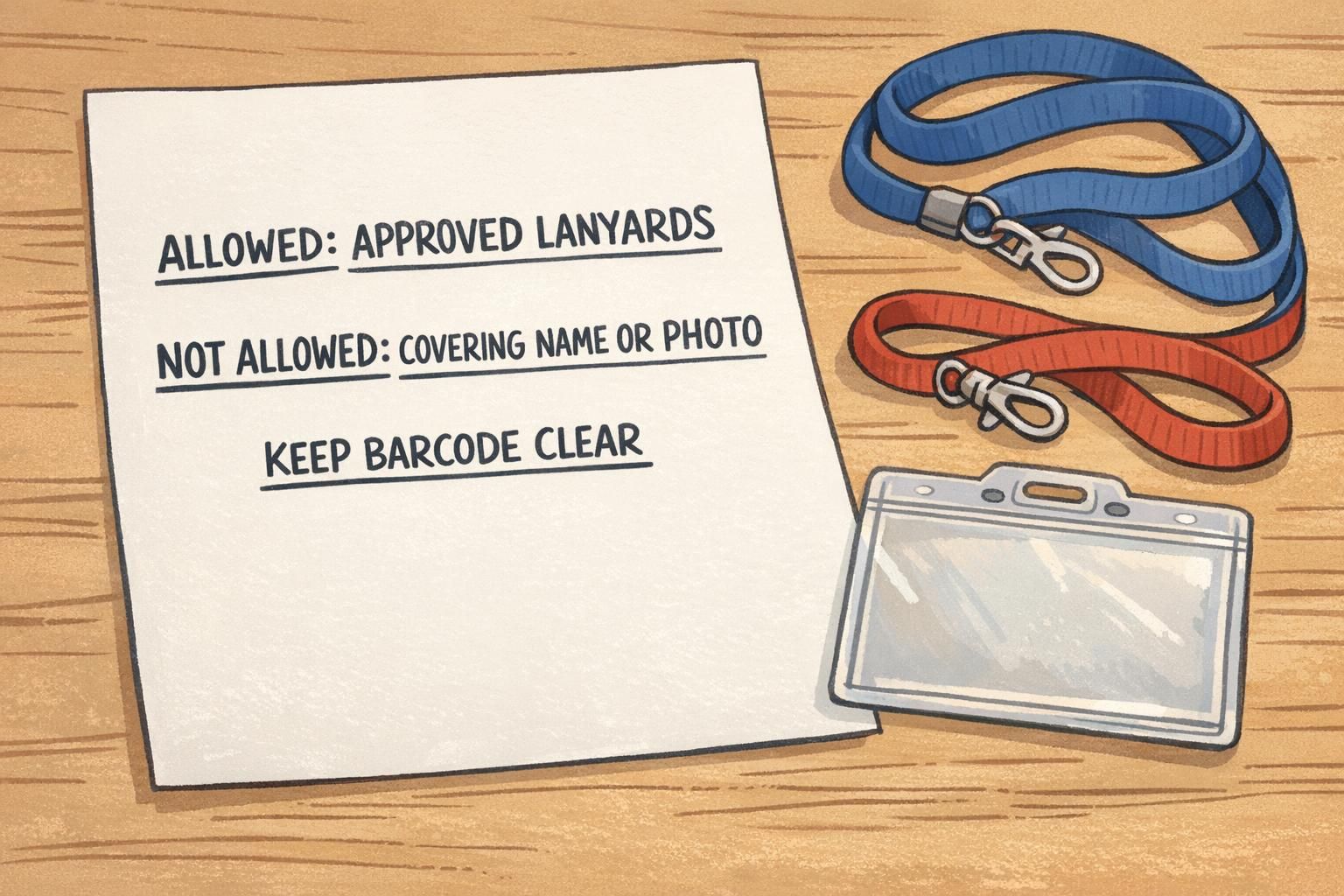
- What is allowed (examples): approved lanyard colors, approved attachment types, approved holder styles
- What is not allowed: anything that covers the name/photo, alters printed content, or blocks barcode/QR code zones
- Who approves exceptions: role title (e.g., Security, HR, Facilities) rather than an individual person’s preference
- How exceptions are requested: a simple form or email with a photo of the setup
- How edge cases are handled: contractors, visitors, events, clinical areas, labs, and high-security zones
- What happens if something is out of compliance: replacement process and a neutral, consistent reminder
“The easiest policies to follow are the ones that show people exactly what ‘good’ looks like—and where the line is.” – Facilities Coordinator
Where individuality belongs: lanyards, holders, and small role cues (not on the name/photo)
If your goal is fast recognition, the badge face is sacred space. The safest place for individuality is around the credential: personalized lanyards within an approved palette, comfortable holders, and small role cues that add clarity rather than clutter.
A useful boundary is visual: treat the name, photo, and barcode/QR code zones as “no-cover zones.” People can choose accessories, but those choices must never overlap the badge face. That includes pins, charms, retractable reels mounted on top of the badge, or decorative sleeves that cut into the visible area.
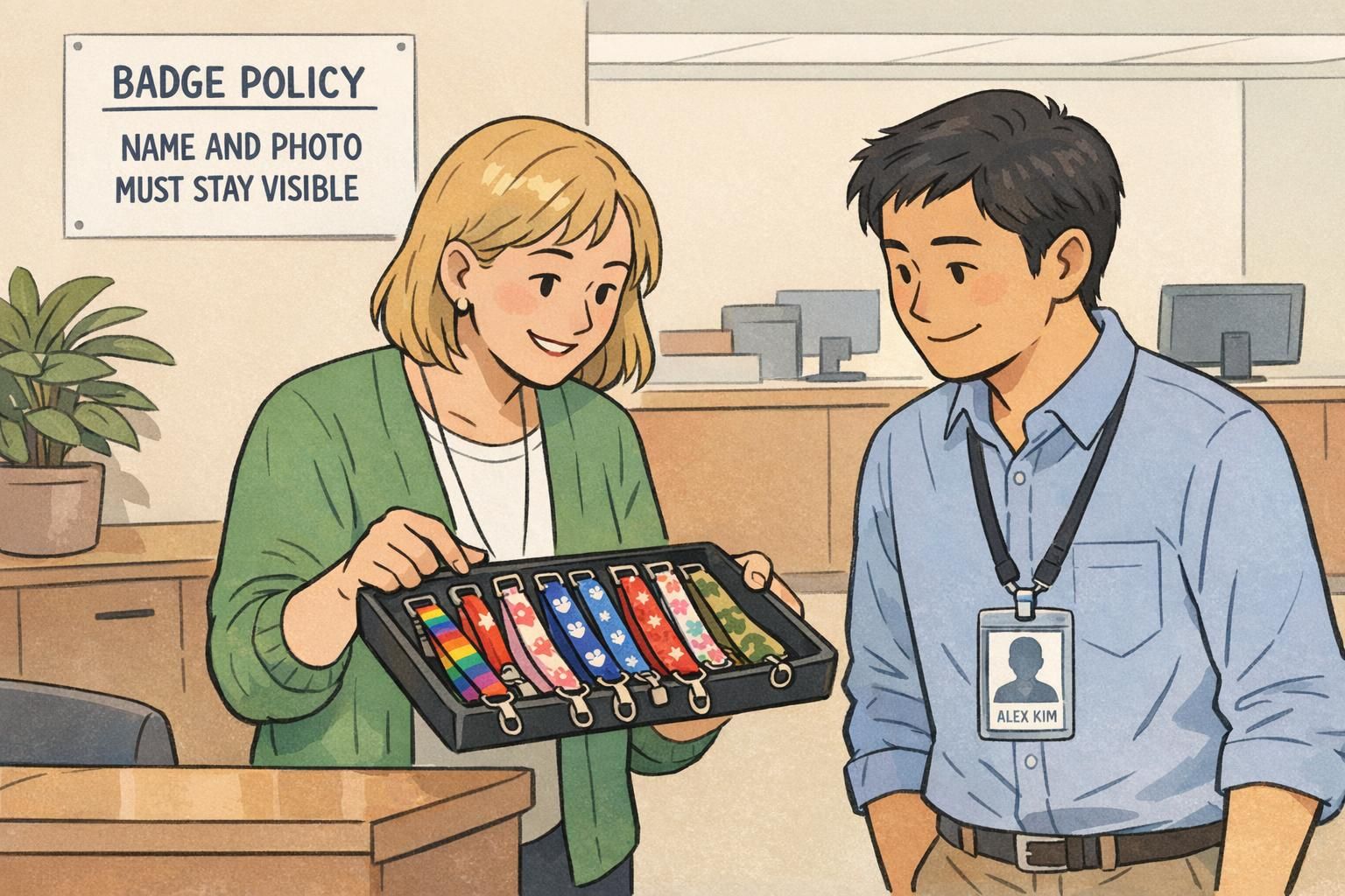
- Approved lanyard colors/patterns (limited set): gives choice while still looking intentional
- Attachment hardware choices: swivel hook vs. badge clip if they meet safety requirements
- Badge holders: clear vertical/horizontal holders that keep the badge flat and readable
- Small add-ons that don’t block the badge: pronoun pins or clip-on tags placed on the lanyard above the badge (only if they do not cover the face)
- Standard role cues: department color lanyards or small icons—while keeping the printed badge template unchanged
A simple rule people remember: personalize the strap, not the identity.
Company branding without clutter: keep the system cohesive
Company branding works best on credentials when it’s consistent and restrained. A badge program is a system people scan quickly; too many variations can look unofficial, even when they’re well-intended. The goal is to make the whole program feel coherent at a glance—across departments, shifts, and locations.
A simple “brand kit for badges” can prevent mismatched accessories that reduce professional appearance. It doesn’t need to be complicated: specify a standard logo placement on the badge template, a small set of brand colors, and a limited set of approved lanyard designs that complement each other. Then allow individuals to choose within those guardrails.
- Standard badge template: consistent layout and typography across the organization
- Approved logo placement: same position every time for instant recognition
- Limited color system: brand colors plus a small set of department colors (if used)
- Accessory cohesion: a short list of lanyards that look intentional together
- Avoid visual overload: keep role indicators simple and easy to interpret
“When every badge looks like it belongs here, people trust what they’re seeing—and they spend less time double-checking.” – HR Generalist
Operational guardrails: procurement, replacements, and compliance checks
Even a great policy fails if people don’t know how to get the approved items—or what to do when something breaks. Operational guardrails keep the program consistent without turning it into a daily debate. They also reduce the chance that well-meaning employees “solve the problem” with a non-compliant workaround.
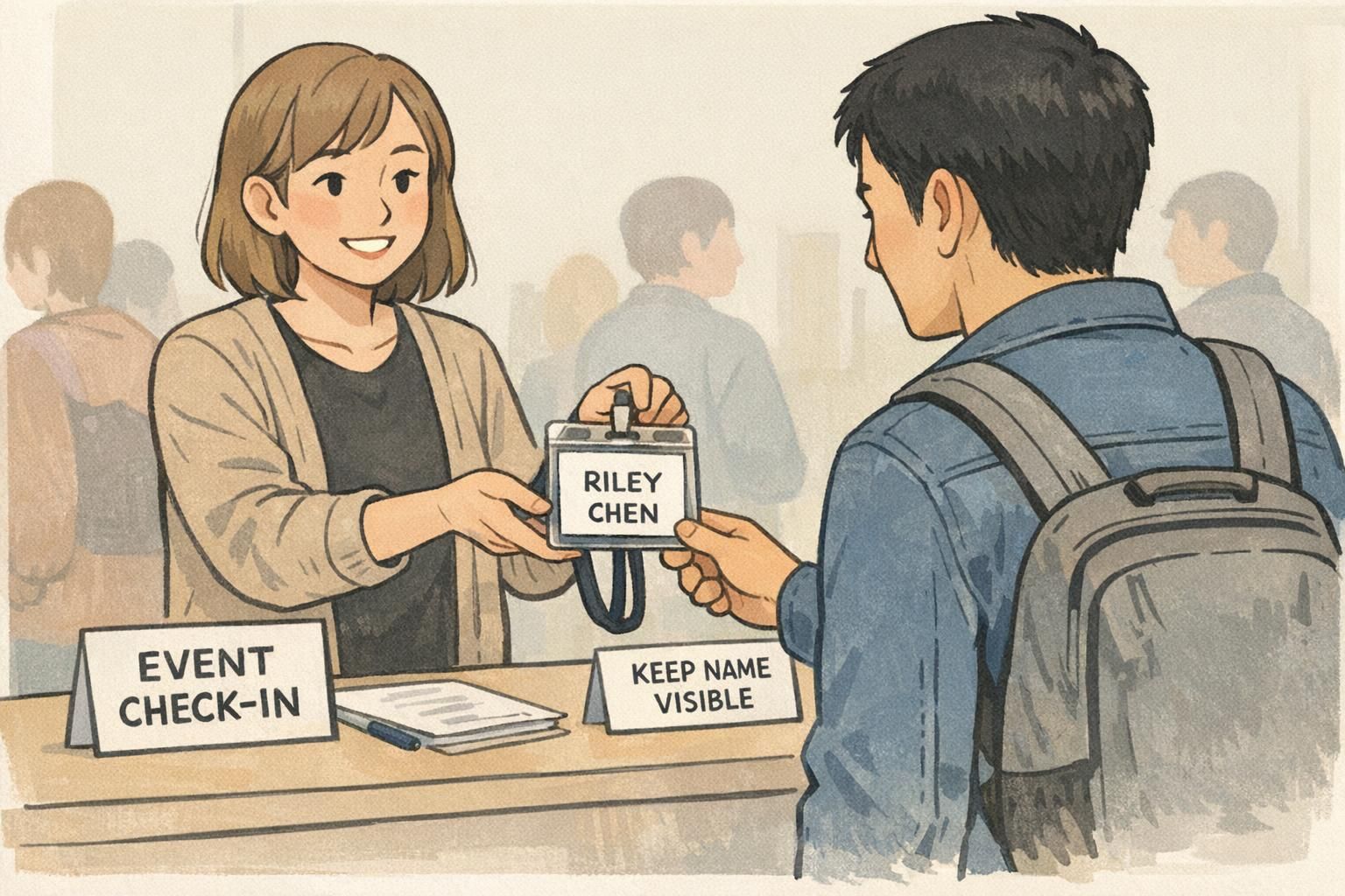
Start by deciding how employees receive approved lanyards: during onboarding, through a simple request process, or via team leads. Then define what happens when accessories wear out or disappear. Replacements should be easy enough that people don’t feel pushed to use whatever they can find.
- Distribution: issue approved lanyards at onboarding or from a central supply point
- Replacement rules: swap worn/broken lanyards and holders promptly
- Lost item process: simple request and reasonable verification
- Neutral compliance checks: quick spot-checks focused on visibility and safety
- Documentation: keep the approved options list current and easy to find
Supportive enforcement works best: the aim is consistent, clear identification—not policing personal style.
- Quick supervisor spot-check script:
- • Name visible
- • Photo visible
- • Barcode/QR code unobstructed
- • Correct lanyard color for the area (if applicable)
- • Attachment looks safe and secure
Role-based and event-based exceptions (without creating confusion)
Most organizations need a few exceptions—visitors, vendors, temporary staff, conferences, and multi-day events. The key is to separate “everyday rules” from “special context rules,” so exceptions don’t quietly become the new normal.
Event badges, for example, can support more personality (themes or sponsor marks) while still preserving critical identification zones and readable typography. Similarly, certain areas—clinical settings, labs, or high-security zones—may need stricter accessory rules to support safety and verification. If you use add-on indicators for access or role, keep them standardized so they’re easy to interpret across locations.
- Visitors/vendors: distinct badge type or holder color; minimal accessory options
- Temporary staff/contractors: clear labeling approach and limited personalization
- Events: themed lanyards allowed, but name and role remain prominent and unobstructed
- High-security zones: tighter list of approved attachments and holders
- Multi-site clarity: standardize role/access indicators so they mean the same thing everywhere
Yes—if the badge stays readable and trusted. Keep the same “no-cover zones” for name, photo, and barcode/QR code areas, and avoid accessories that overlap the badge face.
Handle it through the same exception path you use for other edge cases. The goal is a safe solution that still keeps identification zones fully visible.
Product options that support policy: durable name badges, event badges, and lanyards
Your policy becomes easier to follow when the physical products support it. Rigid or laminated ID cards help keep names and photos readable. Sturdy, clear badge holders protect barcodes and reduce wear. And comfortable lanyards that sit well help the badge stay centered and visible instead of flipping or tucking under clothing.
If your teams need quick role recognition, choose standardized accessories that add clarity without hiding the credential—like consistent lanyard colors by department or approved add-on cues placed above the badge. The goal is always the same: make correct identification the default, not something people have to work at.
If you’re standardizing accessories across a team, it can help to source them from one consistent set of options—such as BadgeZoo’s custom lanyards for consistent team identification—so colors and construction stay aligned with your program’s rules.
Choose accessories that reduce badge flipping, protect the printed surface, and keep scan zones flat and unobstructed.
Quick template: a one-page personalization policy you can copy
A short, one-page policy is easier to teach, easier to enforce consistently, and easier to revisit when needs change. Use the template below as a fill-in outline for your organization. Keep the language direct, and include a visual diagram showing “safe zones” (around the badge) versus “no-cover zones” (on the badge face).
- ONE-PAGE POLICY TEMPLATE (FILL-IN):
- 1) Purpose
- • This policy supports clear, fast workplace identification while allowing limited personal choice in accessories.
- 2) Non-negotiables (No-cover zones)
- • Name: must remain fully visible
- • Photo: must remain fully visible
- • Organization name: must remain visible
- • Barcode/QR code zone: must remain unobstructed and scannable
- 3) Approved lanyards (choose your options)
- • Colors/patterns allowed: [list approved palette]
- • Department/role colors (if used): [define meaning per color]
- 4) Approved attachments and holders
- • Allowed attachment types: [list]
- • Allowed holder styles/orientation: [list]
- 5) Not allowed
- • Any accessory that covers or overlaps the badge face
- • Any sticker, writing, or alteration on the printed ID fields
- • Any attachment that creates a safety risk in your environment
- 6) Exceptions
- • Who can approve: [role/team]
- • How to request: [process]
- • Where exceptions may apply: [contractors/visitors/events/clinical/labs/high-security zones]
- 7) Replacements and compliance
- • How to get replacements: [process]
- • Spot-check guidance: name visible, photo visible, barcode clear, correct color (if required)
- 8) Review cadence
- • Policy owner: [role/team]
- • Review frequency: [e.g., annually or as needed]
Enough to provide choice, but few enough to stay recognizable. Many organizations do best with a small, approved palette plus any required role/area colors.
Keep it memorable: personalize the lanyard if you want, but never cover the name or photo, and keep barcode/QR code areas clear.