Department color coding: How to Improve Wayfinding Without Creating Silos
Why department color coding works (and when it doesn’t)
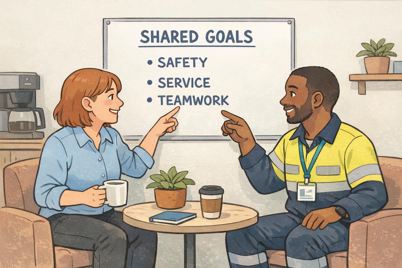
Department color coding is popular for a simple reason: our brains pick up color faster than text. In a busy lobby, a large campus, or a multi-room event, colors can help people decide where to go and who to ask—without stopping a staff member every few steps.
At its best, department color coding functions like a “visual shortcut” for wayfinding and coordination. It can reduce misroutes, speed up handoffs, and make first-time visitors feel less lost. It can also help staff recognize who is likely to handle a request (for example, an IT issue versus an Operations question) while still keeping everyone aligned under one organization.
When it doesn’t work, the problem usually isn’t the color itself—it’s what the color comes to mean. If colors become shorthand for rank, exclusivity, or “who matters most,” people may hesitate to collaborate across lines. A helpful navigation tool can unintentionally turn into a social label. The practical goal is to use color to increase recognition and coordination, while keeping shared purpose and cross-team help front and center.
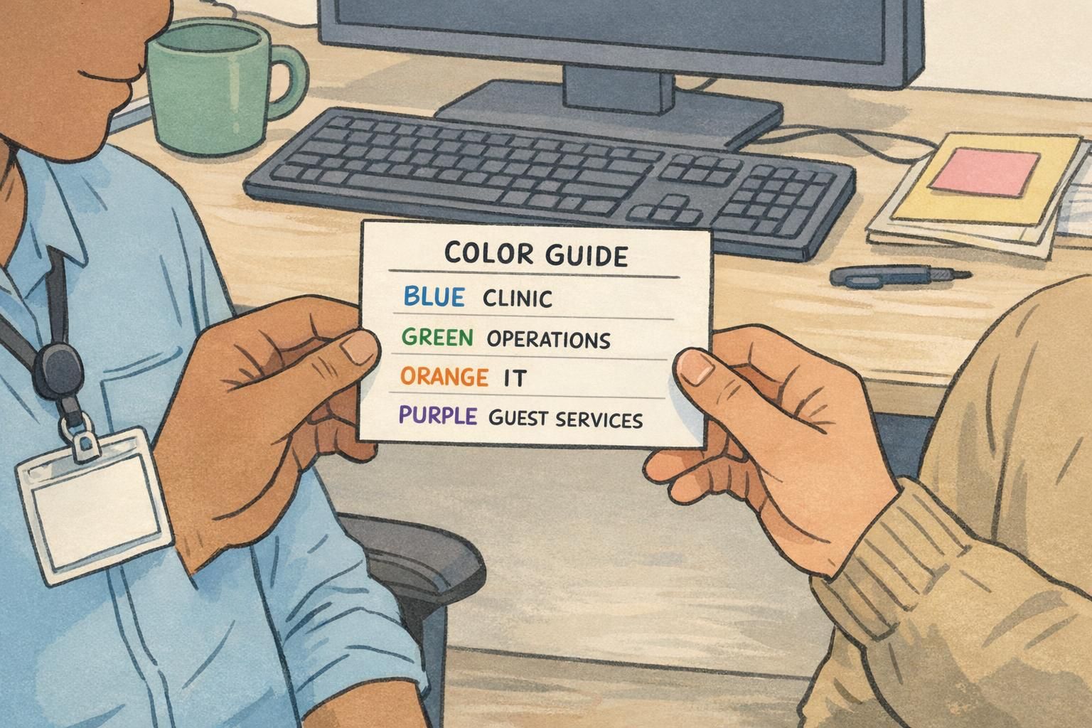
- Works well when: the colors are consistent, easy to read, and paired with clear role labels
- Breaks down when: colors imply status, change from place to place, or are the only identifier
- Most effective approach: treat color as a cue for direction and function, not a statement about importance
Start with outcomes: clarity, speed, and safety—not status
Before choosing a palette, decide what you want colors to accomplish. If the outcome is vague (“make it look organized”), you’re more likely to end up with inconsistent decisions and mixed messages. If the outcome is specific (“reduce wrong-room deliveries” or “help visitors find the right desk without interrupting staff”), design becomes much easier.
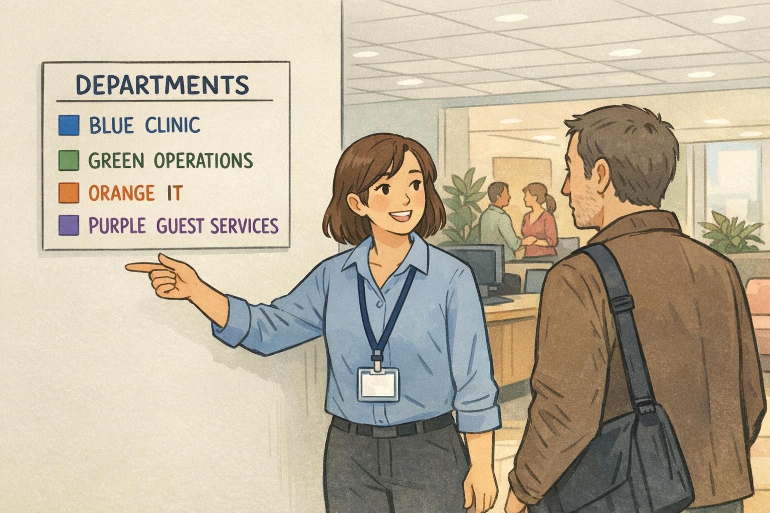
A strong system defines colors as a shared visual standard across the organization. That means a person should interpret the same color the same way in common areas, on a schedule, and on workplace identification like badges and lanyards. Consistency is what turns color into speed.
- Quick wayfinding: visitors can match a color on a map to a color at a hallway junction
- Correct handoffs: staff can route a request faster to the right team
- Reduced interruptions: fewer “Where do I go?” and “Who handles this?” questions
- Safety and accountability: easier identification of support roles during busy periods
If a color system makes people feel sorted into “tiers,” it’s doing the opposite of what wayfinding is meant to do. Aim for clarity and coordination, not a social scoreboard.
Design principles that prevent “silo signaling”
To prevent colors from turning into “silo signaling,” build your design around equity and shared identity. That means each department is presented in the same visual format, with the same prominence for a person’s name and role. Color should be a cue, not the headline.
A practical starting point is a neutral palette with balanced saturation. Extremely bright or “premium-looking” colors can unintentionally read as more important. Similarly, avoid giving one group extra visual treatments unless there’s an objective operational reason (like a safety role or a security-access distinction).
It also helps to include an organization-wide element—like a shared header band, a consistent badge layout, or a logo placement—so every person looks like part of the same team first. This keeps departmental cues in their proper place: helpful, but secondary.
Finally, remember that silos are primarily cultural and structural: they’re about how knowledge moves (or doesn’t), how teams coordinate, and what incentives are reinforced. Visual systems can support integrated communication practices, but they can’t replace them. Used thoughtfully, color-coding can reduce friction while the real work of collaboration happens in processes, meetings, and shared goals (source).
- Keep layouts equal: same font sizes, same placement, same emphasis for name and role
- Balance the palette: avoid a single color that looks “special” compared with the others
- Reserve special treatments for objective needs: safety functions, on-call roles, or access requirements
- Add unity cues: a common header band or organization name across all badges and signs
“Color should help you find the right place or person fast. It shouldn’t tell you who belongs more than someone else.” – Facilities Coordinator
Make it readable for everyone: accessibility and color-blind-friendly choices
Color should never be the only cue. People experience color differently, lighting varies across hallways and rooms, and printed materials can shift depending on paper and finish. If your system requires perfect color perception to work, it will fail at the exact moment someone is trying to make a quick decision.
Instead, pair color with at least one backup cue: a role label, a simple icon, or a subtle pattern. This keeps the system usable for people with color-vision differences and makes it more resilient at a distance. It also helps visitors who are unfamiliar with your departments, because icons and plain-language labels are easier to decode than internal team names.
- Use color + text: a clear department or role label in plain language
- Add icons: simple, distinct shapes (for example, wrench for IT, building for Operations)
- Prioritize contrast: ensure text remains legible on the colored area from a few steps away
- Standardize reproduction: keep the same color logic across badges, signage, and digital schedules
Where color belongs: badges, signs, schedules, and shared spaces
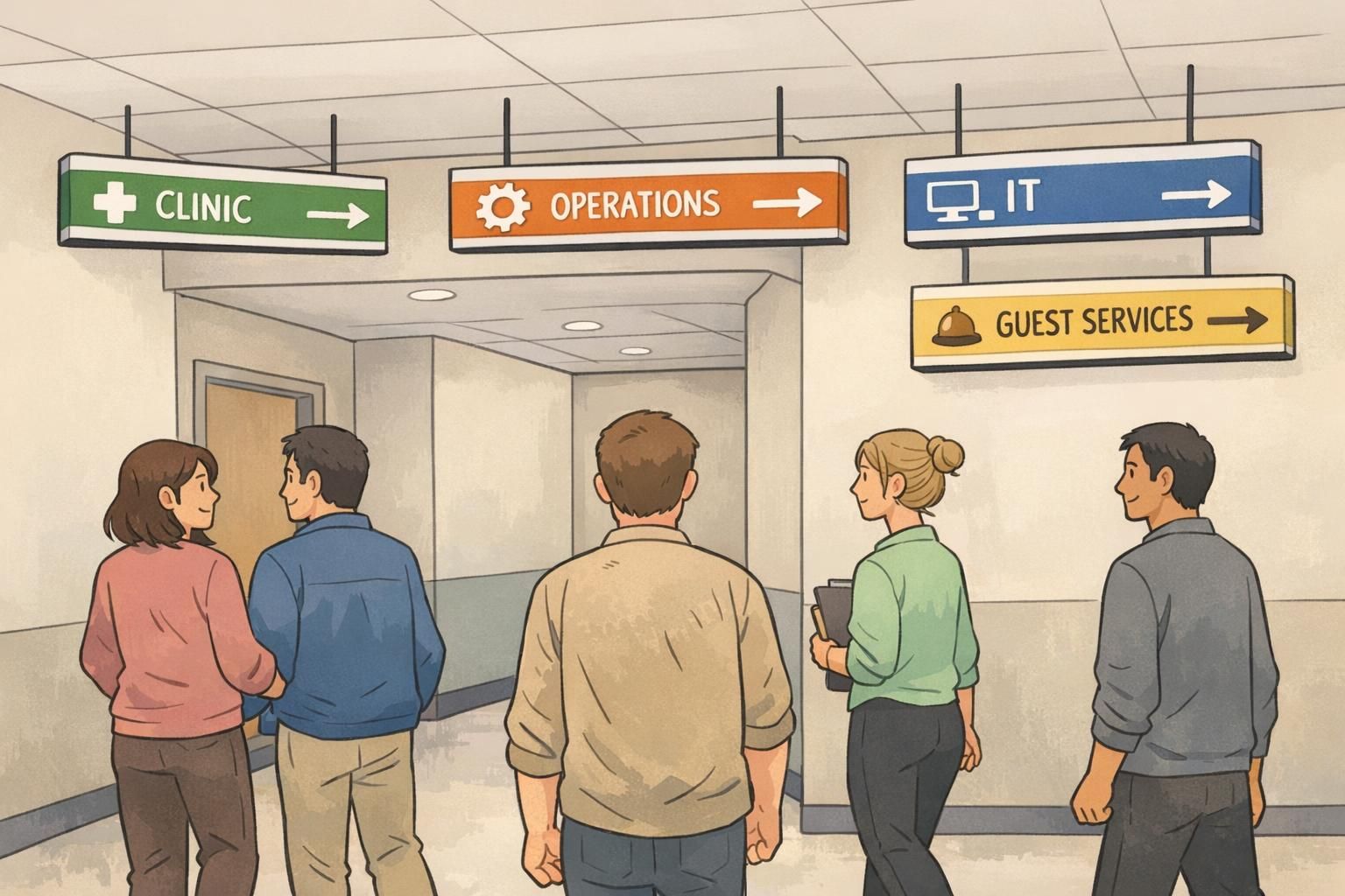
Color systems work when they show up where people make quick decisions. That often means the first 30 seconds after arrival (check-in and entrances), the moments before a turn (hallway junctions), and the moments before an interaction (finding the right desk or support person).
For staff identification, keep the actual ID badge clear and standardized—name, photo (if used), and role should remain the primary information. Color can then be layered in as a fast visual cue through consistent elements such as lanyards, badge headers, or badge backers. This approach supports wayfinding without making the color the “identity” of the person.
Don’t forget the collaboration spaces. A cross-department meeting room is a great place to reinforce unity: shared signage, shared project boards, and shared norms. When color is present there, it should emphasize coordination (who’s responsible for which part of the workflow) rather than separation (who sits with whom).
- Entrances and check-in: a simple legend that matches your maps and badges
- Department entrances: colored band + label + icon so the destination is unmistakable
- Schedules and maps: the same colors and names people see in the hallway
- Staff coordination boards: color used for routing tasks, not ranking teams
- Shared spaces: cues that highlight cross-functional work, not department “territory”
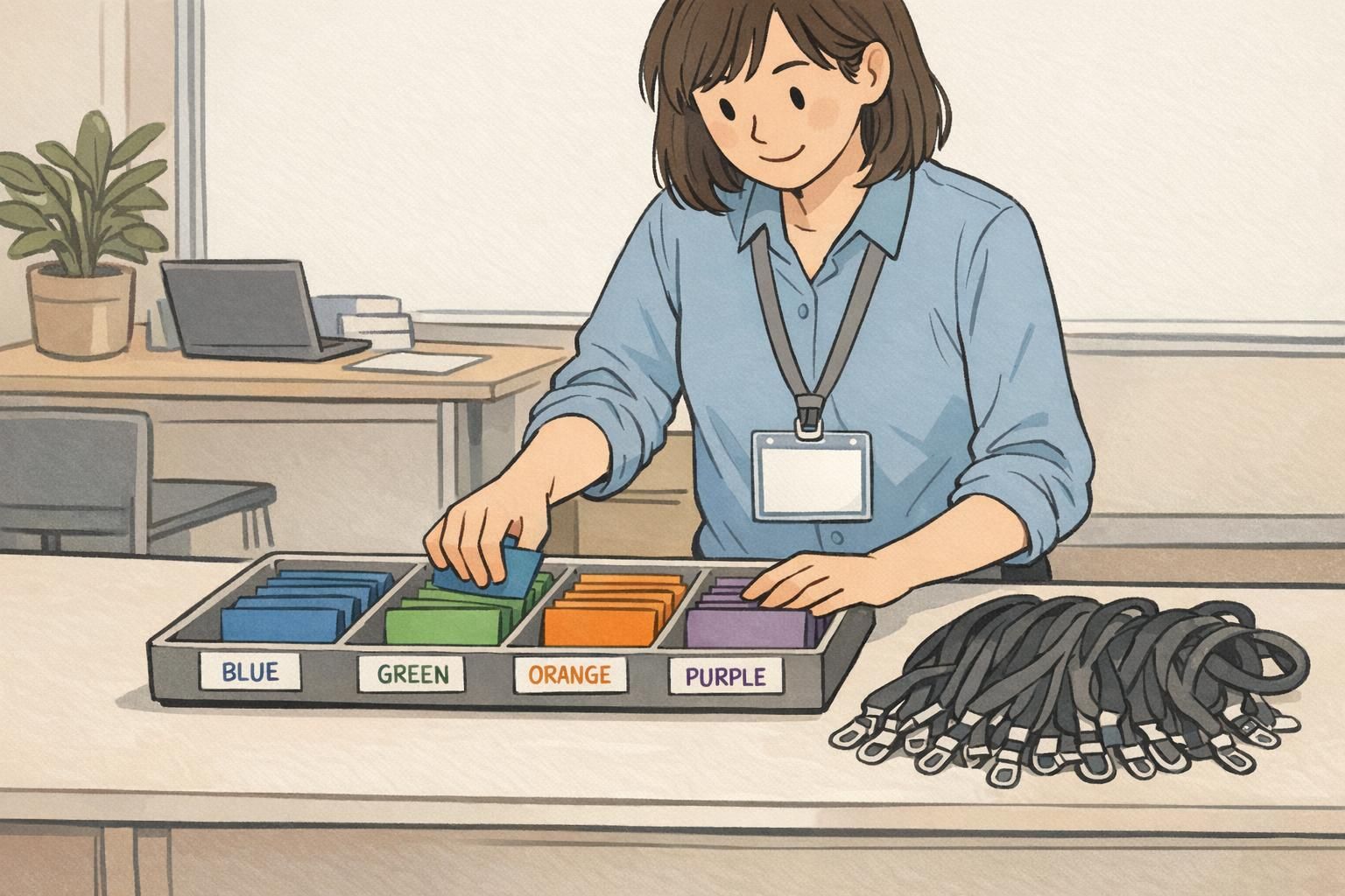
Using badge backer colors without creating barriers
Badge backer colors can be one of the fastest ways to add a functional cue to workplace identification, especially when people need to scan a room quickly. The key is to keep the message task-oriented: “how to get help” and “where to go,” not “who’s in which group.”
A good rule of thumb is neutrality. Use the same size backer, the same placement, and similarly readable text (if any) across departments. Avoid language that sounds like rivalry or exclusivity. Instead of a backer that encourages clustering, design one that encourages service: who can answer questions, who is on call, or who can direct visitors.
If you’re building or refreshing a system, keep the base ID badge standardized and let the backer be the quick cue. This preserves clarity (the ID still reads like an ID) while giving you a flexible way to identify functions for events, rotating assignments, or cross-coverage.
If you’re exploring options for badge backer colors, aim for designs that keep names and roles easy to read while using backers as a supporting signal rather than a spotlight.
- Prefer function-first messaging: “TEAM SUPPORT,” “ON CALL,” or “ASK ME” (as appropriate to your environment)
- Keep every department visually equal: same typography, same prominence, same materials
- Use policy language that invites cross-team help: for example, “Ask anyone wearing a badge for directions”
- Avoid turning colors into “clubs”: don’t encourage separate seating, separate lines, or separate rules
How to preserve team identity while strengthening the whole organization
Team identity is valuable. People like knowing who they work with, what they’re responsible for, and how they fit into the larger mission. The goal isn’t to erase differences—it’s to connect them. Color can support that connection if it points toward shared workflows rather than closed boundaries.
One effective approach is to add “bridge” cues: elements that cut across departments and show how work is grouped at a higher level. For example, you might use shared role families (like Clinical, Operations, or Guest Services) or shared service principles that everyone recognizes. The point is to create multiple paths to understanding: color helps you route the question, and shared labels help you understand how teams collaborate.
You can also make cross-functional work more visible. When a visitor, a new employee, or a contractor sees a shared project board, a mixed-department huddle, or a common header on every badge, color becomes an on-ramp: “Here’s who can help—and we’re all part of the same system.”
“We kept department cues, but we added a shared header on every badge. It quietly reminded everyone that we’re one organization with different responsibilities.” – HR Generalist
Rollout plan: pilot, train, and keep it consistent
Even a well-designed color system can stumble if rollout is rushed. A pilot helps you learn where confusion happens in real life: which locations cause misroutes, where lighting makes colors harder to distinguish, and which labels people actually understand.
Training matters because the meaning of the system should be explicit. Supervisors and front-desk staff should be able to explain the intent in one sentence: the colors exist to improve clarity and speed, not to separate people. When that message is consistent, the system stays functional instead of turning into “team territory.”
- Pilot in one location or one event: choose a place with measurable wayfinding friction
- Measure confusion points: misroutes, repeated questions, slow handoffs, and bottlenecks
- Publish a one-page legend: place it at entrances and include it in onboarding
- Train the interpreters: supervisors and check-in staff should explain the system consistently
- Set governance rules: decide who assigns colors and how changes are approved to avoid drift
The fastest way to break a color system is frequent, unannounced changes. Stability is what turns color into a shared language.
Quick checklist: a color system that supports collaboration
Use this checklist to sanity-check your department color coding before you print new signage, issue new badges, or launch an event badge system. The goal is a visual language that helps people move, ask, and hand off work smoothly—without implying separation.
- Every color has a clear purpose tied to wayfinding, handoffs, or safety
- Color is never the only cue (each department also has a label and/or icon)
- All departments have equal visual prominence (no “special” layout or extra emphasis)
- The system works at a distance and under typical indoor lighting
- Colors are consistent across badges, signs, maps, schedules, and shared boards
- Badge backers and lanyards support the ID badge rather than competing with it
- Language around the system encourages cross-department help and shared service
- A simple governance rule exists so the system stays consistent over time
Often, the clearest approach is to keep the ID badge standardized (name/role easy to read) and add color through a consistent element like a header band, lanyard, or backer. This keeps identification clear while still enabling quick scanning.
Start from outcomes and usability, not preferences. If two teams sit near each other or share heavy traffic, distinct colors reduce errors. If a shared color supports a shared role family, make that explicit with a label and icon so the grouping feels purposeful rather than competitive.
Use neutral, task-focused labels; keep visual treatment equal; and reinforce shared workflows in training and signage. Pair colors with messages that encourage people to ask for help from anyone wearing a badge, not only “their” color.