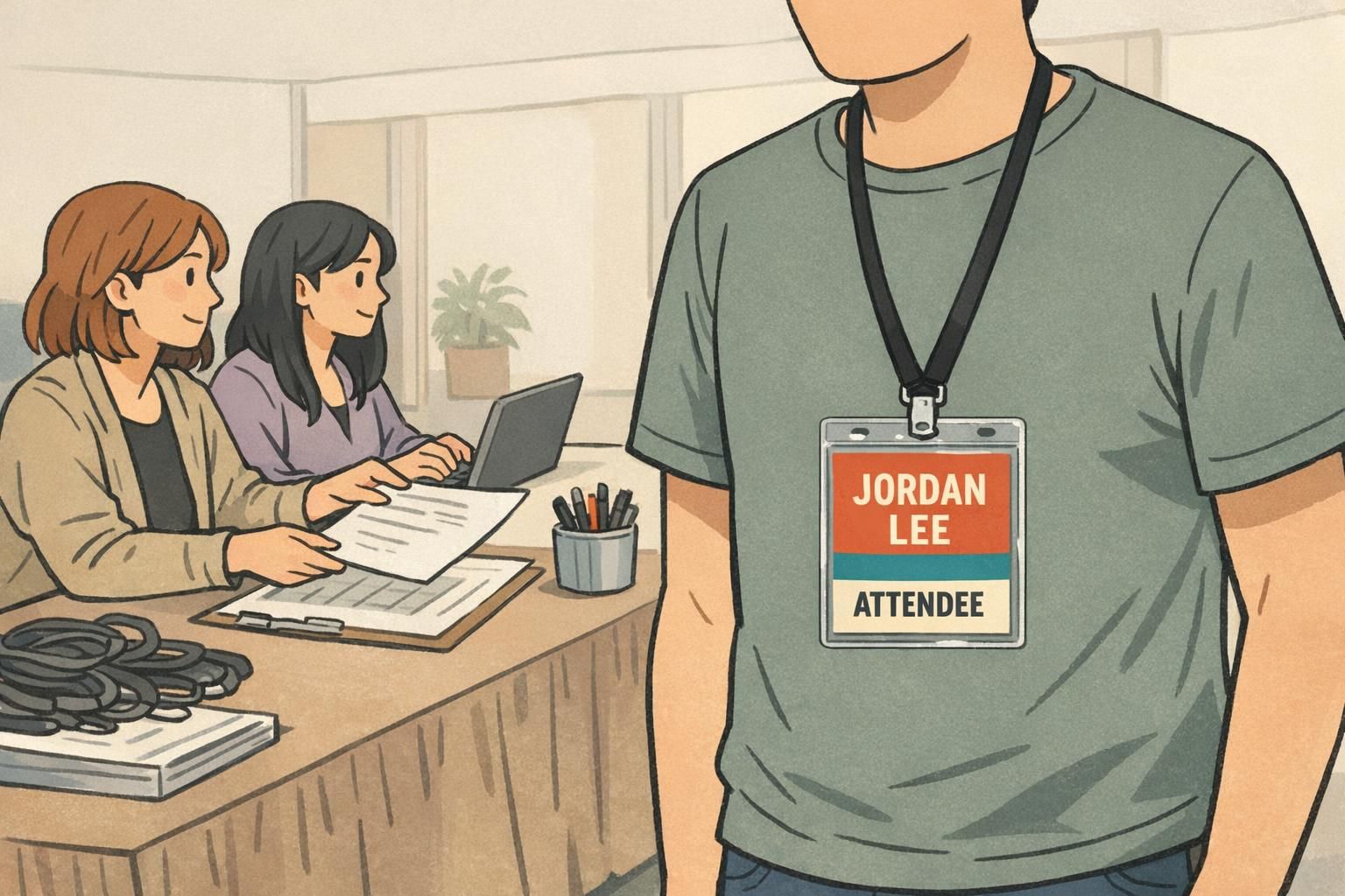
Retro Badge Design: Vintage Looks With Modern Readability
Why Retro Badge Design Works (When Readability Comes First)
Retro badge design works because it adds immediate personality—bold blocks of color, familiar shapes, and era-inspired type can make a badge feel welcoming instead of purely utilitarian. The catch is that a badge is still a tool for fast recognition. If someone can’t read a name at arm’s length, the design has failed no matter how charming the vintage styling is.
There’s also a practical reason retro cues can be powerful: vintage-inspired fonts and design signals can influence perception and responses in a positive, nostalgic way, which is one reason people gravitate toward them in the first place (source). The best approach is “neo-retro”: borrow what people love about older styles, while keeping modern readability standards so names, roles, and organizations scan quickly.
That balance matters in real-world places where identification needs to be both friendly and functional—conferences, schools, healthcare settings, retail, museums, offices, and visitor management desks. In these environments, a badge is often read from 3–6 feet away, under mixed lighting, sometimes while people are moving. Retro flair should support recognition, not compete with it.
A good retro look is a layer on top of a clear layout—not a replacement for clear names, roles, and organization info.
Start With a Clear Information Hierarchy (Name, Role, Organization)
Before color, type, or icons, decide what the badge must communicate in one glance. For most name tags, ID cards, and event badges, the minimum hierarchy is consistent:
- Name (largest): the primary reason people look at the badge
- Role/Department (second): the “how can you help me?” line
- Organization/Event (third): context, brand, or location
Design for the real viewing distance. If the badge is commonly read from 3–6 feet away, your name line needs to dominate the layout. Retro elements—stripes, borders, corner shapes, and accent fonts—should frame the hierarchy rather than shrink it.
Hierarchy shifts slightly by context:
- Event badges: Name is still biggest, but access cues (e.g., Attendee/Speaker/Staff) often needs to be nearly as prominent for quick routing.
- Daily workplace name tags: Role/department may be second, but the organization mark can be smaller because the setting already provides context.
- Healthcare and high-interruption settings: Role can be especially important (patients and visitors look for “Nurse,” “Tech,” or “Security” quickly).
If you’re unsure what to enlarge, enlarge the line a stranger would need first: usually the name, then the role.
Retro Color Blocks That Stay Accessible: Contrast, Borders, and Negative Space
Color blocking is one of the easiest ways to get a retro feel without sacrificing legibility. Mid-century-inspired layouts often use simple panels, stripes, and framed rectangles—and those same structures can improve readability by giving text a clean, solid background.
Use these do/don’t rules to keep retro color blocks accessible:
- Do: Put text on solid color blocks (not gradients or photos).
- Do: Use high-contrast pairings—dark text on a light block, or white text on a deep navy/forest/charcoal block.
- Do: Add a thin border or frame when two colors meet closely; it prevents “vibration” and keeps edges crisp.
- Do: Use negative space intentionally so the badge can be read quickly while someone is walking.
- Don’t: Place names over busy textures, patterns, or multicolor backgrounds.
- Don’t: Rely on low-contrast pastels (e.g., cream text on light tan, pale gray on mint) for critical info like names and roles.
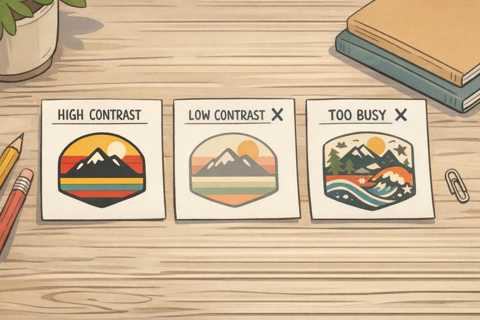
A practical trick: reserve your highest contrast for the two most important lines (name and role), and let the organization/event line live in a calmer area of the layout. This maintains retro flair while protecting scan speed.
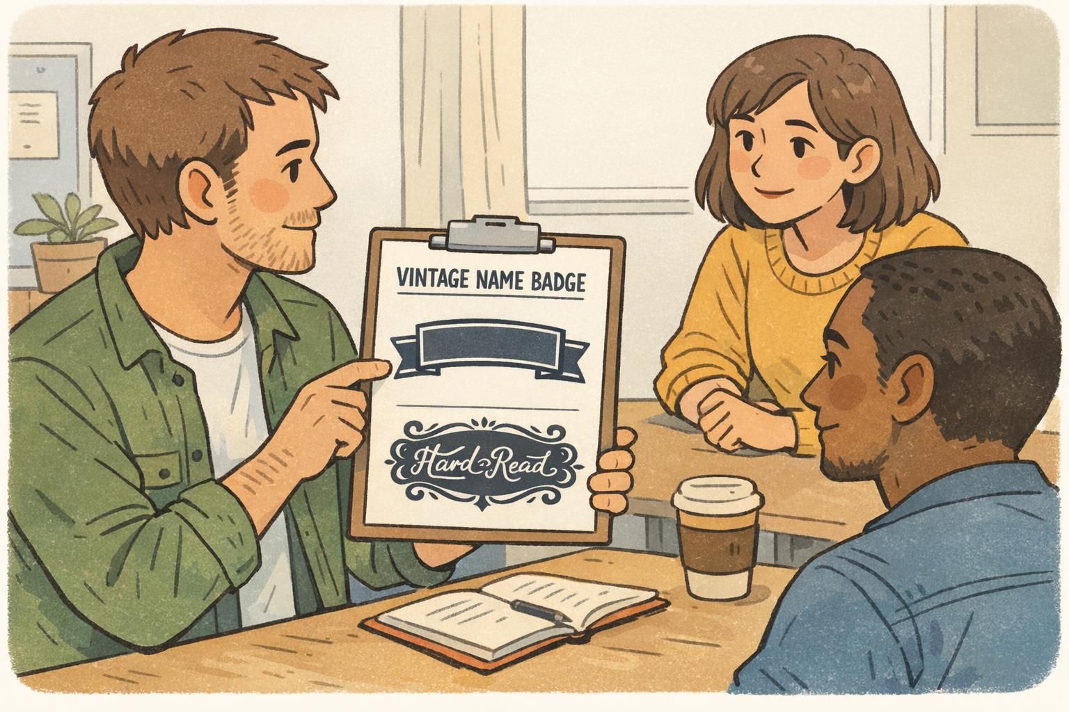
Typography Do/Don’t Rules for a Vintage Name Badge (Without the Squint)
Typography is where many retro looks succeed—or fall apart. A vintage name badge can absolutely use a “character” font (think classic sign-painter or mid-century display styles), but the core information needs to read instantly. The simplest, most reliable method is a two-font system:
- One accent font for small, non-critical elements (a tagline, a small header, or a subtle label)
- One clean sans-serif for names, roles, and any scannable identifiers
Typography do’s that keep retro vibes readable:
- Do: Choose fonts with sturdy stroke weight (thin hairlines disappear at distance).
- Do: Slightly increase letter spacing for all-caps labels like roles (e.g., STAFF, VOLUNTEER) so they don’t clump.
- Do: Keep capitalization consistent (Title Case for names is often easier to read than ALL CAPS).
- Do: Use generous line spacing if name and role stack; crowded lines feel smaller than they are.
Typography don’ts that cause squinting:
- Don’t: Use thin scripts for the name (script can work as a tiny accent, but not as the main identifier).
- Don’t: Use extreme condensed fonts for critical info—condensed styles reduce character recognition at a glance.
- Don’t: Use all-caps for long names at small sizes; it can turn into a uniform rectangle from 4–6 feet away.
- Don’t: Overuse decorative alternates (swashes, unusual letterforms) where clarity matters.
Quick vintage name badge checklist: check kerning on the name, avoid tight line spacing, and test-print a sample to read from 3–6 feet away under real lighting.
Classic Shapes and Simple Icons: Shields, Circles, and Enamel-Inspired Details
Retro styling often shines through shape language. Rounded rectangles, shield-like panels, circles, and “enamel pin” outlines can feel timeless and familiar. The key is to treat shapes as containers that improve scanning—not decorations that squeeze your text.
- Use classic shapes to group information (e.g., name in a large rounded panel; role in a smaller pill-shaped block).
- Keep icons secondary to text: the icon should never be the only way to tell role or access.
- Avoid tiny details (thin lines, intricate crests) that blur when printed small.
- Maintain generous padding so text doesn’t collide with borders or curves.
When choosing motifs, simple and culture-agnostic symbols tend to age best: a star, a dot, a simple check mark, a minimal building outline, or a clean geometric divider. These can read as retro without implying a specific group, era, or message you don’t intend.
Textures and “Aged” Effects: How to Fake Patina Without Hurting Print Clarity
Light grain and subtle distressing can add warmth to retro badge design, but texture is also the fastest path to muddy print. The safest rule is simple: texture belongs behind information, not on top of it.
- Do: Keep texture low-contrast and confined to background panels.
- Do: Preserve clean, solid text edges—especially for names and roles.
- Do: Test-print textures; what looks subtle on-screen can become noisy in physical printing.
- Don’t: Put distressing over names, job titles, barcodes, or QR codes.
- Don’t: Use heavy “worn” edges that interfere with borders, safe zones, or alignment.
Operationally, many ID cards and event badges are checked quickly or scanned. If a badge is likely to be scanned, prioritize crisp contrast and clean code placement. You can still keep the vintage feel by adding patina to secondary areas (like a top banner) while keeping any machine-readable zones clean and quiet.
Badge Design Ideas by Use Case: Events, Staff, Volunteers, and Visitors
The best badge design ideas start with the job the badge needs to do. Retro styling should amplify that job—helping people recognize who’s who, where to go, and what support is available.
Events (conferences, trainings, school functions)
- Do: Make role and access cues obvious (Attendee, Speaker, Vendor, Staff) using a bold block or band.
- Do: Keep the name large enough to read during quick introductions.
- Do: Use simple retro stripes or frames to separate name from access info.
- Don’t: Rely on subtle hue differences to indicate access levels; use high contrast and clear labels.
Staff name tags (daily wear in workplaces, retail, schools, clinics)
- Do: Prioritize the name first, then role/department in a strong secondary line.
- Do: Use durable, easy-to-read layouts that stay clear under overhead lighting.
- Do: Use a retro accent in the header or border rather than behind the name.
- Don’t: Make the organization line so large that it competes with the name.
Volunteer badges (high visibility and wayfinding)
- Do: Use a bold role block (VOLUNTEER) in a highly contrasting color for instant recognition.
- Do: Add a simple icon only if it reinforces recognition (kept larger and minimal).
- Don’t: Use decorative type for the role; volunteers are often identified at a distance in busy spaces.
Visitor badges (quick recognition and controlled access)
- Do: Make “VISITOR” unmistakable with a strong label and clean background.
- Do: Keep layouts uncluttered so staff can confirm status quickly.
- Don’t: Hide visitor status in small text or low-contrast colors.
When in doubt, let the retro styling live in the framing (blocks, borders, shapes). Keep the core identity lines clean, bold, and untextured.
Print-Ready Specs: Sizes, Bleed, Safe Zones, and Material Choices
Retro-inspired layouts look best when the print setup is clean. Many “readability problems” happen at the edges: text too close to the trim, important info sitting in a clip area, or thin borders that get uneven after cutting.
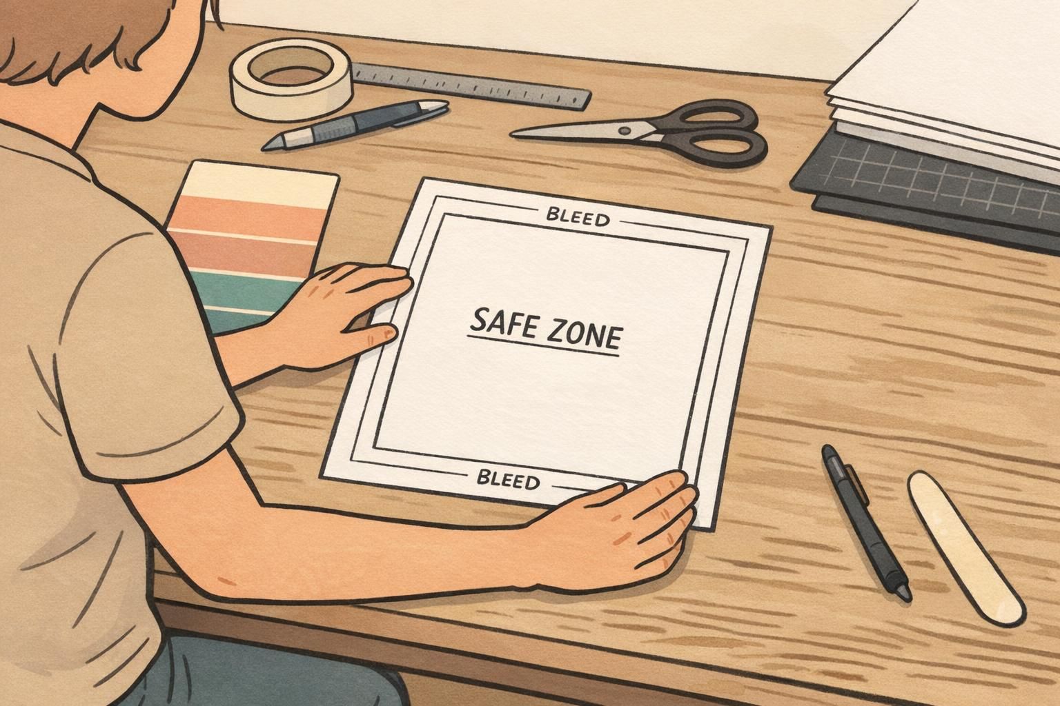
- Use safe zones: keep names and roles comfortably away from edges, slots, and clips.
- Plan for bleed: if you use edge-to-edge color blocks, extend the background beyond the trim so it cuts clean.
- Avoid tiny edge details: thin stripes and hairline borders can look uneven if they land near the cut.
- Proof at real size: print on a basic office printer to check spacing and legibility before final production.
Material and finish affect perceived contrast. Glossy finishes can create glare under bright lighting; matte/silk finishes can reduce reflections and make text easier to read in some settings. If your retro palette is subtle, consider how lamination or plastic surfaces may shift colors slightly and reduce the perceived difference between text and background.
For organizations that issue many badges, consistent templates are a quiet advantage: you can keep the same retro style across teams while ensuring every badge maintains the same hierarchy, spacing, and readability standards.
Order and Customize Retro-Inspired Name Tags and ID Badges
Once your layout rules are set, the easiest way to keep retro style consistent is to standardize a template and then vary only what truly changes (name, role, department, access label). That approach prevents “design drift,” where small tweaks gradually reduce readability across a large team or multi-day event.
- Pick a base template with your hierarchy locked (name largest, role second, organization third).
- Define your retro elements (a fixed color-block system, one accent font, one core font).
- Set guardrails: minimum font sizes, consistent capitalization, and no textures over critical text.
- Review a proof for edge spacing, contrast, and real-distance readability before approving variations.
If you’re producing badges for a team or event, it helps to use an ordering process that supports consistent layouts across many names. BadgeZoo’s custom name tags can be a practical option for bringing a retro-inspired design into a modern, easy-to-read format.
Limit retro elements to one or two moves—usually color blocks and a simple border—and keep the name and role on solid, high-contrast backgrounds with generous spacing.
Yes, but use script as a small accent (like a tiny header), not for the name or role. The main identity lines should be in a clean, sturdy font designed for quick reading.
Print one sample at actual size and view it from 3–6 feet away under the lighting where it will be worn. If you hesitate to read the name or role, increase contrast or simplify the background.