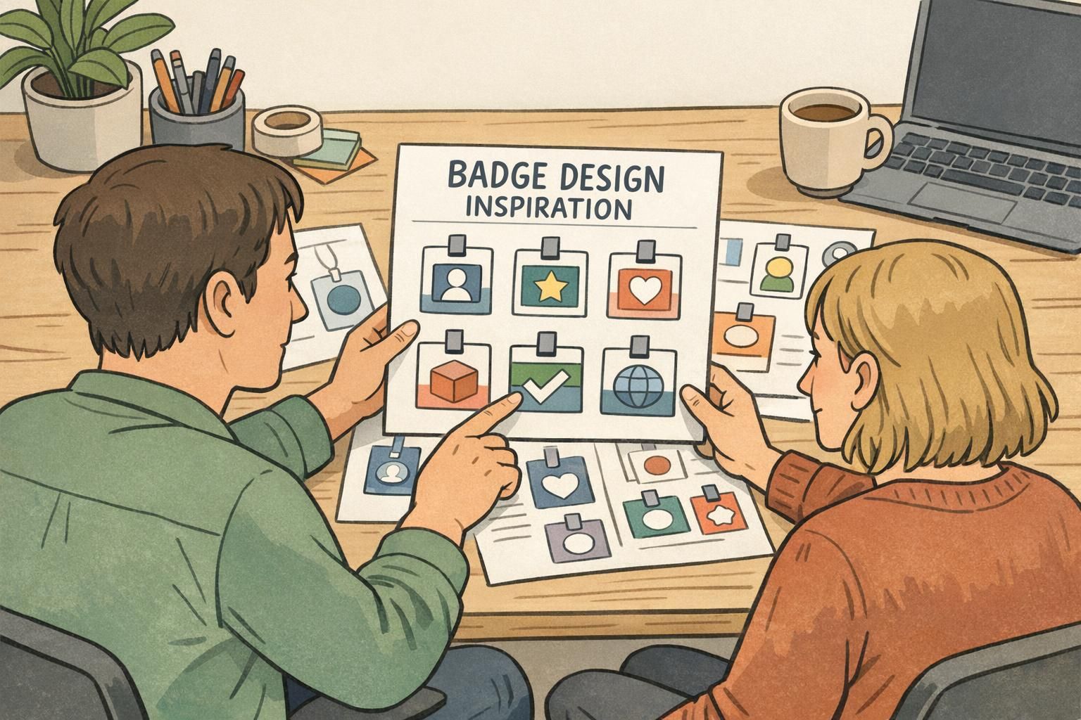
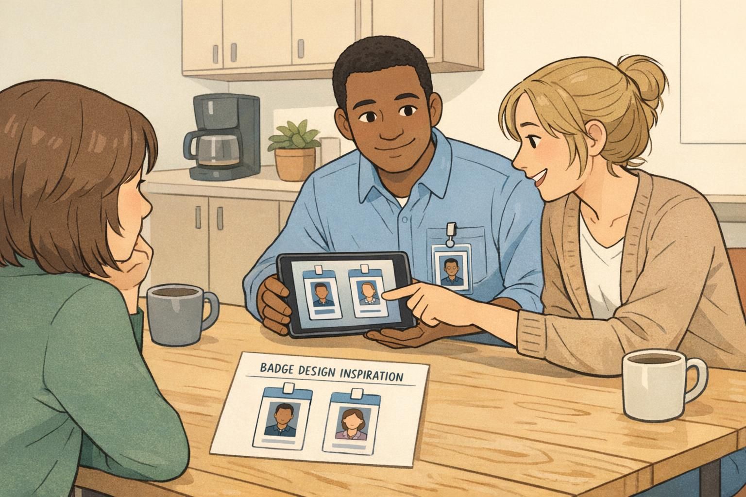
Badge Design Inspiration from Different Industries: Layout Lessons for Clear IDs
Why Badge Design Inspiration Matters Across Industries
Good IDs do one thing exceptionally well: they let people understand who someone is—quickly, confidently, and without awkward squinting. That’s why badge design inspiration is so valuable when you look beyond your own workplace. Retail, hospitals, schools, and corporate offices all solve the same core problem (clear identification), but they solve it under very different pressures: speed, safety, durability, and brand consistency.
In this guide, you’ll see how each environment sets its visual hierarchy—what’s largest, what’s secondary, and what’s intentionally quiet. You can then reuse those same layout lessons for employee IDs, visitor passes, event credentials, and everyday name tags. The goal isn’t to copy another industry’s style; it’s to borrow what works so your IDs are readable at a glance, comfortable to wear, and easier to manage day-to-day.
Across industries, the purpose stays constant: clear identification. What changes is which detail must be recognized first—name, role, photo, or status.
Retail: High-Visibility Name-First Layouts for Customer-Facing Speed
Retail is the home of “read it from a few feet away” design. Customers often need one key detail immediately: who to address. That’s why many retail layouts lead with a large first name, supported by a smaller role or department and a quiet brand mark.
A practical retail hierarchy often looks like this: NAME (largest) + role/department (medium) + logo (small). The best versions also protect legibility with high contrast, strong spacing, and minimal extra details competing for attention.
- Lead with the human element: make the first name the focal point when approachability and speed matter.
- Keep secondary details quiet: role, department, or store location should be easy to find but not fight the name.
- Use whitespace as a design tool: margins and breathing room can outperform decorative graphics for real-world readability.
- Choose contrast over trends: light text on mid-tone backgrounds or dark text on light backgrounds reads faster under varied lighting.
Transferable lesson: if the badge’s main job is friendly, fast interaction, use name-first hierarchy and avoid clutter. Many reliable name badge ideas are simply bold type, clear spacing, and a clean layout that stays readable all day.
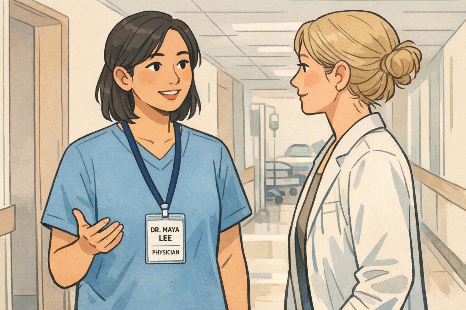
Hospitals & Clinics: Safety, Role Clarity, and Photo-Forward Identification
Healthcare IDs are built for high stakes and high tempo. In busy hallways and patient rooms, people may not have time to read small print. That’s why many healthcare layouts put a clear photo up front and reinforce identity with large name text and unmistakable role labeling.
A common healthcare approach is zoning: a dedicated photo block, a dedicated name block, and a dedicated role/credential block. Color coding is often used as a quick differentiator between teams, but strong layouts don’t rely on color alone—because lighting varies and badges get partially covered by clips, lanyards, or clothing folds.
- Use hierarchy and redundancy: photo + large name + role reduces confusion when interactions are fast.
- Create predictable zones: people learn where to look after a few encounters, which speeds recognition.
- Make role unmistakable: if role clarity is the safety requirement, it should be as easy to spot as the name.
- Design for partial obstruction: key info should still be readable if the lower edge is covered by a holder lip.
Transferable lesson: when quick differentiation matters, borrow from healthcare-style employee ID examples—structured zones, a clear photo, and a large role label that doesn’t depend on tiny text.
“When the layout is consistent, I don’t have to ‘decode’ a badge. I can focus on the interaction.” – Operations Coordinator
Schools (K–12 and Higher Ed): Simple, Durable IDs and Age-Appropriate Readability
School IDs often prioritize simplicity and durability. Students may need only a few identity fields, and staff need a layout that’s easy to verify quickly during arrival, pickup, or events. In many school settings, the best design decision is restraint: include what people truly need to confirm identity—nothing more.
For student IDs, layouts tend to use larger text, minimal fields, and clean spacing. For staff IDs, schools may add role (teacher, admin, counselor) and sometimes a photo to support quick verification, especially in visitor-heavy environments.
- Reduce cognitive load: fewer fields can make the remaining fields faster to read.
- Use calm structure: clear spacing and consistent alignment helps staff scan information quickly.
- Plan for wear-and-tear: simple layouts often stay legible even after scuffs or daily handling.
- Keep text age-appropriate: larger type and straightforward labels are easier for everyone to interpret.
Transferable lesson: a simple layout is often the most readable layout. School-inspired designs are a strong model when you want clarity, durability, and minimal fields without sacrificing recognition.
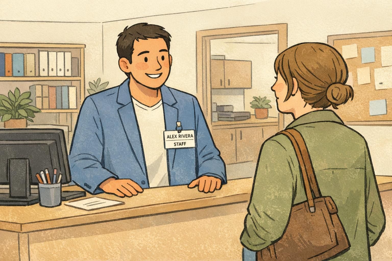
Corporate Offices: Brand Systems, Consistency, and Professional Minimalism
Corporate badges often serve two jobs at once: identification and professional presentation. They may be seen in meetings, at reception desks, or during vendor visits—so alignment, typography, and consistent margins matter more than people expect.
Many corporate layouts mirror brand guidelines: a fixed logo position, restrained color use, and clean grid alignment. Photos may be optional depending on security needs, while role and department are included selectively to keep the design minimal and polished.
- Treat the badge as a small brand touchpoint: consistent alignment makes even simple layouts feel intentional.
- Use a grid: line up edges, keep spacing consistent, and avoid “floating” elements.
- Decide when role is necessary: include it when it improves daily operations, not by default.
- Avoid competing focal points: one primary element (often the name) should lead.
Transferable lesson: corporate design teaches you how to make employee ID examples look clean and consistent—especially helpful when you want professionalism without relying on loud colors.
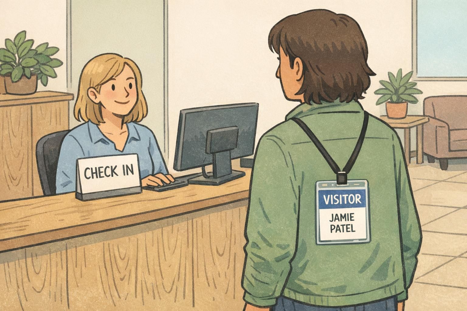
Borrowed Ideas from Digital Badges: Status Signals and Structured “Badge Architecture”
Digital communities and learning platforms have spent years refining how badges communicate meaning quickly. One of the most useful concepts to borrow is “badge architecture”: a structured system that defines categories, levels, and consistent rules for how badges are displayed and interpreted.
Even if you’re designing physical IDs, the same thinking applies. If every department invents its own layout conventions, people spend time deciphering instead of recognizing. But if role bands, access indicators, or visitor status always appear in the same place, the system becomes self-explanatory across the organization. Research discussing structured badge systems and display rules supports this as a practical framework for clarity and consistency (source).
- Standardize placement for status: keep “VISITOR,” “CONTRACTOR,” or access level in a predictable zone.
- Limit the number of visual languages: reuse the same shapes, label styles, and hierarchy across teams.
- Create variants from one template: consistent architecture makes updates and onboarding simpler.
- Use subtle cues first: shape, band placement, and type size can signal meaning without adding clutter.
Transferable lesson: consistency across a badge program can matter as much as any single layout choice. A coherent system reduces confusion and training time.
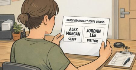
A Practical Badge Layout Checklist You Can Reuse Anywhere
When you’re designing an ID that must work in real life—on real people, under real lighting—small choices make a big difference. The best layouts begin by deciding what must be recognized first, then building everything else in support of that goal.
- Pick the #1 field and make it the biggest element (often name or role).
- Use 2–3 information zones (for example: photo, identity text, scan element).
- Align to a simple grid with consistent margins and edges.
- Keep contrast strong and avoid busy backgrounds behind text.
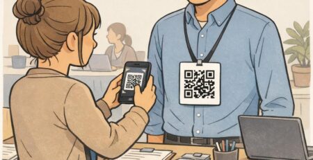
- Include only operationally useful fields: name, photo, role, department, and an ID number or barcode/QR if needed.
- Test at arm’s length: if it’s not readable from that distance, simplify and enlarge the primary field.
- Check “holder reality”: ensure key text won’t be hidden by a clip, slot punch, or holder edge.
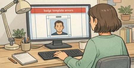
Too many competing elements—small text, multiple logos, decorative backgrounds, or unclear hierarchy. Simplifying and enlarging the primary field usually fixes the issue.
Only if photo verification meaningfully supports your environment. Healthcare and higher-security spaces often benefit; some corporate settings prefer minimalism unless security requirements call for photos.
In a dedicated “quiet” zone with enough blank space around it so it scans reliably, and positioned so it won’t be covered by a clip or hand when presented.
Production Choices That Affect Design: Material, Holders, and Orientation
Design isn’t just what you see on screen—production decisions change what stays readable in daily use. Orientation (vertical vs. horizontal) affects how the eye travels. Materials and finishes affect glare. Holders and clips can hide edges, which matters if your name or barcode sits too close to the border.
If your organization uses holders, design with “safe margins” so essential fields aren’t cut off visually. Likewise, scanning elements need calm space around them to read cleanly. This is where practical name badge ideas shine: high-contrast type, clear hierarchy, and simple blocks tend to outperform busy graphics once the badge is worn, bumped, and viewed at an angle.
- Vertical vs. horizontal: choose the orientation that supports your primary field and typical wearing style.
- Finish and glare: if badges are worn under bright lights, glare can reduce contrast; consider a less reflective finish if readability is a frequent issue.
- Holder interference: leave extra breathing room near edges, especially along the bottom where holders often have thicker lips.
- Scanning reliability: give barcodes/QR codes a dedicated zone and keep it away from heavy graphics.
A layout that looks perfect on a screen can fail when worn behind a holder. Build in margins, keep key fields away from edges, and test in the real carry method.
Bring Your Design to Life with BadgeZoo Printing Options
Once you’ve chosen a layout approach, the next step is matching it to the format you’ll actually use—employee IDs, visitor badges, name tags, or event credentials—so the design works in daily wear and daily workflows. Many organizations keep one core template and create role-based variants, which helps the whole system stay consistent across departments.
If you’re producing physical cards, it can help to choose finishes with real-world readability in mind. BadgeZoo offers multiple finish options (including gloss and matte/silk), which can be useful when you’re balancing color vibrancy with glare control. If you’re refining a template and want input on format or production details, you can also reach out with questions via http://badgezoo.com/contact.
When you’re ready to produce your layout, BadgeZoo supports formats like photo IDs and role-forward designs that keep key information clear—whether you’re building a full employee program or updating a visitor workflow. You can explore custom ID cards as one common starting point for consistent templates.
A consistent badge system is easier to recognize, easier to manage, and easier to expand. Start with one strong template, then create disciplined variants for roles, teams, or visitor status.

