Badge Recognition as Subtle Ways to Celebrate Training and Tenure
Why badge recognition works for low-key celebrations
Badge recognition is a practical way to celebrate progress without turning recognition into a production. Instead of a big announcement, a small, consistent visual cue on a name tag, ID card, or event badge quietly communicates: “This person completed a step,” “This skill has been verified,” or “This teammate has tenure we value.” It’s recognition that fits naturally into the flow of work—especially in environments where professional appearance, privacy, and clarity matter.
Low-key celebrations work because they reinforce momentum. When milestones like training completion are visible in a restrained way, people can connect effort to progress. Over time, incremental recognition can help participation and follow-through feel more worthwhile—without distracting from the badge’s primary job: clear identification and role clarity. Research on digital badging has also noted relationships between earning badges and indicators like engagement and performance, supporting the idea that incremental milestones can matter when they’re implemented thoughtfully (source).
The best subtle systems keep the badge readable first, then add a single clear signal of accomplishment—so recognition complements identification instead of competing with it.
- Visible without being loud: recognition is present, but not distracting
- Consistent across teams: the same milestone looks the same in every location
- Easy to interpret at a glance: one cue communicates one meaning
- Professional by default: avoids “sticker-book” clutter while still celebrating progress

Start with a fairness-first recognition policy (before you design anything)
Before you pick icons, colors, or layouts, define the rules. A fairness-first policy prevents the most common recognition problem: uncertainty about who qualifies and why. No design choice can compensate for a system that feels inconsistent or subjective.
Start by identifying which milestones count (and which do not). Training completion is often straightforward, but even then you’ll want to specify what “complete” means—finished modules, passed assessments, verified competencies, or documented sign-off. For tenure recognition, use a clear date source (hire date or service date) and standard intervals. When people understand the rule, recognition feels respectful rather than political.
- Define milestones: training steps, verified competencies, role readiness, tenure intervals
- Use objective criteria: completion records, assessments, manager verification, HR dates
- Document exceptions: leaves of absence, transfers, rehires, contract-to-hire transitions
- Make visibility optional when appropriate: some employees may prefer less public recognition
- Avoid privacy pressure: don’t force disclosure of sensitive details through badge markings
- Assign ownership: who approves, who issues, and who handles corrections
Not always. If a marker could create unwanted attention or pressure, consider making it optional or limiting it to role-relevant credentials (for example, safety training required for a task). A fair system respects both consistency and personal comfort.
Unclear criteria. When people can’t tell how recognition is earned—or think exceptions are handled inconsistently—confusion spreads fast. Clear written rules solve more problems than visual redesigns.
“We found that the visual system wasn’t the hard part—the hard part was agreeing on the same definition of ‘trained’ across departments. Once we wrote it down, everything got easier.” – Operations Coordinator
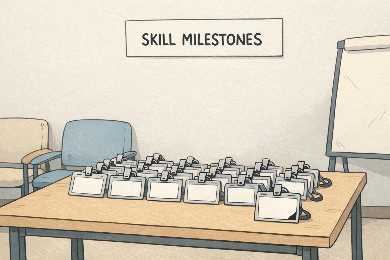
Small add-ons that celebrate training without clutter
Subtle recognition works best when you choose one small element at a time. A badge is read quickly—photo, name, and role often matter most—so recognition cues should be minimal, repeatable, and predictable.
A useful rule of thumb is “one meaning, one marker.” If an icon means “training complete,” don’t add a second icon that also hints at training. And rather than stacking more elements as people progress, consider a system that updates the same element—so the badge stays clean and the message stays clear.
- Tiny single icon: one small symbol near the edge for “training complete”
- Thin border color: a narrow stroke that changes by level (kept consistent organization-wide)
- Corner stripe: small, single-color accent that doesn’t interfere with name or photo
- One short line of text: a brief label like “TRAINED” or “LEVEL 2” when text is necessary
- Replacement-not-addition: update the same marker as progress increases instead of adding new ones
If someone has to stare at the badge to decode it, it’s no longer subtle—it’s just confusing. Keep recognition cues simple enough to understand at a glance.
Design a clean certification badge system employees actually want to wear
A certification badge should communicate one clear idea: a verified skill, clearance, or completed pathway. If it starts trying to do three jobs—credential, celebration, and decoration—it usually ends up doing none of them well.
Start by choosing a consistent structure across all levels. Many teams use one icon family (same basic symbol) and change only one attribute—like a level number, a single stripe color, or a minimal border. Keep titles short so they don’t crowd the badge layout, and avoid wording that implies status beyond the credential itself. The point is legitimacy and clarity, not flash.
- Keep the credential name short: aim for 1–3 words when possible
- Use consistent iconography: one icon style across all levels
- Change only one variable per level: number OR stripe color OR border, not all three
- Align naming across systems: match printed wording to internal training records and profiles
- Test for quick readability: can someone interpret it from a normal conversation distance?
A certification badge indicates a verified credential tied to a specific skill or requirement. A general recognition marker may simply celebrate progress (like finishing onboarding) without implying formal qualification.
Usually no. Long course titles reduce readability. If detailed course info matters, keep it in your internal records or a separate system, and let the badge show a concise credential name.

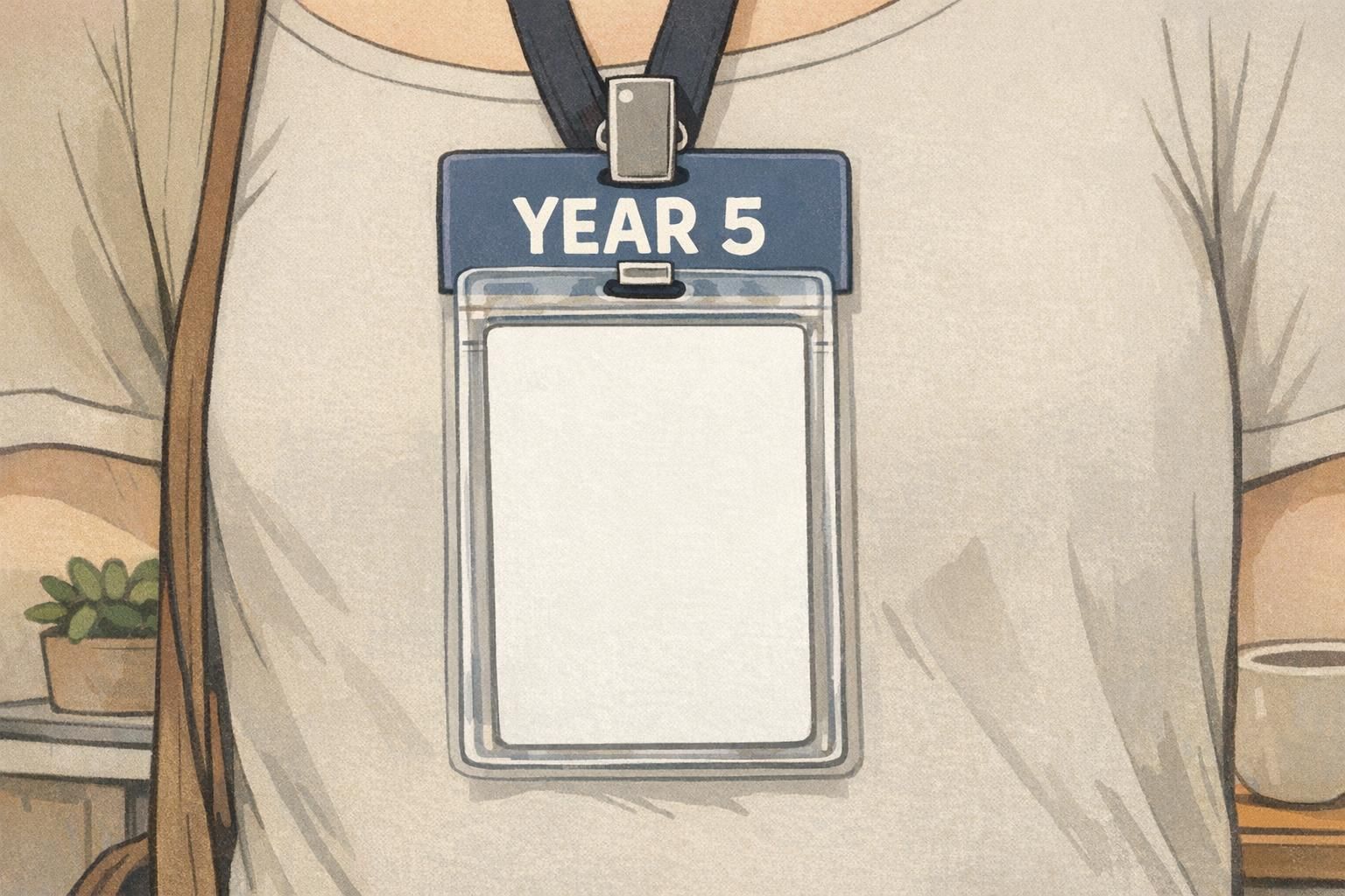
Years of service that feels respectful (not performative)
Years of service recognition can be meaningful when it feels steady and respectful—something that communicates appreciation without exaggeration. The most effective designs tend to be restrained: a small numeral, a subtle stripe, or a brief label such as “YEAR 5.” These cues acknowledge commitment while keeping the badge focused on identification.
To keep the program manageable, many organizations update at set intervals (for example: 1, 3, 5, 10). That reduces constant changes and helps the recognition feel more intentional. It also supports fairness: everyone knows when the next update happens, and updates aren’t dependent on department visibility or manager style.
- Use restrained cues: small numeral, short label, thin stripe
- Standardize intervals: 1, 3, 5, 10 (or your organization’s chosen cadence)
- Keep placement consistent: same location on the badge or buddy every time
- Avoid oversized “anniversary” graphics: recognition should not overwhelm identification
- Apply across departments: tenure recognition shouldn’t depend on role or location
“A simple year marker did more for morale than we expected. It wasn’t flashy—but it was consistent, and people noticed it in a good way.” – HR Generalist
Where recognition belongs: name tags, ID cards, event badges, and badge buddies
The cleanest recognition programs match the recognition method to the context. Not every milestone belongs on the primary ID layout, and not every environment needs the same level of visibility. The goal is to keep identification reliable while placing recognition where it reads naturally.
Name tags are great for interpersonal moments—helping peers and customers connect a face, name, and small achievement marker. ID cards are usually worn daily and may be scanned or checked, so recognition cues should be especially restrained and should never interfere with photo visibility or any access-control elements. Event badges are ideal for time-bound recognition (speaker, volunteer, training-day completion) because the badge itself is temporary and purpose-built.
Badge buddies are often the most practical way to add a secondary message—like a role, milestone, or tenure interval—without redesigning the main ID. Because the buddy sits behind the primary ID in the same holder, it can carry the recognition message while the main card stays consistent across teams.
- Name tags: best for light, social recognition cues (one icon, small stripe)
- ID cards: keep primary layout stable; use minimal markers that don’t reduce readability
- Event badges: ideal for short-term accomplishments and roles during training days or conferences
- Badge buddies: carry secondary labels (role, milestone, years of service) while keeping the main ID clean
- Placement rule: never block the photo area, scannable zones, or essential ID information
It can if it overlaps key design zones or causes people to cover the card with extra stickers or bulky add-ons. Keep recognition to a designated area and avoid anything that makes the badge harder to scan, check, or read quickly.
If your ID card layout needs to stay uniform across departments, a badge buddy often works better. It adds a clear secondary label while preserving a stable, readable primary ID.
Production and rollout tips: keep it consistent, replaceable, and easy to maintain
Subtle recognition only looks “official” when it’s consistent. That means standard sizes, predictable placement, and a clear approval workflow. When a program is rolled out unevenly—different colors in different locations, slightly different labels, or ad-hoc exceptions—it starts to look improvised, which undermines the recognition itself.
Plan for maintenance from day one. People lose badges, roles change, and training gets refreshed. The easiest systems use templates and simple versioning so updates are quick and replacements match the original design. A short pilot can help you catch issues like low contrast, hard-to-read markers, or wear-and-tear problems before full rollout.
- Standardize specs: same sizes, same placement rules, same color palette
- Create templates: one for each credential level and each tenure interval
- Set approvals: who can create a new marker, and who can issue it
- Plan replacements: lost badges, reprints, and updates should follow the same template
- Pilot first: test readability at a glance and durability in real workflows
Consistency is the difference between “a real credential marker” and “something someone added one day.” Keep the system tight and repeatable.
Product tie-in: simple recognition add-ons that stay readable
If you want recognition without redesigning your entire ID system, add-ons can be the cleanest option. Badge buddies, for example, can carry a role or milestone label while the primary ID remains unchanged and easy to read. This approach is especially useful when different departments share the same base ID design but need small, approved distinctions for training, credentials, or years of service.
The key is standard sizing and a consistent message format, so the add-on aligns correctly in the holder and looks intentional. For organizations building a tidy, maintainable system, a rigid vertical stack buddy can create a single straight layout that’s easy to issue and replace. If you’re exploring this approach, BadgeZoo’s badge buddy backing cards are designed for a clean vertical stack behind the main ID.
- Keep the main ID clean: photo, name, and essential info stay primary
- Let the add-on do one job: one role label or one milestone indicator
- Use a repeatable format: same label style for every interval or level
- Design for updates: swapping a buddy is often simpler than reissuing the primary ID
Use “replacement-not-addition.” Update one element (like a single stripe or one buddy label) rather than adding more items over time. It keeps recognition visible while protecting readability.
A single training completion marker is often the easiest start because the criteria can be objective and the visual cue can be minimal—like a small icon or a simple buddy label.