Employee Recognition Badge Ideas for Simple, Inclusive Milestone Celebrations
Why an employee recognition badge works as a simple visual celebration
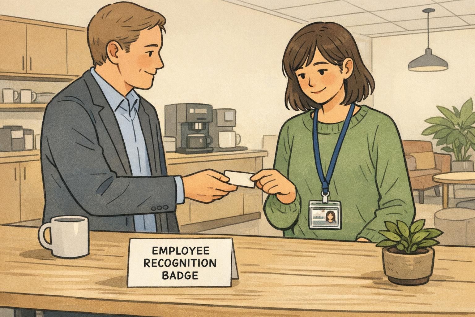
An employee recognition badge is one of the simplest ways to make progress visible—without turning recognition into a big production. Because it’s small and consistent, it can signal “we noticed your effort” while still keeping the workday moving. Instead of relying on occasional announcements (which not everyone enjoys), a badge creates a steady, everyday cue that milestones matter.
This approach fits especially well in workplaces that already use name tags, ID cards, or event badges. You’re not asking employees to adopt something entirely new; you’re simply adding a subtle marker to something they already wear. When done well, recognition becomes easy to spot at a glance, easy to maintain, and easy to explain to new hires.
The strongest recognition systems are the ones that are easy to understand, easy to administer, and optional enough to respect individual preferences—while still being consistent across teams.
There’s also a practical advantage to badges as a recognition tool: they’re structured and repeatable. A small collection of milestone markers can reinforce perseverance and participation—not just “winning.” In settings where badges are used to encourage ongoing engagement, simple collectible markers can help people stay motivated over time in a way that’s straightforward to implement (source).
Recognition that stays inclusive: visibility without spotlighting
The goal of workplace recognition is belonging, not pressure. A program that’s too loud can backfire for people who prefer privacy, who come from cultures where public praise feels uncomfortable, or whose roles are behind-the-scenes. Subtle recognition markers help keep the message positive: progress is valued here, and it shows up in small, consistent ways.
To keep participation comfortable, offer a few parallel options. Some employees will enjoy wearing a marker on their ID card; others may prefer a desk display or a digital badge on an internal profile. The important part is that the meaning stays consistent across options, so the recognition feels real and not like a separate “track.”
- Offer choice: wearable marker, desk display, and/or internal profile badge
- Use neutral language that recognizes contribution and perseverance (not just “top performer” outcomes)
- Standardize criteria so recognition feels fair across departments and shifts
- Keep timing predictable (for example, monthly updates or set milestone dates)
- Make it opt-in or easy to decline without awkwardness
“The best recognition is the kind that feels steady and sincere. A small marker on a badge can say ‘you matter here’ without turning someone into a headline.” – People Operations Lead
Years of service badge: subtle markers that don’t interrupt the workday
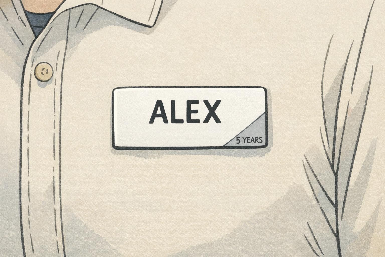
A years of service badge works best when it’s instantly readable and visually quiet. Think of it as a small design cue that adds meaning to what employees already wear—without changing the overall look of the name tag or ID badge.
Good options include a tiny emblem on a name tag, a discreet color band on a badge insert, or a small pin placed in the same position on every lanyard. The key is consistency: same placement, same style, same scale. That makes it easy for employees to recognize milestones and easy for managers to keep up with updates.
- Corner marker on a name tag (small icon + short milestone text, or icon-only)
- Thin color band at the bottom of a badge insert (paired with an icon so color isn’t the only cue)
- Small lanyard pin placed in a standard location (for example, near the clip)
- Badge buddy-style backing card with a subtle service indicator (kept minimal to avoid clutter)
If privacy is a concern, use broad ranges (like “5+ Years”) or icon-only tiers rather than exact year counts.
For milestone steps, keep the system simple enough to remember and maintain—common tiers include 1, 3, 5, 10, 15+ years. You can also align milestones to how your organization already thinks about tenure (for example, probation completion, first annual review, or long-term retention marks).

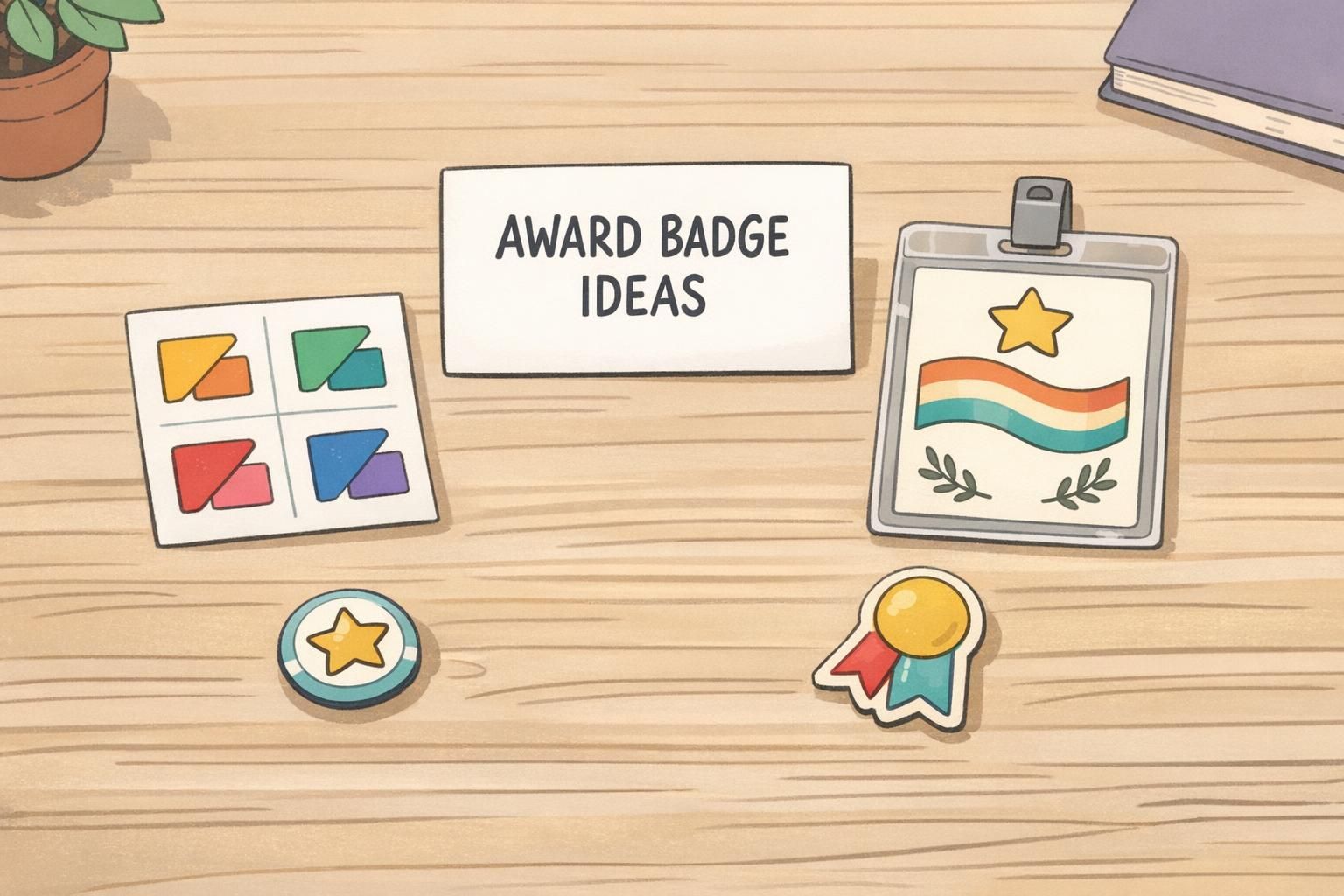
Award badge ideas that pair with ID cards and name tags (without clutter)
The most practical award badge ideas are designed to fit the reality of daily work: badges get scanned, clipped, wiped down, and worn in customer-facing spaces. Recognition should never get in the way of identification or create visual noise that makes a name tag harder to read.
A clean rule of thumb is “one recognition element at a time.” That might mean a single stripe, a single icon, or a short label—rather than multiple elements competing for attention. If you run multiple recognition programs, reduce confusion by reserving colors for categories and keeping shapes consistent.
- Removable overlay: a thin corner tab that sits on top of an ID card without covering key info
- Add-on mini card: a small, separate card clipped behind the main ID in the same holder
- Corner marker system: consistent corner shapes (triangle, circle, flag) with a matching icon
- Single-stripe insert: a narrow band that indicates category (service, training, safety, mentoring)
- Short role-recognition label for collaboration moments (for example, “MENTOR” or “TRAINER”), used sparingly
Design for conversational distance: if someone is close enough to read it, it should be clear; if they’re farther away, it should still look neat and intentional.
Add-on cards and badge stacks: simple configurations that stay neat
When you want recognition to be a bit more visible—especially for cross-department work—stacked add-ons can be a clean option. This means keeping the primary ID badge in front for scanning and identification, with a slim add-on card aligned behind it using the same clip. Done well, it looks organized, not busy.
Badge stacks are particularly helpful in environments where people meet many new faces, such as conferences, onboarding cohorts, float pools, or multi-site organizations. A small add-on that says something simple (like “MENTOR” or a service milestone) can reduce awkward introductions and help employees quickly find the right person to ask.
- Keep all stacked cards the same width to prevent shifting and corner wear
- Use one add-on card per category at a time (avoid tall stacks)
- Standardize placement rules (for example, add-on goes behind the ID, centered, with a bottom stripe visible)
- Choose durable materials that handle daily clipping and movement
- Ensure the add-on never covers barcodes, photos, or access tech areas on the primary ID
How to choose colors and icons that are accessible and non-distracting
Color can help people understand a recognition system quickly—but it should never be the only way to understand it. For accessibility, pair every color cue with an icon so employees who are colorblind (or working in low-light areas) still get the meaning immediately.
To keep things calm and professional, avoid neon or overly saturated colors that can feel loud in clinical, hospitality, or customer-facing settings. Muted tones and small corner placements often read as more respectful and uniform-friendly. Icons should be universal and simple enough to recognize at a glance.
- Use high-contrast combinations so small markers stay readable
- Pair color + icon (don’t rely on color alone)
- Limit your icon set to a small, repeatable group (for example: star, check, shield, handshake)
- Keep shapes consistent so employees learn the system quickly
- Test the design on actual holders and lanyards before rolling it out
Use a tiny corner marker on an existing name tag or ID insert so the recognition stays within the same format employees already wear. If wearables aren’t feasible, offer a desk display or internal profile badge with the same icon system.
Assign each category a consistent cue (like a color + icon pair), then keep placement and shape the same across all markers. Also, avoid awarding multiple visible markers at once—rotate what’s displayed if needed.
Operational checklist: make recognition easy to run and easy to update
A recognition program succeeds or fails on operations. If criteria are unclear, replacements are awkward, or managers don’t know how to request updates, even a great-looking system will lose momentum. A lightweight internal guide is usually enough—as long as it’s specific and easy to follow.
- Define criteria in plain language (what qualifies, and what doesn’t)
- Set who approves recognition and how requests are submitted
- Choose a consistent award cadence (for example: monthly, quarterly, or on anniversary dates)
- Document placement rules (exact corner, stripe position, or stacking order)
- Plan replacements: lost badges, damaged markers, role changes, and milestone updates
- Create a simple feedback loop so employees can suggest improvements over time
When recognition is easy to update, it stays fair. When it’s hard to update, it becomes inconsistent—and inconsistency is what makes recognition feel arbitrary.
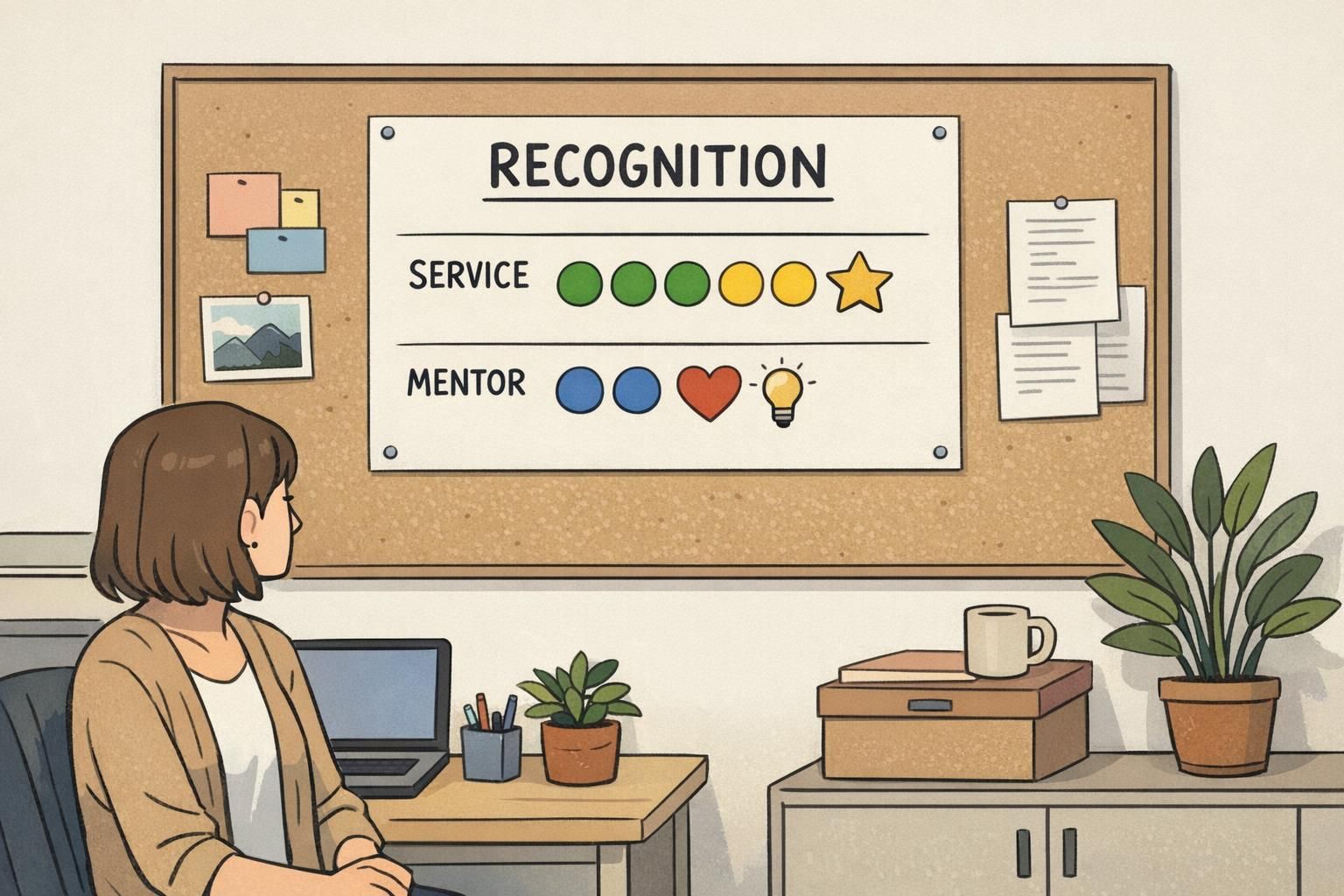
If you also use training recognition, consider aligning your physical markers with digital badges inside your learning system. Employees shouldn’t have to learn two different languages for the same accomplishment. One shared set of categories (service, safety, mentoring, training) helps people understand what’s being celebrated and why.
Product fit: recognition add-ons that work with BadgeZoo ID and name tag systems
Recognition runs smoother when it fits the same everyday identification people already wear. If employees already carry ID cards or use name tags, the cleanest path is usually a compatible add-on or insert that uses the same holders, clips, and placement rules across teams.
BadgeZoo formats like custom ID badges can support a consistent base badge that pairs neatly with subtle recognition add-ons (like corner markers or stacked cards). Many organizations start with one or two recognition types—often service and mentoring—then expand once the design language feels familiar.
A simple system that matches your existing ID setup is easier to distribute, easier to replace, and easier for employees to adopt without feeling like they’re wearing “one more thing.”
Simple rollout plan: pilot, refine, then scale across teams
A pilot keeps the program practical. Start in one department for 30–60 days, using the exact sizes, placements, and categories you’d use long-term. This avoids a common problem: a pilot that looks great in theory but becomes messy when it hits real workflows.
During the pilot, focus on a few real-world signals: who chooses to participate, how easy it is to order and distribute markers, how often replacements are needed, and whether the recognition stays readable and professional in day-to-day wear.
- Choose 1–2 recognition types for the pilot (for example: years of service and mentoring)
- Define the visual rules (placement, icon set, color palette, and what text is allowed)
- Document the request/approval path so managers aren’t improvising
- Collect feedback privately (so employees can be honest without social pressure)
- Refine and simplify before scaling—remove anything that feels cluttered or confusing
Once you scale, keep the tone steady: subtle, consistent, and supportive. When recognition becomes a normal part of how people identify each other—rather than an attention-grabbing add-on—it tends to feel more inclusive and more sustainable over time.