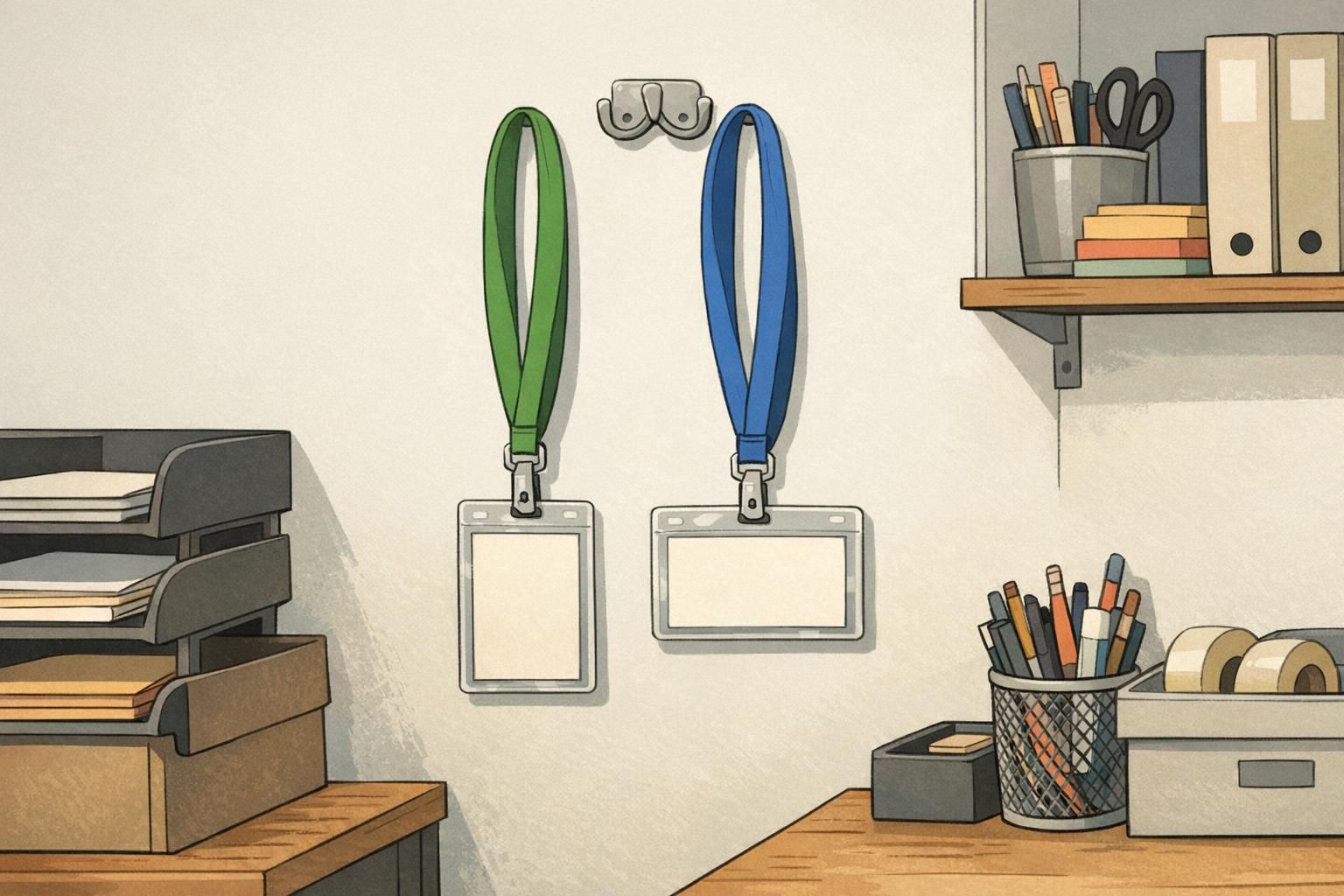
Vertical badge holder vs Horizontal Badge Holder: Choosing the Right Orientation
Why vertical vs horizontal orientation matters for daily scanning and readability
A badge does more than hold an ID—it helps people identify names and roles quickly, and it helps scanners read barcodes or QR codes without friction. That’s why the choice between a vertical badge holder and a horizontal badge holder matters more than many teams expect. When the holder orientation matches your card design, the name, photo, and scannable codes stay upright, readable, and consistent across your workplace or event.
Orientation affects three practical things every day: (1) how quickly someone can read a name and recognize a face, (2) whether a QR code or barcode can be scanned without twisting the badge, and (3) how the badge hangs based on where the slot or holes are located. If the slot is in the wrong place relative to your card’s “top,” the badge may rotate 90 degrees and force the wearer—or the security desk—to keep turning it to make sense of it.
- Readability at a glance: Names and photos are fastest to process when they’re upright and consistently placed.
- Faster scanning: Codes scan more reliably when the badge doesn’t need to be rotated each time.
- Professional appearance: A badge that hangs straight looks intentional and reduces “fiddling” during introductions.
- Fewer printing surprises: Matching orientation early prevents last-minute reprints caused by sideways layouts or covered headers.
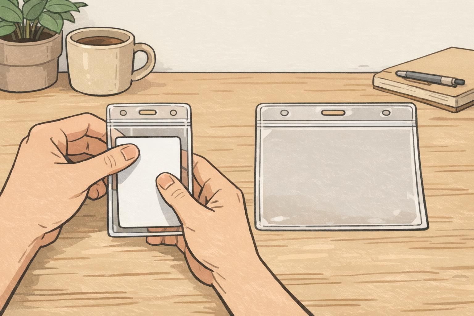
Vertical badge holder basics: when portrait orientation is the safer choice
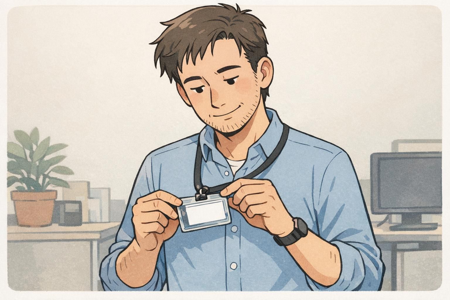
A vertical badge holder (portrait) is typically the safer choice when your design reads from top to bottom. If your layout stacks elements—logo at the top, photo beneath it, then name and title—portrait orientation keeps the visual hierarchy natural. It also tends to look “right” on a lanyard because the top edge is clearly defined, and many vertical holders use a centered slot at the top that helps the badge hang straight.
Portrait layouts are especially common for workplace IDs where the photo is above the name. In these cases, a vertical badge holder helps prevent accidental rotation that could put the photo sideways (which makes quick recognition harder). Portrait is also helpful when the card includes a prominent header band or logo that should remain at the top during check-ins.
Choose a vertical badge holder when your card’s most important information is stacked (top-to-bottom) and should stay upright without any turning—especially the photo and the name line.
- Best for: Photo above name, stacked logos/roles, tall layouts with multiple lines of info
- Often easier to keep upright: When the slot is centered on the top edge
- Good for: Employee IDs where instant recognition matters during greetings, access checks, and introductions
Horizontal badge holder basics: when landscape layouts reduce wasted space
A horizontal badge holder (landscape) is ideal when your card design is naturally wide. This is common when you have a long organization name, a department line that benefits from extra width, or a layout that places the photo to the left and the name/title to the right. Landscape designs often feel less cramped for long names, and they can make certain logos look more proportional when the brand mark is wide rather than tall.
The key with a horizontal badge holder is confirming that the slot placement matches the card’s intended “top” edge. If the holder is landscape but the slot is positioned as if the card were portrait (or vice versa), the badge may hang sideways even though the card technically fits. When the layout is built for left-to-right reading, keeping it truly level makes check-ins smoother and improves the visual consistency of a group wearing badges.
- Best for: Left-to-right layouts, wide logos, long names, large department labels, photo-left/text-right designs
- Helpful when: You want larger text without shrinking font size to fit a narrow portrait width
- Common in: Conferences and events where sponsors/roles are displayed alongside attendee names
Slot placement and clip style: what actually controls “upright” vs “sideways”
Most badge orientation issues come from slot position, not the clear plastic shape by itself. Think of the slot (or holes) as the “hinge point.” If it’s aligned with the top edge of your printed design, the badge hangs upright. If it’s aligned with the side edge of your printed design, the badge rotates and wears sideways.
A top-center slot is the most common choice for keeping a badge straight on a lanyard, especially when the attachment point is centered and stable. Side slots, off-center slots, or mismatched hole punches can cause the badge to spin—sometimes slowly throughout the day. Hardware matters too: a swivel hook can reduce twisting, while a rigid strap clip may hold the badge in a fixed (and sometimes wrong) orientation if the slot is poorly placed.
- Top-center slot: Usually the best default for upright, stable hanging
- Dual-slot holders: Can help balance the badge and reduce flipping for some setups
- Swivel hook on a lanyard: Helps the holder self-correct when it twists
- Retractable reel: Convenient for scanning, but the reel’s tension can increase spinning if the slot is off-center
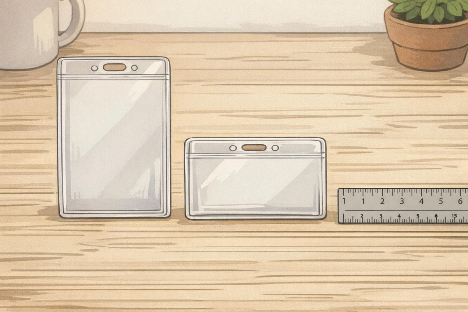
Quick measurements and ID holder size: avoid cards that don’t fit
Before choosing orientation, confirm the basics: the card must fit the holder cleanly and sit flat. Getting ID holder size right prevents corners from bending, reduces the chance of the card slipping, and helps keep the printed layout aligned so names and photos stay visible.
A very common credential size is CR80 (also known as ID-1), which is widely used for ID cards. Many holders are designed around this standardized format, which is why measuring your card against that standard is a reliable starting point. For reference to the standard dimensions used for many ID-1 cards, see source.
That said, not every credential is a CR80 plastic card. Event badges are often larger, and inserts can be thicker or slightly oversized depending on paper stock and laminates. The smartest approach is to measure width, height, and thickness of the actual credential you plan to insert—then match the holder. Finally, map where the slot needs to be relative to your printed “top” edge so the badge hangs upright.
- Measure width and height: Confirm the holder’s internal dimensions match your card size (not just the listing name).
- Check thickness: Thicker cards or laminated inserts need slightly more room to slide in and sit flat.
- Confirm the printed “top”: Decide which edge is the top of the design before choosing slot orientation.
- Order for consistency: Standardizing one card size across teams can simplify holder and lanyard ordering.
Common mistakes that crop logos, cut off names, or rotate photos
Most “bad badge” moments come from small mismatches between the printed design and the holder’s realities. The holder has borders. The slot has a fixed position. And the way the badge hangs affects how people perceive the photo and name instantly. Planning for these details prevents frustrating reprints and awkward check-ins.
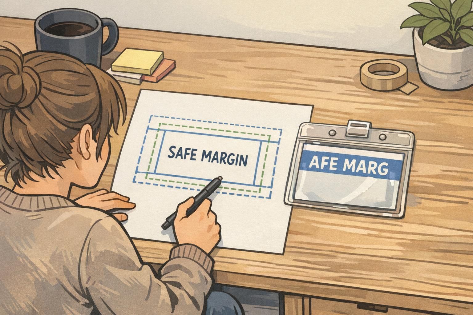
- Placing critical text too close to the edge: Holder borders can cover part of a name, title, or ID number.
- Header logo too high: Some holders have reinforced top edges that can hide a logo band or header element.
- Choosing the correct holder shape but wrong slot orientation: The card fits, but the entire design hangs rotated 90 degrees.
- Ignoring scan zones: A barcode or QR code placed near a covered edge may be harder to scan reliably.
- Assuming all “standard” holders are identical: Small differences in border thickness and slot placement can change what stays visible.
“We didn’t change the card design at all—we just moved the header down slightly and matched the slot to the printed top edge. Suddenly every badge hung straight, and check-in got faster.” – Operations Coordinator
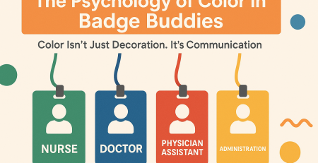
Choosing the right orientation by use case: workplace IDs, visitors, and events
The “right” orientation depends on how the badge is used in real life. A badge worn all day in a workplace has different priorities than a visitor credential used for a quick escort, or an event badge that needs to show role and access level at a distance. The goal is the same in each case: keep the most important information upright, readable, and easy to scan.
Workplace IDs often benefit from simple, consistent recognition: photo and name should read instantly while standing and talking. If the photo is above the name and the layout is stacked, a vertical badge holder usually supports that best. If the organization uses wide layouts—photo left, name and department right—a horizontal badge holder may be more readable without shrinking the text.
Visitor badges frequently need a bold visual cue (like a strong header area) and a clear expiration date or time window. That can push you toward whichever orientation gives more room to highlight the visitor status without squeezing the name. Event badges vary the most: they can be larger than standard cards, and they may include sponsor areas, role identifiers, or QR codes for lead retrieval. For events, confirm the holder size, the intended top edge, and the slot placement before printing a large batch.
- Employees: Optimize for recognition—upright photo and name, minimal twisting, consistent across departments.
- Visitors: Prioritize quick understanding at a glance—clear status area plus readable name and date info.
- Events: Confirm size and scanning needs early—larger badges may need different holders and different slot placement.
Product fit checklist and ordering tips (holders, lanyards, and printed IDs)
If you’re ordering holders, lanyards, and printed IDs together (or updating an existing system), a short checklist can prevent most orientation and fit problems. The main idea is to decide how the badge should read when worn, then align the card layout, holder orientation, and attachment hardware so everything hangs upright and stays visible.
- Confirm card dimensions: Match the holder to the real card width, height, and thickness.
- Pick the orientation based on the layout: Use portrait for stacked elements; landscape for wide layouts and longer text lines.
- Align the slot to the printed “top”: Don’t assume the slot matches the holder’s shape—verify it matches how the design should hang.
- Check border coverage: Keep key content (logos, names, codes) away from edges where the holder frame may overlap.
- Choose the attachment method: Lanyard, clip, or retractable reel can affect twisting and scanning comfort.
- Standardize when possible: Consistency across teams makes badges easier to read and reduces ordering complexity.
If you’re comparing options across sizes and orientations, you can browse clear ID badge holders in vertical and horizontal orientations and match the holder style to your layout and attachment method. If you’re ordering in bulk and want a second set of eyes on fit or slot placement, you can also reach out with questions at http://badgezoo.com/contact.
Usually, yes—but the more important detail is that the slot location must match the card’s intended top edge. A landscape card can still hang sideways if the slot is positioned for portrait wear.
Flipping is often caused by an off-center slot, a single attachment point that allows rotation, or a reel/clip that adds torque. A centered top slot and a swivel attachment can reduce twisting.
Build safe margins into the printed design and assume the holder frame will overlap the outer edges slightly. Also watch for reinforced top borders that can cover high header elements.
Finalize them together whenever possible. Decide the orientation and attachment style, then align the layout’s “top,” safe margins, and scannable code placement to the specific holder’s border and slot.
The simplest way to avoid sideways badges and cropped headers: match the layout’s intended top edge to the holder’s slot position, then confirm ID holder size so the card sits flat and fully visible.