Back of ID Card Design: Smart Uses Without Overloading
Why the Back of ID Card Matters (and When to Use It)
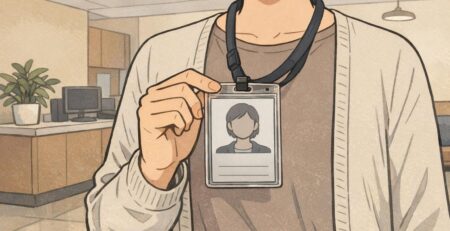
The back of ID card is some of the most useful “hidden” space in workplace identification. The front usually needs to stay clean and people-first: photo, name, department, and maybe a role color—details that help coworkers and visitors recognize someone at a glance. The reverse side can then do the job of supporting actions: scanning for access, quick reference information, or short safety prompts.
Used well, the back becomes a small tool that helps people make correct decisions quickly—especially in busy environments where nobody has time to read a dense policy block. The best designs are intentional: they add only what supports safety, access, and operations, while keeping scannable areas and key details unobstructed.
A strong rule of thumb: the front answers “Who is this?” and the back answers “What should I do with this card?”
Start with a Priority List: What Users Actually Need in the Moment
Before you add anything to the reverse side, decide what the badge needs to help someone do in real life. When a card back is overloaded, the most important element (often a code) becomes harder to locate, harder to scan, or easier to misunderstand. A simple priority list prevents that.
Start by naming the one or two “moment of use” actions. For example: scanning into a door, verifying a membership, checking out equipment, or following a basic emergency step. Then keep the back organized around those actions—so someone can understand it at arm’s length, under pressure, or while moving.
- Must-have: what is required for the primary workflow (typically one scannable code and a human-readable ID number).
- Nice-to-have: short supporting info that prevents confusion (for example, “If found, return to…” or a short internal help line).
- Don’t-print: items that create clutter or quickly become outdated (long policies, long URLs, multi-paragraph instructions, or multiple competing codes).
“If someone can’t find the right element in two seconds, it might as well not be there.” – Facilities Coordinator
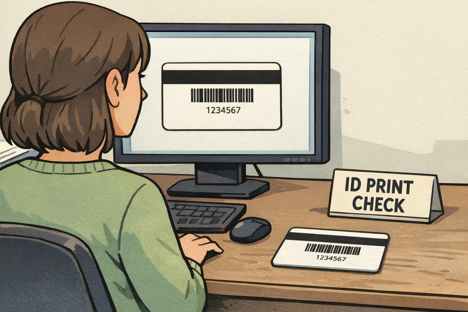
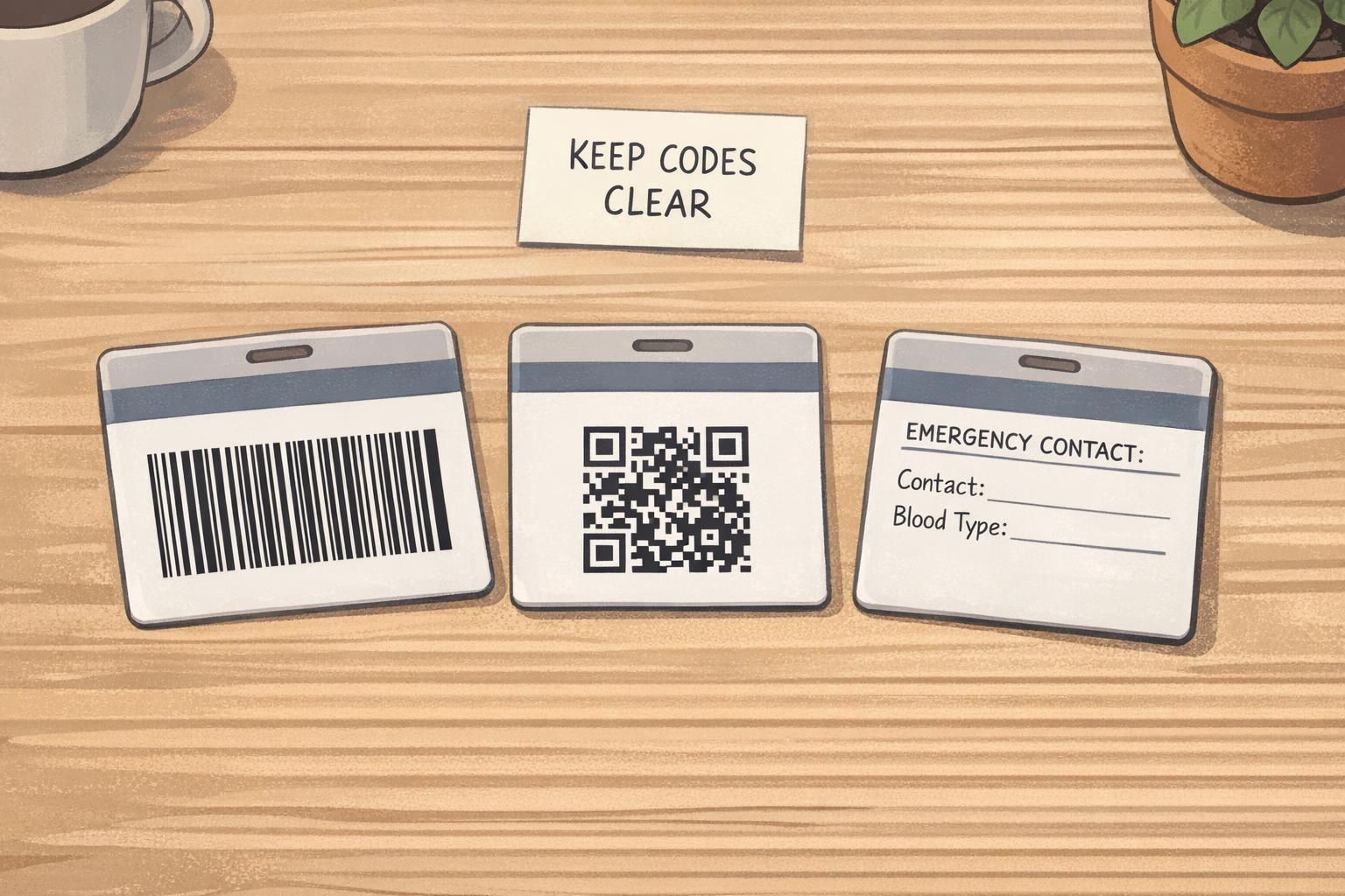
Scannable Elements First: Barcodes, QR Codes, and Numbering
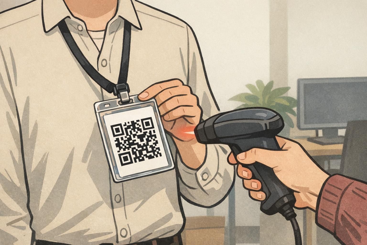
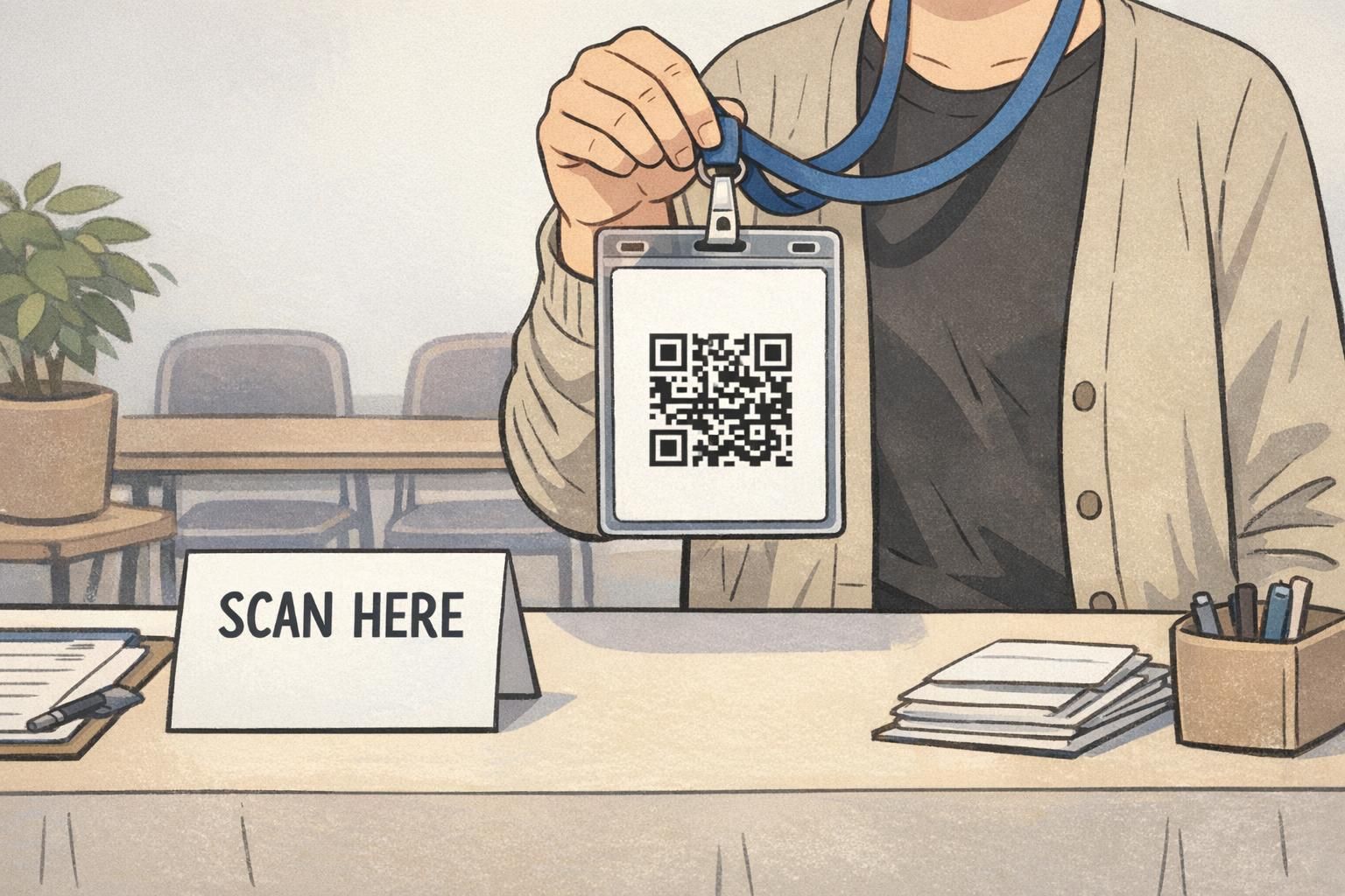
When the back is used for operational workflows, scannable elements usually come first. A barcode or QR code is only helpful if it scans quickly and consistently—so the badge back design should protect the code’s readability above everything else.
Good scanning behavior often depends on simple design choices: strong contrast, sufficient “quiet zone” (empty space around the code), and keeping the code away from areas that get covered by a slot punch, clip, or finger placement. If you’re planning a double sided ID, this is often the cleanest approach: keep the front focused on the person, and reserve the back for the process.
- Use strong contrast (dark code on a light background) and avoid patterned backgrounds behind the code.
- Leave open space around the code so scanners can “see” it easily (avoid placing it too close to edges, slots, or other blocks).
- Keep one primary code per workflow when possible; multiple codes can compete and slow people down.
- Add a short human-readable ID number near the code for manual entry when scanning fails.
- Position the code where it’s less likely to be covered by a thumb or a badge clip (often lower-middle or lower-right on vertical layouts, depending on holder style).
Technology can absolutely improve operational performance, but it can also create new friction when systems don’t align or when too much data is pushed into a small credential. Research on digital and operational systems often notes that increased data and tooling can introduce overload and interoperability challenges, which is a good reminder to keep badge content focused and scannable rather than “everything at once” (source). In practice, that means making the code easy to find, easy to scan, and supported by only the minimum extra information people truly need.
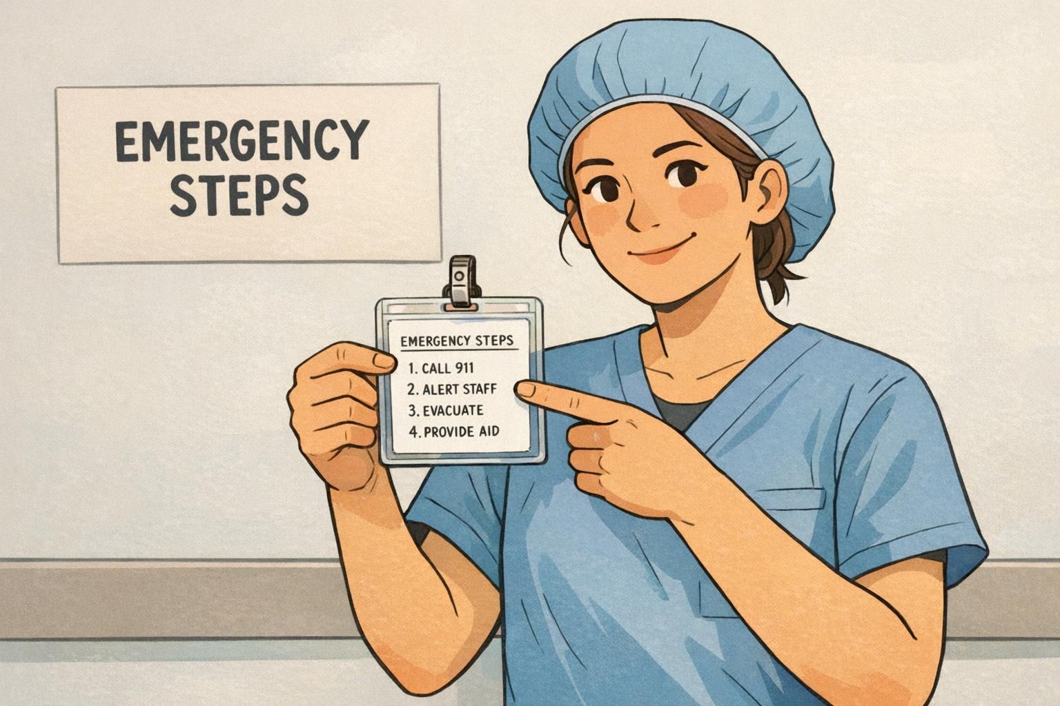
Emergency and Safety Info That Fits (Without Turning into a Wall of Text)
The reverse side is also a good place for brief emergency guidance—especially when people might not have a phone available, or when quick reminders reduce hesitation. The key is to keep it short, standardized, and genuinely useful in the first moments of a situation.
Aim for what someone would need in the first 10–20 seconds: a short “what to do” sequence, a role-based reminder (for example, who to notify), or a single contact point. If you need longer procedures, consider referencing them with one QR code that points to a secure internal page—rather than printing a paragraph in tiny type.
- Evacuation: 2–3 steps such as “Exit, meet at assembly point, check in with supervisor.”
- Emergency contact: one internal number/extension or a main security desk line (where appropriate).
- Role reminders: quick cues like “Charge nurse: notify operator” or “Event staff: direct to help desk.”
Privacy check: avoid printing sensitive personal details on the back unless your policy truly requires it and you can control card handling, loss procedures, and reissues.
Quick Instructions for Daily Operations (Access, Returns, Visitors, Equipment)
Some of the best uses of the reverse side are the small “what to do next” prompts that prevent lost time. These are especially helpful for new employees, rotating staff, volunteers, and event teams—anyone who might not remember the exact process in the moment.
Keep operational instructions short and scannable, just like a good sign. A few lines can reduce rework, cut down on “Where do I go?” questions, and help teams follow consistent steps without needing to look something up mid-task.
- Found badge instructions: “If found, return to Reception” or “Drop in locked box at Security.”
- After-hours entry: a short cue like “Use Door B” plus a help contact for access issues.
- Visitor handling: “Visitors must be escorted” (if your program uses the same card stock for multiple credential types).
- Equipment or checkout: “Scan code to check out” and a backup manual ID number.
“The back doesn’t need to teach the whole policy—just the next step that prevents mistakes.” – Event Operations Lead
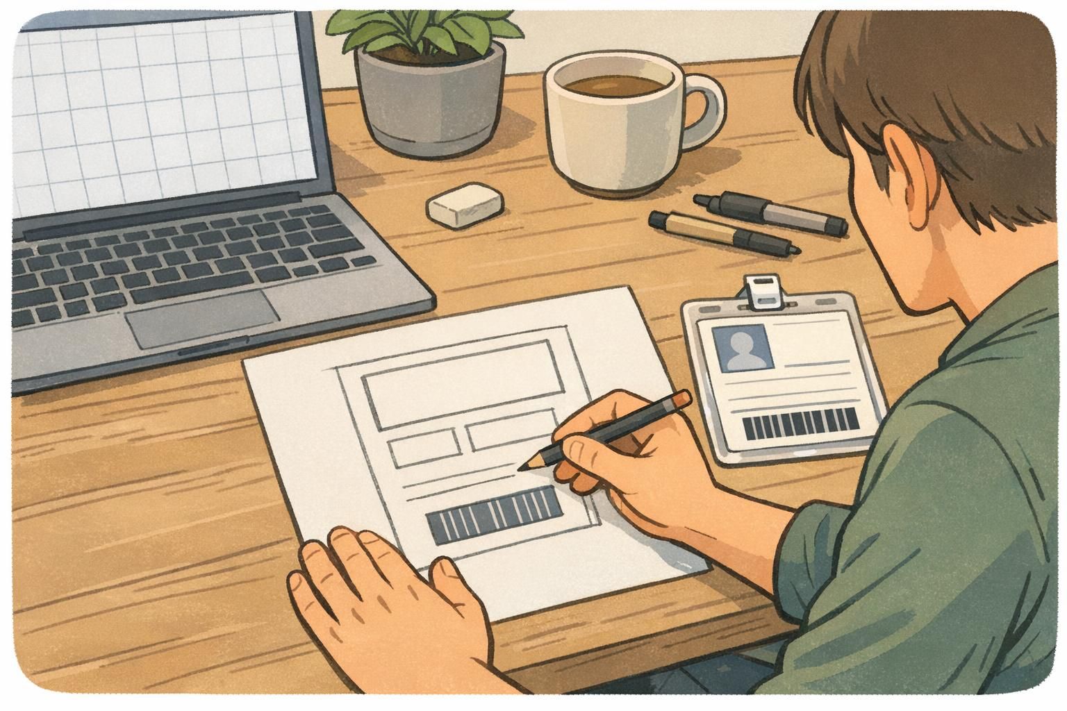
Design Rules for Clarity: Layout, Contrast, and What to Leave Off
A clear badge back design is less about adding content and more about controlling it. The physical reality of badges matters: they get scratched, handled, placed in holders, and scanned quickly. A “busy” design often becomes unreadable faster than a simple one.
Think in blocks. Most backs work best with a small number of clearly separated areas and generous margins. If you need more information than can be comfortably read, that’s a sign the card should point to a digital resource rather than carry it all.
- Use a simple hierarchy: one header line (optional), one primary scannable element (if needed), then two or three short info blocks.
- Leave generous margins so wear and minor misalignment don’t damage readability.
- Avoid dense policies, tiny fonts, and multi-paragraph text.
- Skip long URLs; if needed, use one QR code that links to the right destination.
- Avoid multiple codes unless each one has a distinct, unavoidable purpose and clear labeling.
If you’re choosing a double sided ID layout, decide which side “wins” when there’s a tradeoff. For most programs, the back should protect the scan area first.
Role-Based and Industry Examples (Education, Healthcare, Corporate, Events)
The best back-of-card content depends on traffic flow and how often people need to reference the information. A school badge might be used differently than a hospital badge, and an event credential often needs quick scanning plus attendee guidance. What stays consistent is the goal: keep front/back responsibilities clear so the badge stays fast to understand.
- Education: a brief emergency cue (lockdown or evacuation steps) or a dismissal reminder; keep student privacy in mind and avoid sensitive details on the reverse.
- Healthcare: short safety reminders (for example, emergency steps), one internal extension, and a scannable code for access or tracking when relevant.
- Corporate and offices: access scanning and a clear ID number; optional “If found, return to…” instruction to reduce replacement churn.
- Events and conferences: one QR code for check-in, session tracking, or lead retrieval, plus a short help desk location or reprint instruction.
A consistent layout helps people learn where to look. If different roles require different content, try to keep the same structure (code in the same place, help line in the same place) so the badge still feels familiar.
Either can work well when printed with strong contrast and enough clear space. The best choice depends on your scanners, workflows, and whether you need a compact code with more data versus a simpler code for a single identifier.
Production Choices That Protect Readability (Finish, Durability, and Reprints)
Even a perfect layout can fail if the print doesn’t hold up. The reverse side often gets the most handling because people turn the card to scan it, and it may rub against holders, clips, and clothing. Scratches and smudges can reduce legibility over time, especially around scannable elements.
If your badges are high-use (daily access, frequent scanning, multi-shift environments), it’s worth choosing production options that protect contrast and minimize glare. It also helps to standardize templates so reprints are consistent and quick, especially when roles change or temporary badges are common.
- Choose a finish that keeps text and codes readable under typical lighting and scanning conditions.
- Avoid placing key elements too close to edges that may wear faster inside holders.
- Standardize back-of-card templates to reduce errors and speed up reissues.
- If roles change often, minimize variable text and rely on stable identifiers plus a system lookup.
BadgeZoo offers multiple finishes including gloss and matte/silk, which can help teams balance durability, glare, and everyday readability depending on how the back of ID card will be scanned and handled.
BadgeZoo Options for Double-Sided Cards and Event Badges
If you’re building a double sided ID program or planning event credentials, it helps to choose a format that supports both goals: fast visual identification on the front, and clean operational information on the back. Many teams standardize on a front layout (photo, name, role) and a back layout (single scan code, short ID number, and a small instruction block) so staff and attendees don’t have to guess where to look.
BadgeZoo can produce double-sided cards that follow this front/back split, making it easier to keep the badge back design consistent across departments, shifts, or multi-day events. For teams exploring layout options, you can review double-sided custom ID cards as a starting point for common credential formats.
The most effective backs are intentionally simple: one primary scan element, one backup identifier, and only the short instructions or safety cues someone truly needs in the moment.