Matte ID Card vs Glossy Finishes: When Finish Hurts Readability
Why a Matte ID Card Finish Can Improve Everyday Readability
A matte ID card finish is often chosen for one simple reason: it’s easier to read in the lighting people actually work under. In offices, hospitals, warehouses, and event venues, badges are viewed quickly, at arm’s length, and rarely at the “perfect” angle. When a surface reflects light strongly, names, photos, and role identifiers can look washed out—even if the print quality is excellent.
Matte surfaces reduce the bright highlights that can sit right on top of critical information. That means coworkers, visitors, and security staff spend less time asking someone to turn their badge, lift it, or step out of a spotlight just so it can be read. In environments where fast recognition matters, that small improvement can add up throughout the day.
If a badge is meant to be read quickly at typical viewing angles (not carefully examined), reducing glare is often more important than making colors look extra shiny.
- Less glare under overhead lighting, windows, and task lamps
- More consistent contrast for names, headshots, and role labels
- Fewer “tilt the badge” moments during quick interactions
- Often smoother scanning behavior for QR codes and barcodes at varied angles

What “Glossy” and “Matte” Really Mean for ID Printing
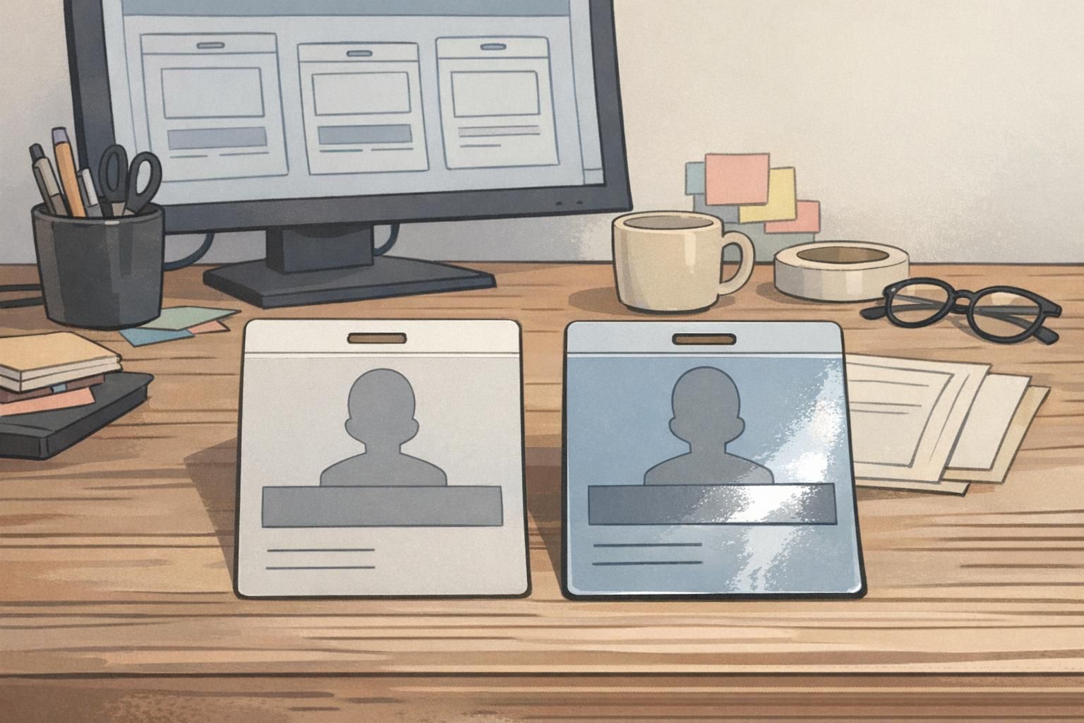
In plain terms, glossy and matte refer to how the card’s surface interacts with light. A glossy finish reflects light in a more mirror-like way. A matte finish scatters light more evenly. That difference changes what your eyes perceive when you look at a badge in real conditions—especially under ceiling LEDs, lobby lighting, and sun from windows.
With a glossy card, the print can look very crisp and vibrant when the angle is favorable. But when the light source lines up with the viewer’s eyes (or a camera), the reflection can overpower the printed information. With a matte ID card, the print may look slightly less “shiny,” but it tends to stay readable across a wider range of angles.
- Glossy: higher perceived shine, more mirror-like reflections, can look vivid but may glare
- Matte: lower shine, diffused reflections, often more consistent readability
- Real-world impact: the faster someone needs to recognize the badge, the more finish matters
Not necessarily. Matte can still look clean and professional. The key difference is that matte reduces strong reflections, which often makes photos and text easier to interpret in everyday lighting.
It’s partly aesthetics, but it also affects usability. If your badge is frequently checked, scanned, or read on the move, finish can influence speed and accuracy.
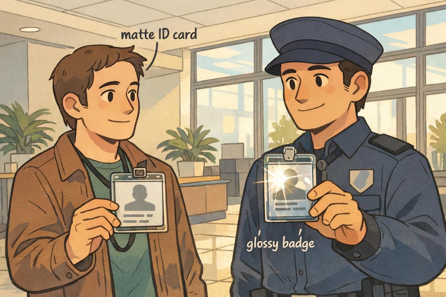
Glossy Badge Glare: When Shine Becomes a Visibility Problem
Glossy badge glare is most noticeable when a bright light creates a sharp highlight across the badge face. Overhead LEDs can do it. Strong lobby lighting can do it. Sunlight through windows can do it. The result is familiar: a bright streak or “hot spot” that lands right where a name or photo is printed, lowering contrast and forcing the viewer to hunt for a readable angle.
This isn’t just a cosmetic issue. In fast-moving settings—conference entry lines, healthcare check-ins, security desks—people rely on quick visual confirmation. If a badge routinely needs tilting, the process slows down, and mistakes become more likely (reading the wrong name, missing a role label, or failing to notice a credential type).
Research in vision and perception supports the practical point that surface gloss changes reflections and perceived contrast, which can influence how easily people read text and interpret visual details under real lighting conditions (source). In other words: glare isn’t just annoying—it can meaningfully interfere with what the eye can pick up quickly.
If your IDs are checked in bright, directional light, glossy may look great in some moments and frustrating in others. Matte tends to be more consistent.
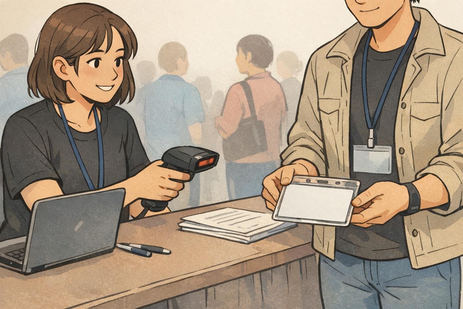
Scanning and Access Control: How Finish Affects Barcodes and QR Codes
Badges and ID cards aren’t only for visual identification. Many organizations rely on barcodes or QR codes for door access, time tracking, visitor management, and event entry. In these workflows, consistent scanning matters as much as (or more than) how the badge looks.
A glossy surface can reflect scanner light back unpredictably, especially when someone presents the badge at a slight angle or under strong lighting. That can reduce read rates in certain situations, creating re-tries and slowdowns. A matte ID card surface typically reduces reflections that interfere with consistent contrast, which can make scanning feel smoother in high-throughput environments.
- If scanning happens frequently (multiple times per shift), prioritize consistent scan performance over “shine.”
- If badges are scanned quickly in a line, matte can reduce angle sensitivity caused by reflections.
- If scanners are used outdoors or near windows, matte often helps by limiting glare on the code area.
- If scanning is occasional and lighting is controlled, glossy can still work well with a strong code design.
Choosing the Right Finish by Lighting, Role, and Wear Environment
Choosing between matte and glossy is easiest when you start with the environment—not the design. Where will the badge be worn? What kind of light hits it? How quickly do people need to read it? And is the badge mainly for visual confirmation, scanning, or both?
Matte is often the practical choice for roles that move between lighting conditions: hallways to outdoors, vehicles to warehouses, day shifts to night shifts. It also tends to work well under strong overhead fixtures where reflections are common. Glossy can still be a solid option in controlled lighting (even, diffuse indoor lighting) or when you want a more vibrant look for photos and brand colors—as long as readability remains strong at normal viewing angles.
- High-glare spaces (lobbies, glass-heavy offices, outdoor check-ins): favor matte
- Roles that move constantly (facilities, logistics, field staff): favor matte for consistency
- Stationary, controlled indoor environments (membership desks, back offices): glossy may be fine
- Frequent scanning (access control, event entry): matte often reduces reflection-related re-scans
- Badges worn lower on the torso (more likely to catch overhead reflections): consider matte
“We didn’t realize how much lighting mattered until people started tilting badges to read names at the front desk. Changing the finish made recognition faster without changing our design.” – Operations Coordinator
Design Tips to Make a Readable Name Badge in Any Finish
Finish helps, but layout does the heavy lifting. A readable name badge depends on contrast, hierarchy, and sizing—so the most important information is visible at a glance. This matters for both day-to-day workplace IDs and event badges where people are meeting quickly and repeatedly.
Start by treating the name as the primary element. Then place the role, department, or access indicator second. Photos help with recognition, but they shouldn’t compete with the name. If you must use glossy, you can lower the risk of glare issues by designing in a way that stays legible even when a highlight crosses part of the badge.
- Use high contrast: dark text on a lighter background is usually easiest to read quickly
- Increase name size: prioritize the name over decorative elements
- Choose simple type: clean, sans-serif fonts often hold up best at a glance
- Create clear hierarchy: name first, role/department second, other details last
- Avoid placing critical text at the very top edge where overhead glare often lands
- Keep the code area clear: give QR/barcodes breathing room to improve scanning reliability
Matte is more forgiving, but it doesn’t replace good contrast. For the most readable name badge, keep the name high-contrast and large enough to read at arm’s length.
A clear photo is mostly about image quality and print settings. Gloss can make colors appear more vibrant, but if it introduces glare over faces, it can make recognition harder in practice.
When Glossy Is Still a Smart Choice (and How to Reduce Glare)
Glossy isn’t “bad”—it’s just more sensitive to lighting. For photo-forward event badges, premium membership cards, or designs where color pop is the priority, glossy can look sharp in evenly lit indoor venues. The key is ensuring the badge remains readable when worn on a moving person, not just when viewed straight-on on a desk.
If you prefer glossy, you can reduce the impact of glossy badge glare by designing and wearing the credential in ways that minimize reflections over critical information. The goal is to keep names and roles readable without forcing people to constantly adjust their badge.
- Use darker text blocks behind key fields (name, role) to preserve contrast
- Increase whitespace around critical fields so glare doesn’t cover everything at once
- Avoid tiny thin fonts, especially for names and role identifiers
- Keep the badge flatter against the body (less tilting can mean fewer intense reflections)
- Test in the real venue: stand under the actual lights and check readability from a few feet away

BadgeZoo Options: Picking a Finish for IDs, Name Tags, and Event Badges
When you’re ordering identification, matching finish to environment can improve daily usability—especially if your IDs are frequently read under overhead lighting or scanned at speed. A matte ID card finish is often the easiest choice when lighting varies or when you want consistent readability across angles. Glossy can still be a good fit for controlled indoor settings or designs where you want extra visual vibrancy, as long as your layout stays legible in motion.
BadgeZoo offers multiple finishes, including gloss and matte/silk, so teams can standardize on what works best for their lighting and workflow. If your IDs include QR codes or other scannable elements, it’s worth thinking about finish alongside the layout so check-in, access control, or time tracking stays smooth.
If you’re comparing options for a new rollout or trying to reduce glare complaints, you can start with the credential type and typical lighting, then choose a finish that supports quick recognition and reliable scanning. For product details, see custom PVC ID cards.
A simple rule of thumb: if your environment creates frequent reflections, prioritize readability and scan consistency first—then tune the design for the look you want.